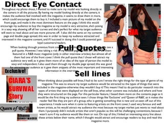
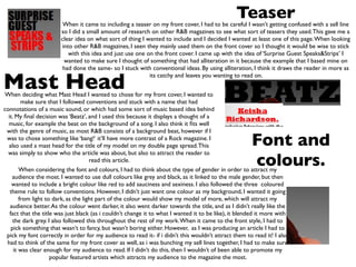
Evaluation 5
How did you attract/address your audience?
•   When producing my front cover, double page
    spread and contents page, I had to think of things
    that would attract my audience, obviously so they
    would buy it. I had to pay close attention to
    features like direct eye contact, sell lines, teasers,
    mast heads, fonts, colours, and pull quotes.You will
    see through the following slides how I tried to
    attract my audience, by using these features.
Direct Eye Contact
 Throughout my photo shoot, I wanted to make sure my model was looking directly at
   the camera in all the pictures. By having my model looking directly at the camera, it
  makes the audience feel involved with the magazine, it seems to draw them in more,
  which could encourage them to buy it. I included a main picture of my model on the
    front page, and made it the most dominant feature on the page, I think this would
encourage my audience to buy the magazine as my model is very attractive, she’s posing
 in a sexy way, showing off all her curves and she’s perfect for what my target audience
 will want to read about and see more pictures off. I also did the same on my contents
   page and double page spread, this was in order to keep my audience attracted and
 interested in the magazine content, and if I succeed in doing this I could potential gain
                                  loyal customers/readers.

                                                   Pull Quotes
        When looking through previous front covers and double page spreads, I tended to see a
          pull quote. However, I was taking a risk in my double page spread as I didn’t see them
          featured in a R&B music magazine (only in other interview articles), but almost all of
            them had one of the front cover. I think the pull quote that I chose will attract my
         audience very well, as it gives them more of an idea of the type of person the model is-
         sexy and independent. I also used them through my double page spread, this was good
        for attracting my audence as it gave them snippets of the most important and interesting

                                                                 Sell lines
                                         information in the interview.


                                 When thinking about possible sell lines, I had to be sure I wrote the right things for the type of genre of my
                                     magazine. This was to ensure my target audience would be attracted to the types of things that were
                                included in the magazine-otherwise they wouldn’t buy it! This meant I had to do particular research into the
                                  types of artists that were displayed on the sell lines, what other content was included, and where and how
                                 they were structured on the page. For this particular feature, I based them more on the contents page as it
                                 would be the first thing my audience seen. I chose things like ‘Exclusive’ and ‘Queen of R&B’, as it makes the
                                   reader feel like they are part of a group, who is getting something that is new and un-seen off out of this
                                   experience. I made sure when it came to featuring artists on the front cover, I used very famous and well
                                known artists, as his would attract my audience the most because my target market just wants to read about
                                  them. I purposely didn’t include artists that aren’t popular, as this will be challenging conventions, because I
                                   wasn’t sure if my audience would like them or not. On top of this, I linked an interesting story line about
                                  these artists below their name, which I thought would attract and encourage readers to buy and read this
                                                                                  magazine more.
Teaser
                         When it came to including a teaser on my front cover, I had to be careful I wasn’t getting confused with a sell line
                        so I did a small amount of research on other R&B magazines to see what sort of teasers they used. This gave me a
                        clear idea on what sort of thing I wanted to include and I decided I wanted at least one of this page. When looking
                        into other R&B magazines, I seen they mainly used them on the front cover so I thought it would be wise to stick
                           with this idea and just use one on the front cover. I came up with the idea of ‘Surprise Guest Speaks&Strips’ I
                         wanted to make sure I thought of something that had alliteration in it because the example that I based mine on
                         had done the same- so I stuck with conventional ideas. By using alliteration, I think it draws the reader in more as


Mast Head
                                                            its catchy and leaves you wanting to read on.


When deciding what Mast Head I wanted to chose for my front cover, I wanted to
         make sure that I followed conventions and stuck with a name that had
connotations of a music sound, or which had some sort of music based idea behind
  it. My final decision was ‘Beatz’, and I used this because it displays a thought of a
  music, for example the beat on the background of a song. I also think it fits well
 with the genre of music, as most R&B consists of a background beat, however if I
 was to chose something like ‘bang!‘ it’ll have more contrast of a Rock magazine. I
  also used a mast head for the title of my model on my double page spread. This                       Font and
  was simply to show who the article was about, but also to attract the reader to
                                      read this article.
                                                                                                       colours.
        When considering the font and colours, I had to think about the type of gender in order to attract my
    audience the most. I wanted to use dull colours like grey and black, as it linked to the male gender, but then
    wanted to include a bright colour like red to add sauciness and sexiness. I also followed the three coloured
   theme rule to follow conventions. However, I didn’t just want one colour as my background, I wanted it going
        from light to dark, as the light part of the colour would show my model of more, which will attract my
   audience better. As the colour went darker, it also went darker towards the title, and as I didn’t really like the
   fact that the title was just black (as i couldn’t change it to what I wanted it to be like), it blended it more with
     the dark grey. I also followed this throughout the rest of my work. When it came to the front style, I had to
    pick something that wasn’t to fancy, but wasn’t boring either. However, as I was producing an article I had to
 pick my font correctly in order for my audience to read it- if i didn’t this wouldn’t attract them to read it! I also
 had to think of the same for my front cover as well, as i was bunching my sell lines together, I had to make sure
     it was clear enough for my audience to read. If I didn’t do this, then I wouldn’t of been able to promote my
                     popular featured artists which attracts my audience to the magazine the most.
Text

Sophies wags powerpoint e5

  • 1.
    Evaluation 5 How didyou attract/address your audience?
  • 2.
    When producing my front cover, double page spread and contents page, I had to think of things that would attract my audience, obviously so they would buy it. I had to pay close attention to features like direct eye contact, sell lines, teasers, mast heads, fonts, colours, and pull quotes.You will see through the following slides how I tried to attract my audience, by using these features.
  • 3.
    Direct Eye Contact Throughout my photo shoot, I wanted to make sure my model was looking directly at the camera in all the pictures. By having my model looking directly at the camera, it makes the audience feel involved with the magazine, it seems to draw them in more, which could encourage them to buy it. I included a main picture of my model on the front page, and made it the most dominant feature on the page, I think this would encourage my audience to buy the magazine as my model is very attractive, she’s posing in a sexy way, showing off all her curves and she’s perfect for what my target audience will want to read about and see more pictures off. I also did the same on my contents page and double page spread, this was in order to keep my audience attracted and interested in the magazine content, and if I succeed in doing this I could potential gain loyal customers/readers. Pull Quotes When looking through previous front covers and double page spreads, I tended to see a pull quote. However, I was taking a risk in my double page spread as I didn’t see them featured in a R&B music magazine (only in other interview articles), but almost all of them had one of the front cover. I think the pull quote that I chose will attract my audience very well, as it gives them more of an idea of the type of person the model is- sexy and independent. I also used them through my double page spread, this was good for attracting my audence as it gave them snippets of the most important and interesting Sell lines information in the interview. When thinking about possible sell lines, I had to be sure I wrote the right things for the type of genre of my magazine. This was to ensure my target audience would be attracted to the types of things that were included in the magazine-otherwise they wouldn’t buy it! This meant I had to do particular research into the types of artists that were displayed on the sell lines, what other content was included, and where and how they were structured on the page. For this particular feature, I based them more on the contents page as it would be the first thing my audience seen. I chose things like ‘Exclusive’ and ‘Queen of R&B’, as it makes the reader feel like they are part of a group, who is getting something that is new and un-seen off out of this experience. I made sure when it came to featuring artists on the front cover, I used very famous and well known artists, as his would attract my audience the most because my target market just wants to read about them. I purposely didn’t include artists that aren’t popular, as this will be challenging conventions, because I wasn’t sure if my audience would like them or not. On top of this, I linked an interesting story line about these artists below their name, which I thought would attract and encourage readers to buy and read this magazine more.
  • 4.
    Teaser When it came to including a teaser on my front cover, I had to be careful I wasn’t getting confused with a sell line so I did a small amount of research on other R&B magazines to see what sort of teasers they used. This gave me a clear idea on what sort of thing I wanted to include and I decided I wanted at least one of this page. When looking into other R&B magazines, I seen they mainly used them on the front cover so I thought it would be wise to stick with this idea and just use one on the front cover. I came up with the idea of ‘Surprise Guest Speaks&Strips’ I wanted to make sure I thought of something that had alliteration in it because the example that I based mine on had done the same- so I stuck with conventional ideas. By using alliteration, I think it draws the reader in more as Mast Head its catchy and leaves you wanting to read on. When deciding what Mast Head I wanted to chose for my front cover, I wanted to make sure that I followed conventions and stuck with a name that had connotations of a music sound, or which had some sort of music based idea behind it. My final decision was ‘Beatz’, and I used this because it displays a thought of a music, for example the beat on the background of a song. I also think it fits well with the genre of music, as most R&B consists of a background beat, however if I was to chose something like ‘bang!‘ it’ll have more contrast of a Rock magazine. I also used a mast head for the title of my model on my double page spread. This Font and was simply to show who the article was about, but also to attract the reader to read this article. colours. When considering the font and colours, I had to think about the type of gender in order to attract my audience the most. I wanted to use dull colours like grey and black, as it linked to the male gender, but then wanted to include a bright colour like red to add sauciness and sexiness. I also followed the three coloured theme rule to follow conventions. However, I didn’t just want one colour as my background, I wanted it going from light to dark, as the light part of the colour would show my model of more, which will attract my audience better. As the colour went darker, it also went darker towards the title, and as I didn’t really like the fact that the title was just black (as i couldn’t change it to what I wanted it to be like), it blended it more with the dark grey. I also followed this throughout the rest of my work. When it came to the front style, I had to pick something that wasn’t to fancy, but wasn’t boring either. However, as I was producing an article I had to pick my font correctly in order for my audience to read it- if i didn’t this wouldn’t attract them to read it! I also had to think of the same for my front cover as well, as i was bunching my sell lines together, I had to make sure it was clear enough for my audience to read. If I didn’t do this, then I wouldn’t of been able to promote my popular featured artists which attracts my audience to the magazine the most.
  • 5.

Editor's Notes