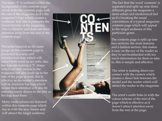
By: Angel Gordon
The letter „V‟ is outlined within the                                                   The fact that the word „contents‟ is
background of the contents page which                                                   separated and split up onto three
links the contents page with the rest of                                                different gives the magazine a more
the magazine as it‟s the magazine‟s logo                                                urban and modernized feel as it‟s
which creates a symbiotic link also it                                                  breaking the usual conventions of a
promotes the brand identity of the                                                      typical magazine contents page which
magazine. This is effective and does not                                                will appeal to the target audience of this
draw attention away from the rest of the                                                particular genre.
contents page. The V initial is big and
bold to reflect a male readership, but
                                                                                        The contents page is split up into two
remains understated and
                                                                                        sections; the main features and a fashion
                                                                                        section, this makes it easy on the eye of
                                                                                        the reader as they‟re not bombarded
The artist featured as the main image on                                                with too much information for them to
this contents page is presented in a sexy                                               take in, this is simple and effective. The
and promiscuous way which will attract                                                  use of script font for „features‟ and
both sexes as sex sells, also her legs are                                              „fashion‟ adds to the sophisticated feel.
making a „V‟ shape which not only                                                       Also, the use of topic areas allow the
relates to the magazine but also leads up                                               readership to navigate their way around
to the title of the page as well, this is                                               the content more effectively.
effective as the reader‟s attention will be
drawn to her legs which means their
attention will also be subconsciously                                                    The artist is making direct eye contact
drawn to the title as her legs lead there.                                               with the camera which creates a direct
                                                                                         link between the model and the reader
                                                                                         which will attract the reader to the
                                                                                         magazine. This direct address makes
Many nude colours are featured within
                                                                                         her seem sexually confident which will
this contents page which ties in with the
                                                                                         appeal to the male audience.
sexy theme and will attract the target
audience. The colour scheme of the page
would appeal to a male audience as
males like things simple and not              The artist‟s outfit links in with the colour scheme of the rest of the page which is
distracting. A gradient from softer to        effective as it doesn‟t attract attention away from the rest of the page. She is
darker grey allows Ciara to be                wearing a leotard with a waist belt which will highlight her curves and is
highlighted and the white title to grab       common iconography of this urban genre. Also the shape of her shoes from the
attention at the top.                         base to the heel mimics the shape of the V creating a symbiotic link.
The model/artist is making direct eye contact with the camera, creating a link
    between the magazine and the audience. This direct address represents confidence
    and self-assurance which are qualities the male target audience will admire.         The way in which the
                                                                                         word ‟contents‟ is
                                                                                         separated into three
The magazine‟s logo is                                                                   different lines shows
presented in the background. It                                                          the individualistic and
is a darker shade of the                                                                 creative nature of this
background colour making it                                                              magazine.
stand out however does not
take attention away from the                                                           The column of content
rest of the page. This is                                                              on the right hand side
effective as it creates a                                                              of this contents page is
symbiotic link with the rest of                                                        very simple and
the magazine and promotes the                                                          organised, it is effective
brand identity of this                                                                 as it is easy on the eye.
magazine, also it is where the
reader‟s attention is first drawn                                                      The model/artist has a
showing that the magazine is                                                           rough look about him
following the usual codes of                                                           which fits in with the
conventions of a typical                                                               urban genre as you‟d
contents page.                                                                         associate someone in a
                                                                                       suit with being clean
This contents page consists of a                                                       cut and shaven
black and white colour scheme                                                          however he is breaking
which is repeated throughout; this is                                                  that stereotype which
a very masculine colour                                                                shows the
scheme, also, there is one bit of                                                      individualistic nature of
colour which is the red heart that a
female is holding on the model‟s
                                                                                       this genre which will
chest. This symbolises love and                                                        appeal to the
passion which could relate to the                                                      magazine‟s target
nature of the article relating to the                                                  audience.
Incorporating the magazine‟s logo into the background promotes the brand identity of the
              magazine and creates a symbiotic link throughout the magazine, this is a good use of codes
              and conventions.
                                                                                                  The artist is wearing a new era cap
The content is listed on the left hand side                                                       backwards showing the
this time, unlike other issues of the                                                             edgy, individualistic nature of this
magazine. This could reflect the individual                                                       urban genre being promoted. He is
star image of the artist featured and how                                                         topless and his pose shows that he is
„VIBE‟ is not afraid to do things differently                                                     showing off not only his body but his
and break boundaries.                                                                             wealth as he has gold teeth also known
                                                                                                  as “grills” and has lots of gold and
The logo within the background is the same                                                        diamonds on his wrists, hands and neck.
colour as the background however a                                                                This is an effect use of iconography and
different shade, this is effective as it makes                                                    is useful in signifying the genre of this
it stand out yet it doesn‟t draw attention                                                        magazine.
away from the rest of the page, also where
                                                                                                  The artist featured on this contents page
the logo is placed is where the reader‟s
                                                                                                  is wearing big chains, one of these
attention first goes, this is also an effective
                                                                                                  chains contains a man in a balaclava
use of codes and conventions.
                                                                                                  which shows the aggressive nature of
                                                                                                  this genre and the “gangster” theme that
                                                                                                  is often promoted by rappers like
The deep red background connotes passion
                                                                                                  himself. These chains connote the urban
which could suggest that this magazine is
                                                                                                  genre of this magazine, this is an
passionate about the music and genre it
                                                                                                  effective use of iconography as it‟s
promotes. The white text on this contents
                                                                                                  something that crops up repeatedly.
page creates a good contrast however it
                                                                                                  Also, the tattoos that are present also
could be a down side as it doesn‟t stand out
                                                                                                  promote the genre of this magazine and
enough and attention is not really drawn to
                                                                                                  the artist‟s rebellious attitude.
it. However, the way in which the content is
presented is effective as it does not bombard     The contents page style of this particular      The artist‟s pose looks as if he is flexing
the reader with lots of information, it‟s easy    magazine is repeated in every issue which       his muscles making him look
on the eyes and contains little snippets of       in itself creates a brand identity and allows   strong, powerful and masculine. The
information which will draw the reader in         the magazine to be easily recognisable.         artist is also using direct address
making them feel inclined to read more
                                                                                                  creating a link between the magazine
about each article.
                                                                                                  and the readership.

Contents page analyses

  • 1.
  • 2.
    The letter „V‟is outlined within the The fact that the word „contents‟ is background of the contents page which separated and split up onto three links the contents page with the rest of different gives the magazine a more the magazine as it‟s the magazine‟s logo urban and modernized feel as it‟s which creates a symbiotic link also it breaking the usual conventions of a promotes the brand identity of the typical magazine contents page which magazine. This is effective and does not will appeal to the target audience of this draw attention away from the rest of the particular genre. contents page. The V initial is big and bold to reflect a male readership, but The contents page is split up into two remains understated and sections; the main features and a fashion section, this makes it easy on the eye of the reader as they‟re not bombarded The artist featured as the main image on with too much information for them to this contents page is presented in a sexy take in, this is simple and effective. The and promiscuous way which will attract use of script font for „features‟ and both sexes as sex sells, also her legs are „fashion‟ adds to the sophisticated feel. making a „V‟ shape which not only Also, the use of topic areas allow the relates to the magazine but also leads up readership to navigate their way around to the title of the page as well, this is the content more effectively. effective as the reader‟s attention will be drawn to her legs which means their attention will also be subconsciously The artist is making direct eye contact drawn to the title as her legs lead there. with the camera which creates a direct link between the model and the reader which will attract the reader to the magazine. This direct address makes Many nude colours are featured within her seem sexually confident which will this contents page which ties in with the appeal to the male audience. sexy theme and will attract the target audience. The colour scheme of the page would appeal to a male audience as males like things simple and not The artist‟s outfit links in with the colour scheme of the rest of the page which is distracting. A gradient from softer to effective as it doesn‟t attract attention away from the rest of the page. She is darker grey allows Ciara to be wearing a leotard with a waist belt which will highlight her curves and is highlighted and the white title to grab common iconography of this urban genre. Also the shape of her shoes from the attention at the top. base to the heel mimics the shape of the V creating a symbiotic link.
  • 3.
    The model/artist ismaking direct eye contact with the camera, creating a link between the magazine and the audience. This direct address represents confidence and self-assurance which are qualities the male target audience will admire. The way in which the word ‟contents‟ is separated into three The magazine‟s logo is different lines shows presented in the background. It the individualistic and is a darker shade of the creative nature of this background colour making it magazine. stand out however does not take attention away from the The column of content rest of the page. This is on the right hand side effective as it creates a of this contents page is symbiotic link with the rest of very simple and the magazine and promotes the organised, it is effective brand identity of this as it is easy on the eye. magazine, also it is where the reader‟s attention is first drawn The model/artist has a showing that the magazine is rough look about him following the usual codes of which fits in with the conventions of a typical urban genre as you‟d contents page. associate someone in a suit with being clean This contents page consists of a cut and shaven black and white colour scheme however he is breaking which is repeated throughout; this is that stereotype which a very masculine colour shows the scheme, also, there is one bit of individualistic nature of colour which is the red heart that a female is holding on the model‟s this genre which will chest. This symbolises love and appeal to the passion which could relate to the magazine‟s target nature of the article relating to the audience.
  • 4.
    Incorporating the magazine‟slogo into the background promotes the brand identity of the magazine and creates a symbiotic link throughout the magazine, this is a good use of codes and conventions. The artist is wearing a new era cap The content is listed on the left hand side backwards showing the this time, unlike other issues of the edgy, individualistic nature of this magazine. This could reflect the individual urban genre being promoted. He is star image of the artist featured and how topless and his pose shows that he is „VIBE‟ is not afraid to do things differently showing off not only his body but his and break boundaries. wealth as he has gold teeth also known as “grills” and has lots of gold and The logo within the background is the same diamonds on his wrists, hands and neck. colour as the background however a This is an effect use of iconography and different shade, this is effective as it makes is useful in signifying the genre of this it stand out yet it doesn‟t draw attention magazine. away from the rest of the page, also where The artist featured on this contents page the logo is placed is where the reader‟s is wearing big chains, one of these attention first goes, this is also an effective chains contains a man in a balaclava use of codes and conventions. which shows the aggressive nature of this genre and the “gangster” theme that is often promoted by rappers like The deep red background connotes passion himself. These chains connote the urban which could suggest that this magazine is genre of this magazine, this is an passionate about the music and genre it effective use of iconography as it‟s promotes. The white text on this contents something that crops up repeatedly. page creates a good contrast however it Also, the tattoos that are present also could be a down side as it doesn‟t stand out promote the genre of this magazine and enough and attention is not really drawn to the artist‟s rebellious attitude. it. However, the way in which the content is presented is effective as it does not bombard The contents page style of this particular The artist‟s pose looks as if he is flexing the reader with lots of information, it‟s easy magazine is repeated in every issue which his muscles making him look on the eyes and contains little snippets of in itself creates a brand identity and allows strong, powerful and masculine. The information which will draw the reader in the magazine to be easily recognisable. artist is also using direct address making them feel inclined to read more creating a link between the magazine about each article. and the readership.