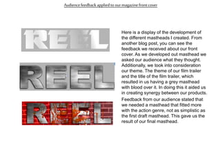
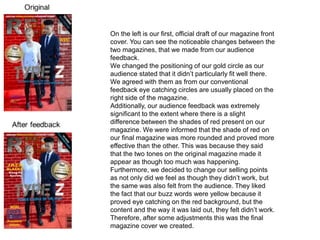
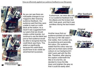
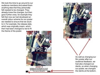
The following way that we communicated
with our audience was when we created
our magazine front cover. After looking at
different magazine names, we then began
to generate our own. We finalised our
options down to three and then allowed
our targeted audience to pick the name
that they preferred. The name that was
voted most for our masthead was ‘REEL’,
which I was happy with as it was my
favourite.
Creating an audience survey was one of
the first ways that we communicated with
our targeted audience. Although this was
very basic research it aided us significantly
in the creation of our product as we were
able to create a product that they liked. As
a result our film would have been very
popular in the cinema as it is a product that
they stated they would like to see.
What have you learnt from your
Audience Feedback?
Audiencefeedback applied to our trailer
This was one of the scenes within our trailer
that we struggled with most and it was
mainly due to our presentation of the news
reporter scene. Within our first draft we were
told that this scene didn’t uphold enough of a
professional state. This was mainly due to
the way in which our actress was dressed
and framed in the camera shot. We were told
that next time her jewellery needed to be
removed and the audience needed to see
more of her body. We followed through with
this feedback, however, we were still told
that it lacked professionalism. To save time,
we decided to take out the recorded footage
of our actress and simply replaced it with a
voice over. The voice over ties in well with
the action on screen as we see the
protagonist escaping as the voice over
explicitly explains that she is wanted. After
showing this to our audience they said that
they preferred this opposed to the recorded
footage of the news scene.
This is the original fight scene that we created. After showing this to our audience they
stated that it was too long. As a result we had to condense it, which is the image
displayed underneath. We were able to condense the fight scene to roughly 1 second.
Although it is only 1 second long it is extremely effective and shows off our editing
skills, as we used slow motion. Another issue in which our audience bought to light
during our feedback was the use of the guns at the end (shown in the image). Our
audience said that the orange nozzles gave a sense of unprofessionalism and that we
shouldn’t bother using them during this scene. This feedback was effective as we
were able to create a short, but effective and professional fight scene.
Audiencefeedback applied to our magazinefront cover
Here is a display of the development of
the different mastheads I created. From
another blog post, you can see the
feedback we received about our front
cover. As we developed out masthead we
asked our audience what they thought.
Additionally, we took into consideration
our theme. The theme of our film trailer
and the title of the film trailer, which
resulted in us having a grey masthead
with blood over it. In doing this it aided us
in creating synergy between our products.
Feedback from our audience stated that
we needed a masthead that fitted more
with the action genre, not as simplistic as
the first draft masthead. This gave us the
result of our final masthead.
On the left is our first, official draft of our magazine front
cover. You can see the noticeable changes between the
two magazines, that we made from our audience
feedback.
We changed the positioning of our gold circle as our
audience stated that it didn’t particularly fit well there.
We agreed with them as from our conventional
feedback eye catching circles are usually placed on the
right side of the magazine.
Additionally, our audience feedback was extremely
significant to the extent where there is a slight
difference between the shades of red present on our
magazine. We were informed that the shade of red on
our final magazine was more rounded and proved more
effective than the other. This was because they said
that the two tones on the original magazine made it
appear as though too much was happening.
Furthermore, we decided to change our selling points
as not only did we feel as though they didn’t work, but
the same was also felt from the audience. They liked
the fact that our buzz words were yellow because it
proved eye catching on the red background, but the
content and the way it was laid out, they felt didn’t work.
Therefore, after some adjustments this was the final
magazine cover we created.
How weeffectively applied our audience feedback to our film poster
As you can see there are
noticeable changes to our
magazine after receiving
audience feedback. Our
audience said that they were
unable to read our credit
block at the bottom. As a
result it was suggested from
our peers that we should
create a white boarder, but
continue to use the black text
just so that audience would
be able to recognise that the
credit block was there. This
aided us significantly
because the credit block
would have to be visible for
advertisement purposes.
Furthermore, we were also told,
in our audience feedback that
the ellipsis and the broken text
didn’t look good, and that it was
pointless having the text broken
up.
Original
After feedback
Another issue that our
audience pointed out was the
fact that our film title wasn’t
that visible, from number one,
its positioning and secondly,
the colour. Our audience
stated that the colour was too
dark and as there were similar
colours on our background it
didn’t work well with the film
title. Therefore, after placing
the caption underneath the
title on to one line, we
decided to move the title
down and brighten the grey so
that it could be easily seen.
We took the time to go around to our
audience members and asked them
anything else that they personally
felt needed to be changed. They
already knew the changes, but then
gave further ones, for example they
felt that now we had developed an
overall colour scheme for our poster
we needed to ensure that we stuck
to it. For example, the release date,
which was originally cream, which
then had been changed to red to fit
the theme of the poster.
As well as changing our
film poster after our
audience feedback, we
had also changed out
idents, so when changing
our poster, we changed
the idents at the bottom.
Our audience feedback has aided us significantly throughout
our production process. Without any of the feedback we
received, we perhaps wouldn’t have spotted the certain
errors that our audience bought to light. It can be difficult as,
the person who created the products may find it hard in being
able to critique your work, because you don’t want anything
to be wrong with it. Therefore being able to record what our
target audience thought about our products and assessing
their feedback was very useful. After looking back at our
starting products to now, I can see a noticeable difference
and far better products have been produced which I am
extremely happy with.

Evaluation Question 3

  • 1.
    The following waythat we communicated with our audience was when we created our magazine front cover. After looking at different magazine names, we then began to generate our own. We finalised our options down to three and then allowed our targeted audience to pick the name that they preferred. The name that was voted most for our masthead was ‘REEL’, which I was happy with as it was my favourite. Creating an audience survey was one of the first ways that we communicated with our targeted audience. Although this was very basic research it aided us significantly in the creation of our product as we were able to create a product that they liked. As a result our film would have been very popular in the cinema as it is a product that they stated they would like to see.
  • 2.
    What have youlearnt from your Audience Feedback?
  • 3.
    Audiencefeedback applied toour trailer This was one of the scenes within our trailer that we struggled with most and it was mainly due to our presentation of the news reporter scene. Within our first draft we were told that this scene didn’t uphold enough of a professional state. This was mainly due to the way in which our actress was dressed and framed in the camera shot. We were told that next time her jewellery needed to be removed and the audience needed to see more of her body. We followed through with this feedback, however, we were still told that it lacked professionalism. To save time, we decided to take out the recorded footage of our actress and simply replaced it with a voice over. The voice over ties in well with the action on screen as we see the protagonist escaping as the voice over explicitly explains that she is wanted. After showing this to our audience they said that they preferred this opposed to the recorded footage of the news scene.
  • 4.
    This is theoriginal fight scene that we created. After showing this to our audience they stated that it was too long. As a result we had to condense it, which is the image displayed underneath. We were able to condense the fight scene to roughly 1 second. Although it is only 1 second long it is extremely effective and shows off our editing skills, as we used slow motion. Another issue in which our audience bought to light during our feedback was the use of the guns at the end (shown in the image). Our audience said that the orange nozzles gave a sense of unprofessionalism and that we shouldn’t bother using them during this scene. This feedback was effective as we were able to create a short, but effective and professional fight scene.
  • 5.
    Audiencefeedback applied toour magazinefront cover Here is a display of the development of the different mastheads I created. From another blog post, you can see the feedback we received about our front cover. As we developed out masthead we asked our audience what they thought. Additionally, we took into consideration our theme. The theme of our film trailer and the title of the film trailer, which resulted in us having a grey masthead with blood over it. In doing this it aided us in creating synergy between our products. Feedback from our audience stated that we needed a masthead that fitted more with the action genre, not as simplistic as the first draft masthead. This gave us the result of our final masthead.
  • 6.
    On the leftis our first, official draft of our magazine front cover. You can see the noticeable changes between the two magazines, that we made from our audience feedback. We changed the positioning of our gold circle as our audience stated that it didn’t particularly fit well there. We agreed with them as from our conventional feedback eye catching circles are usually placed on the right side of the magazine. Additionally, our audience feedback was extremely significant to the extent where there is a slight difference between the shades of red present on our magazine. We were informed that the shade of red on our final magazine was more rounded and proved more effective than the other. This was because they said that the two tones on the original magazine made it appear as though too much was happening. Furthermore, we decided to change our selling points as not only did we feel as though they didn’t work, but the same was also felt from the audience. They liked the fact that our buzz words were yellow because it proved eye catching on the red background, but the content and the way it was laid out, they felt didn’t work. Therefore, after some adjustments this was the final magazine cover we created.
  • 7.
    How weeffectively appliedour audience feedback to our film poster As you can see there are noticeable changes to our magazine after receiving audience feedback. Our audience said that they were unable to read our credit block at the bottom. As a result it was suggested from our peers that we should create a white boarder, but continue to use the black text just so that audience would be able to recognise that the credit block was there. This aided us significantly because the credit block would have to be visible for advertisement purposes. Furthermore, we were also told, in our audience feedback that the ellipsis and the broken text didn’t look good, and that it was pointless having the text broken up. Original After feedback Another issue that our audience pointed out was the fact that our film title wasn’t that visible, from number one, its positioning and secondly, the colour. Our audience stated that the colour was too dark and as there were similar colours on our background it didn’t work well with the film title. Therefore, after placing the caption underneath the title on to one line, we decided to move the title down and brighten the grey so that it could be easily seen.
  • 8.
    We took thetime to go around to our audience members and asked them anything else that they personally felt needed to be changed. They already knew the changes, but then gave further ones, for example they felt that now we had developed an overall colour scheme for our poster we needed to ensure that we stuck to it. For example, the release date, which was originally cream, which then had been changed to red to fit the theme of the poster. As well as changing our film poster after our audience feedback, we had also changed out idents, so when changing our poster, we changed the idents at the bottom.
  • 9.
    Our audience feedbackhas aided us significantly throughout our production process. Without any of the feedback we received, we perhaps wouldn’t have spotted the certain errors that our audience bought to light. It can be difficult as, the person who created the products may find it hard in being able to critique your work, because you don’t want anything to be wrong with it. Therefore being able to record what our target audience thought about our products and assessing their feedback was very useful. After looking back at our starting products to now, I can see a noticeable difference and far better products have been produced which I am extremely happy with.