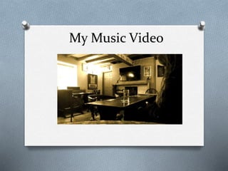
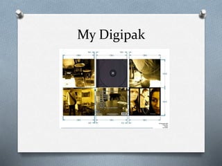
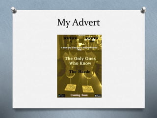
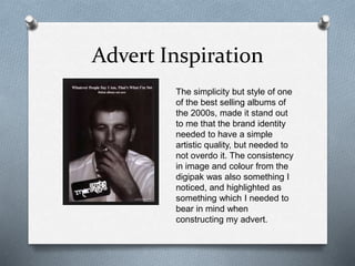
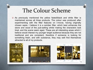
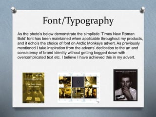
How effective is the
combination of your
main product and
ancillary texts?
My Music Video
My Digipak
My Advert
O I tried incredibly hard to replicate the
synergy found in the work of professional
artists. I studied artists’ brand identity and
style within the alternative genre; looking
at the music video’s of Jake Bugg and
Miles Kane, the albums of Arctic Monkeys
and Tom Odell, and then more broadly at
the work of The Vaccines. These artists
were significant influences to the
techniques which I have deployed in my
project.
Watch Jake Bugg - Broken Here
O Jake Bugg’s single Broken provided great
inspiration to me for the style and format of
my music video. His performance to a
disgruntled audience in a pool bar, who he
watches and studies over the course of the
performance, connected both performance
and narrative, as they both took place in the
same room. The camera work showed both
the audience’s and the performer’s scene to
be intertwined, through the combination of
close up’s and cleverly framed long shots
through crowded areas. Consequently, this
quickly became a style which I knew I wanted
to use, thus the foundations of my music
video had been formed.
Advert Inspiration
The simplicity but style of one
of the best selling albums of
the 2000s, made it stand out
to me that the brand identity
needed to have a simple
artistic quality, but needed to
not overdo it. The consistency
in image and colour from the
digipak was also something I
noticed, and highlighted as
something which I needed to
bear in mind when
constructing my advert.
The Band and it’s front-man
(me)
O I tried hard to create a clear link between the
band in the digipak and advert and the music
video. I portrayed the representative of the
band ‘The Hassle’ in the video, and then
featured in the digipak along with the female
characters of the video; the advert showed the
remaining wine glasses of the failed date in
the music video. This shows how I portrayed a
succinct thematic link between all three
products, as well as the consistency in filter,
font, and location.
How does the lead band member
portray to the audience?
O I certainly did not portray a protagonist to my audience,
with the consequences of the characters actions in the
music video being treated unforgivingly by the female
characters (wife and mistress). Rightly so, as my
character is shown to be foolish; I create this impression
in order for young adult/teenage audience to relate to
foolish decisions we make, and how we judged instantly
for them.
O What happens to the character is fair, but I believe I
create an ambiguity to whether one should sympathize
with him or not. This ambiguity is a progression from Jake
Bugg’s work whom overviews the bar scene while
performing, but the audience doesn’t know the judgment
he passes; I’ve used this idea to leave the sympathies of
the audience for my character in the balance.
The Colour Scheme
O As previously mentioned the yellow faded/black and white filter is
maintained across all three products. The colour was produced after
experimenting with the filter features on I-movie, having originally
chosen sepia. I believe it is a somber filter, which best enhances the
stone and wood of the pub-setting whilst making the characters look
tired, and the scene seem aged. These are all interesting areas which I
believe would interest my younger target audience because they are not
traditional and are consistent, therefore if someone is looking for
something fresh, and with substance, they may well find themselves
attracted to all of my products.
Font/Typography
As the photo’s below demonstrate the simplistic ‘Times New Roman
Bold’ font has been maintained when applicable throughout my products,
and it echo’s the choice of font on Arctic Monkeys advert. As previously
mentioned I take inspiration from the adverts’ dedication to the art and
consistency of brand identity without getting bogged down with
overcomplicated text etc. I believe I have achieved this in my advert.

Evaluation Question 2

  • 1.
    How effective isthe combination of your main product and ancillary texts?
  • 2.
  • 3.
  • 4.
  • 5.
    O I triedincredibly hard to replicate the synergy found in the work of professional artists. I studied artists’ brand identity and style within the alternative genre; looking at the music video’s of Jake Bugg and Miles Kane, the albums of Arctic Monkeys and Tom Odell, and then more broadly at the work of The Vaccines. These artists were significant influences to the techniques which I have deployed in my project.
  • 6.
    Watch Jake Bugg- Broken Here O Jake Bugg’s single Broken provided great inspiration to me for the style and format of my music video. His performance to a disgruntled audience in a pool bar, who he watches and studies over the course of the performance, connected both performance and narrative, as they both took place in the same room. The camera work showed both the audience’s and the performer’s scene to be intertwined, through the combination of close up’s and cleverly framed long shots through crowded areas. Consequently, this quickly became a style which I knew I wanted to use, thus the foundations of my music video had been formed.
  • 7.
    Advert Inspiration The simplicitybut style of one of the best selling albums of the 2000s, made it stand out to me that the brand identity needed to have a simple artistic quality, but needed to not overdo it. The consistency in image and colour from the digipak was also something I noticed, and highlighted as something which I needed to bear in mind when constructing my advert.
  • 8.
    The Band andit’s front-man (me) O I tried hard to create a clear link between the band in the digipak and advert and the music video. I portrayed the representative of the band ‘The Hassle’ in the video, and then featured in the digipak along with the female characters of the video; the advert showed the remaining wine glasses of the failed date in the music video. This shows how I portrayed a succinct thematic link between all three products, as well as the consistency in filter, font, and location.
  • 9.
    How does thelead band member portray to the audience? O I certainly did not portray a protagonist to my audience, with the consequences of the characters actions in the music video being treated unforgivingly by the female characters (wife and mistress). Rightly so, as my character is shown to be foolish; I create this impression in order for young adult/teenage audience to relate to foolish decisions we make, and how we judged instantly for them. O What happens to the character is fair, but I believe I create an ambiguity to whether one should sympathize with him or not. This ambiguity is a progression from Jake Bugg’s work whom overviews the bar scene while performing, but the audience doesn’t know the judgment he passes; I’ve used this idea to leave the sympathies of the audience for my character in the balance.
  • 10.
    The Colour Scheme OAs previously mentioned the yellow faded/black and white filter is maintained across all three products. The colour was produced after experimenting with the filter features on I-movie, having originally chosen sepia. I believe it is a somber filter, which best enhances the stone and wood of the pub-setting whilst making the characters look tired, and the scene seem aged. These are all interesting areas which I believe would interest my younger target audience because they are not traditional and are consistent, therefore if someone is looking for something fresh, and with substance, they may well find themselves attracted to all of my products.
  • 11.
    Font/Typography As the photo’sbelow demonstrate the simplistic ‘Times New Roman Bold’ font has been maintained when applicable throughout my products, and it echo’s the choice of font on Arctic Monkeys advert. As previously mentioned I take inspiration from the adverts’ dedication to the art and consistency of brand identity without getting bogged down with overcomplicated text etc. I believe I have achieved this in my advert.