
Recommended
More Related Content
What's hot
What's hot (18)
Viewers also liked
Similar to Evaluation Question 2
Similar to Evaluation Question 2 (20)
More from krisleonard
More from krisleonard (14)
Evaluation Question 2
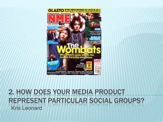
- 1. 2. HOW DOES YOUR MEDIA PRODUCT REPRESENT PARTICULAR SOCIAL GROUPS? Kris Leonard
- 2. My media product represents several social groups, such as male solo artists, young bands and generally young people. I think that it represents young people in quite a positive way as the people featuring in it are mainly young musicians. It conveys them as high achievers and I think it shows a positive side of young people that isn’t often shown in the media. I think it shows a good sense of community between young musicians and young music fans as they are showing a lot of support for sprouting musicians in buying this magazine. In terms of genre, most of the acts in my magazine fit in to the genre of ‘indie rock’, ‘rock’ and ‘acoustic’. This shows through a few things which are as follows-
- 3. FRONT COVER I have adjusted the levels on the main image of the main image to make it appear more grainy and urban. This fits in to the genres of ‘Alternative’ or ‘Rock’. The clothes that the cover star is wearing and the style of his hair could potentially be stereotyped as ‘Alternative’ or ‘Indie’. Also, the title of the magazine ‘AUX’ is short for ‘Auxiliary input’ which is something often found on a guitar amp, a common part of a musicians life. Also, the colours I have used for the text, puffs etc… are very earthy, almost bland colours which fit into the genres of music that are featured.
- 4. CONTENTS PAGE The text, particularly on the contents page, doesn’t have a consistent size which I think is reflective of the target audience as they are alternative and anti-conformists. I adjusted the levels on this image to make the colours darker so that it appears more urban. Again, the clothes that the person in the main image is wearing and the style of his hair could be stereotyped to fit into the Alternative and the Rock scene. The amount of articles shown on the contents page shows that there is a lot going on in the scene which shows a positive, productive side of young musicians and young people in general.
- 5. DOUBLE PAGE SPREAD For the background on this I used the original background of the image as the colour is quite bland and earthy. This colour was used regularly throughout the production process. The text used for the header is weathered and decaying. This makes it look quite rugged which fits into the genres of Rock and Alternative. Also, in the actual interview the star is very polite and intellectual. This shows a well mannered, sophisticated side of young people that might not normally be recognised.
- 6. I think my magazine shows a very different side to young people. Contrary to popular media belief it shows them to be hard working and focused. It acts as a bridge to show the rest of the population that young people can be productive, high achieving individuals. It also acts as a gateway for young musicians to break out into the world of music which shows a very good sense of unity between young musicians and young music fans.