Kolkata Call Girl Bara Bazar 👉 8250192130 ❣️💯 Available With Room 24×7
Contents page analysis
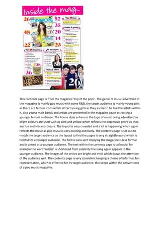
1. This contents page is from the magazine ‘top of the pops’. The genre of music advertised in
the magazine is mainly pop music with some R&B, the target audience is mainly young girls
as there are female icons which attract young girls as they aspire to be like the artists within
it, also young male bands and artists are presented in the magazine again attracting a
younger female audience. The house style enhances the type of music being advertised as
bright colours are used such as pink and yellow which reflects the pop music genre as they
are fun and vibrant colours. The layout is very crowded and a lot is happening which again
reflects the music as pop music is very exciting and lively. The contents page is set out to
match the target audience as the layout to find the pages is very straightforward which is
helpful for a younger audience. The font is sans serif implying the magazine is less formal
and is aimed at a younger audience. The text within the contents page is colloquial for
example the word ‘celebs’ is shortened from celebrity the slang again appeals to the
younger audience. The images of the artists are bright and vivid which draws the attention
of the audience well. The contents page is very consistent keeping a theme of informal, fun
representation, which is effective for its target audience, this keeps within the conventions
of a pop music magazine.
2. This contents page is from the magazine ‘UNCUT’. The image of Paul Weller the lead singer
of ‘The Jam’ takes up the majority of the contents page. The Jam were an English punk
rock/New Wave/mod revival band between late 70’s early 80’s which immediately indicates
that it is aimed at an older target audience although a younger audience do listen to older
music the initial target audience is older.. The image is in black and white which reveals a
classic rock look which is very conventional of UNCUT magazine as its main genre advertised
is rock. This page indicates a professional quality as the house style is consistent for
example the styles of font are all equivalent which is serif, making the magazine appeal
more formal which catches the attention of an older audience to listen to the music
involved in the magazine. Also the colour scheme is constant, this portrays to the audience
the magazine is trustworthy; this gives the impression it is a popular magazine. The colour
connotations on this page vary, the red represents danger and rebellion which reflects the
genre of music in the magazine as rock seeing that this type of music is also known to
influence radical insurgence of outrageous behaviour. The layout of the contents is very
tight and organized again aiming for an older audience as it looks more professional and
structured. As the contents is well organized this makes it easy for the reader to find the
pages quickly which is a convention of all music magazines.