A2 case study
Josh walker
The concept of using ‘Taglines’
• Taglines are a very useful
thing to use and almost an
essential thing when you’re
summing up a basic
overview of a film.
• The tagline is a catchphrase
or a slogan that relates to
the film and it’s used when
marketing the film because
it allows the audience to
have an Idea of what the
general feel/ overview of
the film is going to about.
• The tagline must relate to
the film and also make the
viewer think about what
could happen so maybe
make the tagline like a
rhetorical question to get
them thinking.
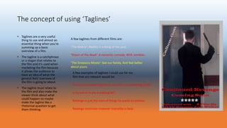
A few examples of taglines I could use for my
film that are relevant would be:
The end of something bad or the start of something good?
Is he evil or is she a walking lie?
Revenge is just the start of things he wants to achieve.
Revenge continues however mortality is fatal.
A few taglines from different films are:
‘The Matrix’: Reality is a thing of the past.
‘Shaun of the dead’: A romantic comedy. With zombies.
‘The Simpsons Movie’: See our family. And feel better
about yours.
In what ways does your media product use, develop or
challenge forms and conventions of real media
products?
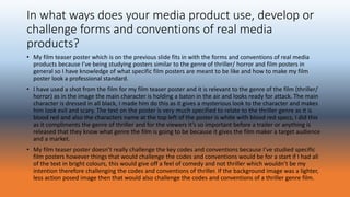
• My film teaser poster which is on the previous slide fits in with the forms and conventions of real media
products because I’ve being studying posters similar to the genre of thriller/ horror and film posters in
general so I have knowledge of what specific film posters are meant to be like and how to make my film
poster look a professional standard.
• I have used a shot from the film for my film teaser poster and it is relevant to the genre of the film (thriller/
horror) as in the image the main character is holding a baton in the air and looks ready for attack. The main
character is dressed in all black, I made him do this as it gives a mysterious look to the character and makes
him look evil and scary. The text on the poster is very much specified to relate to the thriller genre as it is
blood red and also the characters name at the top left of the poster is white with blood red specs, I did this
as it compliments the genre of thriller and for the viewers it’s so important before a trailer or anything is
released that they know what genre the film is going to be because it gives the film maker a target audience
and a market.
• My film teaser poster doesn’t really challenge the key codes and conventions because I’ve studied specific
film posters however things that would challenge the codes and conventions would be for a start if I had all
of the text in bright colours, this would give off a feel of comedy and not thriller which wouldn’t be my
intention therefore challenging the codes and conventions of thriller. If the background image was a lighter,
less action posed image then that would also challenge the codes and conventions of a thriller genre film.
How effective is the combination of your main product
and ancillary texts?
• What I have included on my poster and magazine front cover to target the audience and to market the film. Aspects of brand
identity (font colour style suiting the films genre.)
• Firstly I’m going to talk about my film poster and how I have managed to target the correct audience and also market the film.
• The first way in which I have tried to target the correct audience is by the use of themes and colours on my film poster. I have used
dark colours for the main image and texts and also red, my poster really fits in with the genre of film which is horror as the red
represents blood and the dark colours compliment and determine the genre. There are different ways of going about determining
the genre of film, if the film poster had a little more colour and you changed the main image it could also be seen as a romance
film as the red in that case would represent love.
• I have tried to target an audience of males and females from the ages of 16+ as a thriller film with potential violent scenes would
not be suitable for audiences lower than the age of 16 and they may not even understand half of the scenes in the film. Also my
film is for the thriller genre audience which like I said is determined by the colours and scheme used on the poster.
• A marketing point I have used endorsement (review from the daily telegraph) as this will help with the marketing for the film
because the daily telegraph is a big company and people are going to feel like what they have to say is true, this is a great
marketing point and could potentially help the film to earn a lot more gross profit because more people will know about the film.
• The final marketing point I have used is the use of the main characters name at the top of the page, people may recognise the
actors name and may have thought previous films that the character was in were good and enjoyable.
• Overall on my poster I feel that doing these key things such as getting good reviews, actors names, clear title relating to the genre
of the film you are marketing and overall just a simple, effective poster for your film it can really help to create a revenue and help
your film to be successful.
How effective is the combination of your main
product and ancillary texts?
• Next I’m going to talk about how my magazine front cover and how I have managed to target the correct audience
and also market the film.
• The first thing that I’m going to talk about that targets the correct audience to my genre of film would be the way I
set the theme and colours, this is very similar to the film poster as they’re both marketing the same product. Again
I have used a faded image of the main character playing the stereo typical bad guy dressed all in black and the
colour of text I have used are just black and white to keep things plain and simple.
• The film that I made ‘Continued Revenge’ is in black text but a freaky text shape which gives the impression that
the film is a thriller, I have also made my film the main attraction because all of the over taglines are smaller and
not as bold or as interesting as the ‘Continued Revenge’ title.
• I have used a lot of marketing points on my magazine front cover that will really help with the sale of my film such
as the skyline ‘Award winning magazine’ this is a good marketing point as it makes the magazine seem good and
one of the best. I have added the web address and this also makes the magazine look important as it has it’s own
website.
• I have made the main image of the magazine front cover a shot from a scene in the film ‘Continued Revenge’ which
would draw in a target audience and promote my film because I’m actually using images from the scenes.
• Another way that I targeted the audience with the magazine front cover was by adding a voucher of £5.00 off on a
film website which would sell ‘Continued Revenge’ as this is the main film out at the time that is being marketed
with emphasis to draw the buyer in.
What I have learnt from my audience
feedback
• Feed back on my film poster: I was given the task of giving my partner feedback and he gave me some
feedback to act upon for my film poster. First of all I was told that the main image on my poster was very
clear and well positioned and that it fitted in well with the genre of thriller because it was relevant to the
opening sequence.
• The next bit of feedback I was given was that my title was also positioned well and the red font is eye
catching and links with the genre of thriller. The name of the actor is placed well and the white and red
colours used are effective and give of the sense of thriller. I was told I needed to add a company name under
the 5 star endorsement as it isn’t very reliable just saying my film poster is five stars.
• My partner knew that it was a teaser poster as it just says coming soon with no given date and the poster
wasn’t too complex and over whelming.
• I was also praised on the additional features such as the directors name as viewers of the poster will usually
recognise the film makers name and rate them on the previous films they’ve made in the past.
• I have acted upon all of the corrections and my film poster is looking to a high standard that I’m happy with!
What I have learnt from my audience
feedback
• Feedback on my film magazine front cover: as well as the film poster I was also given the task of looking at
my class mates magazine front cover design and using my knowledge to analyse what he had done well and
how he could improve for next time.
• Here was the feedback that he gave me: the main image was positioned well in the centre of the magazine
cover. The front cover has a mystery feel about it. This was a good point as my film was of the thriller genre
and I was trying to make it obvious.
• The masthead is very bold and clear and will draw peoples attention if it was on a shop shelf. Also I was told
that the ‘skyline’ on my magazine was positioned correctly and promotes my magazine front cover.
• Another good point I was told was that I used convergent media which was the website link that I added to
the front cover so that if the magazine was real people could go on the website and get a better idea about
the magazine.
• I have included taglines which are essential and they’re in the right text colour of red for the genre of thriller.
• Finally I have added a voucher for a film website which my film would be sold on and the good reviews of my
film would probably convince the target audience to buy my film which would create more revenue for me.
How did you use media technologies in the construction
and research, planning and evaluation stages?
• I used a lot of media technology when I was in the process of constructing and research, planning and
evaluating the work I have done so far.
• Firstly to plan the poster and magazine front cover we researched and analysed them both and used
Microsoft word and the internet to write about both the magazine front covers and film posters in detail.
• Next I actually used Photoshop to plan and create both the film poster and magazine front cover as this was
the most effective way to go about making them. I learnt a lot of new skills on Photoshop which I have
broken down on a word document so that firstly I could have something to look back on if I forget a specific
skill I learnt and secondly so that the examiner or person marking my work can see my progress I’ve made
within media.
• We had to review each others pieces of work so far so that we had feedback which was very helpful, we
then had feedback to type up on Microsoft PowerPoint and all of our work will be posted on to a website
called ‘edublogs’ so that all my work can be together and structured well.
• Overall I’m happy with my progress so far and feel that media technology has really helped my progress with
getting my work done efficiently and learning new skills within media to improve.

A2 case studies

  • 1.
  • 2.
    The concept ofusing ‘Taglines’ • Taglines are a very useful thing to use and almost an essential thing when you’re summing up a basic overview of a film. • The tagline is a catchphrase or a slogan that relates to the film and it’s used when marketing the film because it allows the audience to have an Idea of what the general feel/ overview of the film is going to about. • The tagline must relate to the film and also make the viewer think about what could happen so maybe make the tagline like a rhetorical question to get them thinking. A few examples of taglines I could use for my film that are relevant would be: The end of something bad or the start of something good? Is he evil or is she a walking lie? Revenge is just the start of things he wants to achieve. Revenge continues however mortality is fatal. A few taglines from different films are: ‘The Matrix’: Reality is a thing of the past. ‘Shaun of the dead’: A romantic comedy. With zombies. ‘The Simpsons Movie’: See our family. And feel better about yours.
  • 3.
    In what waysdoes your media product use, develop or challenge forms and conventions of real media products? • My film teaser poster which is on the previous slide fits in with the forms and conventions of real media products because I’ve being studying posters similar to the genre of thriller/ horror and film posters in general so I have knowledge of what specific film posters are meant to be like and how to make my film poster look a professional standard. • I have used a shot from the film for my film teaser poster and it is relevant to the genre of the film (thriller/ horror) as in the image the main character is holding a baton in the air and looks ready for attack. The main character is dressed in all black, I made him do this as it gives a mysterious look to the character and makes him look evil and scary. The text on the poster is very much specified to relate to the thriller genre as it is blood red and also the characters name at the top left of the poster is white with blood red specs, I did this as it compliments the genre of thriller and for the viewers it’s so important before a trailer or anything is released that they know what genre the film is going to be because it gives the film maker a target audience and a market. • My film teaser poster doesn’t really challenge the key codes and conventions because I’ve studied specific film posters however things that would challenge the codes and conventions would be for a start if I had all of the text in bright colours, this would give off a feel of comedy and not thriller which wouldn’t be my intention therefore challenging the codes and conventions of thriller. If the background image was a lighter, less action posed image then that would also challenge the codes and conventions of a thriller genre film.
  • 4.
    How effective isthe combination of your main product and ancillary texts? • What I have included on my poster and magazine front cover to target the audience and to market the film. Aspects of brand identity (font colour style suiting the films genre.) • Firstly I’m going to talk about my film poster and how I have managed to target the correct audience and also market the film. • The first way in which I have tried to target the correct audience is by the use of themes and colours on my film poster. I have used dark colours for the main image and texts and also red, my poster really fits in with the genre of film which is horror as the red represents blood and the dark colours compliment and determine the genre. There are different ways of going about determining the genre of film, if the film poster had a little more colour and you changed the main image it could also be seen as a romance film as the red in that case would represent love. • I have tried to target an audience of males and females from the ages of 16+ as a thriller film with potential violent scenes would not be suitable for audiences lower than the age of 16 and they may not even understand half of the scenes in the film. Also my film is for the thriller genre audience which like I said is determined by the colours and scheme used on the poster. • A marketing point I have used endorsement (review from the daily telegraph) as this will help with the marketing for the film because the daily telegraph is a big company and people are going to feel like what they have to say is true, this is a great marketing point and could potentially help the film to earn a lot more gross profit because more people will know about the film. • The final marketing point I have used is the use of the main characters name at the top of the page, people may recognise the actors name and may have thought previous films that the character was in were good and enjoyable. • Overall on my poster I feel that doing these key things such as getting good reviews, actors names, clear title relating to the genre of the film you are marketing and overall just a simple, effective poster for your film it can really help to create a revenue and help your film to be successful.
  • 5.
    How effective isthe combination of your main product and ancillary texts? • Next I’m going to talk about how my magazine front cover and how I have managed to target the correct audience and also market the film. • The first thing that I’m going to talk about that targets the correct audience to my genre of film would be the way I set the theme and colours, this is very similar to the film poster as they’re both marketing the same product. Again I have used a faded image of the main character playing the stereo typical bad guy dressed all in black and the colour of text I have used are just black and white to keep things plain and simple. • The film that I made ‘Continued Revenge’ is in black text but a freaky text shape which gives the impression that the film is a thriller, I have also made my film the main attraction because all of the over taglines are smaller and not as bold or as interesting as the ‘Continued Revenge’ title. • I have used a lot of marketing points on my magazine front cover that will really help with the sale of my film such as the skyline ‘Award winning magazine’ this is a good marketing point as it makes the magazine seem good and one of the best. I have added the web address and this also makes the magazine look important as it has it’s own website. • I have made the main image of the magazine front cover a shot from a scene in the film ‘Continued Revenge’ which would draw in a target audience and promote my film because I’m actually using images from the scenes. • Another way that I targeted the audience with the magazine front cover was by adding a voucher of £5.00 off on a film website which would sell ‘Continued Revenge’ as this is the main film out at the time that is being marketed with emphasis to draw the buyer in.
  • 6.
    What I havelearnt from my audience feedback • Feed back on my film poster: I was given the task of giving my partner feedback and he gave me some feedback to act upon for my film poster. First of all I was told that the main image on my poster was very clear and well positioned and that it fitted in well with the genre of thriller because it was relevant to the opening sequence. • The next bit of feedback I was given was that my title was also positioned well and the red font is eye catching and links with the genre of thriller. The name of the actor is placed well and the white and red colours used are effective and give of the sense of thriller. I was told I needed to add a company name under the 5 star endorsement as it isn’t very reliable just saying my film poster is five stars. • My partner knew that it was a teaser poster as it just says coming soon with no given date and the poster wasn’t too complex and over whelming. • I was also praised on the additional features such as the directors name as viewers of the poster will usually recognise the film makers name and rate them on the previous films they’ve made in the past. • I have acted upon all of the corrections and my film poster is looking to a high standard that I’m happy with!
  • 7.
    What I havelearnt from my audience feedback • Feedback on my film magazine front cover: as well as the film poster I was also given the task of looking at my class mates magazine front cover design and using my knowledge to analyse what he had done well and how he could improve for next time. • Here was the feedback that he gave me: the main image was positioned well in the centre of the magazine cover. The front cover has a mystery feel about it. This was a good point as my film was of the thriller genre and I was trying to make it obvious. • The masthead is very bold and clear and will draw peoples attention if it was on a shop shelf. Also I was told that the ‘skyline’ on my magazine was positioned correctly and promotes my magazine front cover. • Another good point I was told was that I used convergent media which was the website link that I added to the front cover so that if the magazine was real people could go on the website and get a better idea about the magazine. • I have included taglines which are essential and they’re in the right text colour of red for the genre of thriller. • Finally I have added a voucher for a film website which my film would be sold on and the good reviews of my film would probably convince the target audience to buy my film which would create more revenue for me.
  • 8.
    How did youuse media technologies in the construction and research, planning and evaluation stages? • I used a lot of media technology when I was in the process of constructing and research, planning and evaluating the work I have done so far. • Firstly to plan the poster and magazine front cover we researched and analysed them both and used Microsoft word and the internet to write about both the magazine front covers and film posters in detail. • Next I actually used Photoshop to plan and create both the film poster and magazine front cover as this was the most effective way to go about making them. I learnt a lot of new skills on Photoshop which I have broken down on a word document so that firstly I could have something to look back on if I forget a specific skill I learnt and secondly so that the examiner or person marking my work can see my progress I’ve made within media. • We had to review each others pieces of work so far so that we had feedback which was very helpful, we then had feedback to type up on Microsoft PowerPoint and all of our work will be posted on to a website called ‘edublogs’ so that all my work can be together and structured well. • Overall I’m happy with my progress so far and feel that media technology has really helped my progress with getting my work done efficiently and learning new skills within media to improve.