
Recommended
More Related Content
What's hot
What's hot (18)
Similar to Evaluation - Q5: How did you attract/address your audience?
Similar to Evaluation - Q5: How did you attract/address your audience? (20)
More from GregoryMcLaney
More from GregoryMcLaney (11)
Recently uploaded
Recently uploaded (20)
Evaluation - Q5: How did you attract/address your audience?
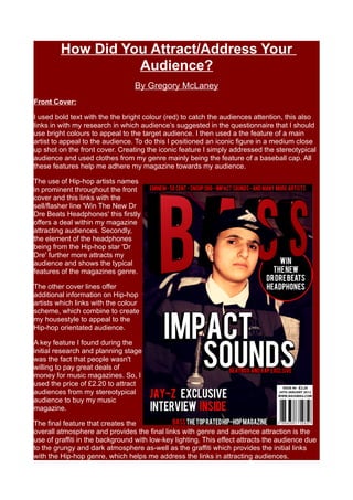
- 1. How Did You Attract/Address Your Audience? By Gregory McLaney Front Cover: I used bold text with the the bright colour (red) to catch the audiences attention, this also links in with my research in which audience’s suggested in the questionnaire that I should use bright colours to appeal to the target audience. I then used a the feature of a main artist to appeal to the audience. To do this I positioned an iconic figure in a medium close up shot on the front cover. Creating the iconic feature I simply addressed the stereotypical audience and used clothes from my genre mainly being the feature of a baseball cap. All these features help me adhere my magazine towards my audience. The use of Hip-hop artists names in prominent throughout the front cover and this links with the sell/flasher line 'Win The New Dr Dre Beats Headphones' this firstly offers a deal within my magazine attracting audiences. Secondly, the element of the headphones being from the Hip-hop star 'Dr Dre' further more attracts my audience and shows the typical features of the magazines genre. The other cover lines offer additional information on Hip-hop artists which links with the colour scheme, which combine to create my housestyle to appeal to the Hip-hop orientated audience. A key feature I found during the initial research and planning stage was the fact that people wasn't willing to pay great deals of money for music magazines. So, I used the price of £2.20 to attract audiences from my stereotypical audience to buy my music magazine. The final feature that creates the overall atmosphere and provides the final links with genre and audience attraction is the use of graffiti in the background with low-key lighting. This effect attracts the audience due to the grungy and dark atmosphere as-well as the graffiti which provides the initial links with the Hip-hop genre, which helps me address the links in attracting audiences.
- 2. Contents Page: To attract and address my audience in my contents page I used the consistent colour scheme of black, red and white. This enabled me to link all my magazine pages and it created the bright effect which was suggested from research. I then used a 'Band Index' to interest the reader in to iconic Hip-hop stars; the use of Hip-hop stars in a large 'Band Index' list creates interest for the audience because it is showing what is going to be in the whole magazine along with links to their favourite genre. The use of a polarized image in the middle of the contents page created a style effect. The effect attracts the audience and then they are lead to read the information which intrigues them to read more and turn to the page with the information on 'stars'. The typography on the polarized image also attracts the audiences attention because it is red and white which links in with my colour scheme and it has a drop shadow to give the overall composition more depth. I used the 4 subheadings under contents: 'News', 'Reviews, 'Live' and 'Radar' these are all of interest to my audience; this is followed by the topic heading under these subheadings. All of these are targeted to attract my audience and to interest them. They have the option of reading about: stars, jail/rehab news, album and festival news and many more other interesting Hip- hop orientated features. The footer of my contents page is targeted to attract my audience to read more and interest them. The footer offers: 'More... Bass's top 100 Hip-hop tracks – Page 72 Bass's Top 100 rappers – Page 41' The reason I positioned this information inside its own area at the bottom of the page is because it is a main feature so I wanted it to be large and bold to attract my audience’s attention. This works well and leads them in to interest about the rest of the magazine.
- 3. Double Page Spread Article: My double page spread works well in attracting audiences attention and fitting in with relevant themes, conventions and ideas from the Hip-hop genre. Firstly, the left main image attracts the audiences attention because of many features, it's an iconic artists so they are immediately interested. Also, the use of graffiti either side of the artist instantly triggers the connection with the Hi-hop genre. Finally, the link with the genre and audience is met with the whole mise-en-scene and atmosphere of the photograph, it is very dark, washed out and dirty. This fits in with the connotations of Hip-hop and leads to an attraction from the target audience. The image on the second page of the double page spread adheres to the whole theme and colour scheme of my music magazine. It is a graffitied wall so there is a link with the Hip-hop genre. Then the audience is attracted to it because it offers the original heritage of the genre, with links of streets and connotations of Hip-hop. I used typography above the artists head on the first page this effect is stylistic and initially attracts the audience towards the magazine because it is offering the artist they are about to read about in a stylish way. The typography on the first page has immediate links with the Hip-hop genre which attracts the audience. But, the main features that make this stand out and get the audience's attention is the sheer size and boldness of the text. This then follows the reader to reading the caption line which is in the colour scheme to stand out and grab the audience's attention. This is finally linked with the article text which explains the whole article and satisfies the audience's information needs. To create and overall linked composition to attract the audience's eyes to this page I added graffiti splatters in photoshop to group the whole framing together this worked well and I used bright colours which I discovered audience's wanted from research. This therefore adheres to my target audience and attracts their attention.