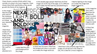
1. I have chosen a variety of fonts which I may
consider on using in my music magazine. I have
chosen these fonts specifically as they would
go with the theme of my magazine.
In this double page spread I liked how all of the
images are at the top of the page, as it is different
and it makes the text look less overwhelming to
the reader.
I liked to lighting on this image
as it makes the image look
bright and well-lit.
In this image I
liked the bright
pink used on
the masthead
and coverlines
as it draws
your attention
to the
magazine.
I liked these
shades of red
as they are
bright so they
would stand
out. I would
probably use
these colours
on something
like a puff to
draw
attention to it.
In this magazine
front cover I
liked how the
background
colour is a plain
bright colour as
it makes the
magazine stand
out very well.
In these two
magazine
double pages I
really liked how
the pull quote
was laid out, as
it draws
attention to
the page and it
looks different.
I really liked the pale
pink background on
this image.
In these two Cd covers I liked how
the background colour is just plain
as it makes the image stand out.
I liked how in this contents page that the
images are all laid out in the shape of
CDs, this is ideal for a music magazine.