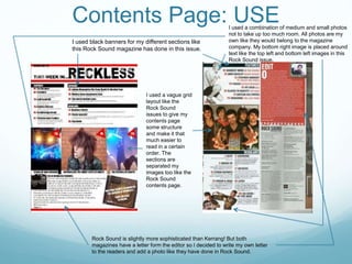
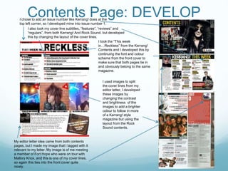
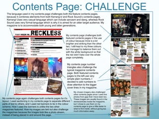
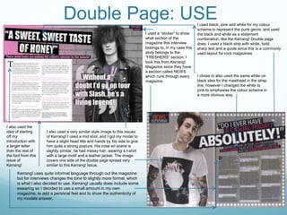
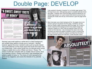
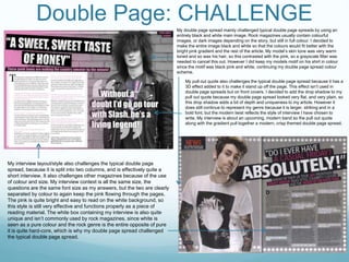
SlideShare a Scribd company logo
1 of 10
AS Media: Evaluation.
Question 1: In what ways does your magazine use, develop or
challenge forms and conventions of real media products?
Front cover: USE
I have taken part of the front cover layout
from this Christmas issue of Kerrang!.
The column on the left hand side is
striking and easy to read, so I decided to
try this with my cover lines, but carry on
with my chosen colour scheme.
I also took inspiration from this Rock
Sound cover for my main colour
scheme. I used the white, black and red
scheme throughout the text and a
masthead.
I also took the idea of adding posters along an edge of the front cover from both
magazines. I used the different angle of images from the Kerrang! Cover, and used no
borders like the Rock Sound cover.
I placed my bar code
sideways so that it didn’t
take up too much room like
the Kerrang! Front cover.
I used a clean cut bold font
(Impact), like Kerrang! does
for it’s titles and cover lines.
I used the
positioning
of my
models
head to
mimic the
position of
the middle
model of
this photo,
and the
innocent
smile to
mimic the
2nd model
on the Rock
Sound
cover.
Front Cover: DEVELOP
I took the idea of adding bands related to articles inside the
magazine in a banner along the top of my magazine, I however
developed this to suit my red black and white colour scheme by
alternating the colours between bands and adding a small red
underlining banner instead of a block red banner as a background
for the test.
I also used a very
similar colour scheme
to this particular
magazine, but I
developed mine by
using a darker red to
suit the red brick
background.
I used the same
medium close up shot,
but I developed this by
placing the model to
the right of the cover
and changed the
positioning of his head
to balance out the text
size and image size.
I placed my headline over
the neck/torso of my
model but instead of
using just the band name,
I used a pun/quote, and
also added a white drop
shadow to continue my
colour scheme.
I needed a bar code for my
magazine, so I placed the bar code
around the rest of the cover, in a
similar place to the Kerrang! Cover
but I changed the rotation of it so
that it would fit better in the corner
of my magazine.
I used poster pull-outs like Kerrang! Magazines, but I made them
more prominent and covered the bottom of my front cover, whereas
the posters on the Kerrang! cover are very small in the bottom right
hand corner. However I did place the posters at different angles like
the Kerrang! Cover to show more of each poster.
I used similar
language to the
Kerrang! cover to
make sure my
magazine would
reach my target
audience correctly.
I however used a
lot more cover lines
since my magazine
would include more
stories/interviews.
However I
developed the
presentation of my
cover lines by not
adding a strip of
colour, since too
much of the red
colour I used would
contrast too much
with the very red
toned background,
so I used the black
and white to my
advantage to
create shadows
and seemingly 3D
text to stand out
from the brightly
coloured
background.
My font sizes are quite similar for
each section, this has been
developed form the Kerrang!
Cover because my magazine has
more structure to it so the
different sections have different
font sizes which make the cover
look slightly more organised like
a Rock Sound magazine cover.
On this Kerrang! Cover a small image and stamp is
used on the top right corner around the masthead, I
decided to develop this and instead of adding more
images I added more to my extra bands that are being
feature in my magazine. Also instead of a stamp I
decided to feature a slogan “Turn up the volume!” to
summarise the punk/rock genre.
The mise en scene of my model is
very similar to the model on
Kerrang’s! cover. My model has
coloured, messy hair, and is wearing
a leather jacket.
Front Cover: CHALLENGE
My model challenges a typical front cover since the model is partially smiling
and is sat quite casual on some steps, whereas the model on the Kerrang!
Cover is posing and smirking. I chose to use my model the way I did because
he is new to the punk scene and very young, so I want him to be considered
as an initial innocent character.
My background for
my front cover also
challenges the rock
magazines, since it
uses a real time,
textured background.
My model hasn’t
been placed on a
blank screen
because I wanted my
feature on Josh to
have a personal,
urban feel to
represent his
background and
where he is from.
My magazine also doesn’t include a “Plus”
section which challenges the stereotypical
rock magazine, but because of my chosen
layout my cover lines down one side cover
up the missing plus section because all the
information is there instead.
The
general
layout of
my
magazine
challenges
the typical
magazine,
because of
the column
style of
cover lines
and the
positioning
of my
model and
posters.
Contents Page: USE
I used black banners for my different sections like
this Rock Sound magazine has done in this issue.
I used a vague grid
layout like the
Rock Sound
issues to give my
contents page
some structure
and make it that
much easier to
read in a certain
order. The
sections are
separated my
images too like the
Rock Sound
contents page.
Rock Sound is slightly more sophisticated than Kerrang! But both
magazines have a letter form the editor so I decided to write my own letter
to the readers and add a photo like they have done in Rock Sound.
I used a combination of medium and small photos
not to take up too much room. All photos are my
own like they would belong to the magazine
company. My bottom right image is placed around
text like the top left and bottom left images in this
Rock Sound issue.
Contents Page: DEVELOP
I used images to split
the cover lines from my
editor letter, I developed
these images by
changing the contrast
and brightness of the
images to add a brighter
colour to follow in more
of a Kerrang! style
magazine but using the
layout from the Rock
Sound contents.
I took the “This week
in…Reckless” from the Kerrang!
Contents and I developed this by
continuing the font and colour
scheme from the front cover to
make sure that both pages tie in
and obviously belong to the same
magazine.
My editor letter idea came from both contents
pages, but I made my image that I tagged with it
relevant to my letter. My image is of me meeting
a member of Fort Hope who were on tour with
Mallory Knox, and this is one of my cover lines,
so again this ties into the front cover quite
nicely.
I chose to add an issue number like Kerrang! does at the
top left corner, so I developed mine into issue number 1.
I also took my cover line subtitles, “features”, “reviews” and
“regulars”, from both Kerrang! And Rock Sound, but developed
this by changing the layout of the cover lines.
Contents Page: CHALLENGE
My contents page challenges both
featured contents pages in the use
of colour because mine is a lot
brighter and striking than the other
two, I still kept to my three colours,
but managed to balance them out
with the white background so that
the red didn’t take over the whole
page completely.
My contents page number
triangles also challenge the
typical magazine contents
page. Both featured contents
pages to the left use very
simple plain numbers, I
decided to add numbers to
draw attention to the bigger
cover lines in my magazine.
The language used in my contents page challenges both the feature contents pages,
because it combines elements from both Kerrang’s! and Rock Sound’s contents pages.
Kerrang! Uses very casual language which can include sarcasm and slang, whereas Rock
Sound uses very formal language which is why it is aimed for an older target audience. My
magazine is to accommodate both young and older generations.
My contents page again challenges both contents pages for it’s
layout. I used sectioning in my contents page to separate different
parts of text to others, and I used red banners to tie in the colour
scheme. How I used the banners is unlike the two other
magazines featured. How my images are laid out also challenge
the magazines because the images look like a photo stream,
instead of being placed in and around the page.
My chosen imagery also challenged
other contents pages since I used live
photos from gigs that I have been too.
These images are usually found in the
stories/articles inside the magazine,
but I chose to use them on my
contents page to give a little taster to
what to find inside, without giving too
much information away.
Double Page: USEI used black, pink and white for my colour
scheme to represent the punk genre, and used
the black and white as a statement
combination, like the Kerrang! Double page
does. I used a black strip with white, bold,
sharp text and a quote since this is a commonly
used layout for rock magazines.
I used a “sticker” to show
what section of the
magazine this interview
belongs to, in my case this
story belongs to the
“FRESHERS” section. I
took this from Kerrang!
Magazine since they have
a section called NEWS
which runs through every
magazine.
I chose to also used the same white on
black idea for the masthead in the strap
line, however I changed the white to
pink to emphasise the colour scheme in
a more obvious way.
I also used a very similar style image to this issues
of Kerrang! I used a mid shot, and I got my model to
have a slight head title and hands by his side to give
him quite a strong posture. His mise en scene is
slightly similar, he had messy hair, wearing a t-shirt
with a large motif and a leather jacket. The image
covers one side of the double page spread very
similar to this Kerrang! Issue.
Kerrang! uses quite informal language through out the magazine
but for interviews changes the tone to slightly more formal, which
is what I also decided to use. Kerrang! usually does include some
swearing so I decided to use a small amount in my own
magazine, to add a personal feel and to show the authenticity of
my models answer.
I also used the
idea of starting
off my
introduction with
a larger letter
than the rest of
the font from this
issue of
Kerrang!
Double Page: DEVELOP
Kerrang! uses small captions in white text on a black background,
and usually these captions include puns or sarcasm. I decided
however against this since I wanted to add a pull out quote instead.
This quote balances out the empty space that would have been over
my models body. I took a direct quote from my interview which would
intrigue a reader who is a fan of Slash and Guns n’ Roses. The
choice of artist also coincides with my models mise en scene, since
he is wearing a Guns n’ Roses t-shirt which I also developed and
added a splash of colour to. The choice of t-shirt represents the
genre of my magazine, and covers the interests of my potential
readers.
Most interviews use a blank background for the pages since a lot
of text is going to be placed onto the page, I wanted to use this
idea but create a slight uniqueness about the page. So in order to
do this I kept the brick background from the original image and
softened it slightly so it didn’t take the attention away from the
model and the interview. I also developed the colour and made
this black and white and added a gradient of pink to continue the
colour scheme and made this progress and fade from the left of
the page inwards behind the interview, to add that plain colour.
I also wanted to develop a boarder for my double page spread. This
Kerrang! Issue uses white glowing spots, to possibly replicate broad-
way lights. I however didn’t think the lights would be relevant for my
double page spread, so I used a sharp white banner across the top,
showing the model over the top of the banner to give the page some
depth.
Double Page: CHALLENGEMy double page spread mainly challenged typical double page spreads by using an
entirely black and white main image. Rock magazines usually contain colourful
images, or dark images depending on the story, but still in full colour. I decided to
make the entire image black and white so that the colours would fit better with the
bright pink gradient and the rest of the article. My model’s skin tone was very warm
toned and so was his hair, so this contrasted with the pink, so a grayscale filter was
needed to cancel this out. However I did keep my models motif on his shirt in colour
since the motif was black pink and white, continuing my double page spread colour
scheme.
My interview layout/style also challenges the typical double page
spread, because it is split into two columns, and is effectively quite a
short interview. It also challenges other magazines because of the use
of colour and size. My interview context is all the same size, the
questions are the same font size as my answers, but the two are clearly
separated by colour to again keep the pink flowing through the pages.
The pink is quite bright and easy to read on the white background, so
this style is still very effective and functions properly as a piece of
reading material. The white box containing my interview is also quite
unique and isn’t commonly used by rock magazines, since white is
seen as a pure colour and the rock genre is the entire opposite of pure
it is quite hard-core, which is why my double page spread challenged
the typical double page spread.
My pull out quote also challenges the typical double page spread because it has a
3D effect added to it to make it stand up off the page. This effect isn’t used in
double page spreads but on front covers. I decided to add the drop shadow to my
pull out quote because my double page spread looked very flat, and very plain, so
this drop shadow adds a bit of depth and uniqueness to my article. However it
does still continue to represent my genre because it is larger, striking and in a
bold font, but the modern twist reflects the style of interview I have chosen to
write. My interview is about an upcoming, modern band so the pull out quote
along with the gradient pull together a modern, crisp themed double page spread.

More Related Content

What's hot

Evaluation of my own music magazine production
Evaluation of my own music magazine productionEvaluation of my own music magazine production
Evaluation of my own music magazine productionAshleigh Foy
 
Evvaluation - Question 1
Evvaluation - Question 1Evvaluation - Question 1
Evvaluation - Question 1asmediab13
 
Construction douple page article
Construction douple page articleConstruction douple page article
Construction douple page articlemediafan
 
Construction Douple Page Article
Construction Douple Page ArticleConstruction Douple Page Article
Construction Douple Page Articlemediafan
 
My evaluation question 1
My evaluation question 1 My evaluation question 1
My evaluation question 1 Emilia Angove
 
Music magazine evaluation- Question 1
Music magazine evaluation- Question 1Music magazine evaluation- Question 1
Music magazine evaluation- Question 1kaiperkins
 
Eval 1 presentation
Eval 1 presentationEval 1 presentation
Eval 1 presentationsteviemccann
 
Music magazine evaluation
Music magazine evaluationMusic magazine evaluation
Music magazine evaluationJames7213
 
Media evaluation q1
Media evaluation q1Media evaluation q1
Media evaluation q1Michel Cooke
 
Evaluation powerpoint
Evaluation powerpointEvaluation powerpoint
Evaluation powerpointRezamarmulak
 
Product Research (3 double page spreads) - Task 4
Product Research (3 double page spreads) - Task 4Product Research (3 double page spreads) - Task 4
Product Research (3 double page spreads) - Task 4vcolquhoun12
 
Analysing double pages finally
Analysing double pages finallyAnalysing double pages finally
Analysing double pages finallylaylakeegan
 
Evaluation: Question 1
Evaluation: Question 1Evaluation: Question 1
Evaluation: Question 1amy-jenkinson
 

What's hot (18)

Evaluation of my own music magazine production
Evaluation of my own music magazine productionEvaluation of my own music magazine production
Evaluation of my own music magazine production
 
Evvaluation - Question 1
Evvaluation - Question 1Evvaluation - Question 1
Evvaluation - Question 1
 
Construction douple page article
Construction douple page articleConstruction douple page article
Construction douple page article
 
Construction Douple Page Article
Construction Douple Page ArticleConstruction Douple Page Article
Construction Douple Page Article
 
Question 1
Question 1Question 1
Question 1
 
Q1
Q1 Q1
Q1
 
My evaluation question 1
My evaluation question 1 My evaluation question 1
My evaluation question 1
 
Music magazine evaluation- Question 1
Music magazine evaluation- Question 1Music magazine evaluation- Question 1
Music magazine evaluation- Question 1
 
Eval 1 presentation
Eval 1 presentationEval 1 presentation
Eval 1 presentation
 
Music magazine evaluation
Music magazine evaluationMusic magazine evaluation
Music magazine evaluation
 
Media evaluation q1
Media evaluation q1Media evaluation q1
Media evaluation q1
 
Evaluation powerpoint
Evaluation powerpointEvaluation powerpoint
Evaluation powerpoint
 
Product Research (3 double page spreads) - Task 4
Product Research (3 double page spreads) - Task 4Product Research (3 double page spreads) - Task 4
Product Research (3 double page spreads) - Task 4
 
Question 1
Question 1Question 1
Question 1
 
Presentation 1
Presentation 1Presentation 1
Presentation 1
 
Analysing double pages finally
Analysing double pages finallyAnalysing double pages finally
Analysing double pages finally
 
Evaluation
EvaluationEvaluation
Evaluation
 
Evaluation: Question 1
Evaluation: Question 1Evaluation: Question 1
Evaluation: Question 1
 

Viewers also liked

J2 book 02 - joão vitor
J2   book 02 - joão vitorJ2   book 02 - joão vitor
J2 book 02 - joão vitorGerson Moura
 
Zkazi.com Marketing for Accountants PowerPoint
Zkazi.com Marketing for Accountants PowerPointZkazi.com Marketing for Accountants PowerPoint
Zkazi.com Marketing for Accountants PowerPointZaiful Kazi
 
Diseño curricular primaria
Diseño curricular primariaDiseño curricular primaria
Diseño curricular primariasantimarti2
 
Empresas Green Computing
Empresas Green ComputingEmpresas Green Computing
Empresas Green ComputingJosé M. Pérez
 
SEO - введение и оснвоные моменты маркетинга.
SEO - введение и оснвоные моменты маркетинга. SEO - введение и оснвоные моменты маркетинга.
SEO - введение и оснвоные моменты маркетинга. Ilya Igorevich
 
Формирование сниппета в выдаче Яндекса
Формирование сниппета в выдаче ЯндексаФормирование сниппета в выдаче Яндекса
Формирование сниппета в выдаче ЯндексаСергей Зорин
 
La tecnología
La tecnologíaLa tecnología
La tecnologíaJenni_Abad
 
Preliminary evaluation questions
Preliminary evaluation questionsPreliminary evaluation questions
Preliminary evaluation questionsdynamiteblogger221
 
Florbela Curto Judge Porto Paper 5 June11
Florbela Curto Judge Porto Paper 5 June11Florbela Curto Judge Porto Paper 5 June11
Florbela Curto Judge Porto Paper 5 June11Florbela Cunha
 

Viewers also liked (20)

CURRICULUM VITAE
CURRICULUM VITAECURRICULUM VITAE
CURRICULUM VITAE
 
John milton
John miltonJohn milton
John milton
 
Teconología____
Teconología____Teconología____
Teconología____
 
J2 book 02 - joão vitor
J2   book 02 - joão vitorJ2   book 02 - joão vitor
J2 book 02 - joão vitor
 
Zkazi.com Marketing for Accountants PowerPoint
Zkazi.com Marketing for Accountants PowerPointZkazi.com Marketing for Accountants PowerPoint
Zkazi.com Marketing for Accountants PowerPoint
 
First lecture
First lectureFirst lecture
First lecture
 
Diseño curricular primaria
Diseño curricular primariaDiseño curricular primaria
Diseño curricular primaria
 
ColdFusion builder plugins
ColdFusion builder pluginsColdFusion builder plugins
ColdFusion builder plugins
 
Empresas Green Computing
Empresas Green ComputingEmpresas Green Computing
Empresas Green Computing
 
Free qlikview training
Free qlikview trainingFree qlikview training
Free qlikview training
 
A Bit of REST
A Bit of RESTA Bit of REST
A Bit of REST
 
SEO - введение и оснвоные моменты маркетинга.
SEO - введение и оснвоные моменты маркетинга. SEO - введение и оснвоные моменты маркетинга.
SEO - введение и оснвоные моменты маркетинга.
 
Apresentação proinfo
Apresentação proinfoApresentação proinfo
Apresentação proinfo
 
Instruction Manual for Volish Slim
Instruction Manual for Volish SlimInstruction Manual for Volish Slim
Instruction Manual for Volish Slim
 
Формирование сниппета в выдаче Яндекса
Формирование сниппета в выдаче ЯндексаФормирование сниппета в выдаче Яндекса
Формирование сниппета в выдаче Яндекса
 
Apc manifesto
Apc manifestoApc manifesto
Apc manifesto
 
La tecnología
La tecnologíaLa tecnología
La tecnología
 
10th Annual Utah's Health Services Research Conference - A High-Quality Elect...
10th Annual Utah's Health Services Research Conference - A High-Quality Elect...10th Annual Utah's Health Services Research Conference - A High-Quality Elect...
10th Annual Utah's Health Services Research Conference - A High-Quality Elect...
 
Preliminary evaluation questions
Preliminary evaluation questionsPreliminary evaluation questions
Preliminary evaluation questions
 
Florbela Curto Judge Porto Paper 5 June11
Florbela Curto Judge Porto Paper 5 June11Florbela Curto Judge Porto Paper 5 June11
Florbela Curto Judge Porto Paper 5 June11
 

Similar to Evaluation question 1 media

AS MEDIA COURSEWORK EVALUATION
AS MEDIA COURSEWORK EVALUATIONAS MEDIA COURSEWORK EVALUATION
AS MEDIA COURSEWORK EVALUATIONAbigailFirth
 
Media evaluation question 1
Media evaluation question 1Media evaluation question 1
Media evaluation question 1TaraJ94
 
Evaluation question 1
Evaluation question 1Evaluation question 1
Evaluation question 1123Hannah456
 
Poppy question one evaluation
Poppy question one evaluationPoppy question one evaluation
Poppy question one evaluationCharis Creber
 
Front cover, DPS and contents page annotations
Front cover, DPS and contents page annotationsFront cover, DPS and contents page annotations
Front cover, DPS and contents page annotationsYenpopo
 
Evaluation Activity 1
Evaluation Activity 1Evaluation Activity 1
Evaluation Activity 1lbarsby
 
Evaluation Question 1
Evaluation Question 1Evaluation Question 1
Evaluation Question 108gilbeya
 
Evaluation question 1
Evaluation question 1Evaluation question 1
Evaluation question 1123Hannah456
 
Evaluation-In what ways does your media product use, develop or challenge for...
Evaluation-In what ways does your media product use, develop or challenge for...Evaluation-In what ways does your media product use, develop or challenge for...
Evaluation-In what ways does your media product use, develop or challenge for...abigailmusic
 
Evaluation 2
Evaluation 2Evaluation 2
Evaluation 2Birteb
 
Amy Callaghan's Media Evaluation
Amy Callaghan's Media EvaluationAmy Callaghan's Media Evaluation
Amy Callaghan's Media Evaluations9137
 
In what ways does your media product use, develop or challenge forms and conv...
In what ways does your media product use, develop or challenge forms and conv...In what ways does your media product use, develop or challenge forms and conv...
In what ways does your media product use, develop or challenge forms and conv...kirstiemaccoy
 

Similar to Evaluation question 1 media (20)

1 evaluation
1 evaluation1 evaluation
1 evaluation
 
Evaluation 1
Evaluation 1Evaluation 1
Evaluation 1
 
AS MEDIA COURSEWORK EVALUATION
AS MEDIA COURSEWORK EVALUATIONAS MEDIA COURSEWORK EVALUATION
AS MEDIA COURSEWORK EVALUATION
 
Media evaluation question 1
Media evaluation question 1Media evaluation question 1
Media evaluation question 1
 
Evaluation question 1
Evaluation question 1Evaluation question 1
Evaluation question 1
 
question 1
question 1question 1
question 1
 
Question 1
Question 1Question 1
Question 1
 
Poppy question one evaluation
Poppy question one evaluationPoppy question one evaluation
Poppy question one evaluation
 
Front cover, DPS and contents page annotations
Front cover, DPS and contents page annotationsFront cover, DPS and contents page annotations
Front cover, DPS and contents page annotations
 
Evaluation Activity 1
Evaluation Activity 1Evaluation Activity 1
Evaluation Activity 1
 
Evaluation Question 1
Evaluation Question 1Evaluation Question 1
Evaluation Question 1
 
Evaluation question 1
Evaluation question 1Evaluation question 1
Evaluation question 1
 
Evaluation-In what ways does your media product use, develop or challenge for...
Evaluation-In what ways does your media product use, develop or challenge for...Evaluation-In what ways does your media product use, develop or challenge for...
Evaluation-In what ways does your media product use, develop or challenge for...
 
Evaluation 2
Evaluation 2Evaluation 2
Evaluation 2
 
Amy Callaghan's Media Evaluation
Amy Callaghan's Media EvaluationAmy Callaghan's Media Evaluation
Amy Callaghan's Media Evaluation
 
Media evaluation
Media evaluationMedia evaluation
Media evaluation
 
Media evaluation
Media evaluationMedia evaluation
Media evaluation
 
In what ways does your media product use, develop or challenge forms and conv...
In what ways does your media product use, develop or challenge forms and conv...In what ways does your media product use, develop or challenge forms and conv...
In what ways does your media product use, develop or challenge forms and conv...
 
In what ways does your media product use, develop or challenge forms and conv...
In what ways does your media product use, develop or challenge forms and conv...In what ways does your media product use, develop or challenge forms and conv...
In what ways does your media product use, develop or challenge forms and conv...
 
As media studies evaluation
As media studies evaluationAs media studies evaluation
As media studies evaluation
 

Recently uploaded

定制(RMIT毕业证书)澳洲墨尔本皇家理工大学毕业证成绩单原版一比一
定制(RMIT毕业证书)澳洲墨尔本皇家理工大学毕业证成绩单原版一比一定制(RMIT毕业证书)澳洲墨尔本皇家理工大学毕业证成绩单原版一比一
定制(RMIT毕业证书)澳洲墨尔本皇家理工大学毕业证成绩单原版一比一lvtagr7
 
Abu Dhabi Call Girls O58993O4O2 Call Girls in Abu Dhabi`
Abu Dhabi Call Girls O58993O4O2 Call Girls in Abu Dhabi`Abu Dhabi Call Girls O58993O4O2 Call Girls in Abu Dhabi`
Abu Dhabi Call Girls O58993O4O2 Call Girls in Abu Dhabi`dajasot375
 
专业一比一美国亚利桑那大学毕业证成绩单pdf电子版制作修改#真实工艺展示#真实防伪#diploma#degree
专业一比一美国亚利桑那大学毕业证成绩单pdf电子版制作修改#真实工艺展示#真实防伪#diploma#degree专业一比一美国亚利桑那大学毕业证成绩单pdf电子版制作修改#真实工艺展示#真实防伪#diploma#degree
专业一比一美国亚利桑那大学毕业证成绩单pdf电子版制作修改#真实工艺展示#真实防伪#diploma#degreeyuu sss
 
3D Printing And Designing Final Report.pdf
3D Printing And Designing Final Report.pdf3D Printing And Designing Final Report.pdf
3D Printing And Designing Final Report.pdfSwaraliBorhade
 
办理学位证(SFU证书)西蒙菲莎大学毕业证成绩单原版一比一
办理学位证(SFU证书)西蒙菲莎大学毕业证成绩单原版一比一办理学位证(SFU证书)西蒙菲莎大学毕业证成绩单原版一比一
办理学位证(SFU证书)西蒙菲莎大学毕业证成绩单原版一比一F dds
 
FiveHypotheses_UIDMasterclass_18April2024.pdf
FiveHypotheses_UIDMasterclass_18April2024.pdfFiveHypotheses_UIDMasterclass_18April2024.pdf
FiveHypotheses_UIDMasterclass_18April2024.pdfShivakumar Viswanathan
 
Call Girls In Safdarjung Enclave 24/7✡️9711147426✡️ Escorts Service
Call Girls In Safdarjung Enclave 24/7✡️9711147426✡️ Escorts ServiceCall Girls In Safdarjung Enclave 24/7✡️9711147426✡️ Escorts Service
Call Girls In Safdarjung Enclave 24/7✡️9711147426✡️ Escorts Servicejennyeacort
 
PORTFOLIO DE ARQUITECTURA CRISTOBAL HERAUD 2024
PORTFOLIO DE ARQUITECTURA CRISTOBAL HERAUD 2024PORTFOLIO DE ARQUITECTURA CRISTOBAL HERAUD 2024
PORTFOLIO DE ARQUITECTURA CRISTOBAL HERAUD 2024CristobalHeraud
 
Call In girls Bhikaji Cama Place 🔝 ⇛8377877756 FULL Enjoy Delhi NCR
Call In girls Bhikaji Cama Place 🔝 ⇛8377877756 FULL Enjoy Delhi NCRCall In girls Bhikaji Cama Place 🔝 ⇛8377877756 FULL Enjoy Delhi NCR
Call In girls Bhikaji Cama Place 🔝 ⇛8377877756 FULL Enjoy Delhi NCRdollysharma2066
 
原版美国亚利桑那州立大学毕业证成绩单pdf电子版制作修改#毕业文凭制作#回国入职#diploma#degree
原版美国亚利桑那州立大学毕业证成绩单pdf电子版制作修改#毕业文凭制作#回国入职#diploma#degree原版美国亚利桑那州立大学毕业证成绩单pdf电子版制作修改#毕业文凭制作#回国入职#diploma#degree
原版美国亚利桑那州立大学毕业证成绩单pdf电子版制作修改#毕业文凭制作#回国入职#diploma#degreeyuu sss
 
8377877756 Full Enjoy @24/7 Call Girls in Nirman Vihar Delhi NCR
8377877756 Full Enjoy @24/7 Call Girls in Nirman Vihar Delhi NCR8377877756 Full Enjoy @24/7 Call Girls in Nirman Vihar Delhi NCR
8377877756 Full Enjoy @24/7 Call Girls in Nirman Vihar Delhi NCRdollysharma2066
 
办理学位证(NUS证书)新加坡国立大学毕业证成绩单原版一比一
办理学位证(NUS证书)新加坡国立大学毕业证成绩单原版一比一办理学位证(NUS证书)新加坡国立大学毕业证成绩单原版一比一
办理学位证(NUS证书)新加坡国立大学毕业证成绩单原版一比一Fi L
 
'CASE STUDY OF INDIRA PARYAVARAN BHAVAN DELHI ,
'CASE STUDY OF INDIRA PARYAVARAN BHAVAN DELHI ,'CASE STUDY OF INDIRA PARYAVARAN BHAVAN DELHI ,
'CASE STUDY OF INDIRA PARYAVARAN BHAVAN DELHI ,Aginakm1
 
shot list for my tv series two steps back
shot list for my tv series two steps backshot list for my tv series two steps back
shot list for my tv series two steps back17lcow074
 
2024新版美国旧金山州立大学毕业证成绩单pdf电子版制作修改#毕业文凭制作#回国入职#diploma#degree
2024新版美国旧金山州立大学毕业证成绩单pdf电子版制作修改#毕业文凭制作#回国入职#diploma#degree2024新版美国旧金山州立大学毕业证成绩单pdf电子版制作修改#毕业文凭制作#回国入职#diploma#degree
2024新版美国旧金山州立大学毕业证成绩单pdf电子版制作修改#毕业文凭制作#回国入职#diploma#degreeyuu sss
 
Design principles on typography in design
Design principles on typography in designDesign principles on typography in design
Design principles on typography in designnooreen17
 
原版1:1定制堪培拉大学毕业证(UC毕业证)#文凭成绩单#真实留信学历认证永久存档
原版1:1定制堪培拉大学毕业证(UC毕业证)#文凭成绩单#真实留信学历认证永久存档原版1:1定制堪培拉大学毕业证(UC毕业证)#文凭成绩单#真实留信学历认证永久存档
原版1:1定制堪培拉大学毕业证(UC毕业证)#文凭成绩单#真实留信学历认证永久存档208367051
 
VIP Call Girls Service Bhagyanagar Hyderabad Call +91-8250192130
VIP Call Girls Service Bhagyanagar Hyderabad Call +91-8250192130VIP Call Girls Service Bhagyanagar Hyderabad Call +91-8250192130
VIP Call Girls Service Bhagyanagar Hyderabad Call +91-8250192130Suhani Kapoor
 
Call Girls Meghani Nagar 7397865700 Independent Call Girls
Call Girls Meghani Nagar 7397865700  Independent Call GirlsCall Girls Meghani Nagar 7397865700  Independent Call Girls
Call Girls Meghani Nagar 7397865700 Independent Call Girlsssuser7cb4ff
 

Recently uploaded (20)

定制(RMIT毕业证书)澳洲墨尔本皇家理工大学毕业证成绩单原版一比一
定制(RMIT毕业证书)澳洲墨尔本皇家理工大学毕业证成绩单原版一比一定制(RMIT毕业证书)澳洲墨尔本皇家理工大学毕业证成绩单原版一比一
定制(RMIT毕业证书)澳洲墨尔本皇家理工大学毕业证成绩单原版一比一
 
Abu Dhabi Call Girls O58993O4O2 Call Girls in Abu Dhabi`
Abu Dhabi Call Girls O58993O4O2 Call Girls in Abu Dhabi`Abu Dhabi Call Girls O58993O4O2 Call Girls in Abu Dhabi`
Abu Dhabi Call Girls O58993O4O2 Call Girls in Abu Dhabi`
 
专业一比一美国亚利桑那大学毕业证成绩单pdf电子版制作修改#真实工艺展示#真实防伪#diploma#degree
专业一比一美国亚利桑那大学毕业证成绩单pdf电子版制作修改#真实工艺展示#真实防伪#diploma#degree专业一比一美国亚利桑那大学毕业证成绩单pdf电子版制作修改#真实工艺展示#真实防伪#diploma#degree
专业一比一美国亚利桑那大学毕业证成绩单pdf电子版制作修改#真实工艺展示#真实防伪#diploma#degree
 
3D Printing And Designing Final Report.pdf
3D Printing And Designing Final Report.pdf3D Printing And Designing Final Report.pdf
3D Printing And Designing Final Report.pdf
 
办理学位证(SFU证书)西蒙菲莎大学毕业证成绩单原版一比一
办理学位证(SFU证书)西蒙菲莎大学毕业证成绩单原版一比一办理学位证(SFU证书)西蒙菲莎大学毕业证成绩单原版一比一
办理学位证(SFU证书)西蒙菲莎大学毕业证成绩单原版一比一
 
FiveHypotheses_UIDMasterclass_18April2024.pdf
FiveHypotheses_UIDMasterclass_18April2024.pdfFiveHypotheses_UIDMasterclass_18April2024.pdf
FiveHypotheses_UIDMasterclass_18April2024.pdf
 
Call Girls In Safdarjung Enclave 24/7✡️9711147426✡️ Escorts Service
Call Girls In Safdarjung Enclave 24/7✡️9711147426✡️ Escorts ServiceCall Girls In Safdarjung Enclave 24/7✡️9711147426✡️ Escorts Service
Call Girls In Safdarjung Enclave 24/7✡️9711147426✡️ Escorts Service
 
PORTFOLIO DE ARQUITECTURA CRISTOBAL HERAUD 2024
PORTFOLIO DE ARQUITECTURA CRISTOBAL HERAUD 2024PORTFOLIO DE ARQUITECTURA CRISTOBAL HERAUD 2024
PORTFOLIO DE ARQUITECTURA CRISTOBAL HERAUD 2024
 
Call In girls Bhikaji Cama Place 🔝 ⇛8377877756 FULL Enjoy Delhi NCR
Call In girls Bhikaji Cama Place 🔝 ⇛8377877756 FULL Enjoy Delhi NCRCall In girls Bhikaji Cama Place 🔝 ⇛8377877756 FULL Enjoy Delhi NCR
Call In girls Bhikaji Cama Place 🔝 ⇛8377877756 FULL Enjoy Delhi NCR
 
原版美国亚利桑那州立大学毕业证成绩单pdf电子版制作修改#毕业文凭制作#回国入职#diploma#degree
原版美国亚利桑那州立大学毕业证成绩单pdf电子版制作修改#毕业文凭制作#回国入职#diploma#degree原版美国亚利桑那州立大学毕业证成绩单pdf电子版制作修改#毕业文凭制作#回国入职#diploma#degree
原版美国亚利桑那州立大学毕业证成绩单pdf电子版制作修改#毕业文凭制作#回国入职#diploma#degree
 
8377877756 Full Enjoy @24/7 Call Girls in Nirman Vihar Delhi NCR
8377877756 Full Enjoy @24/7 Call Girls in Nirman Vihar Delhi NCR8377877756 Full Enjoy @24/7 Call Girls in Nirman Vihar Delhi NCR
8377877756 Full Enjoy @24/7 Call Girls in Nirman Vihar Delhi NCR
 
Cheap Rate ➥8448380779 ▻Call Girls In Iffco Chowk Gurgaon
Cheap Rate ➥8448380779 ▻Call Girls In Iffco Chowk GurgaonCheap Rate ➥8448380779 ▻Call Girls In Iffco Chowk Gurgaon
Cheap Rate ➥8448380779 ▻Call Girls In Iffco Chowk Gurgaon
 
办理学位证(NUS证书)新加坡国立大学毕业证成绩单原版一比一
办理学位证(NUS证书)新加坡国立大学毕业证成绩单原版一比一办理学位证(NUS证书)新加坡国立大学毕业证成绩单原版一比一
办理学位证(NUS证书)新加坡国立大学毕业证成绩单原版一比一
 
'CASE STUDY OF INDIRA PARYAVARAN BHAVAN DELHI ,
'CASE STUDY OF INDIRA PARYAVARAN BHAVAN DELHI ,'CASE STUDY OF INDIRA PARYAVARAN BHAVAN DELHI ,
'CASE STUDY OF INDIRA PARYAVARAN BHAVAN DELHI ,
 
shot list for my tv series two steps back
shot list for my tv series two steps backshot list for my tv series two steps back
shot list for my tv series two steps back
 
2024新版美国旧金山州立大学毕业证成绩单pdf电子版制作修改#毕业文凭制作#回国入职#diploma#degree
2024新版美国旧金山州立大学毕业证成绩单pdf电子版制作修改#毕业文凭制作#回国入职#diploma#degree2024新版美国旧金山州立大学毕业证成绩单pdf电子版制作修改#毕业文凭制作#回国入职#diploma#degree
2024新版美国旧金山州立大学毕业证成绩单pdf电子版制作修改#毕业文凭制作#回国入职#diploma#degree
 
Design principles on typography in design
Design principles on typography in designDesign principles on typography in design
Design principles on typography in design
 
原版1:1定制堪培拉大学毕业证(UC毕业证)#文凭成绩单#真实留信学历认证永久存档
原版1:1定制堪培拉大学毕业证(UC毕业证)#文凭成绩单#真实留信学历认证永久存档原版1:1定制堪培拉大学毕业证(UC毕业证)#文凭成绩单#真实留信学历认证永久存档
原版1:1定制堪培拉大学毕业证(UC毕业证)#文凭成绩单#真实留信学历认证永久存档
 
VIP Call Girls Service Bhagyanagar Hyderabad Call +91-8250192130
VIP Call Girls Service Bhagyanagar Hyderabad Call +91-8250192130VIP Call Girls Service Bhagyanagar Hyderabad Call +91-8250192130
VIP Call Girls Service Bhagyanagar Hyderabad Call +91-8250192130
 
Call Girls Meghani Nagar 7397865700 Independent Call Girls
Call Girls Meghani Nagar 7397865700  Independent Call GirlsCall Girls Meghani Nagar 7397865700  Independent Call Girls
Call Girls Meghani Nagar 7397865700 Independent Call Girls
 

Evaluation question 1 media

  • 1. AS Media: Evaluation. Question 1: In what ways does your magazine use, develop or challenge forms and conventions of real media products?
  • 2. Front cover: USE I have taken part of the front cover layout from this Christmas issue of Kerrang!. The column on the left hand side is striking and easy to read, so I decided to try this with my cover lines, but carry on with my chosen colour scheme. I also took inspiration from this Rock Sound cover for my main colour scheme. I used the white, black and red scheme throughout the text and a masthead. I also took the idea of adding posters along an edge of the front cover from both magazines. I used the different angle of images from the Kerrang! Cover, and used no borders like the Rock Sound cover. I placed my bar code sideways so that it didn’t take up too much room like the Kerrang! Front cover. I used a clean cut bold font (Impact), like Kerrang! does for it’s titles and cover lines. I used the positioning of my models head to mimic the position of the middle model of this photo, and the innocent smile to mimic the 2nd model on the Rock Sound cover.
  • 3. Front Cover: DEVELOP I took the idea of adding bands related to articles inside the magazine in a banner along the top of my magazine, I however developed this to suit my red black and white colour scheme by alternating the colours between bands and adding a small red underlining banner instead of a block red banner as a background for the test. I also used a very similar colour scheme to this particular magazine, but I developed mine by using a darker red to suit the red brick background. I used the same medium close up shot, but I developed this by placing the model to the right of the cover and changed the positioning of his head to balance out the text size and image size. I placed my headline over the neck/torso of my model but instead of using just the band name, I used a pun/quote, and also added a white drop shadow to continue my colour scheme. I needed a bar code for my magazine, so I placed the bar code around the rest of the cover, in a similar place to the Kerrang! Cover but I changed the rotation of it so that it would fit better in the corner of my magazine. I used poster pull-outs like Kerrang! Magazines, but I made them more prominent and covered the bottom of my front cover, whereas the posters on the Kerrang! cover are very small in the bottom right hand corner. However I did place the posters at different angles like the Kerrang! Cover to show more of each poster. I used similar language to the Kerrang! cover to make sure my magazine would reach my target audience correctly. I however used a lot more cover lines since my magazine would include more stories/interviews. However I developed the presentation of my cover lines by not adding a strip of colour, since too much of the red colour I used would contrast too much with the very red toned background, so I used the black and white to my advantage to create shadows and seemingly 3D text to stand out from the brightly coloured background. My font sizes are quite similar for each section, this has been developed form the Kerrang! Cover because my magazine has more structure to it so the different sections have different font sizes which make the cover look slightly more organised like a Rock Sound magazine cover. On this Kerrang! Cover a small image and stamp is used on the top right corner around the masthead, I decided to develop this and instead of adding more images I added more to my extra bands that are being feature in my magazine. Also instead of a stamp I decided to feature a slogan “Turn up the volume!” to summarise the punk/rock genre. The mise en scene of my model is very similar to the model on Kerrang’s! cover. My model has coloured, messy hair, and is wearing a leather jacket.
  • 4. Front Cover: CHALLENGE My model challenges a typical front cover since the model is partially smiling and is sat quite casual on some steps, whereas the model on the Kerrang! Cover is posing and smirking. I chose to use my model the way I did because he is new to the punk scene and very young, so I want him to be considered as an initial innocent character. My background for my front cover also challenges the rock magazines, since it uses a real time, textured background. My model hasn’t been placed on a blank screen because I wanted my feature on Josh to have a personal, urban feel to represent his background and where he is from. My magazine also doesn’t include a “Plus” section which challenges the stereotypical rock magazine, but because of my chosen layout my cover lines down one side cover up the missing plus section because all the information is there instead. The general layout of my magazine challenges the typical magazine, because of the column style of cover lines and the positioning of my model and posters.
  • 5. Contents Page: USE I used black banners for my different sections like this Rock Sound magazine has done in this issue. I used a vague grid layout like the Rock Sound issues to give my contents page some structure and make it that much easier to read in a certain order. The sections are separated my images too like the Rock Sound contents page. Rock Sound is slightly more sophisticated than Kerrang! But both magazines have a letter form the editor so I decided to write my own letter to the readers and add a photo like they have done in Rock Sound. I used a combination of medium and small photos not to take up too much room. All photos are my own like they would belong to the magazine company. My bottom right image is placed around text like the top left and bottom left images in this Rock Sound issue.
  • 6. Contents Page: DEVELOP I used images to split the cover lines from my editor letter, I developed these images by changing the contrast and brightness of the images to add a brighter colour to follow in more of a Kerrang! style magazine but using the layout from the Rock Sound contents. I took the “This week in…Reckless” from the Kerrang! Contents and I developed this by continuing the font and colour scheme from the front cover to make sure that both pages tie in and obviously belong to the same magazine. My editor letter idea came from both contents pages, but I made my image that I tagged with it relevant to my letter. My image is of me meeting a member of Fort Hope who were on tour with Mallory Knox, and this is one of my cover lines, so again this ties into the front cover quite nicely. I chose to add an issue number like Kerrang! does at the top left corner, so I developed mine into issue number 1. I also took my cover line subtitles, “features”, “reviews” and “regulars”, from both Kerrang! And Rock Sound, but developed this by changing the layout of the cover lines.
  • 7. Contents Page: CHALLENGE My contents page challenges both featured contents pages in the use of colour because mine is a lot brighter and striking than the other two, I still kept to my three colours, but managed to balance them out with the white background so that the red didn’t take over the whole page completely. My contents page number triangles also challenge the typical magazine contents page. Both featured contents pages to the left use very simple plain numbers, I decided to add numbers to draw attention to the bigger cover lines in my magazine. The language used in my contents page challenges both the feature contents pages, because it combines elements from both Kerrang’s! and Rock Sound’s contents pages. Kerrang! Uses very casual language which can include sarcasm and slang, whereas Rock Sound uses very formal language which is why it is aimed for an older target audience. My magazine is to accommodate both young and older generations. My contents page again challenges both contents pages for it’s layout. I used sectioning in my contents page to separate different parts of text to others, and I used red banners to tie in the colour scheme. How I used the banners is unlike the two other magazines featured. How my images are laid out also challenge the magazines because the images look like a photo stream, instead of being placed in and around the page. My chosen imagery also challenged other contents pages since I used live photos from gigs that I have been too. These images are usually found in the stories/articles inside the magazine, but I chose to use them on my contents page to give a little taster to what to find inside, without giving too much information away.
  • 8. Double Page: USEI used black, pink and white for my colour scheme to represent the punk genre, and used the black and white as a statement combination, like the Kerrang! Double page does. I used a black strip with white, bold, sharp text and a quote since this is a commonly used layout for rock magazines. I used a “sticker” to show what section of the magazine this interview belongs to, in my case this story belongs to the “FRESHERS” section. I took this from Kerrang! Magazine since they have a section called NEWS which runs through every magazine. I chose to also used the same white on black idea for the masthead in the strap line, however I changed the white to pink to emphasise the colour scheme in a more obvious way. I also used a very similar style image to this issues of Kerrang! I used a mid shot, and I got my model to have a slight head title and hands by his side to give him quite a strong posture. His mise en scene is slightly similar, he had messy hair, wearing a t-shirt with a large motif and a leather jacket. The image covers one side of the double page spread very similar to this Kerrang! Issue. Kerrang! uses quite informal language through out the magazine but for interviews changes the tone to slightly more formal, which is what I also decided to use. Kerrang! usually does include some swearing so I decided to use a small amount in my own magazine, to add a personal feel and to show the authenticity of my models answer. I also used the idea of starting off my introduction with a larger letter than the rest of the font from this issue of Kerrang!
  • 9. Double Page: DEVELOP Kerrang! uses small captions in white text on a black background, and usually these captions include puns or sarcasm. I decided however against this since I wanted to add a pull out quote instead. This quote balances out the empty space that would have been over my models body. I took a direct quote from my interview which would intrigue a reader who is a fan of Slash and Guns n’ Roses. The choice of artist also coincides with my models mise en scene, since he is wearing a Guns n’ Roses t-shirt which I also developed and added a splash of colour to. The choice of t-shirt represents the genre of my magazine, and covers the interests of my potential readers. Most interviews use a blank background for the pages since a lot of text is going to be placed onto the page, I wanted to use this idea but create a slight uniqueness about the page. So in order to do this I kept the brick background from the original image and softened it slightly so it didn’t take the attention away from the model and the interview. I also developed the colour and made this black and white and added a gradient of pink to continue the colour scheme and made this progress and fade from the left of the page inwards behind the interview, to add that plain colour. I also wanted to develop a boarder for my double page spread. This Kerrang! Issue uses white glowing spots, to possibly replicate broad- way lights. I however didn’t think the lights would be relevant for my double page spread, so I used a sharp white banner across the top, showing the model over the top of the banner to give the page some depth.
  • 10. Double Page: CHALLENGEMy double page spread mainly challenged typical double page spreads by using an entirely black and white main image. Rock magazines usually contain colourful images, or dark images depending on the story, but still in full colour. I decided to make the entire image black and white so that the colours would fit better with the bright pink gradient and the rest of the article. My model’s skin tone was very warm toned and so was his hair, so this contrasted with the pink, so a grayscale filter was needed to cancel this out. However I did keep my models motif on his shirt in colour since the motif was black pink and white, continuing my double page spread colour scheme. My interview layout/style also challenges the typical double page spread, because it is split into two columns, and is effectively quite a short interview. It also challenges other magazines because of the use of colour and size. My interview context is all the same size, the questions are the same font size as my answers, but the two are clearly separated by colour to again keep the pink flowing through the pages. The pink is quite bright and easy to read on the white background, so this style is still very effective and functions properly as a piece of reading material. The white box containing my interview is also quite unique and isn’t commonly used by rock magazines, since white is seen as a pure colour and the rock genre is the entire opposite of pure it is quite hard-core, which is why my double page spread challenged the typical double page spread. My pull out quote also challenges the typical double page spread because it has a 3D effect added to it to make it stand up off the page. This effect isn’t used in double page spreads but on front covers. I decided to add the drop shadow to my pull out quote because my double page spread looked very flat, and very plain, so this drop shadow adds a bit of depth and uniqueness to my article. However it does still continue to represent my genre because it is larger, striking and in a bold font, but the modern twist reflects the style of interview I have chosen to write. My interview is about an upcoming, modern band so the pull out quote along with the gradient pull together a modern, crisp themed double page spread.