
Recommended
More Related Content
What's hot
What's hot (18)
Similar to SEO Analyzing Magazine Headline Design
Similar to SEO Analyzing Magazine Headline Design (20)
More from alyblue98
More from alyblue98 (20)
Recently uploaded
Recently uploaded (20)
SEO Analyzing Magazine Headline Design
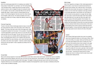
- 1. Headline Both of the double page spreads that I am analysing use a headline “The Flying Oysters Hit Back With Tour and Album” and “Fall Out Boy Make Their Sensational Return” straight away informs the reader what the articles are about in order to engage the reader into reading the article. For my headline I have one with a simple black filled text box with the headline title written in white to produce a contrast between the two colours. In the Kerrang magazine, they have used more vibrant colours for the headline, yellow and red. This make the headline much more striking to the reader and it is likely to attack their attention quicker than my headline. Font and Type Size The text in the both of these double page spreads are easy to read which will visually please the reader as the will be able to read it without any difficulty. Two colours have been used in both of the pages which, helps to separate the question from the answer. For the questions I thought that I would be appropriate to use the colour red as it is a very bold colour and works well with the rest of the page. The main colour for the text is black as it is an easy colour as it contrasts with the white background, plus when I was deciding which colours to use I needed to think that some people could suffer from colour blindness, which means that they would be unable to see certain colours together. I made the questions larger and bold then the main text itself in order to separate the questions from the rest of the text. Main Image Both of the magazines use images on their double page spread, to give the reader a visual incite as to what the band look like and what each band members role is within the band. In the Kerrang magazine they have include more pictures on the page to fill it up as there is not a lot of text that is displayed on the page, whereas on my double page spread I have included a lot more writing so I could not include as many pictures on my page. My main image that I have used is a phot of the lead singer of the Flying Oysters Mark Macdonald and on the right hand side of the page I have included a picture of the bands guitarists Chris Knowlson. The images that the Kerrang magazine have used show Fall Out Boy’s bassists Pete Wentz playing his bass while surrounded what seems to look like audiences hands, there are other pictures of the rest of the band playing at the concert as well as a photo that shows the whole band together. It is also vital that the images that are used in a double page spread must be relevant to the story of the article. Layout Both of these double page spreads have used a very pleasing layout that will please the reader as it will be easy to follow. When it can to the writing on my page I made sure that there was not a lot of white space between each column of writing and I have made sure that everything does not look cramped on the page and everything is in proportion to each other. There is a lot of writing on my page compared to the Kerrang magazine which may put the reader off, but my text is quite big in order the reader will be able to read the text easily without having to squint just to read the article. I have also left a decent amount of space between each column of writing so that the reader does not get confused when reading the text.House Style Mine and the Kerrang magazine’s house style are very similar to each other in terms of text and font style, however their layout is completely different as the Kerrang magazine uses more colour and uses a lot more pictures then I have included in my double page spread, despite of this their style remains the same throughout both of the pages. The register of writing that has been used in both mine and the Kerrang magazine informal as it is a conversation going on between to people as the language that is used is very easy to understand as they both use very simple but effective language.