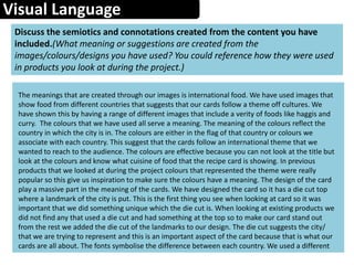
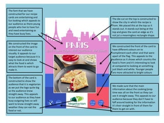
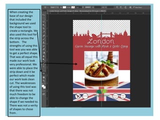
The document summarizes the design choices for a set of recipe cards promoting international vegetarian cuisine. Key points:
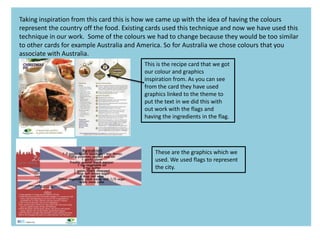
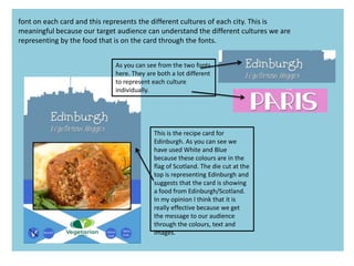
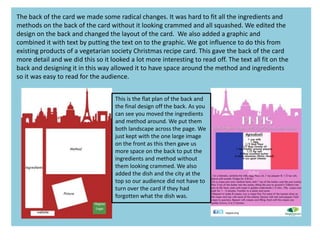
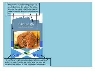
1) Large images were used on the front of each card to attract attention, with ingredients and instructions on the back. Colors represented the country/city featured and were inspired by existing products.
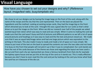
2) A die cut shape of a landmark from the featured city was placed at the top to identify the location. Fonts and layouts varied between cards to represent different cultures.
3) Research informed choices like equal text/image ratios and bright colors. Recipes featured world foods and were quick to make for busy professionals.
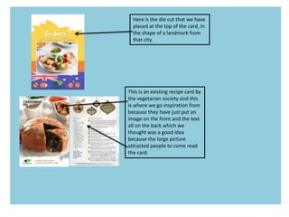
4) Existing vegetarian society cards provided examples of front-image


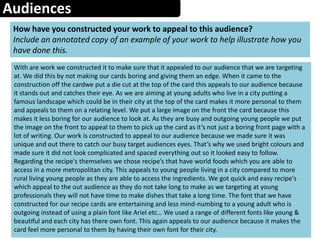
![Audiences
Create an audience profile of your chosen demographic
(Age, gender, psychographic, Geodemographics, NRS Social Grade, hobbies,
sexuality [if appropriate] etc)
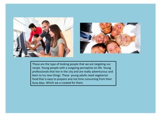
Our audience that we have targeted our product to are young professionals living in this city from
the ages of 21-35. They are middle class people that have busy jobs so we have created quick and
easy recipe’s for them to follow after their work. The audience we have target this at are young
people that like to be adventurous with food and try food from different countries/cultures. That’s
why we have targeted the audience at a younger person rather than an older person because
younger people are most likely to try new food. In our questionnaire that we did at the start of our
project a lot of the younger people who filed out requested for different country cuisine like Indian
and American. This what drove us to chose our target audience as people from 21-35 because
younger people are seen more adventurous and live in the city with busy jobs. We made our cards
bright and fun looking to attract this audience who have lively and outgoing lives. Our cards reflect
the lives of these people. Young people like to travel and this is becoming a very popular thing so
having cards that represent all over the world from America to Paris will attract young people from
the ages of 21-35 because they may like the food of one of the countries like America but be
unable to eat it because their vegetarian so we have put in a substitute for meat. This is another
reason why are target audience are young people from the ages of 21-35. The audience will be in
city living because they will be young and want to be near everything so we have created the cards
to represent cities to reflect on our audience. This is effective because they make the cards
personal to the audience.](https://image.slidesharecdn.com/evaluationproforma-140521094907-phpapp01/85/Evaluation-pro-forma-9-320.jpg)


![Evaluation%20pro%20forma[1]](https://cdn.slidesharecdn.com/ss_thumbnails/evaluation20pro20forma1-140523090727-phpapp01-thumbnail.jpg?width=640&height=640&fit=bounds)

![Evaluation%20pro%20forma[1]](https://cdn.slidesharecdn.com/ss_thumbnails/evaluation20pro20forma1-140523091128-phpapp01-thumbnail.jpg?width=640&height=640&fit=bounds)


