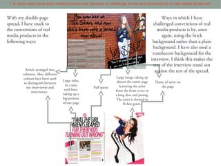
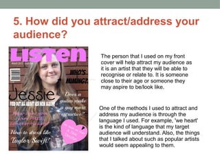
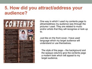
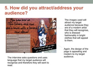
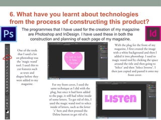
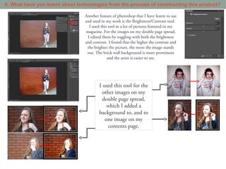
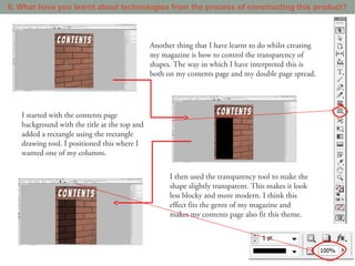
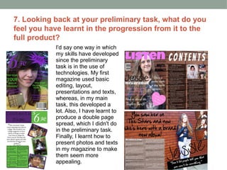
2. The brief
• Our brief was to create a new music magazine.
• We had to create a front cover, a contents page and a
double page spread.
• It was required that we use a minimum of four images.
3. 1. In what ways does your media product use, develop
or challenge forms and conventions of real media
products?
With my front cover, I have stuck to conventions of real media products in the following ways:
Title in top third of the page
Young female with similar styles for the
main image
Coverlines down the side of the page
Barcode
Larger, bolder text used to present main coverline
Use of plug
Use of different colour to make certain
coverlines separate from the others
There aren’t many ways in which I have challenged magazine conventions with my front over.
4. 1. In what ways does your media product use, develop or challenge forms and conventions of real media products?
The ways in which my contents page has followed regular conventions are:
Title at the top of the
page, in a sans serif font
Page numbers on images
‘On the cover’ section to
show where the pages advertised
on the front cover can be found
in the magazine
Page index arranged
into columns
Images of what to expect in
the magazine displayed on the
contents page
One of the ways in which I have challenged the conventions on my contents page is by using a patterned
background. The background that I have used has brick, whereas in most magazines a plain or white
background is used. Also, I have presented the pages in two columns, rather than the usual three columns.
I personally think this presentation looks good in my magazine because it makes it look less cramped and
the background gives it detail.
5. 1. In what ways does your media product use, develop or challenge forms and conventions of real media products?
With my double page Ways in which I have
spread, I have stuck to challenged conventions of real
the conventions of real media products is by, once
media products in the again, using the brick
following ways: background rather than a plain
background. I have also used a
translucent background for the
interview. I think this makes the
text of the interview stand out
Article arranged into against the rest of the spread.
columns. Also, different
colours have been used Large image taking up
Large titles, almost the entire page Name of artist on
to distinguish between
in a sans featuring the artist the page
the interviewer and Pull quote
serif font, from the front cover in
interviewee.
taking up a a long shot and posing.
big portion The artist is dressed to
of one page fit her genre.
6. 2. How does your media product
represent particular social groups?
My target audience for this magazine are
teenage girls aged 14-17 with interests in
music, fashion and celebrities. They would
most likely be mainstreamers who look to
fit in with societies 'norms'. The way in
which my magazine presents these
people is through the artists presented
and the language used and they are all
associated with this social group. I have
presented them as liking high fashion with
low prices and pop music by famous
artists. This is a general representation
and doesn't go further to represent sub
cultures or different races.
7. 3. What kind of media institution might
distribute your media product and why?
I've researched into some media insititutions to distribute my magazine. The sort of
institution that I am looking for would preferably not already distribute a magazine with an
identical genre or audience to my magazine.
8. 4. Who would the audience be for your media product?
Bauer Media is a division of the Bauer Media Group, Europe’s
largest privately owned publishing Group. The Group is a
worldwide media empire offering over 300 magazines in 15
countries, as well as online, TV and radio stations.
Bauer Media joined the Bauer Media Group in January 2008
following acquisition of Emap plc’s consumer and specialist
magazines, radio, TV, online and digital businesses.
Collectively, the Group employs some 6,400 people.
Bauer Media is a multi-platform UK-based media Group consisting of many
companies collected around two main divisions – Magazines and Radio -
widely recognised and rewarded as being industry innovators. (Source:
http://www.bauermedia.co.uk/)
Above are the magazines that Bauer already distribute. Although it distributes
music magazines, such as Q or Mojo, it doesn't distribute any aimed at my
audience.
9. 4. Who would the audience be for your media product?
EMAP owns industry-leading brands that sit at the heart of
business powerful B2B communities like Retail, Health,
Construction, Architecture, and Fashion. Their purpose is
to connect professional communities and inspire them to
know, to grow, progress and win. Brands such as HSJ and
Retail Week create deep relationships and unparalleled
reach, to increase value for their customers. They deliver this through senior
networking events; industry leading awards; online data products; social media
communities; headline conferences and critical insight, news and analysis. Always
independent, relentlessly inquisitive, EMAP embodies quality, market-leading
journalism. They act as the ultimate industry insider, and strive to always be the
trusted authority. For their customers, EMAP provides the best possible way to
connect with their world. (Source: http://www.emap.com/)
To the left are some of the brands that
EMAP distribute. They don't distribute
any music magazines which means that
they have a wide market for music
magazines.
10. 4. Who would the audience be for your media product?
Future plc is an international media group, listed on the
London Stock Exchange . Founded in 1985 with one
magazine, today they have operations in the UK, US and
Australia creating over 200 specialist publications, apps,
websites and events.
They hold market-leading positions in our core sectors:
Technology, Entertainment & Video Games, Sport & Auto,
Music and Creative.
Their most successful products include TechRadar (the UK’s number one
consumer technology website), T3, Total Film, BikeRadar, MusicRadar,
Classic Rock, GamesRadar, Digital Camera and Mollie Makes.
Future attracts more than 50 million monthly unique visitors to their digital
properties websites; and they deliver over 100 digital editions and bespoke apps
on tablet devices. They sell 2.2 million magazines every month, and export or
syndicate to 89 countries, making them the UK’s number one exporter and
licensor of magazine content. Future is the PPA and AOP
Consumer Digital Publisher of the Year.
To the left are a list of music magazines that Future
distribute in the UK. They don't yet publish a magazine of
my genre or aimed at my target audience, meaning there
is a gap in their market for my magazine.
11. 5. How did you attract/address your
audience?
The person that I used on my front
cover will help attract my audience as
it is an artist that they will be able to
recognise or relate to. It is someone
close to their age or someone they
may aspire to be/look like.
One of the methods I used to attract and
address my audience is through the
language I used. For example, 'we heart'
is the kind of language that my target
audience will understand. Also, the things
that I talked about such as popular artists
would seem appealing to them.
12. 5. How did you attract/address your
audience?
One way in which I used my contents page to
attract/address my audience was through the
pictures I used. They are related to music
and/or artists that they will recognise or look up
to.
Just like on the front cover, I have used
language which my target audience will
understand or use themselves.
The style of the page – the background and
the opaque columns give the contents page
a modern look which will appeal to my
target audience.
13. 5. How did you attract/address your
audience?
The images used will
attract my target
audience because they
are of a modern artist
that they will recognise,
who is dressed
fashionably in bright
clothes that will appeal
to them.
Again, the design of the
page is appealing and
modern to my target
The interview asks questions and uses audience.
language that my target audience will
recognise and therefore they will want to
read.
14. 6. What have you learnt about technologies
from the process of constructing this product?
The programmes that I have used for the creation of my magazine
are Photoshop and InDesign. I have used these in both the
construction and planning of each page of my magazine.
With the plug for the front of my
One of the tools magazine, I first created the image
that I used a lot with a white background and then I
on photoshop was added it into photoshop. I used to
the ‘magic wand’ magic wand tool by clicking the space
tool. I used this to around the title and then going to
cut features such ‘Select’ and then ‘Select Inverse’. I
as texts and then just copied and pasted it onto my
shapes before they front cover.
were added to my
magazine. For my front cover, I used the
same technique as I did with the
plug, but once it had been added
to the page, it still had white inside
of some letters. To get rid of this, I
used the magic wand tool to select
inside of letters, such as the letter
‘e’ here and then pressed the
Delete button to get rid of it.
15. 6. What have you learnt about technologies from the process of constructing this product?
Another feature of photoshop that I have learnt to use
and used in my work is the Brightness/Contrast tool.
I used this tool in a lot of pictures featured in my
magazine. For the images on my double page spread,
I edited them by toggling with both the brightness
and contrast. I found that the higher the contrast and
the brighter the picture, the more the image stands
out. The brick wall background is more prominent
and the artist is easier to see.
I used this tool for the
other images on my
double page spread,
which I added a
background to, and to
one image on my
contents page.
16. 6. What have you learnt about technologies from the process of constructing this product?
Another thing that I have learnt to do whilst creating
my magazine is how to control the transparency of
shapes. The way in which I have interpreted this is
both on my contents page and my double page spread.
I started with the contents page
background with the title at the top and
added a rectangle using the rectangle
drawing tool. I positioned this where I
wanted one of my columns.
I then used the transparency tool to make the
shape slightly transparent. This makes it look
less blocky and more modern. I think this
effect fits the genre of my magazine and
makes my contents page also fit this theme.
17. 7. Looking back at your preliminary task, what do you
feel you have learnt in the progression from it to the
full product?
I'd say one way in which
my skills have developed
since the preliminary
task is in the use of
technologies. My first
magazine used basic
editing, layout,
presentations and texts,
whereas, in my main
task, this developed a
lot. Also, I have learnt to
produce a double page
spread, which I didn't do
in the preliminary task.
Finally, I learnt how to
present photos and texts
in my magazine to make
them seem more
appealing.