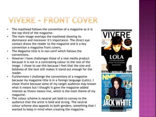
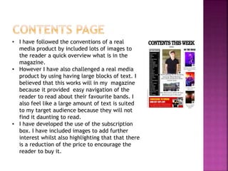
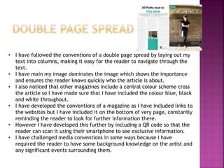
In what ways does your media product
use, develop or challenge forms and
conventions of a real media product?
• The masthead follows the convention of a magazine as it is
the top third of the magazine.
• The main image overlaps the masthead showing its
dominance and moreover it’s importance. The direct eye
contact draws the reader to the magazine and is a key
convention a magazine front covers.
• The Magazine title is in non-cerif which follows the
conventions.
• However I have challenges those of a real media product
because it is not in a contrasting colour to the rest of the
image. I chose to use this because I feel that the size and
boldness of the text still makes it stand out enough for the
reader.
• Furthermore I challenge the conventions of a magazine
because my magazine title is in a foreign language (Latin). I
chose Vivere because some of my target audience may known
what it means but I thought it gave the magazine added
interest as Vivere means live, which is the main theme of my
magazine.
• The colour scheme is neutral yet bold to convey to the
audience that the artist is bold and strong. The neutral
colour scheme also appeals to both genders, something that I
wanted to keep in mind when creating the magazine.
• I have followed the conventions of a real
media product by included lots of images to
the reader a quick overview what is in the
magazine.
• However I have also challenged a real media
product by using having large blocks of text. I
believed that this works will in my magazine
because it provided easy navigation of the
reader to read about their favourite bands. I
also feel like a large amount of text is suited
to my target audience because they will not
find it daunting to read.
• I have developed the use of the subscription
box. I have included images to add further
interest whilst also highlighting that that there
is a reduction of the price to encourage the
reader to buy it.
• I have followed the conventions of a double page spread by laying out my
text into columns, making it easy for the reader to navigate through the
text.
• I have main my image dominates the image which shows the importance
and ensures the reader knows quickly who the article is about.
• I also noticed that other magazines include a central colour scheme cross
the article so I have made sure that I have included the colour blue, black
and white throughout.
• I have developed the conventions of a magazine as I have included links to
the websites but I have included it on the bottom of very page, constantly
reminding the reader to look for further information there.
• However I have developed this further by including a QR code so that the
reader can scan it using their smartphone to see exclusive information.
• I have challenged media conventions in some ways because I have
required the reader to have some background knowledge on the artist and
any significant events surrounding them.

Evaluation of vivere - use, challenge and develop codes

  • 1.
    In what waysdoes your media product use, develop or challenge forms and conventions of a real media product?
  • 2.
    • The mastheadfollows the convention of a magazine as it is the top third of the magazine. • The main image overlaps the masthead showing its dominance and moreover it’s importance. The direct eye contact draws the reader to the magazine and is a key convention a magazine front covers. • The Magazine title is in non-cerif which follows the conventions. • However I have challenges those of a real media product because it is not in a contrasting colour to the rest of the image. I chose to use this because I feel that the size and boldness of the text still makes it stand out enough for the reader. • Furthermore I challenge the conventions of a magazine because my magazine title is in a foreign language (Latin). I chose Vivere because some of my target audience may known what it means but I thought it gave the magazine added interest as Vivere means live, which is the main theme of my magazine. • The colour scheme is neutral yet bold to convey to the audience that the artist is bold and strong. The neutral colour scheme also appeals to both genders, something that I wanted to keep in mind when creating the magazine.
  • 3.
    • I havefollowed the conventions of a real media product by included lots of images to the reader a quick overview what is in the magazine. • However I have also challenged a real media product by using having large blocks of text. I believed that this works will in my magazine because it provided easy navigation of the reader to read about their favourite bands. I also feel like a large amount of text is suited to my target audience because they will not find it daunting to read. • I have developed the use of the subscription box. I have included images to add further interest whilst also highlighting that that there is a reduction of the price to encourage the reader to buy it.
  • 4.
    • I havefollowed the conventions of a double page spread by laying out my text into columns, making it easy for the reader to navigate through the text. • I have main my image dominates the image which shows the importance and ensures the reader knows quickly who the article is about. • I also noticed that other magazines include a central colour scheme cross the article so I have made sure that I have included the colour blue, black and white throughout. • I have developed the conventions of a magazine as I have included links to the websites but I have included it on the bottom of very page, constantly reminding the reader to look for further information there. • However I have developed this further by including a QR code so that the reader can scan it using their smartphone to see exclusive information. • I have challenged media conventions in some ways because I have required the reader to have some background knowledge on the artist and any significant events surrounding them.