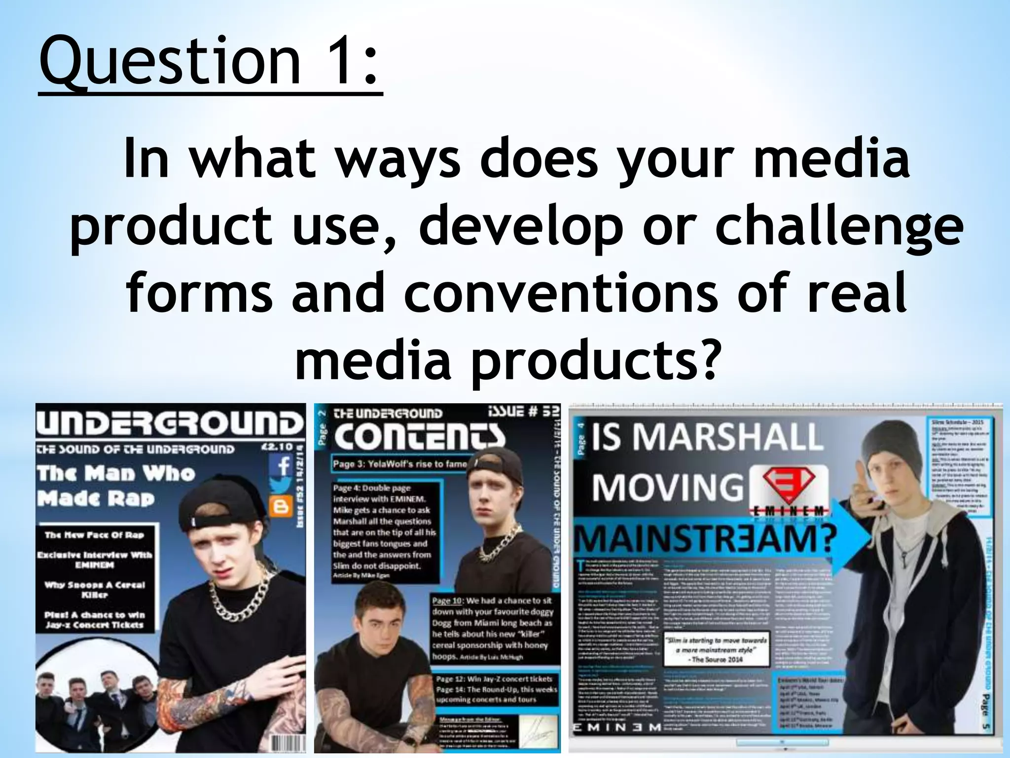
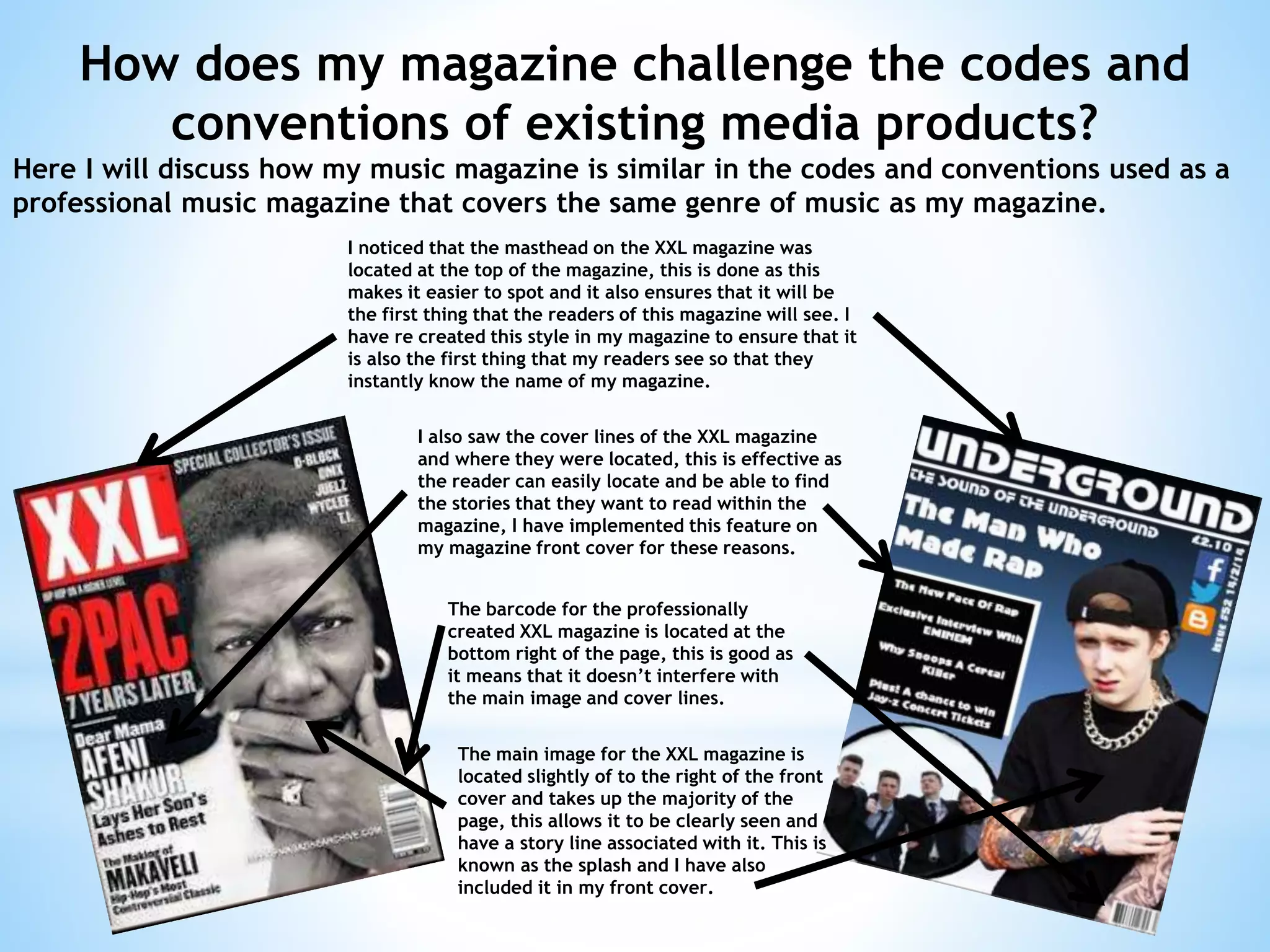
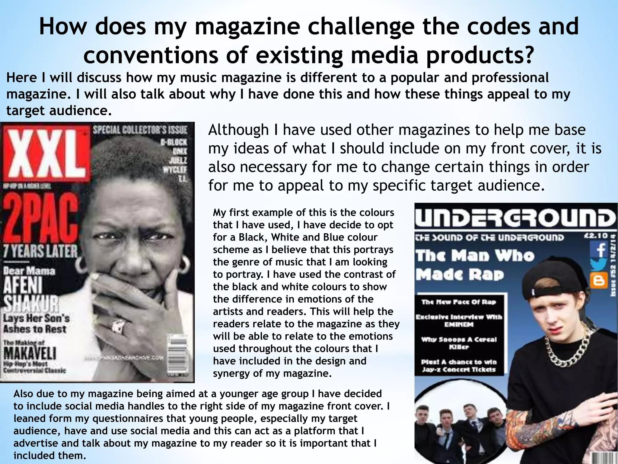
Organic Name Reactions for the students and aspirants of Chemistry12th.pptx
Evaluation question 1
1. Question 1:
In what ways does your media
product use, develop or challenge
forms and conventions of real
media products?
2. How does my magazine challenge the codes and
conventions of existing media products?
Here I will discuss how my music magazine is similar in the codes and conventions used as a
professional music magazine that covers the same genre of music as my magazine.
I noticed that the masthead on the XXL magazine was
located at the top of the magazine, this is done as this
makes it easier to spot and it also ensures that it will be
the first thing that the readers of this magazine will see. I
have re created this style in my magazine to ensure that it
is also the first thing that my readers see so that they
instantly know the name of my magazine.
I also saw the cover lines of the XXL magazine
and where they were located, this is effective as
the reader can easily locate and be able to find
the stories that they want to read within the
magazine, I have implemented this feature on
my magazine front cover for these reasons.
The barcode for the professionally
created XXL magazine is located at the
bottom right of the page, this is good as
it means that it doesn’t interfere with
the main image and cover lines.
The main image for the XXL magazine is
located slightly of to the right of the front
cover and takes up the majority of the
page, this allows it to be clearly seen and
have a story line associated with it. This is
known as the splash and I have also
included it in my front cover.
3. How does my magazine challenge the codes and
conventions of existing media products?
Here I will discuss how my music magazine is different to a popular and professional
magazine. I will also talk about why I have done this and how these things appeal to my
target audience.
Although I have used other magazines to help me base
my ideas of what I should include on my front cover, it is
also necessary for me to change certain things in order
for me to appeal to my specific target audience.
My first example of this is the colours
that I have used, I have decide to opt
for a Black, White and Blue colour
scheme as I believe that this portrays
the genre of music that I am looking
to portray. I have used the contrast of
the black and white colours to show
the difference in emotions of the
artists and readers. This will help the
readers relate to the magazine as they
will be able to relate to the emotions
used throughout the colours that I
have included in the design and
synergy of my magazine.
Also due to my magazine being aimed at a younger age group I have decided
to include social media handles to the right side of my magazine front cover. I
leaned form my questionnaires that young people, especially my target
audience, have and use social media and this can act as a platform that I
advertise and talk about my magazine to my reader so it is important that I
included them.