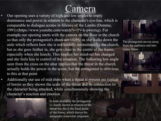
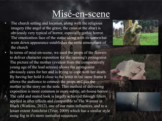
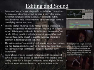
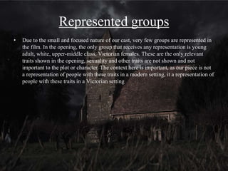
The document provides an analysis of how the opening of a student horror film uses, develops, and challenges conventions of real horror films. It examines elements like titles, plot, camerawork, mise-en-scene, editing, sound, and representation of social groups. It finds the opening challenges some conventions by showing an independent female protagonist but remains fairly conventional to appeal to mainstream audiences. The analysis suggests the film could be distributed by Momentum Pictures and shown in art houses or multiplexes depending on its success. Through the process, the students learned skills with technologies like blogging, filming with DSLR and additional equipment, and editing with software filters and effects.
Evaluation questions 1 and 2 - AS Media Studieshannahbennett98
This document analyzes how the opening sequence of a student film project uses and develops conventions of the horror genre. It discusses various visual, audio, and narrative elements that conform to audience expectations, such as the use of iconography like a rocking horse and pentagram, low key lighting, diegetic sound effects, a "haunted house" location, and a young female ghost character. However, it also notes some ways the sequence challenges conventions, like presenting the ghost character as trying to help rather than being the antagonist. The document considers how the sequence represents social groups through its exclusively young, white cast of two male protagonists and a female ghost.
The document discusses how social groups are represented in a media production. It represents youth as mysterious and scary, shown through the behavior of the boys exploring and a frightening young girl. White people are represented simply by being the race of all characters. Deceased people are portrayed as very pale and scary, belonging more to the underworld than the living world, according to the music. Youth innocence is enhanced through the set design of a young girl's room, while makeup transforms the girl into a deathly creature.
The media product uses, develops, and challenges conventions of horror films in the following ways:
1) It features three main characters - two adventurous teenage boys and a young blonde girl - who fit conventions of typical horror protagonists.
2) Costumes and locations were chosen to create a sense of mystery, danger, and suspense, aligning with horror conventions.
3) Sound design conforms to horror conventions like incorporating a piercing scream and unsettling background music to build tension.
4) Typography and title design took inspiration from popular horror films to be appropriate for the paranormal horror subgenre.
This document contains Callum King's coursework evaluation for a horror film opening sequence project. It discusses various aspects of the opening such as its conventional form and plot devices. Callum analyzes how the opening conforms to horror genre conventions through its characters, plot, mise-en-scene, sound, camera work, editing and typography. He also discusses how the work represents social groups and could potentially secure a distribution deal. The document concludes by describing how the project was filmed using low-budget equipment and lighting techniques in tight spaces.
The document discusses common conventions used in horror film posters. It describes how posters often feature an extreme close-up of an eye that has been manipulated to look unnatural, creating intrigue. Another convention is using a photograph of a creepy-looking house to unsettle viewers. A third technique discussed is depicting the villain from behind with their face partially visible, concealing their identity to generate mystery. These conventions aim to tease audiences about the film's themes and draw them in with a sense of unease.
The document analyzes how the opening sequence of a supernatural horror film product uses and develops genre conventions. It discusses elements like visual signifiers, costumes, lighting, editing, sound, locations, characters and plot that conform to audience expectations of the genre. Some conventions are directly replicated from films like The Conjuring and Insidious, while others like an atypical protagonist challenge conventions to create mystery and intrigue. Overall the sequence aims to immerse the audience in the genre through iconic visual and technical elements.
Religious objects like bibles, rosaries, and ancient religious artifacts are commonly featured in supernatural horror films. These props represent the supernatural entity's origins in religion and are often used in exorcisms to drive out demons. Children's toys, especially old-fashioned dolls, also regularly appear as their innocence being corrupted is effectively disturbing. Candles are another frequent prop that builds tension through their dim lighting and ability to be easily blown out, reminding viewers of pre-electricity traditions in a haunting way.
This document discusses and analyzes several film posters based on their genre conventions. It examines how horror film posters typically use dark lighting, fearful images and vulnerable character placements. Comedy posters are brighter with funny images and lighting suggesting a performance. Action posters have danger cues like fire and portray masculine protagonists. Romantic posters depict intimacy through color and montages telling the story. Sci-fi posters are technologically inspired with mysterious animated characters. Audience feedback indicates short films and full movies attract different crowds based on production values and adherence to genres.
This document outlines conventions for film magazine front covers. It discusses how the covers typically feature the main actor in character, with the masthead in a consistent font and color matching the film's genre. The main image takes over the center of the cover and is dimly lit to make the subject stand out. Close-ups are commonly used for supernatural films to show deformities, while medium shots featuring weapons are more common for slasher films. Text and taglines relate back to the central image and masthead to maintain brand identity. Color choices also aim to be aesthetically pleasing while conveying appropriate themes for the film's genre.
This magazine cover features a close-up shot of the pale main actor from an upcoming movie, contrasted against a black background. His abnormal eye color and pale complexion suggest he is not human and will create mysteries for viewers. He wears a brown suit that connotes dirt and death. Profile lighting darkens one side of his face, adding an air of mystery. The layout is typical for a film magazine, with the masthead at the top and a featured article at the bottom, surrounded by bright sell lines advertising other films in eye-catching colors to attract readers. Free posters are offered as an incentive to purchase the magazine.
The opening sequence conforms to conventions of supernatural horror genre through the use of stock characters, plot, location, sound, and visual elements. Specifically, it features a young American female protagonist and an antagonist in the form of a disturbed spirit. While conforming to genres tropes, the sequence also challenges some conventions through its use of graphic violence and an enigmatic female antagonist meant to subvert patriarchal norms. The sequence largely represents young white Americans but also explores cultural binaries between Western and Japanese cultures. Through its production, the group learned how to use technologies like Premiere, After Effects, and social media to construct media products and engage audiences.
The document discusses how the media product uses and challenges conventions of supernatural horror films. It follows the conventional plot of a spirit possessing someone in a haunted house. While it uses everyday costumes and locations like homes, as is typical, it challenges conventions by using more blood than usual. The sound uses music to build tension but doesn't include typical creaking sounds. Editing and camerawork aim to build tension through shot length and shaky camera. Color grading creates a dark atmosphere. Overall the media product draws on supernatural horror conventions while putting its own spin through unique elements.
The document discusses conventions and techniques commonly used in thriller films. Some typical settings include abandoned buildings, city centers, and family homes which create suspense. Common characters are murderers, psychopaths, and people with dark pasts. Popular themes involve crime, mystery, and the supernatural. Cinematography like close-ups are used to show a character's fear while lighting and sound aim to build tension and an unsettling atmosphere. Editing techniques like match cuts connect unexpected scenes to surprise the audience.
The main image depicts the antagonist holding a large knife against a plain background to catch viewers' attention. Dark lighting highlights the knife and face while creating shadows on the body to convey darkness and lack of emotion. The magazine layout places the main image center with cover lines on the right in bold, colorful fonts that stand out against the dark background and guide the eye down the page. The masthead is designed like painted wood to fit the woodland theme while the magazine title "Scream" implies coverage of slasher films to scare audiences.
The document discusses how the opening sequence for a supernatural horror media product was created. It uses lack of dialogue and mystery around the characters to build intrigue. The supernatural figure is left intentionally ambiguous and mysterious through techniques like costume, makeup, lighting and positioning. The sequence draws from conventions of the horror genre in its plot, titles, typography, location, characters, props, sound, camerawork and editing. It aims to effectively set the tone and entice the audience to continue watching to learn more.
This document discusses and analyzes several film posters based on their genre. It examines how different genres are visually represented through elements like color schemes, images, lighting, and text. Horror posters tend to use dark colors and ominous images that create an unsettling mood. Comedy posters have brighter colors and depict humorous scenes from the film. Action posters show danger and bravery through fire imagery and rough character portraits. Romantic posters utilize intimate photos and warm colors to convey love and romance. The document analyzes how each poster effectively captures and conveys the essence of its genre through visual design choices.
This document outlines the key details of a film project. The film is a coming-of-age teen drama that follows a female protagonist who is an outcast at her school due to having OCD. She uses her camera to cope with her anxiety. The main character is witty, narcissistic, and the school photographer. Though confident, she yearns for someone to talk to. The promotional campaign will highlight the atypical portrayal of mental illness and use the camera as a motif. Elements like fonts, colors, and camera focus will remain consistent across the teaser trailer, poster, and magazine cover. The target audience includes teens, young adults, and those who can relate to themes of friendship and being an outsider.
The document summarizes the filmmaking techniques and conventions used in the student's opening sequence for a supernatural horror media product. It discusses conventions around plot, characters, lighting, sound, titles and more that were utilized and how they were inspired by other horror films. The techniques learned through constructing the product are also reviewed, such as using a DSLR camera, lighting, editing software and more. Overall the document reflects on how the opening challenges and develops genre conventions to create an engaging supernatural horror narrative.
To attract their target audience of thriller and horror fans, the creators:
1) Made the main character a girl to relate to female audiences and break conventions of a typical dark thriller.
2) Had the main female character wear a colorful outfit in a spooky graveyard scene to contrast with the dark setting and intrigue audiences.
3) Included a fight scene at the start where the main character's brother is killed by a demon to make audiences feel sympathetic and want to see what happens next.
This document analyzes several TV show posters, considering elements like layout, focus points, fonts, space usage, colors, images, branding, captions and backgrounds. Example 1 examines a poster for a show about four girls, noting how the poster aims to relate to and inspire young female viewers. Example 2 discusses a poster for the show "Luther" that centers on the main character's intense facial expression and minimal text to intrigue viewers. Example 3 analyzes a poster that implies vampirism through its use of pale skin, red lips and shadows. Example 4 notes how the poster for "The Vampire Diaries" more subtly references vampires and implies a darker love story than other shows.
The document analyzes TV show posters and provides four examples. It considers elements like layout, focus points, fonts, space use, colors, images, branding, captions and backgrounds. Example 1 analyzes a poster for "The Hills" focusing on the young female characters and white dresses. Example 2 analyzes a "Luther" poster focusing on Idris Elba's intense facial expression and nomination. Example 3 analyzes a vampire-themed poster using pale skin, red lips and religious text. Example 4 analyzes a "Vampire Diaries" poster that hints at a love story rather than true vampire themes. In conclusion, it finds "The Hills" targets a younger audience while the others have darker, more mature
1) The document analyzes the shots and techniques used in the trailer for a horror/thriller film.
2) Key elements analyzed include the lighting, camerawork, sound, editing, and how they build tension and mystery around the vulnerable female protagonist who is deaf.
3) Shots establish the isolated setting and introduce the house where most of the film takes place, then titles and music hint at an intruder stalking the unaware female character inside.
The poster promotes the 2013 horror film "The Conjuring" which belongs to the paranormal subgenre. It depicts a frightened middle-aged woman holding up a lit match, suggesting the horror takes place at night. Her facial expression and nightwear indicate she has been scared by something unseen in the dark space. The poster uses vintage effects and styles to imply the film is set in the 1970s. It effectively uses text and lighting to promote the film and draw in audiences.
The poster focuses on a distressed female's open mouth, shown in black and white against a red title to convey fear and horror. Her tiara is askew, hair in her face, eyes covered to show an inability to escape danger on her prom night, as indicated by the tagline "A night to die for." The analysis concludes the poster effectively presents the film as a transition from a typical teen romantic comedy to horror without revealing too many plot details.
The conjuring – semiotic analysis of movie posterrsheeres
The poster depicts an old woman sitting alone in a dark, isolated room holding a creepy doll. The woman's face is turned away from the camera, making her mysterious. The doll is smiling but also seems alive with its head turned, which is unsettling. These visuals along with the dark color scheme and grimy setting create an ominous and frightening atmosphere. The tagline notes the film is based on true cases, adding to the scare factor by implying it could really happen. Overall, the poster employs common horror conventions through its disturbing imagery and dark tone to attract audiences interested in supernatural thrillers from the directors of similar films.
The poster for Shaun of the Dead subverts zombie horror conventions through its comedic elements. It features Simon Pegg as the lone human surrounded by zombies on a tube train, but he looks concerned rather than terrified, suggesting this will be a parody. Pegg is brightly colored compared to the dull zombies, making him the central focus. The text reinforces the comedic tone, describing it as a "Romantic Comedy. With Zombies" and mocking how zombies move. Through Pegg's expression, colorful style, and humorous text, the poster establishes this film will parody the zombie genre in a lighthearted way.
The document analyzes and compares two movie posters for the films "The Stepfather" and "When a Stranger Calls". Both posters use dark backgrounds and red titles to signal the thriller/horror genre. They also both feature a central image of a hand holding an object related to the plot. However, the hand in "The Stepfather" poster looks clean and normal to make the villain seem more familiar, while the hand in "When a Stranger Calls" is dirty to distance the audience. Neither tagline reveals much of the plot but entices viewers. The document concludes the posters effectively use common thriller/horror conventions while differing in their portrayal of the villains.
The document discusses how the group used a blog to collaboratively plan and improve their horror film project. They posted planning updates and received feedback to strengthen their work. Through analyzing example horror film openings, they learned conventions like typography, color, and plot elements to incorporate. They filmed across four locations using a DSLR camera and equipment for stable shots. Editing challenges like desaturating footage and stabilizing shots were overcome. They chose simple title designs and added visual effects to denote flashbacks.
The document discusses how the media product challenges and develops conventions of real media products in the horror genre. It uses flashbacks and gruesome imagery like blood to distinguish scenes, drawing from films like Bonnie and Clyde. Props like knives and cigarettes also help establish the horror and film noir genres. Character archetypes and settings like the abandoned warehouse are conventional. While the editing pace challenges conventions by being slower, the camera work and sound design are generally conventional for horror.
The document summarizes how social groups are represented and the technical structures used in a film production. A male detective interrogates a female criminal suspect. Though traditionally males are portrayed more positively, the production subverts this by having the female outwit the male. Both characters are in their late teens/early 20s. Stereotypes are not represented and the production presents females in a more positive light. Technically, the female's costume and calm demeanor evoke a femme fatale character and film noir conventions. Equal shot time and dialogue are given to both characters to avoid portraying one more prominently.
The document discusses audience research conducted on a student horror film. A questionnaire was administered after a screening to gauge audience understanding, opinions and reactions. While most understood the basic plot, some were confused about specific details like the identity of the murderer and the reason for questioning a character. However, the audience generally enjoyed the film and rated it as tense, with most saying they would recommend it. The research showed the film was mostly successful in engaging the target audience, but could have provided more clarity on some plot points.
The document discusses research conducted on the target audience for a horror film project. It found that the core audience is 15-24 year old males who enjoy gaming and viral marketing. They prefer genres like thriller, gangster and horror films with gory elements. Research was conducted through questionnaires during production and a screening after to assess how well the audience understood the plot. The screening showed overall understanding was good, though some details like the murderer's identity could have been clearer. Most said they would recommend the film.
The document discusses how the opening of a horror film media product challenges conventions through its characterization and style. Specifically:
- It features a female antagonist, challenging the typical male antagonist. Her casual demeanor undermines the male detective's authority.
- It uses slower editing and more dialogue than typical fast-paced horror openings. Tension is built through the conversation rather than cutting.
- The title uses a plain font rather than a bold horror-related font, which challenges conventions.
- Other unconventional elements include the use of a clock ticking to indicate time passing, normal clothing rather than horror-themed costumes, and conveying horror through shots other than close-ups of props.
The social groups represented in the piece are white males and females, while blacks, the disabled, gay and lesbian groups are left out. The white male detective is portrayed in a position of power but shown to lose control of the interrogation to the female suspect. The female suspect is portrayed negatively as evil, murderous, and unsympathetic. However, this challenges the typical representation of women as weak by having the female gain power over the male. While the piece reinforces the dominant ideology of male power, it challenges the ideas of females being weak by having the aggressive female suspect overwhelm the male detective.
The document discusses using various online tools for filmmaking. It describes uploading films and receiving feedback using a YouTube channel. It discusses using Blogger collaboratively to share work and receive feedback from teachers and classmates through comments. It describes using Prezi to create dynamic presentations with multimedia and fluid navigation. It also discusses editing films using Adobe Premiere Elements, including adding effects, audio, and titles. Finally, it outlines some technical difficulties encountered during filming, such as battery life, memory limitations, lighting challenges, and keeping equipment out of shots.
The document discusses the use of various multimedia tools and equipment used to complete blogging assignments and film productions as a group. Prezi was used to create engaging presentations, Blogger allowed sharing of work and receiving feedback, and YouTube was used to upload finished films and embed them in blogs. During filming, the group used a DSLR camera, tripods, and lighting equipment. Challenges with lighting were addressed, and After Effects was used to darken shots. Soundtracks from freesound.org helped build suspense.
The document discusses distribution strategies for an independent film produced with a very small budget. It recommends distributing the film through Vertigo Films, an independent distributor who has distributed similar low-budget films like Monsters. It suggests promoting the film primarily through online and social media marketing since those channels are cheap and appeal to the target audience. Potential exhibition options mentioned include art house cinemas and film festivals.
This document discusses various conventions and elements of the horror genre. It covers conventions from different decades, including the slashers of the 1980s and remakes in the 2000s. It also discusses common mise-en-scene elements like isolated settings, religious symbols, and character archetypes. Additionally, it outlines several horror subgenres like good vs evil, religion-based horror, science gone bad stories, and classic gothic stories. The document also notes common technical elements like camera angles, sound, editing, and lighting used to create tension and fear.
This document discusses how a film opening represents different social groups. It represents the protagonist as a middle-class white male through his expensive clothing and living in a clean, well-lit home. Meanwhile, it represents the antagonist as a working-class white male through his tracksuit and living in a dimly lit, run-down area. Various techniques like lighting, set design, and body language are used to reinforce these class stereotypes and ideologies about the divisions between social classes. Females were purposefully not included to avoid cliches.
How does your media product represent particular socialLauren Gilbert
The document discusses how a media product represents particular social groups through the presentation of characters in its thriller opening. Specifically, it presents the victim as a middle-aged, middle-class white male and the protagonist as his daughter, a young white woman. This challenges stereotypes by having the woman survive rather than be victimized. Social class is signaled through their home, clothing, and occupations. While conforming to some middle-class norms, it subverts expectations by having this group be the victims of the crime rather than a vulnerable minority. Representation of social groups was achieved through mise-en-scene, costumes, locations, camerawork, sound design, and minimal dialogue.
Props play an important role in horror films by establishing conventions and symbols that audiences associate with the genre. Common props in possession films include religious items like crosses and bibles. Weapons also frequently symbolize the antagonist, such as the machete in Friday the 13th and chainsaw in Texas Chainsaw Massacre.
This document discusses the selection and meaning of several props to be used in a student film trailer. Pills will symbolize the antagonist's suicide and advance the narrative. A mobile phone and laptop represent the influence of technology on the plot. A grave symbolizes death and the supernatural, though a traditional marble headstone was chosen over wood for realism. Fake pink flowers symbolize the artificial relationship between
The document discusses genre conventions in horror thriller films. Common themes include the supernatural, religion, insanity, the living dead, revenge, and good vs evil. Settings often involve haunted houses, suburban homes, rural areas, and graveyards. Technical conventions used include canted angles, long tracking shots, point-of-view shots, extreme close-ups, sudden sounds, slow pacing, and depth of field. Symbols of black, red, weapons, and religious icons are also discussed. Main characters are the hero/victim and villain. The media product challenges conventions by filming during the day and using slowed music instead of rising tension music.
The document summarizes Freya Childs' film "Possessed" and discusses horror film conventions. It describes the genre as a supernatural thriller about a witch. It provides examples of key iconography and compares the film to others like "Come Play" and "Slumber." Character archetypes, tone, camera techniques, and title design conventions are examined. Social groups presented include the power dynamic between witches and villagers. The film represents binaries like living/dead and good/evil. Theories of Mulvey and Straus are referenced in relation to the film's representations. Stereotypes around gender are generally adhered to.
The document provides an analysis of a short horror film opening. It discusses various technical and stylistic elements used that conform to conventions of the psychological horror genre. These include the setting, plot, characters, sound, editing, mise-en-scene, camera work, titles, and color palette. It also analyzes how the film represents particular social groups through its gendered characters and their roles. Finally, it considers potential distribution partners for an independent film like theirs, such as television slots and film festivals, and viral marketing strategies to connect with audiences.
This document summarizes how the media product used conventions from real horror films in its narrative, characters, and other elements. It drew on conventions around narrative structure from films like Psycho and The Grudge. It also modernized gender stereotypes in horror based on films from directors like George Romero and John Carpenter. Costuming for the main characters was inspired by The Last Exorcism, The Grudge, and The Ring. Lighting drew from Saw but the poster used conventions from Poltergeist. The setting of a haunted house drew from Psycho, The Grudge, and The Woman in Black. Sound design was inspired by films like Lovefield and The Woman in Black. A key prop of a rotten apple drew
This document summarizes how the media product uses conventions of thriller genres in its filming, editing, and overall narrative structure. Specifically, it discusses how the costumes, lighting, camera angles, sound, and color correction were used to reference films like Psycho, Essex Boys, and Kill Bill while also developing determined female and anonymous male characters. The document analyzes how conventions like extreme close-ups, low camera angles, and over-the-shoulder shots place the audience's perspective and build tension. It concludes by discussing the font and text transitions used in the credits and how they foreshadow the relationship between the two characters.
The document discusses how the opening of the student's horror film follows conventions of the genre through elements like young main characters, isolated setting, low-key lighting, non-diegetic soundtrack, and close-ups. It also describes how the student researched techniques used in films like The Shining and The Departed to understand different genres. While the characters and plot generally conform to horror tropes, the film challenges some norms by having a female antagonist and representing social groups in non-traditional ways. The student aims to distribute the independent, low-budget film through arthouse cinemas.
The document discusses how the opening sequence for a horror/thriller film uses conventions of the genre. It establishes the main protagonist finds her mother dead after hearing strange noises in the house. This reveals a twist, shocking the audience that the mother was strangled. The sequence represents teenagers and young adults partying and getting drunk, leaving the main character vulnerable to being killed while intoxicated. Gender is also discussed, with females seen as more vulnerable due to their nature compared to stronger, more aggressive males.
A Level Media Question 1 'Evaluation Question 1: In what ways does your media product use, develop or challenge forms and conventions of real media products?
Codes and conventions and iconography of horror filmsmagrethxx
This document summarizes common codes, conventions, and iconography used in horror films. It discusses camera angles, sound techniques, themes, settings, lighting, characters, costumes, symbols, and narrative theories that are typically employed to create tension, unease, and fear in viewers. Examples are provided to illustrate techniques like POV shots, isolated settings, low key lighting, innocent victims, and plot twists that subvert expectations. The document serves as a guide to visual and aural elements that establish conventions of the horror genre.
Thriller Planning: Character characteristics and costumeseanbicklemedia
Thriller planning - what each character is going to wear throughout the thriller, why they are going to wear it, and the effects it will have upon our opening sequence.
The document analyzes how the media product uses and challenges conventions of real media forms. It summarizes that the protagonist is an unconventional character that blends genres. Both the protagonist and antagonist begin vulnerable but become terrified. The antagonist uses intellect over strength, which is conventional of thriller and psychological genres. The plot involves conventional elements like a goal to retrieve memory, and the antagonist removing it. The lighting, sound, and editing styles aim for realism to relate to the character, while the credits, subtitles and colors subliminally reinforce themes.
The APCO Geopolitical Radar - Q3 2024 The Global Operating Environment for Bu...APCO
The Radar reflects input from APCO’s teams located around the world. It distils a host of interconnected events and trends into insights to inform operational and strategic decisions. Issues covered in this edition include:
Understanding User Needs and Satisfying ThemAggregage
https://www.productmanagementtoday.com/frs/26903918/understanding-user-needs-and-satisfying-them
We know we want to create products which our customers find to be valuable. Whether we label it as customer-centric or product-led depends on how long we've been doing product management. There are three challenges we face when doing this. The obvious challenge is figuring out what our users need; the non-obvious challenges are in creating a shared understanding of those needs and in sensing if what we're doing is meeting those needs.
In this webinar, we won't focus on the research methods for discovering user-needs. We will focus on synthesis of the needs we discover, communication and alignment tools, and how we operationalize addressing those needs.
Industry expert Scott Sehlhorst will:
• Introduce a taxonomy for user goals with real world examples
• Present the Onion Diagram, a tool for contextualizing task-level goals
• Illustrate how customer journey maps capture activity-level and task-level goals
• Demonstrate the best approach to selection and prioritization of user-goals to address
• Highlight the crucial benchmarks, observable changes, in ensuring fulfillment of customer needs
Brian Fitzsimmons on the Business Strategy and Content Flywheel of Barstool S...Neil Horowitz
On episode 272 of the Digital and Social Media Sports Podcast, Neil chatted with Brian Fitzsimmons, Director of Licensing and Business Development for Barstool Sports.
What follows is a collection of snippets from the podcast. To hear the full interview and more, check out the podcast on all podcast platforms and at www.dsmsports.net
Storytelling is an incredibly valuable tool to share data and information. To get the most impact from stories there are a number of key ingredients. These are based on science and human nature. Using these elements in a story you can deliver information impactfully, ensure action and drive change.
Building Your Employer Brand with Social MediaLuanWise
Presented at The Global HR Summit, 6th June 2024
In this keynote, Luan Wise will provide invaluable insights to elevate your employer brand on social media platforms including LinkedIn, Facebook, Instagram, X (formerly Twitter) and TikTok. You'll learn how compelling content can authentically showcase your company culture, values, and employee experiences to support your talent acquisition and retention objectives. Additionally, you'll understand the power of employee advocacy to amplify reach and engagement – helping to position your organization as an employer of choice in today's competitive talent landscape.
Part 2 Deep Dive: Navigating the 2024 Slowdownjeffkluth1
Introduction
The global retail industry has weathered numerous storms, with the financial crisis of 2008 serving as a poignant reminder of the sector's resilience and adaptability. However, as we navigate the complex landscape of 2024, retailers face a unique set of challenges that demand innovative strategies and a fundamental shift in mindset. This white paper contrasts the impact of the 2008 recession on the retail sector with the current headwinds retailers are grappling with, while offering a comprehensive roadmap for success in this new paradigm.
Navigating the world of forex trading can be challenging, especially for beginners. To help you make an informed decision, we have comprehensively compared the best forex brokers in India for 2024. This article, reviewed by Top Forex Brokers Review, will cover featured award winners, the best forex brokers, featured offers, the best copy trading platforms, the best forex brokers for beginners, the best MetaTrader brokers, and recently updated reviews. We will focus on FP Markets, Black Bull, EightCap, IC Markets, and Octa.
Structural Design Process: Step-by-Step Guide for BuildingsChandresh Chudasama
The structural design process is explained: Follow our step-by-step guide to understand building design intricacies and ensure structural integrity. Learn how to build wonderful buildings with the help of our detailed information. Learn how to create structures with durability and reliability and also gain insights on ways of managing structures.
Industrial Tech SW: Category Renewal and CreationChristian Dahlen
Every industrial revolution has created a new set of categories and a new set of players.
Multiple new technologies have emerged, but Samsara and C3.ai are only two companies which have gone public so far.
Manufacturing startups constitute the largest pipeline share of unicorns and IPO candidates in the SF Bay Area, and software startups dominate in Germany.
Event Report - SAP Sapphire 2024 Orlando - lots of innovation and old challengesHolger Mueller
Holger Mueller of Constellation Research shares his key takeaways from SAP's Sapphire confernece, held in Orlando, June 3rd till 5th 2024, in the Orange Convention Center.
The Genesis of BriansClub.cm Famous Dark WEb PlatformSabaaSudozai
BriansClub.cm, a famous platform on the dark web, has become one of the most infamous carding marketplaces, specializing in the sale of stolen credit card data.
Company Valuation webinar series - Tuesday, 4 June 2024FelixPerez547899
This session provided an update as to the latest valuation data in the UK and then delved into a discussion on the upcoming election and the impacts on valuation. We finished, as always with a Q&A
Discover timeless style with the 2022 Vintage Roman Numerals Men's Ring. Crafted from premium stainless steel, this 6mm wide ring embodies elegance and durability. Perfect as a gift, it seamlessly blends classic Roman numeral detailing with modern sophistication, making it an ideal accessory for any occasion.
https://rb.gy/usj1a2
At Techbox Square, in Singapore, we're not just creative web designers and developers, we're the driving force behind your brand identity. Contact us today.
❼❷⓿❺❻❷❽❷❼❽ Dpboss Matka Result Satta Matka Guessing Satta Fix jodi Kalyan Final ank Satta Matka Dpbos Final ank Satta Matta Matka 143 Kalyan Matka Guessing Final Matka Final ank Today Matka 420 Satta Batta Satta 143 Kalyan Chart Main Bazar Chart vip Matka Guessing Dpboss 143 Guessing Kalyan night
How MJ Global Leads the Packaging Industry.pdfMJ Global
MJ Global's success in staying ahead of the curve in the packaging industry is a testament to its dedication to innovation, sustainability, and customer-centricity. By embracing technological advancements, leading in eco-friendly solutions, collaborating with industry leaders, and adapting to evolving consumer preferences, MJ Global continues to set new standards in the packaging sector.
Taurus Zodiac Sign: Unveiling the Traits, Dates, and Horoscope Insights of th...my Pandit
Dive into the steadfast world of the Taurus Zodiac Sign. Discover the grounded, stable, and logical nature of Taurus individuals, and explore their key personality traits, important dates, and horoscope insights. Learn how the determination and patience of the Taurus sign make them the rock-steady achievers and anchors of the zodiac.
2. Question 1: In what ways does
your media product use, develop
or challenge forms and
conventions of real media
products
3. Titles
• The placement of titles showing the names of the cast and crew is conventional of older
horror films as the titles are all grouped at the start, and while some horror films do
open with a list of names, like Nosferatu the Vampyre (Herzog, 1979), Rosemary's
Baby (Polanski, 1968), more modern films spread them out or integrate them into the
frame
• Placing the film title early in the opening but after the pivotal establishing shot helps
give it added significance while also divorcing it conventionally in terms of editing,
from typical horror trailers. In these, the title would usually be revealed after an
especially noteworthy scare and the end of the trailer
• The typography has a typical Gothic serif style to it which is both fitting of the
Victorian period setting and of the more formal style of the film
The more complex and colourful
background of the main title give
it greater importance than the
other titles
4. Plot
• The opening prefacing the main plot is highly conventional of other horror
openings like The Amityville Horror (Douglas, 2005), as it is comparable to
flashbacks and significant establishing plot segments that act as exposition,
designed to establish a character's back-story and provide context to later events
5. Camera
• Our opening uses a variety of high and low angles to imply
dominance and power in relation to the character's eye-line, which is
comparable to dialogue scenes in Silence of the Lambs (Demme,
1991) (https://www.youtube.com/watch?v=5V-k-p4wzxg). For
example our opening starts with the camera on the floor in the church
so that only the protagonist's shoes are visible as she walks down the
aisle which reflects how she is not initially intimidated by the church,
but as she goes further in, she gets close to the centre of the frame,
especially when she kneels. This implies her mind-set has changed
and she feels less in control of the situation. The following low angle
seen from the cross on the altar implies that the threat in the church
actually holds the power in the scene, but the protagonist is oblivious
to this at that point
• Additionally our use of mid shots when a threat is present are typical
of horror as they shown the scale of the threat and its connection to
the character being attacked, while simultaneously showing the
character’s reaction and emotion
The protagonist moves away
from the audience and into
centre frame
In both examples the protagonist
is clearly shown in relation to the
threat but she is the focal point
of the frame, which leaves the
antagonist somewhat enigmatic
6. Misé-en-scene
• The church setting and location, along with the religious
imagery (the angel at the grave, the cross at the altar) is
obviously very typical of horror, especially gothic horror.
The emotionless face of the statue along with its somewhat
worn down appearance establishes the eerie atmosphere of
the church
• In terms of misé-en-scene, we used the props of the flowers
to deliver character exposition for the opening's protagonist.
The picture of the mother (evident from the comparatively
young age of the lead actress) shows the protagonist
obviously cares for her and is trying to cope with her death.
By having her hold it close to the letter in the same frame it
allows the audience to connect the props and ties the
mother to the story on the note. This method of delivering
exposition is more common in more subtle, art-house horror
• The cold and muted look is largely achieved through filters
applied in after effects and comparable to The Woman in
Black (Watkins, 2012), one of our main influences, and to a
lesser extent Antichrist (Trier, 2009) which has a similar style
using fog in it's more surrealist sequences
7. Editing and Sound
• In terms of sound the opening conforms to horror conventions.
As is appropriate of the period, we used a fairly slow piano
piece that punctuates more melancholy moments, but the
sustained notes have the added merit of maintaining a sense of
underlying tension and dread
• In some scenes when we really wanted to build tension we
stopped using music entirely and would rely only on diegetic
sound. This is most evident in the build up to the sound of the
candle falling, in which only the sound of an amplified draft
rushing through the church is audible. Absence of music is
common in building tension in horror
• The cutting rate of our opening conforms to horror conventions
to a fair degree, most obviously in the sense that the cutting
rate increases when the threat of the ghost becomes more
pronounced
• In our climax we also intercut our protagonist being dragged
down the aisle with a close up of her face, which makes for a
jarring scene that is designed to create a sense of panic for the
audience as we alternate between two very intense shots
Cutting between a tight close up
of the protagonist screaming with
the visible blood prosthetic and
an action shot of the protagonist
being dragged to overwhelm the
audience somewhat
8. Question 2: How does your
media product represent
particular social groups?
9. Represented groups
• Due to the small and focused nature of our cast, very few groups are represented in
the film. In the opening, the only group that receives any representation is young
adult, white, upper-middle class, Victorian females. These are the only relevant
traits shown in the opening, sexuality and other traits are not shown and not
important to the plot or character. The context here is important, as our piece is not
a representation of people with these traits in a modern setting, it a representation of
people with these traits in a Victorian setting
10. How they are represented
• The representation of this group in the context of Victorian society is somewhat
reminiscent of emergent ideologies as the protagonist is seen to be vulnerable and
hurt by the death of her mother, shown by her repeatedly looking at the note and the
photograph, rather than distanced and cold, as is often typical of representations of
the upper-class members of Victorian society. However, she does not openly
express these emotions, and can be seen as strong in that she has somewhat come to
terms with her mother’s death, but is still ultimately hurt and upset by the events.
She is resilient but not cold.
• In terms of horror, it is not unreasonable to expect that the audience would fear the
threat in the same way our protagonist does, but their death may act as a
punishment for their selfish nature, and not be somewhat sad for the audience, as
the protagonist's death seems unjustified in our opening
11. How representation is constructed
• Our representation is constructed through the protagonist's costume, which highlights her
class through her modest but well-crafted dress and the golden broach pinned to her
blouse, along with the props of the note and photograph, which establishes how she has
not fully come to terms with her mother's death.
• The amplified sound of the protagonist's footsteps initially implies dominance and
control. She upset at her mother's death but does not consider the church a threat initially.
• The high angle used from the cross at the altar places her below the ghost in terms of
power and the eye level shot used with the candle subtly places the audience with her, in
that they should react to the jump scare together, which helps make her more relatable
and sympathetic.
The intricate pattern
of the broach
combined with its
reflective surface
make the broach look
expensive and upper-
class
Although the
costume is mostly
simplistic in
design and colour
to reflect the
protagonist’s state
of mind, the
blouse has a
pattern and shape
to it that feed into
her class
12. Macro Issues
• In a sense, our production challenges dominant ideology regarding the upper class
in that they are somewhat self-centred and uncompassionate, particularly in
Victorian representations of the upper class, but our protagonist is shown to be
fairly selfless and caring by putting herself in danger, even while mourning her
mother's death.
• In regards to gender, there is a progressive element in the independence and
emotional resilience of the protagonist, when Victorian women at the time were still
very much subject to conservative values and patriarchal gender roles
• However, in regards to more modern representations of women it can be seen as
challenging dominant ideology loosely but not properly subverting it, as
independent, resilient female characters are more common
13. Question 3: What kind of media
institution might distribute your
media product and why?
14. Distributor
• Our film could likely succeed in securing a distribution deal with
Momentum Pictures
• They have distributed an increasing number of fairly low budget
horror films in recent years, The Crazies (Eisner, 2010), Insidious
(Wan, 2011), House at the End of the Street (Tonderai, 2012),
Sinister (Derrickson, 2012), The Woman in Black (Goldman,
2012), The Bay (Levinson, 2013), Antiviral (Cronenburg, 2013),
V/H/S (Wingard, 2013), all of which have medium to low
budgets, and this is relevant to our production
• Most notably they distributed supernatural horror movies
comparable to our opening, The Woman in Black has upper-class
characters and a 19th century period setting
• Both Sinister and Insidious are more orientated around
supernatural events affecting a middle-class family
15. Industrial Model
• Our film reminiscent of an independent film due to some it's low
production values. Using a DSLR camera gives our production quite
a deep field of view that is not typical of major studio productions,
and our prosthetics do look somewhat cheap, for example the blood
in some of our more clearly lit shots looks a little unconvincing
• Alternatively our film could pass as a somewhat high budget
production shown in our protagonist sitting in front of the window.
The after effects work and lighting look more reminiscent of higher
budget productions and the shot composition also showcases talent -
it is possible that a larger distributor like Momentum may pick up
our film after it being scouted at a film festival
• The important question is whether our production is conventional
enough to appeal to a general audience on some level, and in a
number of ways it is, with the release of tension coming from jump-
scares that are extremely common in mainstream horror currently,
such as in the Paranormal Activity franchise (2007-2015, Peli) and in
the young protagonist in our opening, and some other young
characters that would appear in the rest of the film that would attract
younger audiences
These two shots are less
than a second apart to
create a jump scare
16. Target Audience
• Our film could target a similar core audience to Insidious and Sinister, of about 15-
24 year-olds, but in some ways the title could appeal to a broader audience with it's
family of characters and overall genre cross-over with the character and period
drama element would appeal to an older, more middle-aged demographic that is a
core part of the art house audience of middle-class 45 year-olds and over
• This also includes typical white collar workers who can give the film additional
niche exposure as part of "water-cooler culture", which could earn it a cult
following
17. Distribution
• Due to the more niche nature of the production it is likely that it would begin with a
platform release to test the audience interest in the film, before moving it onto a
wide release in multiplex cinemas if it is successful
• If our film were picked up by Momentum then it may receive print advertising
targeted at more specific audiences using mosaic profiling. This would not be
possible with lower budget productions as print advertising is too expensive, Web
2.0 being a much more affordable alternative
• Whatever type of release the film would receive, the campaign would use Web 2.0
with a website and trailer that would be most readily available on YouTube, which
has functionality in its comment section that encourages discussion. If the film
receives a narrow release then there would be minimal advertising across the
internet, and more specialised advertising targeting the core audience in areas it
would be most visible, such as forums involving horror discussion and blogs that
can generate buzz
• Reviews are also openly available to general audiences, but recommendations from
critics most strongly appeal to a more art-house audience, which is beneficial to our
production
18. Exhibition
• In terms of exhibition, our film could be shown in art-house cinemas, but with the
support of Momentum Pictures such as Curzon and Odeon, it could be bought to
multiplex cinemas if it proved successful, as they have done with some of their
more successful horror films like the Woman in Black and Sinister
19. Question 6: What have you learnt
about technologies from the
process of constructing this
product
20. Using the blog
• We used the comment facility on our blog to discuss details of the project and reached
mutual decisions both during pre and post-production. It helped make receiving feedback
and possible areas of improvement more efficient by allowing our teachers a method of
giving us a direct response to each piece
• Generally, we all gained a level of mastery over using blogger to present our work - bullet
points were useful for the more informal style that is typical of blogs, subheadings assisted
with structure and we used the insert image and link functions to embed evidence into each
of our blog posts
• The layout options like bullet points helped structure and present our first hand research
like our questionnaires after our screenings and how we intend to act on our feedback, and
secondary research such as analysis of film openings in which we could embed the video
we were analysing
• We used You Tube to publish our film online. It was exported and uploaded on Harry's
channel, and the comment section allows those that watch the chance to give us any
feedback they want to
This is an example of how we used Blogger’s
comment function to communicate
The comment option
The like and dislike system
is another way viewers can
give us feedback on our
work and provides an easy
way to gauge audience
reaction
21. Filming
• The camera we used was a Sony Alpha 65 DSLR which has a deep depth of field, something
that is more typical of low budget films, as major industry cameras in high budget production
can have a very narrow depth of field
• We used a tripod for all of our steady shots, which was most appropriate for the more formal
and controlled style and tone of our film, due to the Victorian period setting
• We used a boom mic to capture diegetic sound while on set, which was valuable as it gave us
access to our own original sounds of good quality and saved us having to find other
appropriate sounds without copy-right that we could add in post production
• The slider was used to follow Cat into the church, but it is doesn't follow her completely,
which is effective in showing how Cat is straying deeper into the church and further into
dangerous territory, by having her distance herself from the audience.
• We used a tracking shot with the track for a simple establishing shot of the church
22. Filming continued
• We used the fog machine to create a cold and hostile atmosphere that felt somewhat
uncharted. I also helped accentuate the light, as shown by our profile shot of Cat sitting on
the pew with the intense light from the window highlighted behind her
• It was difficult working with the prosthetic blood as it was more runny than we expected,
which made it difficult to keep in the correct position. This is evidence of our low budget -
major Hollywood productions would obviously be able to afford and create better prosthetics
with their make-up and effects departments
• The majority of lighting was natural as the church was fairly well lit, but in some more
poorly lit areas like Cat being the dragged down the aisle at the end, we had to use the light
from one of our phones as there was nothing else available for lighting. While this was
certainly inconvenient, the take we used still looked fairly decent as we held the light at a
fair distance that prevented it from looking too unnatural
• The shoulder rig was used when we shot a pull over of Cat's shoulder both in and outside the
church to reveal the props of the picture and note she held which provided smooth way to
them that didn’t break the pace of the opening while simultaneously highlighting the
importance of the props
23. Editing
• We decided not to use the tracking shot to establish the location in the end as it wasn't
necessary, and it was more impactful to introduce the church by having Cat walk into
it and letting the audience become gradually more aware of what the location was.
Essentially the decision aided the continuity and flow of the production.
• Harry added filters in post production using separate editing software, Adobe
Premiere, which had more advanced options than the school's Premiere Elements.
Typically we would adjust the lighting to make it darker or lighter in small amounts.
The best example of this was when we made the shot of Cat in profile in front of the
church windows which was slightly too bright and vaguely idyllic looking but by
lowering the intensity of the light it made the outline of the window visible, which was
most fitting of the gothic tone
24. Editing
• We also added a fake sun to the background of the opening shot, which helped establish
the tone and atmosphere and highlighted that the production opens at midday, thus
justifying why the opening becomes progressively darker in terms of light throughout –
thus solving lighting problems in post-production
• Our titles are introduced using a watery, somewhat distorted animation to fade in and a
direct simple fade out with no animation, so that the titles still feel fairly minimalist and
simple and don’t distract from the main production
• Our main title of the opening is the only text using any overt animation, and this is
effective in highlighting its importance, while keeping with the tone and down-beat
style of the overall production. The greater emphasis on colour, the extended animation
and zoom and the introduction of the soundtrack to the point where it is most noticeable
all help underscore the significance of the title. It helps continuity by creating a smooth
transition between the exterior to the interior of the church