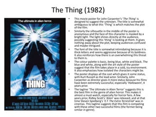
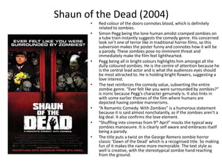
How to Make a Field invisible in Odoo 17Celine George
It is possible to hide or invisible some fields in odoo. Commonly using “invisible” attribute in the field definition to invisible the fields. This slide will show how to make a field invisible in odoo 17.
Instructions for Submissions thorugh G- Classroom.pptxJheel Barad
This presentation provides a briefing on how to upload submissions and documents in Google Classroom. It was prepared as part of an orientation for new Sainik School in-service teacher trainees. As a training officer, my goal is to ensure that you are comfortable and proficient with this essential tool for managing assignments and fostering student engagement.
A Strategic Approach: GenAI in EducationPeter Windle
Artificial Intelligence (AI) technologies such as Generative AI, Image Generators and Large Language Models have had a dramatic impact on teaching, learning and assessment over the past 18 months. The most immediate threat AI posed was to Academic Integrity with Higher Education Institutes (HEIs) focusing their efforts on combating the use of GenAI in assessment. Guidelines were developed for staff and students, policies put in place too. Innovative educators have forged paths in the use of Generative AI for teaching, learning and assessments leading to pockets of transformation springing up across HEIs, often with little or no top-down guidance, support or direction.
This Gasta posits a strategic approach to integrating AI into HEIs to prepare staff, students and the curriculum for an evolving world and workplace. We will highlight the advantages of working with these technologies beyond the realm of teaching, learning and assessment by considering prompt engineering skills, industry impact, curriculum changes, and the need for staff upskilling. In contrast, not engaging strategically with Generative AI poses risks, including falling behind peers, missed opportunities and failing to ensure our graduates remain employable. The rapid evolution of AI technologies necessitates a proactive and strategic approach if we are to remain relevant.
Model Attribute Check Company Auto PropertyCeline George
In Odoo, the multi-company feature allows you to manage multiple companies within a single Odoo database instance. Each company can have its own configurations while still sharing common resources such as products, customers, and suppliers.
Unit 8 - Information and Communication Technology (Paper I).pdfThiyagu K
This slides describes the basic concepts of ICT, basics of Email, Emerging Technology and Digital Initiatives in Education. This presentations aligns with the UGC Paper I syllabus.
Welcome to TechSoup New Member Orientation and Q&A (May 2024).pdfTechSoup
In this webinar you will learn how your organization can access TechSoup's wide variety of product discount and donation programs. From hardware to software, we'll give you a tour of the tools available to help your nonprofit with productivity, collaboration, financial management, donor tracking, security, and more.
Francesca Gottschalk - How can education support child empowerment.pptxEduSkills OECD
Francesca Gottschalk from the OECD’s Centre for Educational Research and Innovation presents at the Ask an Expert Webinar: How can education support child empowerment?
2. Mad Max: Fury Road (2015)
• This film poster for 2015’s ‘Mad Max: Fury Road’ depicts the post-
apocalyptic world in many ways. First of all, the lettering is somewhat
stained and looks dirty, a lot like the aesthetic of the film itself. The
words ‘Mad Max’ take up almost half of the poster and captures the
viewers attention immediately. It suggests aggression and also
illustrates how big the scale of the film will be. It is also indicative of it
being a blockbuster and its high budget.
Essentially, the ‘Fury Road’ part of the title is irrelevant (accentuated
by its small font size) because the poster is wanting audiences to
recognise that the film is a return to the classic movie franchise.
• The two main characters take up half the poster, depicting them as the
protagonists of the film. Their clothing helps define what kind of
characters they are – the world they live in is clearly not particularly
wealthy and it seems somewhat cruel, especially with the face guard
over Max (Tom Hardy). It also emphasises the post-apocalyptic genre
the film is.
• The colour palette is very stereotypical of film posters. It is
predominantly yellow and blue, with some black to emphasise the
titles. These colours are primarily used because their contrast is
pleasant to look at. It also hints at the beautiful cinematography this
film will have, with its bright colours. Being so vibrant also helps catch
audience’s eyes, which makes them see the poster.
• The tagline ‘The Future Belongs to the Mad’ is in scrawny font which is
almost intimidating. It encapsulates the notion that this place is in
desperation, madness and fear.
• The use of the director’s name, George Miller, is important because he
directed the earlier Mad Max films, some of which were extremely
popular and successful. With his return as director, those who
remember him and his films might be comforted to know he is back
directing. Similarly, Charlize Theron and especially Tom Hardy are well
known and successful actors, which might make fans of these actors
want to watch the film.
3. The Thing (1982)
• This movie poster for John Carpenter’s ‘The Thing’ is
designed to suggest the unknown. The title is somewhat
ambiguous to what this ‘Thing’ is which matches the plot
of the film.
• Similarly the silhouette in the middle of the poster is
anonymous and the face of this character is masked by a
bright light. The light shines directly at the audience,
possibly suggesting this ‘thing’ is looking at them. It gives
nothing away about the plot, keeping audiences confused
and maybe intrigued.
• The font of the title is somewhat intimidating because it is
thick letters and seems aggressive because of its boldness.
It also reinforces how there is an overwhelming this threat
to them is.
• The colour palette is basic, being blue, white and black. The
blue and white, along with the art style of the poster
suggest that the film takes place in a cold, icy environment.
It also emphasises how isolated the characters might be.
• The poster displays all the cast which gives it some status,
with Kurt Russell as the lead actor. Similarly, John
Carpenter as director gives it more status because his films
have been extremely successful, especially ‘Halloween’, 4
years prior.
• The tagline ‘The Ultimate in Alien Terror’ suggests this is
the best film in the genre of alien horror. This makes it
almost a must-watch, especially for horror fans. A few
years prior, Ridley Scott’s ‘Alien’ was released, and at that
time Steven Spielberg’s ‘E.T. The Extra Terrestrial’ was in
cinemas. This tagline suggests that this film is competing
with these other two successful films (the former being
similar in genre).
4. Toy Story 3 (2010)
• The colours of the poster are bright and not alarming,
despite the worried look on the characters’ faces. The
bright and multiple colours emphasise how this is a
children’s film and not to be something to fear necessarily.
These bright colours are also used to interest audiences. It
easily catches their eyes because of how vibrant it is.
• The poster establishes that the film takes place in a
nursery. This setting is of course a child friendly place.
Added to that, the toys are designed in a non-threatening
manner, to not frighten children. They also have
humanistic features to make them seem somewhat
relatable.
• The poster has all the familiar faces of the toys from ‘Toy
Story’ together. This makes the film appealing to those
who grew up with the franchise and children (who would
be attracted to toys). Additionally, all the characters all
blatantly have different personalities and this is easily
distinguished through this poster. The logo is also kept the
same from the previous couple of films.
• It boasts being ‘The breakout comedy of the summer’, not
necessarily a tagline but provides the film with some kind
of status and a must watch amidst all the summer
blockbusters. It also identifies that this isn’t a scary or
rude film, but just good entertainment for all the family.
• Disney obviously has a good reputation for successful
summer/ children blockbusters and it reinforces this
statement through stating some of its previous films such
as ‘Finding Nemo’ and ‘Up’.
• It has technological advances being available in 3D, which
might intrigue audiences to go and see it in a different
way (earning more money for the Disney/Pixar).
5. Titanic (1997)
• The bright colour scheme depicted on this poster are a reflection on
the central romance within the main narrative. Bright colours
suggest happiness and contentment. They are also there to attract
the attention of the viewer.
• The two main characters are placed at the top of the poster and
they take up about a third of the poster. This represents their
significance to the plot and makes them more noticeable They are
both young and attractive, which might make the film more
intriguing for teenage audiences. Their character design of the
poster also hints at their difference in class, yet this is irrelevant,
due to their strong connection.
• The front of the ship coming towards the viewer. This connotes the
magnificence of the ship and it emphasises its splendour. This fits in
with the theme of the poster and doesn’t focus at all of the horrific,
historical event.
• The black colour of the belly of the ship helps accentuate the white
and gold coloured text. This matches the colour scheme of the boat
but also connotes a majestic sense because gold and white are
typically associated with royalty. The text font of the title also
suggests the time period and it provokes a sense of elegance.
• James Cameron was already established in the film industry before
this point, which is why a few of his most notable films have been
cited on the poster such as ‘Aliens’, ‘T2’, and ‘True Lies’, all
recognisable, successful and respected films, which might give the
film some status among film buffs or audiences familiar with those
films.
• ‘Nothing on earth could come between them’ – their love
transcends that of any other worldly relationship. It also hints that
even such a disaster as this could not break their bond.
• The bow of the ship is centralised in the poster because that is
where the famous scene takes place, so it is already referring to
that.
6. Shaun of the Dead (2004)
• Red colour of the doors connotes blood, which is definitely
related to zombies.
• Simon Pegg being the lone human amidst cramped zombies on
a tube train instantly suggests the comedy genre. His concerned
look isn’t one of terror like in traditional horror films, so this
subversion makes the poster funny and connotes how it will be
a parody. These zombies pose no imminent threat and
immediately make the film feel lighthearted.
• Pegg being all in bright colours highlights him amongst all the
dully coloured zombies. He is the centre of attention because he
is the central lead actor and is what the audiences eyes should
be most attracted to. He is holding bright flowers, suggesting a
love interest.
• The text reinforces the comedy value, subverting the entire
zombie genre. “Ever felt like you were surrounded by zombies?”
is ironic because Pegg’s character genuinely is. It also links in
with some earlier themes of the film where humans are
depicted having zombie mannerisms.
• “A Romantic Comedy. With Zombies” is a humorous statement
because it is said almost nonchalantly, as if the zombies aren’t a
big deal. It also confirms the love element.
• “Shuffling into cinemas from 9th April” mocks the typical way
zombies manoeuvre. It is clearly self aware and embraces itself
being a parody.
• The title puts a twist on the George Romero zombie horror
classic ‘Dawn of the Dead’ which is a recognised title. So making
fun of it makes the name more memorable. The text style as
well is creative, with the stereotypical zombie hand reaching
from the ground.