My Evaluation


  By Edward Thompson
*
My magazine has many forms of conventions of a real media product. For example on my Front
cover it has a Bar Code. A Bar Code is seen on every magazine so by keeping so the codes and
conventions I have a Bar Code on my Front Cover.


Another typical Code and convention on a Magazine, when the main image on the front cover
Covers the Masthead. Here you Can see my main image cover my mast head ‘the lyric’. This is
typical for a magazine front cover to do this because it shows that there magazine creators
and not afraid to cover their Masthead. They no that people recognise there Masthead so well
they don’t need to show all of it.


One my Front cover I have challenged the codes and conventions with my Main image, My
main image is different to most. Most magazine has the main image looking at the camera
and sometimes doing a pose or position which is unique to the magazine. I have blacked out
the face of my Main image and put a question mark there. Saying ‘new band member
revealed’ so it’s a pug itself. Here I have done it my own way and tries something different,
challenging the codes and conventions of a usual media product.
*   On my contents page I have definitely challenged the
    codes and conventions of a normal magazine contents.
    For example the way I have done ‘Contents’ in the top
    left hand side of the page is completely different to
    other magazine contents and how they do it. They
    always use a recurring theme with the masthead. The
    contents page would look quite similar to the front
    page, as in the colour and style. I have used my own
    way and even thought it is similar in some aspects like
    the style and unique look about it, it looks different to
    my front cover.
* On my DPS I kept the same style and
 design as my Front cover. The same type
 of writing for example ‘the birth of a
 hero’ is the same style of writing as ‘blink
 184 new member’. Here I have kept the
 same writing style as my front cover and is
 very different to a usual magazine front
 cover and DPS.
 Kerrang magazine for example their style
 of writing is completely different from
 their front cover then their DPS


                                                Here you
                                                 can see
                                                   the
                                                 similar
                                                text font
                                                and style
*
Indie/Rock
The social groups I am trying to attract is the indie/rock world.
 Because these two groups are the most successful and popular in
 the media business I decided to do my magazine both indie and rock
 style.
These are some of the pictures I decided to use for my magazine.
 These are typical types of pictures a magazine would use to attract
 the younger generation because this is what appeals to them. This
 is what they call ‘Cool’
*
* It got my magazine influences from many magazines. I had a look at Q magazine for
 my contents and layout of my contents, all so the style of my magazine i used was
 from Q magazine. The style of the writing i used was similar to Q magazine and also
 the positioning of the pictures and the pugs and puffs .
 Because I wanted to keep my magazine quite unique and original i decided to take
 the ideas of Q
 and set it out how i wanted and how it looks best with my article and pugs and
 puffs.
  So the positioning of the photos and writing would be different to Qs Positioning and
 writing but
 i still used there ideas through out my work on my Blog.
* I think my style of magazine would suit Q magazine well and it
 would bring something different
 to the table. I think Q magazine is quiet similar to my magazine in
 many ways. The actual context
 and writing of the Magazine is very similar to Q magazine.
* Also my Mast head on my front cover is very similar to Kerrang
 magazine Masthead, as in
 in covers the whole of the top of the page. Its bigger and more
 attractive to the eye.
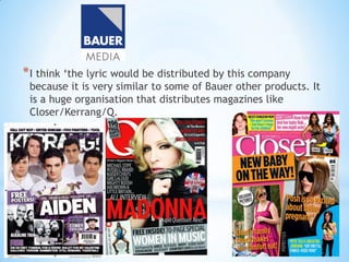
* I think ‘the lyric would be distributed by this company
 because it is very similar to some of Bauer other products. It
 is a huge organisation that distributes magazines like
 Closer/Kerrang/Q.
*
*   Before i constructed my magazine i did sufficient research on age and gender. I did a
    questionnaire to see what the audiences personal choices of age and gender would be. I found
    out that most of the results show that their magazine would be for the younger generation and to
    mix genders.
*   This is what i decided to do with my magazine, I choose to do my magazine for the younger
    generation between the ages of 15-25 as that is what most magazines aim at for, example
    Kerrang magazine/ NME. Both have the same target audience and that is at the younger adults/
    teenagers. I made my magazine in the same shadow.
*   The gender of my magazine is mixed. It has no set gender so i decided to make it with the
    intention that any person could read it. With the results of my Questionnaire i decided that i was
    going to follow the codes and conventions of Kerrang magazine and NME and have no set gender.
*   Kerrang magazine has a Niche market, the people there are aiming at are the people who like
    rock music, this is what i have done with my magazine but also applies for the indie type bands
    as well. Kerrang has no set gender, Women/Girl and Men/Boys can all read the magazine and
    they would enjoy, this is what i have tried to do with my magazine. I wanted the audience to
    believe that my magazine is for them even if they are a boy or a girl.
*
* My Front cover has many things that would attract an audience. The first thing the
 audience would see is the main picture. The main picture is of a mystery man. A
 blanked out face of a person with a questionnaire mark on their face. This makes the
 audience want to find out who this person is and makes them want to read more.
 That image of someone that they could find out in the magazine draws them in. It
 makes the audience want to read on and buy my magazine.
 Also my colours I have used on my Front cover. Because the front cover is the first
 thing the audience would see it is important that it attracts the person, with many
 colours pugs and puffs. The colours I have used on my front cover would pull the
 reader in, I used bright and eye catching colours on my front cover like this hard red
 colour and the bottom of my front cover.
* The language I have used in my Front cover Is to attract the audience. The word
 ‘REVEALED’ positioned right in the centre of my magazine draws the audience in.
 They want to no what is revealed and what this means. Also the words ‘what is the
 best band’. A rhetorical question again to draw the reader in. To get them to want to
 find out who the best band is.
* This is my masthead and is positioned across my front cover of my magazine. This
 much bigger than my original idea and I think more effect. Its more eye catching and
 the readers eye would be drawn straight to it. I used the name ‘the lyric’ because it
 explains within it self what type of magazine it would be. Lyrics are mostly
 associated with solo artists. This is the type of magazine I wanted to construct. A
 magazine for solo artists but also for bands. The name ‘the lyric’ is something
 different, and what Ive tried to do with the font and style of writing is make it look
 like it is a lyric its self. To make it look like it has been written down like someone is
 writing down lyrics. Handwriting and messy.
*
*   The software I used for my magazine is word 2007. Word allowed me to do substantial things on
    my magazine and allowed me to edit it in many ways.


*   This is the top bar on word which allows me to do what ever I want to my magazine. I used many
    effects and edit techniques including fade, crop and many more.
    I personally think that word was a great software to use for my magazine it was very fast and
    easy to use. You can have as many pages as you want and able to do what ever you want to those
    pages. Edit them in any way, shape or form.


*   There were some problems I had with word. In word it was difficult for me to take the image I
    have created and put it on my blog. For that I had to use paint. Paint allowed me to crop the
    photo and save it as a photo unlike word, which it saves the image as a document.


I also used paint.net, pain.net is a programme which lets me to edit whatever photo I like in
whatever way I would like. For example
* This Image here I did on paint.net. As you can see that the picture its blured and I
  also used an editing technique called oil painting.
  This effect makes the image look like a oil painting and with the blured effect the
  image comes out like this.
* I found BlogSpot very easy to use. For updating and adding new posts onto
 my BlogSpot it was very simple. As you can see here it is very simple. You
 type in the title you want to call your post and the information below it.


* I did have trouble adding word documents onto my BlogSpot so I found a
 new way to put the documents on. I would print screen a image of the
 document and save it as an image. This would let me put it on my Blog
 with no trouble at all.
*
* When I did my preliminary task I was limited to what software products I used for my
  magazine and low on ideas. My preliminary task I thought was an ok start to my magazine
  because it gave a lot of ideas and opened my eyes of the publishing world. It really helped
  me do my final magazine with the ideas I constructed. Doing the preliminary it really put
  in prospective what I had yet to do and what I needed to do to bring my magazine grade
  up.


                                                      This is my preliminary
                                                      task


As you can see its very basic, with the basic pugs and puffs and main image.
*   This is my final magazine front cover and personally I think it has much improved from my
    preliminary. What I have learnt is to know what the audience is looking for in a magazine. What
    is going to stop them from walking past your magazine and taking no notice. Most importantly
    what is going to make the audience want to buy your magazine.
*   With the big huge picture and a the Masthead covering the whole of the top of the page I think
    this is a good attempt.
*
*
    POSITIVES
    I think I have made a good magazine. It draws the audience in well and does
    its job. With the pugs and puffs I have used I think it would do its job of
    enticing people into buying it.
    I would say that my strengths are the main image. It is a dominant main
    image and very unique. It is different to most magazines and personally this
    is what I think that stands out from the crowd then any other magazine.
    I also believe that my DPS has much improved and is very effective, the
    design and layout is very well done and the pictures match the story line and
    fit very well.
NEGATIVES
*    a Weakness I would Say are the lack of pugs and puffs on the magazine. There needs
    to be more headlines and pugs and puffs to draw the reader in more.
    Also I think the Mast head is to plain and needs to stand out more. It needs to be
    more dominant and eye drawing. Most Mastheads on magazines are the first thing
    the audience sees when they look at the magazine. My Masthead has no colour and
    needs to be more eye drawing.
* There needs to be more action on the page, more stuff going on. So there are a lot
    of things that the reader could see. If its pugs puffs cover lines etc.

Edds Presentation

  • 1.
    My Evaluation By Edward Thompson
  • 2.
  • 3.
    My magazine hasmany forms of conventions of a real media product. For example on my Front cover it has a Bar Code. A Bar Code is seen on every magazine so by keeping so the codes and conventions I have a Bar Code on my Front Cover. Another typical Code and convention on a Magazine, when the main image on the front cover Covers the Masthead. Here you Can see my main image cover my mast head ‘the lyric’. This is typical for a magazine front cover to do this because it shows that there magazine creators and not afraid to cover their Masthead. They no that people recognise there Masthead so well they don’t need to show all of it. One my Front cover I have challenged the codes and conventions with my Main image, My main image is different to most. Most magazine has the main image looking at the camera and sometimes doing a pose or position which is unique to the magazine. I have blacked out the face of my Main image and put a question mark there. Saying ‘new band member revealed’ so it’s a pug itself. Here I have done it my own way and tries something different, challenging the codes and conventions of a usual media product.
  • 4.
    * On my contents page I have definitely challenged the codes and conventions of a normal magazine contents. For example the way I have done ‘Contents’ in the top left hand side of the page is completely different to other magazine contents and how they do it. They always use a recurring theme with the masthead. The contents page would look quite similar to the front page, as in the colour and style. I have used my own way and even thought it is similar in some aspects like the style and unique look about it, it looks different to my front cover.
  • 5.
    * On myDPS I kept the same style and design as my Front cover. The same type of writing for example ‘the birth of a hero’ is the same style of writing as ‘blink 184 new member’. Here I have kept the same writing style as my front cover and is very different to a usual magazine front cover and DPS. Kerrang magazine for example their style of writing is completely different from their front cover then their DPS Here you can see the similar text font and style
  • 6.
  • 7.
    Indie/Rock The social groupsI am trying to attract is the indie/rock world. Because these two groups are the most successful and popular in the media business I decided to do my magazine both indie and rock style. These are some of the pictures I decided to use for my magazine. These are typical types of pictures a magazine would use to attract the younger generation because this is what appeals to them. This is what they call ‘Cool’
  • 8.
  • 9.
    * It gotmy magazine influences from many magazines. I had a look at Q magazine for my contents and layout of my contents, all so the style of my magazine i used was from Q magazine. The style of the writing i used was similar to Q magazine and also the positioning of the pictures and the pugs and puffs . Because I wanted to keep my magazine quite unique and original i decided to take the ideas of Q and set it out how i wanted and how it looks best with my article and pugs and puffs. So the positioning of the photos and writing would be different to Qs Positioning and writing but i still used there ideas through out my work on my Blog.
  • 10.
    * I thinkmy style of magazine would suit Q magazine well and it would bring something different to the table. I think Q magazine is quiet similar to my magazine in many ways. The actual context and writing of the Magazine is very similar to Q magazine. * Also my Mast head on my front cover is very similar to Kerrang magazine Masthead, as in in covers the whole of the top of the page. Its bigger and more attractive to the eye.
  • 11.
    * I think‘the lyric would be distributed by this company because it is very similar to some of Bauer other products. It is a huge organisation that distributes magazines like Closer/Kerrang/Q.
  • 12.
  • 13.
    * Before i constructed my magazine i did sufficient research on age and gender. I did a questionnaire to see what the audiences personal choices of age and gender would be. I found out that most of the results show that their magazine would be for the younger generation and to mix genders. * This is what i decided to do with my magazine, I choose to do my magazine for the younger generation between the ages of 15-25 as that is what most magazines aim at for, example Kerrang magazine/ NME. Both have the same target audience and that is at the younger adults/ teenagers. I made my magazine in the same shadow. * The gender of my magazine is mixed. It has no set gender so i decided to make it with the intention that any person could read it. With the results of my Questionnaire i decided that i was going to follow the codes and conventions of Kerrang magazine and NME and have no set gender. * Kerrang magazine has a Niche market, the people there are aiming at are the people who like rock music, this is what i have done with my magazine but also applies for the indie type bands as well. Kerrang has no set gender, Women/Girl and Men/Boys can all read the magazine and they would enjoy, this is what i have tried to do with my magazine. I wanted the audience to believe that my magazine is for them even if they are a boy or a girl.
  • 14.
  • 15.
    * My Frontcover has many things that would attract an audience. The first thing the audience would see is the main picture. The main picture is of a mystery man. A blanked out face of a person with a questionnaire mark on their face. This makes the audience want to find out who this person is and makes them want to read more. That image of someone that they could find out in the magazine draws them in. It makes the audience want to read on and buy my magazine. Also my colours I have used on my Front cover. Because the front cover is the first thing the audience would see it is important that it attracts the person, with many colours pugs and puffs. The colours I have used on my front cover would pull the reader in, I used bright and eye catching colours on my front cover like this hard red colour and the bottom of my front cover. * The language I have used in my Front cover Is to attract the audience. The word ‘REVEALED’ positioned right in the centre of my magazine draws the audience in. They want to no what is revealed and what this means. Also the words ‘what is the best band’. A rhetorical question again to draw the reader in. To get them to want to find out who the best band is.
  • 16.
    * This ismy masthead and is positioned across my front cover of my magazine. This much bigger than my original idea and I think more effect. Its more eye catching and the readers eye would be drawn straight to it. I used the name ‘the lyric’ because it explains within it self what type of magazine it would be. Lyrics are mostly associated with solo artists. This is the type of magazine I wanted to construct. A magazine for solo artists but also for bands. The name ‘the lyric’ is something different, and what Ive tried to do with the font and style of writing is make it look like it is a lyric its self. To make it look like it has been written down like someone is writing down lyrics. Handwriting and messy.
  • 17.
  • 18.
    * The software I used for my magazine is word 2007. Word allowed me to do substantial things on my magazine and allowed me to edit it in many ways. * This is the top bar on word which allows me to do what ever I want to my magazine. I used many effects and edit techniques including fade, crop and many more. I personally think that word was a great software to use for my magazine it was very fast and easy to use. You can have as many pages as you want and able to do what ever you want to those pages. Edit them in any way, shape or form. * There were some problems I had with word. In word it was difficult for me to take the image I have created and put it on my blog. For that I had to use paint. Paint allowed me to crop the photo and save it as a photo unlike word, which it saves the image as a document. I also used paint.net, pain.net is a programme which lets me to edit whatever photo I like in whatever way I would like. For example
  • 19.
    * This Imagehere I did on paint.net. As you can see that the picture its blured and I also used an editing technique called oil painting. This effect makes the image look like a oil painting and with the blured effect the image comes out like this.
  • 20.
    * I foundBlogSpot very easy to use. For updating and adding new posts onto my BlogSpot it was very simple. As you can see here it is very simple. You type in the title you want to call your post and the information below it. * I did have trouble adding word documents onto my BlogSpot so I found a new way to put the documents on. I would print screen a image of the document and save it as an image. This would let me put it on my Blog with no trouble at all.
  • 21.
  • 22.
    * When Idid my preliminary task I was limited to what software products I used for my magazine and low on ideas. My preliminary task I thought was an ok start to my magazine because it gave a lot of ideas and opened my eyes of the publishing world. It really helped me do my final magazine with the ideas I constructed. Doing the preliminary it really put in prospective what I had yet to do and what I needed to do to bring my magazine grade up. This is my preliminary task As you can see its very basic, with the basic pugs and puffs and main image.
  • 23.
    * This is my final magazine front cover and personally I think it has much improved from my preliminary. What I have learnt is to know what the audience is looking for in a magazine. What is going to stop them from walking past your magazine and taking no notice. Most importantly what is going to make the audience want to buy your magazine. * With the big huge picture and a the Masthead covering the whole of the top of the page I think this is a good attempt.
  • 24.
  • 25.
    * POSITIVES I think I have made a good magazine. It draws the audience in well and does its job. With the pugs and puffs I have used I think it would do its job of enticing people into buying it. I would say that my strengths are the main image. It is a dominant main image and very unique. It is different to most magazines and personally this is what I think that stands out from the crowd then any other magazine. I also believe that my DPS has much improved and is very effective, the design and layout is very well done and the pictures match the story line and fit very well.
  • 26.
    NEGATIVES * a Weakness I would Say are the lack of pugs and puffs on the magazine. There needs to be more headlines and pugs and puffs to draw the reader in more. Also I think the Mast head is to plain and needs to stand out more. It needs to be more dominant and eye drawing. Most Mastheads on magazines are the first thing the audience sees when they look at the magazine. My Masthead has no colour and needs to be more eye drawing. * There needs to be more action on the page, more stuff going on. So there are a lot of things that the reader could see. If its pugs puffs cover lines etc.