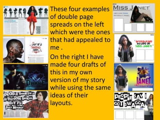
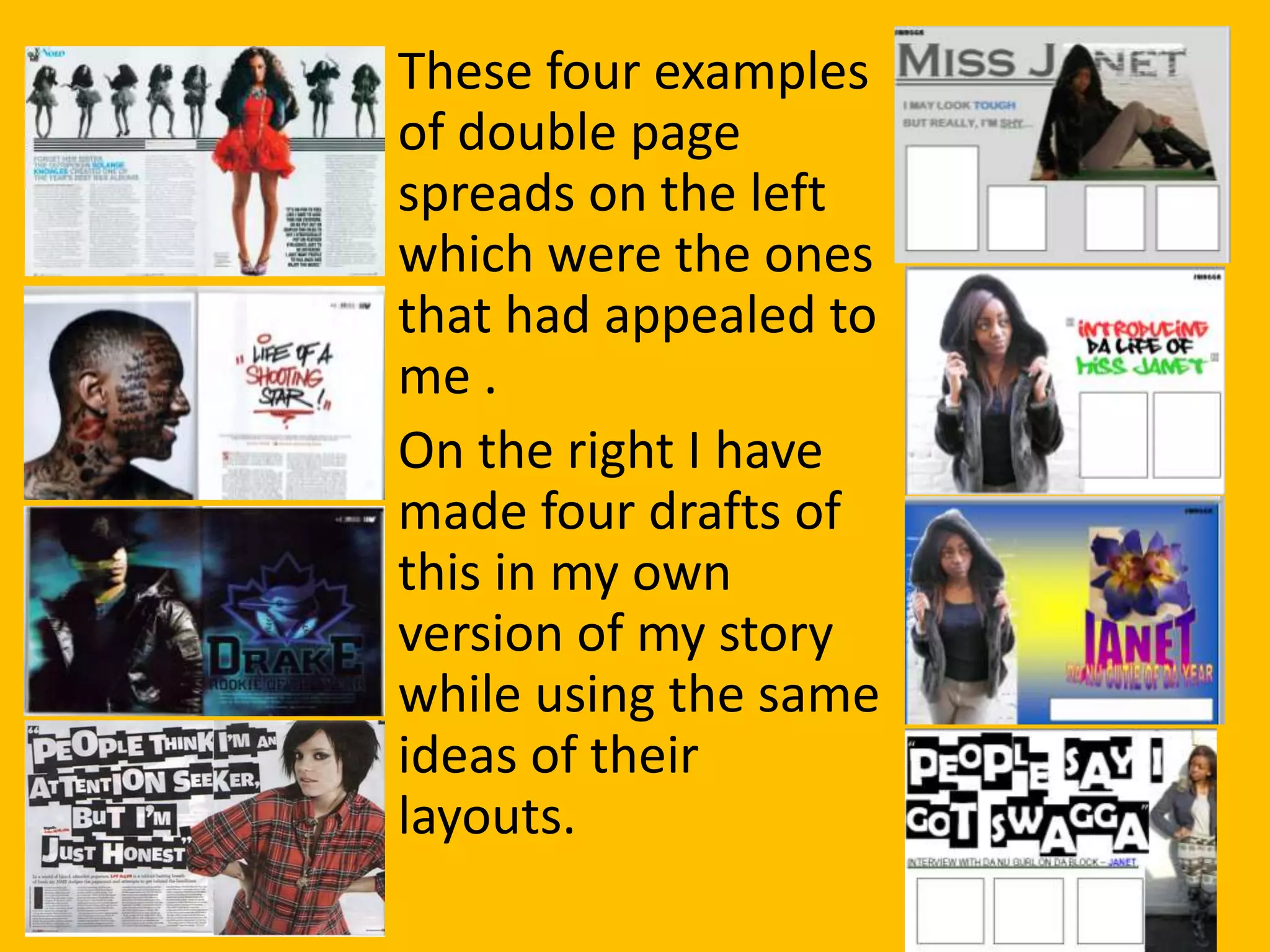
The document describes the process of creating a double page spread for a magazine. It discusses upgrading the last draft to be more unique by cutting up the title into single letters. The author positions the title at the top and leaves space for a light image on the right side. Referring back to the front cover colors, a dark background is used to contrast with the light image, and a purple shadow is added to give a 3D effect rather than a flat look. Guidelines are followed to thoughtfully position text boxes across the double page spread.


![Evaluation of magazine[1]](https://cdn.slidesharecdn.com/ss_thumbnails/evaluationofmagazine1-110506112917-phpapp02-thumbnail.jpg?width=640&height=640&fit=bounds)


