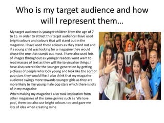
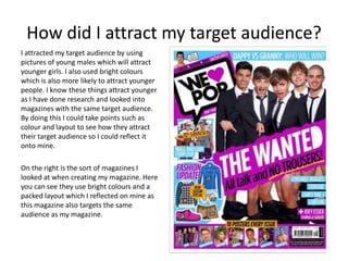
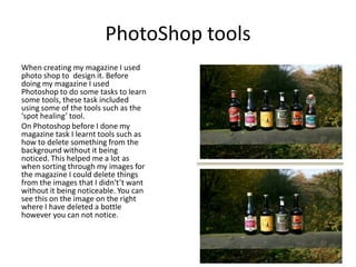
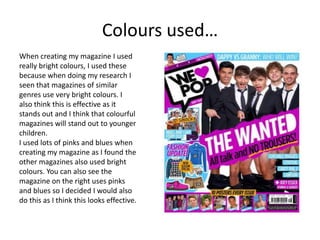
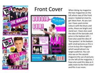
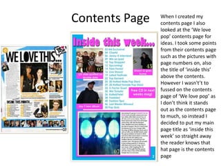
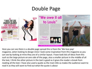
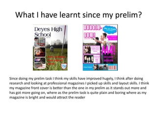
My Media Evaluation
Who is my target audience and how
will I represent them…
My target audience is younger children from the age of 7
to 15. in order to attract this target audience I have used
bright colours and colours that will stand out in the
magazine. I have used these colours as they stand out and
if a young child was looking for a magazine they would
chose the one that stands out most. I have also used lots
of images throughout as younger readers wont want to
read masses of text as they will like to visualise things. I
have also catered for the younger generation by getting
pictures of people who look young and look like the sort of
pop stars they would like. I also think that my magazine
audience swings more towards younger girls as they are
more likely to like young male pop stars which there is lots
of in my magazine
When making my magazine I also took inspiration from
other magazines of the same genres such as ‘We love
pop’, them too also use bright colours too and gave me
lots of idea when creating mine
How did I attract my target audience?
I attracted my target audience by using
pictures of young males which will attract
younger girls. I also used bright colours
which is also more likely to attract younger
people. I know these things attract younger
as I have done research and looked into
magazines with the same target audience.
By doing this I could take points such as
colour and layout to see how they attract
their target audience so I could reflect it
onto mine.
On the right is the sort of magazines I
looked at when creating my magazine. Here
you can see they use bright colours and a
packed layout which I reflected on mine as
this magazine also targets the same
audience as my magazine.
PhotoShop tools
When creating my magazine I used
photo shop to design it. Before
doing my magazine I used
Photoshop to do some tasks to learn
some tools, these task included
using some of the tools such as the
‘spot healing’ tool.
On Photoshop before I done my
magazine task I learnt tools such as
how to delete something from the
background without it being
noticed. This helped me a lot as
when sorting through my images for
the magazine I could delete things
from the images that I didn't’t want
without it being noticeable. You can
see this on the image on the right
where I have deleted a bottle
however you can not notice.
Colours used…
When creating my magazine I used
really bright colours, I used these
because when doing my research I
seen that magazines of similar
genres use very bright colours. I
also think this is effective as it
stands out and I think that colourful
magazines will stand out to younger
children.
I used lots of pinks and blues when
creating my magazine as I found the
other magazines also used bright
colours. You can also see the
magazine on the right uses pinks
and blues so I decided I would also
do this as I think this looks effective.
Front Cover When doing my magazine
the two magazines on the
left where two of the front
covers I looked at most to
get ideas from. As you can
see I have used similar
colours with the blues and
pinks, these are bright and
stand out. I have also used
the idea of the barcode and
price in the bottom left. I
have also used the idea of
‘free posters’ at the bottom
with small pictures as this is
a lure to buy the magazine
which would attract my
target audience. You can
also see on the second
magazine the use of pictures
on the left of the magazine, I
have also used this idea as it
adds more to the front cover
and fills it out more.
Contents Page When I created my
contents page I also
looked at the ‘We love
pop’ contents page for
ideas. I took some points
from their contents page
such as the pictures with
page numbers on, also
the title of ‘inside this’
above the contents.
However I wasn't’t to
fussed on the contents
page of ‘We love pop’ as
I don’t think it stands
out as the contents page
to much, so instead I
decided to put my main
page title as ‘inside this
week’ so straight away
the reader knows that
hat page is the contents
page
Double Page
Here you can see there is a double page spread this is from the ‘We love pop’
magazine, when looking to design mine I took some inspiration from this magazine as you
can see by looking at mine they are of a similar layout. I have took lots of ideas from this
such as the large picture on one side of the page, also a smaller picture in the middle of all
the text, I think the other picture in the text is good as it gives the reader a break from
reading all the text. I have also used a quote as the main title as makes the audience want to
read it as they will want to find out what the quote is about
What kind of media institution might distribute
your media product and why?
I think the type of institution that would sell
my magazine is a company called Seymour.
This company also distribute the ‘We love
pop’ magazine which is a similar type and
genre to my magazine. I think this company
would also distribute my magazine as it has
had big success with ‘We love pop’ so I think
they could also have success with my
magazine. I don’t think IPC which are the
UK’s leading distributer would be
appropriate to my magazine as they tend to
distribute different genres such as NME and
not Bubblegum pop.
How does your product represent a
particular social group?
My magazine represents the social group
of younger people who are in to pop
music. Although my target audience is
both boys and girls I think it edges
towards girls a bit as they would be more
interested in male pop stars which i have
used frequently through out my magazine.
So overall I think my magazine represents
a social group of young female school girls
aged 7-15 who would be interested in
young male pop stars and bright colours. I
also think my magazine would stand out
more to that social group as it uses blues
and pinks which are bright that will attract
young children and again probably attract
more girls than boys as boys will often not
be attracted to the pink.
What have you learnt about technologies from
the process of constructing this product?
From creating this product I have learnt very much
about Photoshop. I found the Photoshop software
very good, it provided all the tools I needed such as
tools to edit photos to make them brighter or darker
or crop things out. I think this software was also
excellent as it allowed me to do lots of things that
Microsoft Publisher would not allow such as changing
image contrast and brightness. Also tools such as the
‘spot healing tool’ that allows you to remove things
from a picture such as spots or cuts on peoples faces
or things in the background. Overall I found Photoshop
cs5 a great program and from doing this task I would
feel confident using this software again in the future.
I also learnt a lot about cameras and realised that
different cameras are better for taking pictures than
others.
If it wasn’t for Photoshop I don’t think that my
magazine would look as effective as it allowed me to
edit photos to levels that are unnoticeable although it
did take lots of time doing it.
Looking back at your prelim task what do you feel you
have learnt in the progression from it to a full product?
After looking back at my prelim task I think I have
come a log way. I think my prelim task was vital to do
as it really helped me pick up tools on photo shop that
I could use when creating my real magazine. However
after looking back at the prelim task I realise how
much progress I have made, I also now feel confident
making the music magazines where as at first I didn’t
so I think my skills have really improved.
I also think I have improved with the technology after
doing my prelim task as I used publisher to create my
prelim and used photo shop just for the photos
however after doing my prelim I felt confident I could
use Photoshop to create my music mag. I also think my
skills have got better as on my prelim you may be able
to notice where I have edited photos using Photoshop
however now on my music magazine it is extremely
difficult to know.
What I have learnt since my prelim?
Since doing my prelim task I think my skills have improved hugely, I think after doing
research and looking at professional magazines I picked up skills and layout skills. I think
my magazine front cover is better than the one in my prelim as it stands out more and
has got more going on, where as the prelim task is quite plain and boring where as my
magazine is bright and would attract the reader

Evaluation

  • 1.
  • 2.
    Who is mytarget audience and how will I represent them… My target audience is younger children from the age of 7 to 15. in order to attract this target audience I have used bright colours and colours that will stand out in the magazine. I have used these colours as they stand out and if a young child was looking for a magazine they would chose the one that stands out most. I have also used lots of images throughout as younger readers wont want to read masses of text as they will like to visualise things. I have also catered for the younger generation by getting pictures of people who look young and look like the sort of pop stars they would like. I also think that my magazine audience swings more towards younger girls as they are more likely to like young male pop stars which there is lots of in my magazine When making my magazine I also took inspiration from other magazines of the same genres such as ‘We love pop’, them too also use bright colours too and gave me lots of idea when creating mine
  • 3.
    How did Iattract my target audience? I attracted my target audience by using pictures of young males which will attract younger girls. I also used bright colours which is also more likely to attract younger people. I know these things attract younger as I have done research and looked into magazines with the same target audience. By doing this I could take points such as colour and layout to see how they attract their target audience so I could reflect it onto mine. On the right is the sort of magazines I looked at when creating my magazine. Here you can see they use bright colours and a packed layout which I reflected on mine as this magazine also targets the same audience as my magazine.
  • 4.
    PhotoShop tools When creatingmy magazine I used photo shop to design it. Before doing my magazine I used Photoshop to do some tasks to learn some tools, these task included using some of the tools such as the ‘spot healing’ tool. On Photoshop before I done my magazine task I learnt tools such as how to delete something from the background without it being noticed. This helped me a lot as when sorting through my images for the magazine I could delete things from the images that I didn't’t want without it being noticeable. You can see this on the image on the right where I have deleted a bottle however you can not notice.
  • 5.
    Colours used… When creatingmy magazine I used really bright colours, I used these because when doing my research I seen that magazines of similar genres use very bright colours. I also think this is effective as it stands out and I think that colourful magazines will stand out to younger children. I used lots of pinks and blues when creating my magazine as I found the other magazines also used bright colours. You can also see the magazine on the right uses pinks and blues so I decided I would also do this as I think this looks effective.
  • 6.
    Front Cover Whendoing my magazine the two magazines on the left where two of the front covers I looked at most to get ideas from. As you can see I have used similar colours with the blues and pinks, these are bright and stand out. I have also used the idea of the barcode and price in the bottom left. I have also used the idea of ‘free posters’ at the bottom with small pictures as this is a lure to buy the magazine which would attract my target audience. You can also see on the second magazine the use of pictures on the left of the magazine, I have also used this idea as it adds more to the front cover and fills it out more.
  • 7.
    Contents Page WhenI created my contents page I also looked at the ‘We love pop’ contents page for ideas. I took some points from their contents page such as the pictures with page numbers on, also the title of ‘inside this’ above the contents. However I wasn't’t to fussed on the contents page of ‘We love pop’ as I don’t think it stands out as the contents page to much, so instead I decided to put my main page title as ‘inside this week’ so straight away the reader knows that hat page is the contents page
  • 8.
    Double Page Here youcan see there is a double page spread this is from the ‘We love pop’ magazine, when looking to design mine I took some inspiration from this magazine as you can see by looking at mine they are of a similar layout. I have took lots of ideas from this such as the large picture on one side of the page, also a smaller picture in the middle of all the text, I think the other picture in the text is good as it gives the reader a break from reading all the text. I have also used a quote as the main title as makes the audience want to read it as they will want to find out what the quote is about
  • 9.
    What kind ofmedia institution might distribute your media product and why? I think the type of institution that would sell my magazine is a company called Seymour. This company also distribute the ‘We love pop’ magazine which is a similar type and genre to my magazine. I think this company would also distribute my magazine as it has had big success with ‘We love pop’ so I think they could also have success with my magazine. I don’t think IPC which are the UK’s leading distributer would be appropriate to my magazine as they tend to distribute different genres such as NME and not Bubblegum pop.
  • 10.
    How does yourproduct represent a particular social group? My magazine represents the social group of younger people who are in to pop music. Although my target audience is both boys and girls I think it edges towards girls a bit as they would be more interested in male pop stars which i have used frequently through out my magazine. So overall I think my magazine represents a social group of young female school girls aged 7-15 who would be interested in young male pop stars and bright colours. I also think my magazine would stand out more to that social group as it uses blues and pinks which are bright that will attract young children and again probably attract more girls than boys as boys will often not be attracted to the pink.
  • 11.
    What have youlearnt about technologies from the process of constructing this product? From creating this product I have learnt very much about Photoshop. I found the Photoshop software very good, it provided all the tools I needed such as tools to edit photos to make them brighter or darker or crop things out. I think this software was also excellent as it allowed me to do lots of things that Microsoft Publisher would not allow such as changing image contrast and brightness. Also tools such as the ‘spot healing tool’ that allows you to remove things from a picture such as spots or cuts on peoples faces or things in the background. Overall I found Photoshop cs5 a great program and from doing this task I would feel confident using this software again in the future. I also learnt a lot about cameras and realised that different cameras are better for taking pictures than others. If it wasn’t for Photoshop I don’t think that my magazine would look as effective as it allowed me to edit photos to levels that are unnoticeable although it did take lots of time doing it.
  • 12.
    Looking back atyour prelim task what do you feel you have learnt in the progression from it to a full product? After looking back at my prelim task I think I have come a log way. I think my prelim task was vital to do as it really helped me pick up tools on photo shop that I could use when creating my real magazine. However after looking back at the prelim task I realise how much progress I have made, I also now feel confident making the music magazines where as at first I didn’t so I think my skills have really improved. I also think I have improved with the technology after doing my prelim task as I used publisher to create my prelim and used photo shop just for the photos however after doing my prelim I felt confident I could use Photoshop to create my music mag. I also think my skills have got better as on my prelim you may be able to notice where I have edited photos using Photoshop however now on my music magazine it is extremely difficult to know.
  • 13.
    What I havelearnt since my prelim? Since doing my prelim task I think my skills have improved hugely, I think after doing research and looking at professional magazines I picked up skills and layout skills. I think my magazine front cover is better than the one in my prelim as it stands out more and has got more going on, where as the prelim task is quite plain and boring where as my magazine is bright and would attract the reader