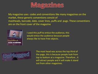
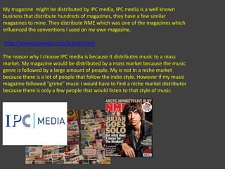
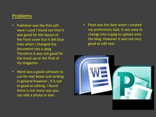
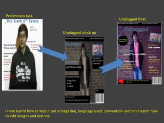
Media EvaluationJames Smith
In what ways does your media product use, develop or challenge form and conventions of a real media product?
MagazinesMy magazine uses  codes and conventions like many magazines on the market, these generic conventions consist of mastheads, barcode, date, cover lines, puffs and  pugs. These conventions are on the front cover of the magazine.I used this puff to entice the audience, this would entice the audience because people always like to have Free objects.The mast head was across the top third of the page, this is because people look from top to bottom at a magazine. Therefore , it will attract people and it will make it stand out from other magazines.
A barcode is used in all magazines on sale, I used this to show that the magazine is on sale and it shows how I used the conventions to show that I create a magazine.I used cover lines , with superlatives to attract the audience but to show them what is inside my magazine.Within my magazine I also challenged some conventions , an example of this is a photo on my contents. The photo shows the artist not looking towards the camera this gives the artist an attitude that he doesn’t care about being in the main article
When creating my magazine I had influences which helped me to target my target audience, my genre of magazine was targeted at rock and indie music therefore my influences was similar magazines. The magazines were NME and Kerrang, they had similar conventions so I chose some of the conventions and layouts as these magazines. By doing this it would allow me to attract the same target audience.  Also Q magazine influenced my contents page, the reason for this is because Q magazine uses a formal layout so it is easy to see what pages it is for different articles. Whereas NME is usual informal but I thought that the Q contents page style suited my magazine better.http://www.nme.com/http://www.kerrang.com/http://jamessmith93media.blogspot.com/2011/01/research-into-similar-magazines.htmlOn my blog i discussed what influences I used.
How does your media product represent particular social groups?
The social groups represented in my magazine are similar to the ones in NME magazine. These social groups are “indie” groups of people. This group is usual dominated with males, as they always seem to be rebellious side to the music genre. It also similar with rock music and rock people. Which is also dominated with males. However there are some women which make music in this genre so there are some woman featured in my magazine.  NME appeal to teenagers and early 20 year old, they use the conventions and the music genre to attract these people, this is why my target audience is similar because NME influenced the work I created. They also have similar social groups that they target, they target the music genre and style of indie , this style attracts the people who listen to indie music which is what I tried to do.
My magazine also fits in the stereotype of men being more dominant and women being passive, even though this is not the case in society. The reason I have done this because other brands of magazines with similar social groups have men being dominant because there is a lot more men who are in bands in this genre.The indie and rock genre usually stereotypes young teenagers as binge drinkers because this is how famous bands act and are known for in this genre of music.
What kind of media institution might distribute your media product and why?
My magazine  might be distributed by IPC media, IPC media is a well known business that distribute hundreds of magazines, they have a few similar magazines to mine. They distribute NME which was one of the magazines which influenced the conventions I used on my own magazine. http://www.ipcmedia.com/brands/nmeThe reason why I choose IPC media is because it distributes music to a mass market. My magazine would be distributed by a mass market because the music genre is followed by a large amount of people. My is not In a niche market because there is a lot of people that follow the indie style. However if my music magazine followed “grime” music I would have to find a niche market distributor because there is only a few people that would listen to that style of music.
Who would be the audience for your media product?
My magazine will be targeted towards teenagers, from 13-21 years old .
Both males and females are also my target audience of the magazine. However, males dominate the magazine because there are more males then females, this is because there is more male artists on the front cover of similar magazines.The reason I choose this target audience because my questionnaire gave me the data of what ages and gender would read my magazine. Also, it is similar to NME which has the same target audience to age and gender.
NME and Kerrang both appeal to the “rock and roll” life style, this is what I wanted to accomplish with my magazine. They have similar conventions and they was my influence on creating my own magazine therefore I have the same themes. This meant I would have a similar target audience to NME and Kerrang magazines.NME appeal to teenagers and early 20 year old, they use the conventions and the music genre to attract these people, this is why my target audience is similar because NME influenced the work I created.Q magazine attracts to the people in there twenties because there articles and styles in their magazines are more formal, I used this style in my contents page because I thought it would fit better than an informal style like NME or Kerrang.
How did you attract/address your audience?
I changed my colour scheme of my front cover page because I noticed that the magazines like NME and Kerrang had really bright colours. So I changed the colours from dull to bright colours so I  would be able to attract the audience with the colours o my front cover. Also my feedback from my draft said that the magazine looked dull and boring.
From the feedback of the draft I also needed to change the positioning of the masthead , the reason I change this is because it didn’t stand out on the page therefore, I place it in a central position and made it larger
I placed an exclusive in the centre of the front cover which would of attracted the audience because people always to see articles that have never been seen or done by another magazine.I kept the same main image because it fitted with the convention of the magazine also , I thought that It addressed the audience because the model John was looking into the camera which look like the artist is addressing you when looking at the magazine.
The language I used was informal , the reason I chose this style of writing because of the target audience. People of 13-21 don’t wan to read formal articles and this is my target audience therefore, I chose a informal writing style. Another influence was NME and Kerrang they both have informal language and I wanted to create a similar magazine.More central mast head, stands out moreMore colour in comparison from mock up to finalLess box’sSame images used
The images I used at the beginning was okay some of them I used in the mock up as well as the final product however, I realised there wasn’t much diversity so I took more photos so I could incorporate more bands and articles in my cover lines and contents pages.I also got the models on my front cover and double page spread to act if they didn’t care about being on the front cover on the magazine , I done this because many other magazines do a similar photos, these types of images go with the style of music the magazine is about. This means the target audience would be able to relate and recognise the music in the magazine.
What have you learnt about technologies form the process of constructing the product?
To create my magazine I used a range of different types of software, they all had advantages and disadvantages.
ProblemsPublisher was the first soft ware I used I found out that it was good for the layout of the front cover but it left blue lines when I changed the document into a Jpeg. Therefore it was not good for the mock up or the final of my magazine.
Word was a good software to use for text boxes and writing in general however , it is not to good at editing. I found there is not many was you can edit a photo or text.
Paint was the best when I created my preliminary task, it was easy to change into a jpeg to upload onto the blog. However it was not very good at edit text.Paint.net was even better than paint, it was the software I used to edit my images and the text. It allowed me to change and edit almost as good as Photoshop.
Photoshop was by far the best software to edit my pictures, text and layout of my magazine however, it was to complicated for me to use. I couldn’t understand how to use it so I stuck to paint and paint.net.I thought that blogger was a really good way to present my work. It prevents any work from being lost or damaged in folders and it is easy to use once you understand how to use it. The only problem I had with blogger is that it does not upload anything off a word processor , instead I had to do the work in a word processor , open a paint , print screen , crop and save and then finally upload. It is a long winded way to upload your work but it becomes okay once you know how to upload your work.Overall I found that blogger was the best way to present my work, it allowed me to show all my work without any sheet being lost or damaged. It also allowed me to understand another way of using media software. It was a good experience and it was easy to use.
Looking back to your preliminary task, what do you feel that you have learnt in the progression from it to the full product?
Preliminary taskUnplugged finalUnplugged mock upI have learnt how to layout out a magazine, language used, convention used and learnt how to edit images and text etc.

Media presentation

  • 1.
  • 2.
    In what waysdoes your media product use, develop or challenge form and conventions of a real media product?
  • 3.
    MagazinesMy magazine uses codes and conventions like many magazines on the market, these generic conventions consist of mastheads, barcode, date, cover lines, puffs and pugs. These conventions are on the front cover of the magazine.I used this puff to entice the audience, this would entice the audience because people always like to have Free objects.The mast head was across the top third of the page, this is because people look from top to bottom at a magazine. Therefore , it will attract people and it will make it stand out from other magazines.
  • 4.
    A barcode isused in all magazines on sale, I used this to show that the magazine is on sale and it shows how I used the conventions to show that I create a magazine.I used cover lines , with superlatives to attract the audience but to show them what is inside my magazine.Within my magazine I also challenged some conventions , an example of this is a photo on my contents. The photo shows the artist not looking towards the camera this gives the artist an attitude that he doesn’t care about being in the main article
  • 5.
    When creating mymagazine I had influences which helped me to target my target audience, my genre of magazine was targeted at rock and indie music therefore my influences was similar magazines. The magazines were NME and Kerrang, they had similar conventions so I chose some of the conventions and layouts as these magazines. By doing this it would allow me to attract the same target audience. Also Q magazine influenced my contents page, the reason for this is because Q magazine uses a formal layout so it is easy to see what pages it is for different articles. Whereas NME is usual informal but I thought that the Q contents page style suited my magazine better.http://www.nme.com/http://www.kerrang.com/http://jamessmith93media.blogspot.com/2011/01/research-into-similar-magazines.htmlOn my blog i discussed what influences I used.
  • 6.
    How does yourmedia product represent particular social groups?
  • 7.
    The social groupsrepresented in my magazine are similar to the ones in NME magazine. These social groups are “indie” groups of people. This group is usual dominated with males, as they always seem to be rebellious side to the music genre. It also similar with rock music and rock people. Which is also dominated with males. However there are some women which make music in this genre so there are some woman featured in my magazine. NME appeal to teenagers and early 20 year old, they use the conventions and the music genre to attract these people, this is why my target audience is similar because NME influenced the work I created. They also have similar social groups that they target, they target the music genre and style of indie , this style attracts the people who listen to indie music which is what I tried to do.
  • 8.
    My magazine alsofits in the stereotype of men being more dominant and women being passive, even though this is not the case in society. The reason I have done this because other brands of magazines with similar social groups have men being dominant because there is a lot more men who are in bands in this genre.The indie and rock genre usually stereotypes young teenagers as binge drinkers because this is how famous bands act and are known for in this genre of music.
  • 9.
    What kind ofmedia institution might distribute your media product and why?
  • 10.
    My magazine might be distributed by IPC media, IPC media is a well known business that distribute hundreds of magazines, they have a few similar magazines to mine. They distribute NME which was one of the magazines which influenced the conventions I used on my own magazine. http://www.ipcmedia.com/brands/nmeThe reason why I choose IPC media is because it distributes music to a mass market. My magazine would be distributed by a mass market because the music genre is followed by a large amount of people. My is not In a niche market because there is a lot of people that follow the indie style. However if my music magazine followed “grime” music I would have to find a niche market distributor because there is only a few people that would listen to that style of music.
  • 11.
    Who would bethe audience for your media product?
  • 12.
    My magazine willbe targeted towards teenagers, from 13-21 years old .
  • 13.
    Both males andfemales are also my target audience of the magazine. However, males dominate the magazine because there are more males then females, this is because there is more male artists on the front cover of similar magazines.The reason I choose this target audience because my questionnaire gave me the data of what ages and gender would read my magazine. Also, it is similar to NME which has the same target audience to age and gender.
  • 14.
    NME and Kerrangboth appeal to the “rock and roll” life style, this is what I wanted to accomplish with my magazine. They have similar conventions and they was my influence on creating my own magazine therefore I have the same themes. This meant I would have a similar target audience to NME and Kerrang magazines.NME appeal to teenagers and early 20 year old, they use the conventions and the music genre to attract these people, this is why my target audience is similar because NME influenced the work I created.Q magazine attracts to the people in there twenties because there articles and styles in their magazines are more formal, I used this style in my contents page because I thought it would fit better than an informal style like NME or Kerrang.
  • 15.
    How did youattract/address your audience?
  • 16.
    I changed mycolour scheme of my front cover page because I noticed that the magazines like NME and Kerrang had really bright colours. So I changed the colours from dull to bright colours so I would be able to attract the audience with the colours o my front cover. Also my feedback from my draft said that the magazine looked dull and boring.
  • 17.
    From the feedbackof the draft I also needed to change the positioning of the masthead , the reason I change this is because it didn’t stand out on the page therefore, I place it in a central position and made it larger
  • 18.
    I placed anexclusive in the centre of the front cover which would of attracted the audience because people always to see articles that have never been seen or done by another magazine.I kept the same main image because it fitted with the convention of the magazine also , I thought that It addressed the audience because the model John was looking into the camera which look like the artist is addressing you when looking at the magazine.
  • 19.
    The language Iused was informal , the reason I chose this style of writing because of the target audience. People of 13-21 don’t wan to read formal articles and this is my target audience therefore, I chose a informal writing style. Another influence was NME and Kerrang they both have informal language and I wanted to create a similar magazine.More central mast head, stands out moreMore colour in comparison from mock up to finalLess box’sSame images used
  • 20.
    The images Iused at the beginning was okay some of them I used in the mock up as well as the final product however, I realised there wasn’t much diversity so I took more photos so I could incorporate more bands and articles in my cover lines and contents pages.I also got the models on my front cover and double page spread to act if they didn’t care about being on the front cover on the magazine , I done this because many other magazines do a similar photos, these types of images go with the style of music the magazine is about. This means the target audience would be able to relate and recognise the music in the magazine.
  • 21.
    What have youlearnt about technologies form the process of constructing the product?
  • 22.
    To create mymagazine I used a range of different types of software, they all had advantages and disadvantages.
  • 23.
    ProblemsPublisher was thefirst soft ware I used I found out that it was good for the layout of the front cover but it left blue lines when I changed the document into a Jpeg. Therefore it was not good for the mock up or the final of my magazine.
  • 24.
    Word was agood software to use for text boxes and writing in general however , it is not to good at editing. I found there is not many was you can edit a photo or text.
  • 25.
    Paint was thebest when I created my preliminary task, it was easy to change into a jpeg to upload onto the blog. However it was not very good at edit text.Paint.net was even better than paint, it was the software I used to edit my images and the text. It allowed me to change and edit almost as good as Photoshop.
  • 26.
    Photoshop was byfar the best software to edit my pictures, text and layout of my magazine however, it was to complicated for me to use. I couldn’t understand how to use it so I stuck to paint and paint.net.I thought that blogger was a really good way to present my work. It prevents any work from being lost or damaged in folders and it is easy to use once you understand how to use it. The only problem I had with blogger is that it does not upload anything off a word processor , instead I had to do the work in a word processor , open a paint , print screen , crop and save and then finally upload. It is a long winded way to upload your work but it becomes okay once you know how to upload your work.Overall I found that blogger was the best way to present my work, it allowed me to show all my work without any sheet being lost or damaged. It also allowed me to understand another way of using media software. It was a good experience and it was easy to use.
  • 27.
    Looking back toyour preliminary task, what do you feel that you have learnt in the progression from it to the full product?
  • 28.
    Preliminary taskUnplugged finalUnpluggedmock upI have learnt how to layout out a magazine, language used, convention used and learnt how to edit images and text etc.