
Recommended
More Related Content
What's hot
What's hot (18)
Viewers also liked
Viewers also liked (10)
Similar to Sasha Hodjati AS media evaluation
Similar to Sasha Hodjati AS media evaluation (20)
More from Anne Horne
More from Anne Horne (20)
Recently uploaded
Recently uploaded (20)
Sasha Hodjati AS media evaluation
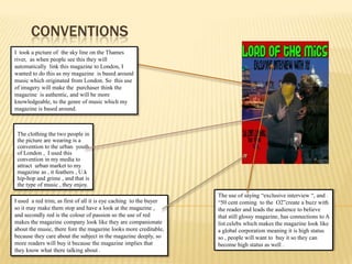
- 1. Conventions I took a picture of the sky line on the Thames river, as when people see this they will automatically link this magazine to London, I wanted to do this as my magazine is based around music which originated from London. So this use of imagery will make the purchaser think the magazine is authentic, and will be more knowledgeable, to the genre of music which my magazine is based around. The clothing the two people in the picture are wearing is a convention to the urban youth of London , I used this convention in my media to attract urban market to my magazine as , it feathers , U.k hip-hop and grime , and that is the type of music , they enjoy. The use of saying “exclusive interview “, and . “50 cent coming to the O2”create a buzz with the reader and leads the audience to believe that still glossy magazine, has connections to A list celebs which makes the magazine look like a global corporation meaning it is high status so , people will want to buy it so they can become high status as well . I used a red trim, as first of all it is eye caching to the buyer so it may make them stop and have a look at the magazine , and secondly red is the colour of passion so the use of red makes the magazine company look like they are companionate about the music, there fore the magazine looks more creditable, because they care about the subject in the magazine deeply, so more readers will buy it because the magazine implies that they know what there talking about .
- 2. Representation My media product, is for a genre of music which in are society, has a bad boy image, this means that, the representations in my magazine is going to imitate this because that is what the audience wants to see, it makes it exciting for them. To achieve this, the picture I took for my front cover had to have the dominant representation which are society see’s as a bad boy image. First of all I told the two people in my picture to do gang signs so that they look like authentic rappers as, raping originated from gang culture, then I told one of the boys to were a bandana around his face as this is another representation, which will make the reader, believe he is in a gang an is a rapper/grime artist, they make this association because in U.S.A gangster rappers mainly come from two gangs bloods and crips, which were are well known for there colored bandana,. Further more I told both the boys to were hoodies and one to put there hood up, the reson for this is because in the UK hoodies represent, anti social behavior and rebellion, which is what grime/ UK hip-hop is seen to represent. Also I have put a condenser microphone in the hands of one of the people my front cover, I done this because the title of my magazine is Lord of the mic so I wanted to show that the person in the picture is a lord of the mic and there for its worth to look into the magazine an read about it. I go on further to use representation in my content page to show the social group which my magazine is aimed at . I done this by taking a picture of myself with urban clothing , and a picture of the London sky line. This links to a social group as the readers of this magazine ill be interested in urban things, so therefore the reader will be able to make links to this representation. I used the color green for all the titles in my magazine this is because my magazine is aimed at a young social group, and the color green represents, freedom of speech, and having rights, this is something which represents young people as they have always fighted for rights.
- 3. distribution From the market research which I done, I found out that there is a gap in the market for a magazine which offers grime and UK hip-hop all in one magazine, this market is not global but is unique to England, but with work it may be able to become a hit in the U.S market as the hip-hop genre is very big there. There is a buzz around the genre of Grime which is a part of my magazine. This is because it is a relatively new, so i believe by producing this magazine may create a hype around potential distributors, and therefore there will be allot of investors. A company which would be interested in distribute my magazine would have to be a company, that is willing to takes risks because it is a original idea so there's only two thing my magazine could be a , ether a complete failure or a success. If it is a success it could be a major player for magazines in this genre as there is only a hand full of magazines which include these genres of music. The magazine which distributes my magazine would have to be in touch with a younger/ teenage audience as that is the audiance of my magazine, they need to be in touch there needs and know were there shopping , so that the magazine can get into the hand of my target audience .
- 4. Who is my audience My target audience for my magazine are young adults/teens who are interested in Grime and UK Hip-hop music. I want to create a new place to find out about the new music that can download and listen to. Also, I’d like to attract people from a urban area, as the magazine is more aimed at them , and they would enjoy it more as it relates to them more than a person who lives in the country for instance. Further more this music is urban so it following is mainly the urban teenager , they have been brought up listening to this urban style of music and may bring back memories of there child hood by reading this magazine as in my double page spread, I have written a about the history of grime., Which is something my urban audience would have been brought up herein about in schools, internet and maybe even had first had experiences of the this. I chose this as my double page spread as I believe that people who enjoy this genre of music would like to read about how it started off in the late 90’s.
- 5. Attracting my audiance To attract my audience I used photos and fonts to catch their eye and keep them interested and wanting to read more. My photos attract an audience with a unique sense of style. The audience can look at the photos and relate them to their lives. Also the use of photos and font , which I have used are exact to the creator needed to make an image of a grime/ UK Hip-hop artist, this attracts an audience because it shows that the magazine no what there talking about the criteria of this music and shows the originality of my magazine which will help attract an audience . Also the information which I put into my double page spread is very valid and give a detailed history of the genre of grime, I know a lot about this topic, there fore this should help keep y audience because they would wont to by next weeks copy , so that they can gain more knowledge about the genre of music which they enjoy.
- 6. tecnology During the process of designing and making my magazine I had to learn the basics of some programmes'such a Photoshop. I found this the most difficult task in the hole project, as firstly we had no teacher for the period of time which we were doing this course work in, there for we had nobody except fellow student to give there point of view and help me with Photoshop, secondly I found it hard to grasp how to use Photoshop in an effective way as I have never used it befor so I didn’t know how to create the effects which I wanted , further more there was no help In using this programs there should have been a after school section which teaches people how to use Photoshop because it is not easy at all . On the other hand nearing to the end of my project I found using Photoshop very useful because it had very good editing tools for example manipulating and editing photos to a very high standard. When I did my preliminary magazine I was thinking about what I wanted to see in the magazine, but now I have learnt more about marketing and audience I have learnt to consider what the audience want to see in the magazine.
- 7. Perilimary task and final task Looking at both my preliminary task and final piece you can see a major difference between the two. I have learnt so much since doing my first task. Like how to target a specific audience and how to use images in a useful manor and also I learned how to use Photoshop to a average standard , also I have learned how to use convention to try and attract a specific audienc, also I have lernt the important of front and color when trying to send a message to a audience, and I have further learnt how to do proper market research, on a hold the task itself tort me about how to put into context the thing we learnt in media to make a media product which is worthy of being sold in shops.