SlideShare a Scribd company logo
Benita Walugembe
My idea came from the magazine ‘Vibe’. My reason for using this magazine was to
help me create my own which was similar to it, as it had the same music genre.
The information on the my magazine follows the convention of a real magazine in
several ways. Firstly with the information, my text is written in a large bold front in
the colour black so that it stands out from the background. Also the layout of my
magazine follows the forms of a real magazine.

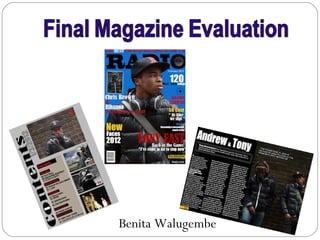
My masthead is positioned behind my model’s head, covering mainly the letters ‘a’
and ‘d’. The magazine vibe is also laid out in this way. This is because the music
artist is the selling point and he must be seen on the magazine visibly, as he is our
target’s focus to want to buy and read more about a well known music artist. The
Vibe magazine uses a settled, composed dark colour for the background which is
a mellow red. This is to allow the information that is written in the colours black,
white and green stand out. These colours give the magazine a hip hop, cool look
so that its appealing to those with an interest of this kind of genre. My magazine
does the same. It also follows the typical convention of having cover lines down
each side of the page in horizontal lines. I noticed that on the magazine, a well-
known music artists name is a large front size to all the other cover lines. I took
this and also did the same to my magazine cover lines.
I chose a ‘Kerrang’ magazine contents page to help me create my own contents page. I looked at the different
conventions it had, which I also followed. I noticed that the page had several images and less information on it. The
layout of the page is neat and has been categorised. In the middle of the page, one photograph has been enlarged to
out stand the other photos. This indicates to the target audience that he is our main focus on the page so we are now
drawn into turning to the page to read more about him. My contents page also does the same. I have selected
photographs of models that look appealing to its audience. Also I have one photo that is bigger than the others for the
same reason as stated above. To improved my contents page I would have included a caption on each photograph to
explain what the page is about, as the kerrang magazine has done this.
This is to give a slight information on the images before turning to the page. On my page I have also put each topic in a
category, reason being is to make it easier for the audience to know what topics that are
in the magazine, who may have an interest in a particular topic where they can easily and quickly turn to the page. I
used dark colours such as grey, black and red. This was to keep the hip hop style to it, I
chose these colours by looking at the vibe contents pages below as it is a hip hop
magazine .
I used a Double page spread to help me follow the codes and conventions
of a hip hop magazine. The font of the masthead is written in a large
White bold text with a black background to make the information stand
out, I also did the same with my double page spread. Whilst observing
The double page spread I noticed one side of the page had an image that
took up the whole page. The photograph used is of a well- known hip hop
artist, along with information written on the other side of the page. The text
is written in three neat paragraphs. At the beginning of the text, the first
letter “I” is outsized from the rest of the information, reason being is to indicate to
the audience that the article was a one to one interview with the artist himself.
This attracts the audience to read the magazine as they would want to know
what the artist himself maybe putting out there. My magazine also follows this
code for the same purpose. In the corner of the page, below the photograph, a
quote is taken from the article and placed alone to standout, as this maybe
some important information that needs to be seen and make known of. My
double page spread also had a quote positioned on the top left of my photo
page.
I used several conventions of a hip hop magazine to represent my social group. Firstly I
chose my model to have a specific look, I forced on what prop I was going to use to make
my magazine more appealing to its target audience. On my front page I used
headphones, as this object is well used by young teens as they have a great interest in
music, therefore they tend to listen to music allot ,also in society nowadays headphones
are as well used as a fashion trend.


My model was told to wear in a way that represented the social group I
was aiming for. This was to attract and be more appealing to my
audience. He wore a bomber black jacket with a hood and a baseball
hat with a side bag. This dress sense is now worn by young teenage
boys, this very well represents the teens of London today. My location
of my photograph also represents my social group, reason being is that
young teens are known as hanging around on streets, sitting on walls in
a group of friends, I included this in my photograph to portray this.


  I also thought about the information to include on my front page. This is
  important as it will attract your audience into reading an article that is relatable
  to them or that fascinates them. So I included information on well- known
  artists such as Rihanna and Chris brown as their story is something that
  young people will gossip about and have an interest in. also the topic being on
  their relationship is relatable to young teenagers.
The type of media institution that might distribute my music magazine would bauer, this institution is a well -known large
company, that has a great reputation of the magazines it publishes therefore my magazine would be seen as a really high
standard magazine. Bauer is a worldwide media empire offering over 300 magazines in 15 countries, as well as online, TV
and radio stations. This means that my magazine would be well-known around the world as it offers over 300 hundred
magazine in 15 country therefore my magazine has a great opportunity to be made recognizable. Bauer Media is also
multi-platform UK-based consisting of many companies collected around two main divisions – Magazines and Radio -
widely recognised and rewarded as being industry innovators. As my magazine is targeted at uk teenagers its a quicker
access to purchase my magazine as they are based in the UK. Bauer’s business is built on influential media brands with
millions of personal relationships with engaged readers and listeners. Therefore my magazine will have allot of readers as
bauer has a great relationship with its readers. There strategy is to connect audiences with excellent content through there
broad multi-touch point brand platforms, wherever and whenever and however they want. This would be great for my
magazine, as this brings a large audience into knowing my magazine.
My media product will be aimed at females but mostly males, from the age range of 15-25.My
demographic profile is stereotypical of young black teenagers of society today . The type of audience that
would purchase my product are those that have a strong interest in hip- hop and grime music, Especially
grime. Grime is a style of music that is birthed from the genre hip hop, Its a style of music that emerged
from England in the early 2000’s, primarily as a development of UK garage . Dancehall. The pioneers of
the style include so solid crew, dizzee Rascal. Wiley and Skepta, These artist are well known with my
target audience. Teens that may be fans for such music artist as the ones listed above are more likely to
read my magazine as my magazine has these types of artist.. My audience would also be the same profile
audience that the films such “Adulthood” and “Attack the block” aim their films at. Because they have a
cast of young teenagers that are dressed in a way that our young teens are of today and they are my main
focus. The language that is also used within the movie is appealing to my audience. “slang” is a way
teenagers speak to each other. Therefore in my magazine I included informal language so that its relative
to my audience.
To attract my audience I used several features on my magazine that I thought
would be eye catching. Firstly my masthead challenges the conventions of
most magazine masthead , as it has an imagine of a speaker co positioned in
the centre of the letter “O”. I used this to represent the name of the magazine
“Radio”. As my magazine is more for young teenagers to get their voice heard,
opinions, talents and issues said through the magazine, Therefore this speaker
symbolizes this. Furthermore it also symbolizes listening to music. On the front
page I placed an photograph of a model, who would be a well-known rapper.
Reason for this was to indicate to my audience that information about this
rapper is also included within the magazine, by using a well known artist
attracts its target audience that it may appeal to.

I also thought about the information to include that would catch the
attention of my target audience. I integrated information such as “10 facts
of becoming a successful music artist”. This will attract my audience as its
aimed for teens with a passion in music and this will help them gain
knowledge on how to improve their talent to become successful. . Most
teens have a dream to make it in the music industry, so this would catch
their attention. I’ve also stated on my magazine 120 must – have songs.
This draws the attention of the readers to want to know what new songs
are out so that they are updated with music that is released by artists.
Also i have given away a free poster, people love to receive free items.
During the process of making my magazine, I learnt you go through several stages to
  have a complete successful magazine. I also blogged my work up to keep a record of
  my progress. Internet explorer was very helpful as it helped me researched on hip-
  hop magazines so I known the codes and conventions to include on my magazine.
  Also to make my product successful I used several technologies such as :-

• Digital camera
• Adobe Photoshop
• Internet explorer
• Blogger
• Microsoft PowerPoint
Camera -canon 400D.            Photography                Selected Image        Photoshop CS3


Firstly I took a few photographs using a technology “canon 400D camera".
From the pictures I had taken, I selected the photo that I mostly liked. When
taking my photos I had to think carefully about where my location was as it
affected the lighting of my photo. I chose to take them outside using natural
lighting. I then placed my image onto Photoshop which was extremely helpful in
the development of making my media product. I cropped and resized my image
using this programme, I then used the magic wand to take out a section that
wasn't needed, the background. Then placed it on a blue solid back ground and
used the blur tool on the image to give it a smooth surface. I then added the
different coloured, sizes of text to complete my product.
   When first creating my college magazine I used the programme Microsoft publisher. This meant that my magazine was
    poor quality as it was limited to tools that I could have used to help me produced a better cover. While observing my
    collage magazine I noticed that my masthead was positioned in front of my main photograph this does not follow
    magazine codes and conventions so as I came to make my music magazine I made the change of placing the
    masthead behind the main photograph. Also my cover lines were not neatly layout onto my font page, so I made sure y
    cover lines were neatly spread out and layered on each side of the page written in different sizes to indicate which
    information is most important. However I do like the quality of my photograph in my college magazine, it was taken with
    a high quality camera which I didn't even need to do any touches on the photo. I like the way the background was
    automatically blurred out to bring out the model as a force of the magazine. My college contents page is weaker than
    my front college page. I have less images and to much descriptive information, this being a college magazine for
    students does not draw their attention to want to read it as its not eye catching, no interesting photos and to much text to
    read which will make them bored. Whereas on my music contents page I have an amount of photos and less
    information neatly laid out and clear to read, place on one solid colour to make the information stand out.

More Related Content

What's hot

Media updated evaluation
Media updated evaluationMedia updated evaluation
Media updated evaluationarifmo
 
Presentation1 evaluation
Presentation1 evaluationPresentation1 evaluation
Presentation1 evaluationcharlieparker8
 
Media - Evaluation
Media - EvaluationMedia - Evaluation
Media - Evaluationrreardon1
 
magazine evaluation
magazine evaluation magazine evaluation
magazine evaluation
emzywmzy087
 
Kieron's Media evaluation
Kieron's Media evaluationKieron's Media evaluation
Kieron's Media evaluationKieronSava
 

What's hot (11)

Evaluation
EvaluationEvaluation
Evaluation
 
Evaluation
EvaluationEvaluation
Evaluation
 
Media updated evaluation
Media updated evaluationMedia updated evaluation
Media updated evaluation
 
Evaluation
EvaluationEvaluation
Evaluation
 
Presentation1 evaluation
Presentation1 evaluationPresentation1 evaluation
Presentation1 evaluation
 
Media eval
Media evalMedia eval
Media eval
 
Media - Evaluation
Media - EvaluationMedia - Evaluation
Media - Evaluation
 
magazine evaluation
magazine evaluation magazine evaluation
magazine evaluation
 
Kieron's Media evaluation
Kieron's Media evaluationKieron's Media evaluation
Kieron's Media evaluation
 
Evaluation
EvaluationEvaluation
Evaluation
 
Evaluation
EvaluationEvaluation
Evaluation
 

Similar to (Final evalution2)

(Final evalution)
(Final evalution)(Final evalution)
(Final evalution)
Benita29
 
Evaluation main task
Evaluation main taskEvaluation main task
Evaluation main task7483
 
Evaluation pdf
Evaluation pdfEvaluation pdf
Evaluation pdfbhavzz03
 
AS Media Final Evaluation
AS Media  Final EvaluationAS Media  Final Evaluation
AS Media Final Evaluation
Nav Man
 
New music magazine evaul ryo panis
New music magazine evaul ryo panisNew music magazine evaul ryo panis
New music magazine evaul ryo panisryojordanpanis
 
Media evaluation
Media evaluationMedia evaluation
Media evaluationOllySnowxx
 
As media presentation
As media presentationAs media presentation
As media presentationKorrinaalbert
 
Media evaluation
Media evaluationMedia evaluation
Media evaluation
James Metcalfe
 
Kieron's Media Magazine Evaluation
Kieron's Media Magazine EvaluationKieron's Media Magazine Evaluation
Kieron's Media Magazine EvaluationKieronSava
 
Music Magazine Evaluation
Music Magazine EvaluationMusic Magazine Evaluation
Music Magazine Evaluationjerrelle
 
Music Magazine Evaluation
Music Magazine EvaluationMusic Magazine Evaluation
Music Magazine Evaluationjerrelle
 
Evaluation new
Evaluation newEvaluation new
Evaluation newbhavzz03
 
Music magazine evaluation
Music magazine evaluationMusic magazine evaluation
Music magazine evaluation
azainab1
 
Media evaluation pdf
Media evaluation pdfMedia evaluation pdf
Media evaluation pdf
Fumiko Takeuchi
 
Media evaluation
Media evaluationMedia evaluation
Media evaluationOllySnowxx
 

Similar to (Final evalution2) (20)

(Final evalution)
(Final evalution)(Final evalution)
(Final evalution)
 
Evaluation main task
Evaluation main taskEvaluation main task
Evaluation main task
 
Evaluation pdf
Evaluation pdfEvaluation pdf
Evaluation pdf
 
AS Media Final Evaluation
AS Media  Final EvaluationAS Media  Final Evaluation
AS Media Final Evaluation
 
New music magazine evaul ryo panis
New music magazine evaul ryo panisNew music magazine evaul ryo panis
New music magazine evaul ryo panis
 
Media evaluation
Media evaluationMedia evaluation
Media evaluation
 
As media presentation
As media presentationAs media presentation
As media presentation
 
Media Evaluation
Media EvaluationMedia Evaluation
Media Evaluation
 
Media evaluation
Media evaluationMedia evaluation
Media evaluation
 
Evaluation
EvaluationEvaluation
Evaluation
 
Kieron's Media Magazine Evaluation
Kieron's Media Magazine EvaluationKieron's Media Magazine Evaluation
Kieron's Media Magazine Evaluation
 
Evaluation
EvaluationEvaluation
Evaluation
 
Evaluation
EvaluationEvaluation
Evaluation
 
Music Magazine Evaluation
Music Magazine EvaluationMusic Magazine Evaluation
Music Magazine Evaluation
 
Music Magazine Evaluation
Music Magazine EvaluationMusic Magazine Evaluation
Music Magazine Evaluation
 
Evaluation new
Evaluation newEvaluation new
Evaluation new
 
Music magazine evaluation
Music magazine evaluationMusic magazine evaluation
Music magazine evaluation
 
Media evaluation pdf
Media evaluation pdfMedia evaluation pdf
Media evaluation pdf
 
Media evaluation
Media evaluationMedia evaluation
Media evaluation
 
Evaluation
EvaluationEvaluation
Evaluation
 

Recently uploaded

Meet Crazyjamjam - A TikTok Sensation | Blog Eternal
Meet Crazyjamjam - A TikTok Sensation | Blog EternalMeet Crazyjamjam - A TikTok Sensation | Blog Eternal
Meet Crazyjamjam - A TikTok Sensation | Blog Eternal
Blog Eternal
 
Meet Dinah Mattingly – Larry Bird’s Partner in Life and Love
Meet Dinah Mattingly – Larry Bird’s Partner in Life and LoveMeet Dinah Mattingly – Larry Bird’s Partner in Life and Love
Meet Dinah Mattingly – Larry Bird’s Partner in Life and Love
get joys
 
I Know Dino Trivia: Part 3. Test your dino knowledge
I Know Dino Trivia: Part 3. Test your dino knowledgeI Know Dino Trivia: Part 3. Test your dino knowledge
I Know Dino Trivia: Part 3. Test your dino knowledge
Sabrina Ricci
 
240529_Teleprotection Global Market Report 2024.pdf
240529_Teleprotection Global Market Report 2024.pdf240529_Teleprotection Global Market Report 2024.pdf
240529_Teleprotection Global Market Report 2024.pdf
Madhura TBRC
 
Tom Selleck Net Worth: A Comprehensive Analysis
Tom Selleck Net Worth: A Comprehensive AnalysisTom Selleck Net Worth: A Comprehensive Analysis
Tom Selleck Net Worth: A Comprehensive Analysis
greendigital
 
Create a Seamless Viewing Experience with Your Own Custom OTT Player.pdf
Create a Seamless Viewing Experience with Your Own Custom OTT Player.pdfCreate a Seamless Viewing Experience with Your Own Custom OTT Player.pdf
Create a Seamless Viewing Experience with Your Own Custom OTT Player.pdf
Genny Knight
 
The Evolution of Animation in Film - Mark Murphy Director
The Evolution of Animation in Film - Mark Murphy DirectorThe Evolution of Animation in Film - Mark Murphy Director
The Evolution of Animation in Film - Mark Murphy Director
Mark Murphy Director
 
Reimagining Classics - What Makes a Remake a Success
Reimagining Classics - What Makes a Remake a SuccessReimagining Classics - What Makes a Remake a Success
Reimagining Classics - What Makes a Remake a Success
Mark Murphy Director
 
Hollywood Actress - The 250 hottest gallery
Hollywood Actress - The 250 hottest galleryHollywood Actress - The 250 hottest gallery
Hollywood Actress - The 250 hottest gallery
Zsolt Nemeth
 
Scandal! Teasers June 2024 on etv Forum.co.za
Scandal! Teasers June 2024 on etv Forum.co.zaScandal! Teasers June 2024 on etv Forum.co.za
Scandal! Teasers June 2024 on etv Forum.co.za
Isaac More
 
This Is The First All Category Quiz That I Made
This Is The First All Category Quiz That I MadeThis Is The First All Category Quiz That I Made
This Is The First All Category Quiz That I Made
Aarush Ghate
 
Young Tom Selleck: A Journey Through His Early Years and Rise to Stardom
Young Tom Selleck: A Journey Through His Early Years and Rise to StardomYoung Tom Selleck: A Journey Through His Early Years and Rise to Stardom
Young Tom Selleck: A Journey Through His Early Years and Rise to Stardom
greendigital
 
Maximizing Your Streaming Experience with XCIPTV- Tips for 2024.pdf
Maximizing Your Streaming Experience with XCIPTV- Tips for 2024.pdfMaximizing Your Streaming Experience with XCIPTV- Tips for 2024.pdf
Maximizing Your Streaming Experience with XCIPTV- Tips for 2024.pdf
Xtreame HDTV
 
Panchayat Season 3 - Official Trailer.pdf
Panchayat Season 3 - Official Trailer.pdfPanchayat Season 3 - Official Trailer.pdf
Panchayat Season 3 - Official Trailer.pdf
Suleman Rana
 
A TO Z INDIA Monthly Magazine - JUNE 2024
A TO Z INDIA Monthly Magazine - JUNE 2024A TO Z INDIA Monthly Magazine - JUNE 2024
A TO Z INDIA Monthly Magazine - JUNE 2024
Indira Srivatsa
 
Christina's Baby Shower Game June 2024.pptx
Christina's Baby Shower Game June 2024.pptxChristina's Baby Shower Game June 2024.pptx
Christina's Baby Shower Game June 2024.pptx
madeline604788
 
Treasure Hunt Puzzles, Treasure Hunt Puzzles online
Treasure Hunt Puzzles, Treasure Hunt Puzzles onlineTreasure Hunt Puzzles, Treasure Hunt Puzzles online
Treasure Hunt Puzzles, Treasure Hunt Puzzles online
Hidden Treasure Hunts
 
From Slave to Scourge: The Existential Choice of Django Unchained. The Philos...
From Slave to Scourge: The Existential Choice of Django Unchained. The Philos...From Slave to Scourge: The Existential Choice of Django Unchained. The Philos...
From Slave to Scourge: The Existential Choice of Django Unchained. The Philos...
Rodney Thomas Jr
 
Skeem Saam in June 2024 available on Forum
Skeem Saam in June 2024 available on ForumSkeem Saam in June 2024 available on Forum
Skeem Saam in June 2024 available on Forum
Isaac More
 

Recently uploaded (19)

Meet Crazyjamjam - A TikTok Sensation | Blog Eternal
Meet Crazyjamjam - A TikTok Sensation | Blog EternalMeet Crazyjamjam - A TikTok Sensation | Blog Eternal
Meet Crazyjamjam - A TikTok Sensation | Blog Eternal
 
Meet Dinah Mattingly – Larry Bird’s Partner in Life and Love
Meet Dinah Mattingly – Larry Bird’s Partner in Life and LoveMeet Dinah Mattingly – Larry Bird’s Partner in Life and Love
Meet Dinah Mattingly – Larry Bird’s Partner in Life and Love
 
I Know Dino Trivia: Part 3. Test your dino knowledge
I Know Dino Trivia: Part 3. Test your dino knowledgeI Know Dino Trivia: Part 3. Test your dino knowledge
I Know Dino Trivia: Part 3. Test your dino knowledge
 
240529_Teleprotection Global Market Report 2024.pdf
240529_Teleprotection Global Market Report 2024.pdf240529_Teleprotection Global Market Report 2024.pdf
240529_Teleprotection Global Market Report 2024.pdf
 
Tom Selleck Net Worth: A Comprehensive Analysis
Tom Selleck Net Worth: A Comprehensive AnalysisTom Selleck Net Worth: A Comprehensive Analysis
Tom Selleck Net Worth: A Comprehensive Analysis
 
Create a Seamless Viewing Experience with Your Own Custom OTT Player.pdf
Create a Seamless Viewing Experience with Your Own Custom OTT Player.pdfCreate a Seamless Viewing Experience with Your Own Custom OTT Player.pdf
Create a Seamless Viewing Experience with Your Own Custom OTT Player.pdf
 
The Evolution of Animation in Film - Mark Murphy Director
The Evolution of Animation in Film - Mark Murphy DirectorThe Evolution of Animation in Film - Mark Murphy Director
The Evolution of Animation in Film - Mark Murphy Director
 
Reimagining Classics - What Makes a Remake a Success
Reimagining Classics - What Makes a Remake a SuccessReimagining Classics - What Makes a Remake a Success
Reimagining Classics - What Makes a Remake a Success
 
Hollywood Actress - The 250 hottest gallery
Hollywood Actress - The 250 hottest galleryHollywood Actress - The 250 hottest gallery
Hollywood Actress - The 250 hottest gallery
 
Scandal! Teasers June 2024 on etv Forum.co.za
Scandal! Teasers June 2024 on etv Forum.co.zaScandal! Teasers June 2024 on etv Forum.co.za
Scandal! Teasers June 2024 on etv Forum.co.za
 
This Is The First All Category Quiz That I Made
This Is The First All Category Quiz That I MadeThis Is The First All Category Quiz That I Made
This Is The First All Category Quiz That I Made
 
Young Tom Selleck: A Journey Through His Early Years and Rise to Stardom
Young Tom Selleck: A Journey Through His Early Years and Rise to StardomYoung Tom Selleck: A Journey Through His Early Years and Rise to Stardom
Young Tom Selleck: A Journey Through His Early Years and Rise to Stardom
 
Maximizing Your Streaming Experience with XCIPTV- Tips for 2024.pdf
Maximizing Your Streaming Experience with XCIPTV- Tips for 2024.pdfMaximizing Your Streaming Experience with XCIPTV- Tips for 2024.pdf
Maximizing Your Streaming Experience with XCIPTV- Tips for 2024.pdf
 
Panchayat Season 3 - Official Trailer.pdf
Panchayat Season 3 - Official Trailer.pdfPanchayat Season 3 - Official Trailer.pdf
Panchayat Season 3 - Official Trailer.pdf
 
A TO Z INDIA Monthly Magazine - JUNE 2024
A TO Z INDIA Monthly Magazine - JUNE 2024A TO Z INDIA Monthly Magazine - JUNE 2024
A TO Z INDIA Monthly Magazine - JUNE 2024
 
Christina's Baby Shower Game June 2024.pptx
Christina's Baby Shower Game June 2024.pptxChristina's Baby Shower Game June 2024.pptx
Christina's Baby Shower Game June 2024.pptx
 
Treasure Hunt Puzzles, Treasure Hunt Puzzles online
Treasure Hunt Puzzles, Treasure Hunt Puzzles onlineTreasure Hunt Puzzles, Treasure Hunt Puzzles online
Treasure Hunt Puzzles, Treasure Hunt Puzzles online
 
From Slave to Scourge: The Existential Choice of Django Unchained. The Philos...
From Slave to Scourge: The Existential Choice of Django Unchained. The Philos...From Slave to Scourge: The Existential Choice of Django Unchained. The Philos...
From Slave to Scourge: The Existential Choice of Django Unchained. The Philos...
 
Skeem Saam in June 2024 available on Forum
Skeem Saam in June 2024 available on ForumSkeem Saam in June 2024 available on Forum
Skeem Saam in June 2024 available on Forum
 

(Final evalution2)

  • 2. My idea came from the magazine ‘Vibe’. My reason for using this magazine was to help me create my own which was similar to it, as it had the same music genre. The information on the my magazine follows the convention of a real magazine in several ways. Firstly with the information, my text is written in a large bold front in the colour black so that it stands out from the background. Also the layout of my magazine follows the forms of a real magazine. My masthead is positioned behind my model’s head, covering mainly the letters ‘a’ and ‘d’. The magazine vibe is also laid out in this way. This is because the music artist is the selling point and he must be seen on the magazine visibly, as he is our target’s focus to want to buy and read more about a well known music artist. The Vibe magazine uses a settled, composed dark colour for the background which is a mellow red. This is to allow the information that is written in the colours black, white and green stand out. These colours give the magazine a hip hop, cool look so that its appealing to those with an interest of this kind of genre. My magazine does the same. It also follows the typical convention of having cover lines down each side of the page in horizontal lines. I noticed that on the magazine, a well- known music artists name is a large front size to all the other cover lines. I took this and also did the same to my magazine cover lines.
  • 3. I chose a ‘Kerrang’ magazine contents page to help me create my own contents page. I looked at the different conventions it had, which I also followed. I noticed that the page had several images and less information on it. The layout of the page is neat and has been categorised. In the middle of the page, one photograph has been enlarged to out stand the other photos. This indicates to the target audience that he is our main focus on the page so we are now drawn into turning to the page to read more about him. My contents page also does the same. I have selected photographs of models that look appealing to its audience. Also I have one photo that is bigger than the others for the same reason as stated above. To improved my contents page I would have included a caption on each photograph to explain what the page is about, as the kerrang magazine has done this. This is to give a slight information on the images before turning to the page. On my page I have also put each topic in a category, reason being is to make it easier for the audience to know what topics that are in the magazine, who may have an interest in a particular topic where they can easily and quickly turn to the page. I used dark colours such as grey, black and red. This was to keep the hip hop style to it, I chose these colours by looking at the vibe contents pages below as it is a hip hop magazine .
  • 4. I used a Double page spread to help me follow the codes and conventions of a hip hop magazine. The font of the masthead is written in a large White bold text with a black background to make the information stand out, I also did the same with my double page spread. Whilst observing The double page spread I noticed one side of the page had an image that took up the whole page. The photograph used is of a well- known hip hop artist, along with information written on the other side of the page. The text is written in three neat paragraphs. At the beginning of the text, the first letter “I” is outsized from the rest of the information, reason being is to indicate to the audience that the article was a one to one interview with the artist himself. This attracts the audience to read the magazine as they would want to know what the artist himself maybe putting out there. My magazine also follows this code for the same purpose. In the corner of the page, below the photograph, a quote is taken from the article and placed alone to standout, as this maybe some important information that needs to be seen and make known of. My double page spread also had a quote positioned on the top left of my photo page.
  • 5. I used several conventions of a hip hop magazine to represent my social group. Firstly I chose my model to have a specific look, I forced on what prop I was going to use to make my magazine more appealing to its target audience. On my front page I used headphones, as this object is well used by young teens as they have a great interest in music, therefore they tend to listen to music allot ,also in society nowadays headphones are as well used as a fashion trend. My model was told to wear in a way that represented the social group I was aiming for. This was to attract and be more appealing to my audience. He wore a bomber black jacket with a hood and a baseball hat with a side bag. This dress sense is now worn by young teenage boys, this very well represents the teens of London today. My location of my photograph also represents my social group, reason being is that young teens are known as hanging around on streets, sitting on walls in a group of friends, I included this in my photograph to portray this. I also thought about the information to include on my front page. This is important as it will attract your audience into reading an article that is relatable to them or that fascinates them. So I included information on well- known artists such as Rihanna and Chris brown as their story is something that young people will gossip about and have an interest in. also the topic being on their relationship is relatable to young teenagers.
  • 6. The type of media institution that might distribute my music magazine would bauer, this institution is a well -known large company, that has a great reputation of the magazines it publishes therefore my magazine would be seen as a really high standard magazine. Bauer is a worldwide media empire offering over 300 magazines in 15 countries, as well as online, TV and radio stations. This means that my magazine would be well-known around the world as it offers over 300 hundred magazine in 15 country therefore my magazine has a great opportunity to be made recognizable. Bauer Media is also multi-platform UK-based consisting of many companies collected around two main divisions – Magazines and Radio - widely recognised and rewarded as being industry innovators. As my magazine is targeted at uk teenagers its a quicker access to purchase my magazine as they are based in the UK. Bauer’s business is built on influential media brands with millions of personal relationships with engaged readers and listeners. Therefore my magazine will have allot of readers as bauer has a great relationship with its readers. There strategy is to connect audiences with excellent content through there broad multi-touch point brand platforms, wherever and whenever and however they want. This would be great for my magazine, as this brings a large audience into knowing my magazine.
  • 7. My media product will be aimed at females but mostly males, from the age range of 15-25.My demographic profile is stereotypical of young black teenagers of society today . The type of audience that would purchase my product are those that have a strong interest in hip- hop and grime music, Especially grime. Grime is a style of music that is birthed from the genre hip hop, Its a style of music that emerged from England in the early 2000’s, primarily as a development of UK garage . Dancehall. The pioneers of the style include so solid crew, dizzee Rascal. Wiley and Skepta, These artist are well known with my target audience. Teens that may be fans for such music artist as the ones listed above are more likely to read my magazine as my magazine has these types of artist.. My audience would also be the same profile audience that the films such “Adulthood” and “Attack the block” aim their films at. Because they have a cast of young teenagers that are dressed in a way that our young teens are of today and they are my main focus. The language that is also used within the movie is appealing to my audience. “slang” is a way teenagers speak to each other. Therefore in my magazine I included informal language so that its relative to my audience.
  • 8. To attract my audience I used several features on my magazine that I thought would be eye catching. Firstly my masthead challenges the conventions of most magazine masthead , as it has an imagine of a speaker co positioned in the centre of the letter “O”. I used this to represent the name of the magazine “Radio”. As my magazine is more for young teenagers to get their voice heard, opinions, talents and issues said through the magazine, Therefore this speaker symbolizes this. Furthermore it also symbolizes listening to music. On the front page I placed an photograph of a model, who would be a well-known rapper. Reason for this was to indicate to my audience that information about this rapper is also included within the magazine, by using a well known artist attracts its target audience that it may appeal to. I also thought about the information to include that would catch the attention of my target audience. I integrated information such as “10 facts of becoming a successful music artist”. This will attract my audience as its aimed for teens with a passion in music and this will help them gain knowledge on how to improve their talent to become successful. . Most teens have a dream to make it in the music industry, so this would catch their attention. I’ve also stated on my magazine 120 must – have songs. This draws the attention of the readers to want to know what new songs are out so that they are updated with music that is released by artists. Also i have given away a free poster, people love to receive free items.
  • 9. During the process of making my magazine, I learnt you go through several stages to have a complete successful magazine. I also blogged my work up to keep a record of my progress. Internet explorer was very helpful as it helped me researched on hip- hop magazines so I known the codes and conventions to include on my magazine. Also to make my product successful I used several technologies such as :- • Digital camera • Adobe Photoshop • Internet explorer • Blogger • Microsoft PowerPoint
  • 10. Camera -canon 400D. Photography Selected Image Photoshop CS3 Firstly I took a few photographs using a technology “canon 400D camera". From the pictures I had taken, I selected the photo that I mostly liked. When taking my photos I had to think carefully about where my location was as it affected the lighting of my photo. I chose to take them outside using natural lighting. I then placed my image onto Photoshop which was extremely helpful in the development of making my media product. I cropped and resized my image using this programme, I then used the magic wand to take out a section that wasn't needed, the background. Then placed it on a blue solid back ground and used the blur tool on the image to give it a smooth surface. I then added the different coloured, sizes of text to complete my product.
  • 11. When first creating my college magazine I used the programme Microsoft publisher. This meant that my magazine was poor quality as it was limited to tools that I could have used to help me produced a better cover. While observing my collage magazine I noticed that my masthead was positioned in front of my main photograph this does not follow magazine codes and conventions so as I came to make my music magazine I made the change of placing the masthead behind the main photograph. Also my cover lines were not neatly layout onto my font page, so I made sure y cover lines were neatly spread out and layered on each side of the page written in different sizes to indicate which information is most important. However I do like the quality of my photograph in my college magazine, it was taken with a high quality camera which I didn't even need to do any touches on the photo. I like the way the background was automatically blurred out to bring out the model as a force of the magazine. My college contents page is weaker than my front college page. I have less images and to much descriptive information, this being a college magazine for students does not draw their attention to want to read it as its not eye catching, no interesting photos and to much text to read which will make them bored. Whereas on my music contents page I have an amount of photos and less information neatly laid out and clear to read, place on one solid colour to make the information stand out.