Vegan Booklet
Evaluation.
By Chris Bailey
Front Cover
I decided to go with a set idea for my front cover, in relation to my
male target audience I decided to create a style reminiscent of the
Haynes Manuals. Haynes have sold over 150Million manuals
globally to a predominantly male audience, even throughout the
digital age they are in theory internationally recognised.
There are many Haynes Manual styles depending on the product, I
chose to simulate the ‘Thunderbirds Agent’s Technical Manual’ for
my design as the unusually simplistic layout seemed appropriate for
my idea.
Initially I created the basic layout of the front cover, the colours and
section sizes, as well as the Haynes logo with the integrated
Veganuary logo. I then put a lot of effort into finding the correct
fonts, which included mostly manipulated Helvetica styles. With the
correct background and fonts, I had to start piecing the page
together which was a lot harder than I thought. Configuring the page
to look similar to the original Haynes manual was a complex task,
as I had to define the small elements that make up a Haynes front
cover.
My last step on the front cover was to choose an image, I searched
for a long time to find an image that was 100%, ideally I wanted a
high quality image taken at around f16 to keep it all nicely in focus
like the images on real Haynes Manuals, but unfortunately we are in
a period where a shallow depth of field supposedly makes a good
image (thanks Instagram…not) which made it very difficult to find a
fully sharp image. I eventually gave up and settled for a burger
that’s 20% in focus. Looking back I could have taken my own
picture, but that idea hadn’t occurred to me during production.
During production 100% of people I asked recognised that the idea
was formed from a Haynes Manual, unfortunately that 100% was
derived from asking myself and my culturally diverse tutor. After
production I released a survey online, out of 8 participants only 2
where my target audience of men, and only 2 recognised the Haynes
style – unfortunately these weren’t the same people, instead it was
two women who claim to have recognised it. This depressing fact
made me realise that the Haynes manual might not have been the
best choice in a time where information is so easily accessible online,
rather than in a book. Although, contrary to that, the majority who
took my survey were aged 16-25 meaning that those older who are
the target audience of Haynes will be more likely to recognise my
front cover. Recognition by the older male generation would be ideal,
as they may be facing health issues or realisation of their bad diet
and lifestyle choices and therefor find my booklet useful.
I received personal feedback from 3 peers, the colourfulness and
positivity represented from the front cover is mentioned which is good
because it is also very simplistic. I was happy with this response as I
was worried about the success rate upon expressing positivity and
veganism at the same time to a non vegan audience.
Technically I used methods to perfect my work once I had the basics
completed, this included using rulers and measurements to perfectly
align my work. I also measured out the spacing on other Haynes
Manuals to see what they have and haven't kept the same. An
example of this includes how far the image protrudes out of the box,
or how far below the title the subtext is positioned. Keeping these
lines and measurements consistent is very important when keeping
something looking professional. It adds a feeling of structure rather
than something that has been thrown together.
Front Cover
Comparison
This shows a direct comparison between the front and back
cover of my booklet vs real Haynes Manuals that the style
has been derived from. I attempted to pick particular
elements from the original but did not copy it 100% as there
are aspects that I don’t think look so good. I attempted to
make the front cover very similar, but in comparison it is
clear that the original looks a lot denser and informative,
where as mine seems a little more bubbly and relaxed. I
tried to keep the colours and fonts identical on the front
cover, although I can see now that the text is all denser on
the original which would be something to improve upon. I
feel like my booklet will be clear to the niche who are
interested in Haynes Manuals, but will also appear inviting
enough to those who are not aware of the theme. If it
looked too dense and complicated it may cause people to
avoid reading it. I think my front cover looks a lot slicker and
easy to understand than the original which is good as
people want simplicity when it comes to understanding
something they are interested in.
The back cover I created is quite dissimilar to the original
for a few reasons. Initially I though it looks very ugly, its too
dense and dark and isn't very graphically inviting. The large
amount of text and information might fit well on an A4 book
but on an A5 book there has to be a lot less text and it also
has to be bigger. I wanted to keep the back cover the same
colour as the front as it is a quite relaxing and natural
colour, where as the original is too industrial and negative. I
took aspects such as the boxed text and swapped the
‘Haynes Hints’ for ‘Haynes Facts’. I also used the triple
image selection with a fine white stroke as seen on almost
all Haynes Manuals.
I feel like the originals look a lot more rigid and industrial
than mine, although I believe I have chosen the right
elements from the manuals to use in my own to hold onto
the style yet not make it look over complicated and
industrial.
Back Cover
I created a back cover to match the front covers Haynes manual
style. This page was very easy to create – especially compared to
the front cover as the quantity of Haynes Manual elements where far
less than that of the front cover. I simply had focus on using 3
images along the top, and L shaped banner along the bottom with
the logo and then a few boxes explaining the contents of the book.
I chose to copy the front cover style in an attempt to keep the book
focused on my target audience of males. If this booklet was seen
facedown in a doctors surgery and it had a regular pro-veganism
back cover then people would be less likely to pick it up than if they
recognised the leading ‘how to’ book provider Haynes.
I chose to stick to the Haynes font (Helvetica) throughout to keep the
style similar to the originals, this not only makes the booklet more
appealing to the viewer but Helvetica is also an extremely clear font.
I included the boxes of text to introduce the viewer to the booklet
before opening it up. I tried to keep the information snappy yet
informative, in an attempt to interest the reader enough for them to
open it up.
I used similar technical aspects to the front cover, using tools such
as colour picker and rulers. I used the colour picker to make sure I
had the perfect colours for the background and info bar at the
bottom. The rulers were used for measuring spacing and choosing
the edges of my booklet. Keeping the measurements consistent
allows me to keep a professional and structured look.
Keeping the booklet looking structured and professional appeals to
my target audience of males who are likely to prefer a sharp and
easy to read booklet versus a cartoony or natural layout/scrap book
style vegan booklet as seen in other booklets.
Introduction
I created an introduction page to explain the basics of veganism, as well as
including a warning regarding your choice to turn vegan and also a small print
describing the fluctuating statistics that will likely not show the same as the
booklet in coming years.
The main reason for creating this page though was to have 1 more page that
held the Haynes manual style. Initially this page was plain white like the real
Haynes Manuals, but during development I created a new style which included
a carbon fiber background and a gradient overlay. I was unsure whether to
use this theme on the introduction, but decided for when I realised the plain
intro looked too boring for the first page of the booklet.
I chose to develop this particular background as in my opinion it included
aspects that appealed to men, yet also included enough colour to not look
boring. I included a carbon fiber texture as its typically something men are
interested in, as it plays an important role in luxury or fast vehicles. I thought
this texture was subtle yet gives the page a bit more detail to make it look
fuller.
I chose to use the Helvetica font on the intro as it suits the front and back
cover, as well as being very clear. Helvetica is a very customisable font which
makes it’s use very easy and moldable throughout the booklet. The font is very
straight forward which traditionally appeals to men as it cuts to the chase and
doesn’t mess around with awkward curls and designs.
I used a picture of some vegetables beneath my title to add some colour to the
page. My reason for doing this was to make sure the viewer didn’t get too
bored, it is also common in Haynes manuals to have simple images dotted
around relating to the subject at hand. I post processed this image to remove
most of the background, as well as adding a grainy and sketchy style to give it
more of a rough workshop style. I believed this would be appealing to men
who would prefer a simple sharp image as opposed to a pretty shallow depth
of field Instagram style image.
Technical elements of this page include alignment, font manipulation and the
editing of the image. I chose to keep everything perfectly aligned and
structured to express the professionalism of the booklet, as this would typically
gain more trust than one that looked unprofessional or cheap.
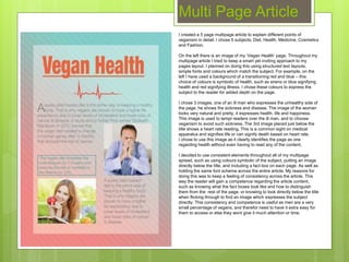
Multi Page Article
Multi Page Article
I created a 5 page multipage article to explain different points of
veganism in detail. I chose 5 subjects; Diet, Health, Medicine, Cosmetics
and Fashion.
On the left there is an image of my ‘Vegan Health’ page. Throughout my
multipage article I tried to keep a smart yet inviting approach to my
pages layout. I planned on doing this using structured text layouts,
simple fonts and colours which match the subject. For example, on the
left I have used a background of a transitioning red and blue – this
choice of colours is symbolic of health, such as sirens or blue signifying
health and red signifying illness. I chose these colours to express the
subject to the reader for added depth on the page.
I chose 3 images, one of an ill man who expresses the unhealthy side of
the page, he shows the sickness and disease. The image of the woman
looks very natural and pretty, it expresses health, life and happiness.
This image is used to tempt readers over the ill man, and to choose
veganism to avoid such sickness. The 3rd image placed just below the
title shows a heart rate reading. This is a common sight on medical
apparatus and signifies life or can signify death based on heart rate.
I chose to use this image as it clearly identifies the page as one
regarding health without even having to read any of the content.
I decided to use consistent elements throughout all of my multipage
spread, such as using colours symbolic of the subject, putting an image
directly below the title, and including a fact box on each page. As well as
holding the same font scheme across the entire article. My reasons for
doing this was to keep a feeling of consistency across the article. This
way the reader will gain a competence regarding the article content,
such as knowing what the fact boxes look like and how to distinguish
them from the rest of the page, or knowing to look directly below the title
when flicking through to find an image which expresses the subject
directly. This consistency and competence is useful as men are a very
small percentage of vegans, and therefor need to have it extra easy for
them to access or else they wont give it much attention or time.
I used rulers throughout the production of my multipage article to
keep everything looking sharp and in line. This keeps the pages
looking neat and similar, expressing professionalism and
consistency.
The overall feedback for my multipage article was relatively positive,
although it was mentioned that my ‘Vegan Fashion’ page was scarce
in terms of content compared to my other pages. Although only one
person criticised this, I cant help but agree. The fashion page is
missing elements that have been consistently used throughout the
rest of the booklet. The fashion page is very noticeably different to
the rest. The first major difference is the quantity of imagery vs. text.
The pages that don’t have much text are filled with images to
compensate, those with lots of text don’t have many images. The
fashion page does not have much text, and also is lacking in imagery
which makes it look half finished. I could easily improve upon this by
adding another image and spreading out the text. The colours are
also quite dark on that page and the box in the middle is much darker
than those on the rest.
Rather than having a preset fact file page, I decided to integrate it
into my multipage article. I chose to do this as it would make my
pages seem fuller and give the reader a short and interesting fact on
each page. This technique hopefully pushes the reader to follow onto
the next page to at least read the facts. This is an element which
follows up the Haynes Manual style, as the official manuals have mini
facts and tips integrated into the pages. Facts regarding the
production of machines or tips that make the task easier. Although
my main target audience is older males, it is likely that younger
people will still occasionally take a look at the booklet. The facts
clearly boxed on each page will hopefully give younger people with
shorter attention spans a reason to swipe through the pages
absorbing the facts with the chance of spotting something in the
article that interests them.
Multi Page Article
Info-Graphic
On the left is the info-graphic I created in order to provide the reader with
facts alongside images that will express the information to them with more
clarity. For example I have put the 84 next to the age fact, the reason for
this is to show the reader the average natural lifespan of a Vegan male.
To appeal to my target audience, I decided to create the info graphic using
masculine colours and the metal grate texture in the background. I chose
to keep the colour scheme very basic, using only a very dark red and a
light grey. I trialed using multiple different colour styles but I found that
anymore that 2 colours in the one image looked messy and childish. Once I
had narrowed it down to using only 2 colours I realised that the page now
looked to empty, I combatted this by adding a texture. My male target
audience are typically interested in cars, machinery, workshops and more.
An element these have in common is their use of steel grate panels as a
heavy duty yet gripping surface. I thought this would very stereotypically
appeal to my target audience, and my feedback suggests that it does
appeal to men over women. Adding this background texture not only
improved the clarity of my target audience but also made the page look
fuller and more attractive.
The facts I chose to use are aimed at the male target audience specifically.
I attempted to target a wide span of issues important to men. Life span,
physical fitness, a reduction in a common killer of men in their older age,
and a reduction of common mood killer of men in their older age – and if
there’s one thing to convince a man to at least try veganism then this is it.
I chose to use a consistent style in my images to keep the page looking
simple. I have tried to relate each image to the fact beside it, such as the
muscles for the protein fact and the floppy man for the erectile dysfunction
fact. Trying to create an image for the E.D fact without being graphic or
unsightly was quite hard. After some experimenting I eventually came
across a simple yet effective idea that expressed males and flaccidity.
According to feedback by peers the image successfully describes the
content of the fact almost as clearly as those above it.
I feel like the entire info-graphic is overall successful as it is simple,
contains a fine tuned selection of facts, and suits the target audience.
Comparison
On the left is my info graphic next to
one created by a survey company
called ‘Survey Crest”. I chose to
compare mine to a feminine info
graphic to show the strong
stereotypical themes used between
each graphic to appeal to the specific
target audience.
Firstly they are obviously targeting
different genders, but the
characteristics such as font choice,
colour scheme and information very
clearly show they are attempting the
same thing of appealing 100% to a
specific gender. For example, I have
chose a dark red and industrial grey
which is typically masculine where as
the female graphic has feminine
colours such as pink and purple.
I feel like the feminine info graphic is a
lot aesthetically pleasing compared to
my own work, I feel like the
consistency of imagery and simplicity
looks very nice. I feel like mine is
better when it comes to how easy it is
to read, as the statistics which are
made to stand out on the female
graphic are not always clear as to
where they should be placed in the
sentence.
Burger Recipe
I decided to create a page that would really target my male audience head on. I
had in mind the style I wanted to go for but not exactly what it would contain. I
decided to go for a single recipe page. Although looking back I may have
approached the recipe page wrongly, or at least shouldn’t have included the
word ‘recipe’.
I chose to use the Terminator style as a something that I thought men would
commonly recognise. I focused on the aspects such as the techy hexagonal
background, the highly informative visuals around the burger which have been
derived from the vision of a Terminator robot, as well as including the
Terminator font. Initially the entire image except the burger was red as that is
how it looks in the movies, but this looked a little too dark and negative, so I
decided to use green as it’s symbolic of veganism and health.
I hoped the Terminator style would be very obvious to men, although 2/2 males
that took my survey did not recognise the movie style. Unfortunately I am unsure
of how to combat this as there could be complications when mentioning the
Terminator movie directly in the booklet, not only due to copyright issues but
also based on the fact that the Terminator movies don’t exactly promote the
preservation of natural lives.
Personally I really like this page and think it is really well suited to my male
target audience, even if some men don’t realise the connection between it and
Terminator it is still very obviously a male targeted page. I feel like the details
such as the background and the light green stroke around the burger are really
effective and looks of a high quality. I was also impressed to see that the most
commonly suggested Vegan friendly burger buns were of the brand name
‘Arnold’. Based on the successfulness of the Terminator recognition I doubt
many people will connect ‘Arnold’ to Terminator, although those who do will
hopefully be briefly entertained by the connection.
In retrospect I feel like I shouldn’t have called the page a ‘recipe’ page. The
reason for this is because as one of my survey respondents mentioned, it
doesn't’t really tell you how to make the burger as a survey should. In-fact, I
should have called it the ‘Vegan Burger Shopping List’ as it is merely a list of
ingredients.
Technical aspects of my ‘shopping list’ include using the colour selection tool to
finely pick up all of the detailed lines in the terminator vision, as I didn’t want any
mistakes – it had to be ultra sharp and specific. I also used the ruler tools to line
up the title and text at the bottom to keep everything sleek and professional. I
put a lot of effort into keeping this page perfect as I was really impressed with
the initial idea and didn’t want to spoil it.
Vegan Advert
I created this advertisement page as I needed to fill space in my booklet and with one page remaining I decided to go for an advertisement page as I’d already covered the
basic needs of my booklets content. I decided to go for a humorous approach to my advert. I did this by integrating 2 very different periods of time – a painting created early
in the 16th century and an image of a cat – regarding cats which have dominated social media for years. My inspiration for this design was almost completely fresh, I simply
saw an advert showing someone's hands out as if showing someone something in their grip, this led me strangely quickly to the Sistine Chapel painting idea.
Initially I knew this advert would not appeal directly to my target audience as it doesn’t exactly scream masculinity. I decided this would not be important, as the overall
image appeared unisex which I believe is okay for the booklet. I made sure to avoid slipping into feminine with the design so kept the dark grass and impactful text font,
rather than flowery grass and curly text as often seen in feminine Vegan booklets. I am happy with the overall design of my image, although I would try to improve the grass
shapes as I expanded them to cover part of the painting and cat which has ended up looking quite bad. I attempted to integrate the cat into the image using a series of edits
such as graininess, colour edits and sharpening. And although it has had very positive feedback, I believe it could have been done better as it doesn’t fit in very well.
I am happy with the overall design of my image, although I would try to improve the grass shapes as I expanded them to cover part of the painting and cat which has ended
up looking quite bad. I attempted to integrate the cat into the image using a series of edits such as graininess, colour edits and sharpening. And although it has had very
positive feedback, I believe it could have been done better as it doesn’t fit in very well.
I chose a text that would appeal to both genders and
would also stand out as an important message. I feel that
I have been successful in accomplishing those two
elements, but there are a couple things I’d change.
Firstly, why is the punch line smaller than the lead up? I
would definitely switch the sizes round. I was quite limited
in ways to size the ‘Go vegan’ text as it was fitted
together perfectly and the length vs height would make it
tip over the page line down the center if it was equally
expanded.
I’d also make the text sharper as it seems to look a little
soft compared to the images above, this is possibly due
to them being positioned in front of a very sharp
background which has diluted the impactfulness of the
text.
I was presented with feedback by my peers and a survey
and those who took part were very positive regarding this
advert. It’s possible that the popularity of this image vs
the front cover or Terminator recipe could be related to
age, as this advert is going to appeal to a much younger
audience than that of the Haynes Manual style or
Terminator image.
I have not mentioned much information such as websites,
I’ve simply included the #VEGAN2016 for Twitter and
Facebook. This is to get people talking about it online and
spread information via word of mouth/type.
Audience
I believe I have successfully targeted my male audience using stereotypically male elements and
elements which are proven to be male orientated. For example I have used the metal grate background
on the info graphic to make it look more masculine and industrial, this is an example of me using an
assumption of what would appeal to men more.
I have used real male orientated elements such as the Haynes manual style on the front cover, back
cover, and introduction. Haynes has a readership of around 85% men, meaning that some of my booklets
content isn’t just stereotypically targeted towards men, it factually appeals more to men. I feel like most of
my pages will appeal to the male audience over the female audience, although the one page that maybe
falls back a little in regards to a male audience is the advertisement page. On this page I’ve created a
very laid back unisex advert. I believe this makes sense though as the advert is attempting to get the
#Vegan2016 popular on Twitter, Instagram and Facebook, and making this totally male orientated would
equal a lot less posts of the hash tag than if it appealed to both genders.
Those who took my survey have said that my target audience is mostly male, 8/11 participants suggested
this. To me this is a positive result and shows that my specific audience targeting has been successful.

Evaluation

  • 1.
  • 2.
    Front Cover I decidedto go with a set idea for my front cover, in relation to my male target audience I decided to create a style reminiscent of the Haynes Manuals. Haynes have sold over 150Million manuals globally to a predominantly male audience, even throughout the digital age they are in theory internationally recognised. There are many Haynes Manual styles depending on the product, I chose to simulate the ‘Thunderbirds Agent’s Technical Manual’ for my design as the unusually simplistic layout seemed appropriate for my idea. Initially I created the basic layout of the front cover, the colours and section sizes, as well as the Haynes logo with the integrated Veganuary logo. I then put a lot of effort into finding the correct fonts, which included mostly manipulated Helvetica styles. With the correct background and fonts, I had to start piecing the page together which was a lot harder than I thought. Configuring the page to look similar to the original Haynes manual was a complex task, as I had to define the small elements that make up a Haynes front cover. My last step on the front cover was to choose an image, I searched for a long time to find an image that was 100%, ideally I wanted a high quality image taken at around f16 to keep it all nicely in focus like the images on real Haynes Manuals, but unfortunately we are in a period where a shallow depth of field supposedly makes a good image (thanks Instagram…not) which made it very difficult to find a fully sharp image. I eventually gave up and settled for a burger that’s 20% in focus. Looking back I could have taken my own picture, but that idea hadn’t occurred to me during production.
  • 3.
    During production 100%of people I asked recognised that the idea was formed from a Haynes Manual, unfortunately that 100% was derived from asking myself and my culturally diverse tutor. After production I released a survey online, out of 8 participants only 2 where my target audience of men, and only 2 recognised the Haynes style – unfortunately these weren’t the same people, instead it was two women who claim to have recognised it. This depressing fact made me realise that the Haynes manual might not have been the best choice in a time where information is so easily accessible online, rather than in a book. Although, contrary to that, the majority who took my survey were aged 16-25 meaning that those older who are the target audience of Haynes will be more likely to recognise my front cover. Recognition by the older male generation would be ideal, as they may be facing health issues or realisation of their bad diet and lifestyle choices and therefor find my booklet useful. I received personal feedback from 3 peers, the colourfulness and positivity represented from the front cover is mentioned which is good because it is also very simplistic. I was happy with this response as I was worried about the success rate upon expressing positivity and veganism at the same time to a non vegan audience. Technically I used methods to perfect my work once I had the basics completed, this included using rulers and measurements to perfectly align my work. I also measured out the spacing on other Haynes Manuals to see what they have and haven't kept the same. An example of this includes how far the image protrudes out of the box, or how far below the title the subtext is positioned. Keeping these lines and measurements consistent is very important when keeping something looking professional. It adds a feeling of structure rather than something that has been thrown together. Front Cover
  • 4.
    Comparison This shows adirect comparison between the front and back cover of my booklet vs real Haynes Manuals that the style has been derived from. I attempted to pick particular elements from the original but did not copy it 100% as there are aspects that I don’t think look so good. I attempted to make the front cover very similar, but in comparison it is clear that the original looks a lot denser and informative, where as mine seems a little more bubbly and relaxed. I tried to keep the colours and fonts identical on the front cover, although I can see now that the text is all denser on the original which would be something to improve upon. I feel like my booklet will be clear to the niche who are interested in Haynes Manuals, but will also appear inviting enough to those who are not aware of the theme. If it looked too dense and complicated it may cause people to avoid reading it. I think my front cover looks a lot slicker and easy to understand than the original which is good as people want simplicity when it comes to understanding something they are interested in. The back cover I created is quite dissimilar to the original for a few reasons. Initially I though it looks very ugly, its too dense and dark and isn't very graphically inviting. The large amount of text and information might fit well on an A4 book but on an A5 book there has to be a lot less text and it also has to be bigger. I wanted to keep the back cover the same colour as the front as it is a quite relaxing and natural colour, where as the original is too industrial and negative. I took aspects such as the boxed text and swapped the ‘Haynes Hints’ for ‘Haynes Facts’. I also used the triple image selection with a fine white stroke as seen on almost all Haynes Manuals. I feel like the originals look a lot more rigid and industrial than mine, although I believe I have chosen the right elements from the manuals to use in my own to hold onto the style yet not make it look over complicated and industrial.
  • 5.
    Back Cover I createda back cover to match the front covers Haynes manual style. This page was very easy to create – especially compared to the front cover as the quantity of Haynes Manual elements where far less than that of the front cover. I simply had focus on using 3 images along the top, and L shaped banner along the bottom with the logo and then a few boxes explaining the contents of the book. I chose to copy the front cover style in an attempt to keep the book focused on my target audience of males. If this booklet was seen facedown in a doctors surgery and it had a regular pro-veganism back cover then people would be less likely to pick it up than if they recognised the leading ‘how to’ book provider Haynes. I chose to stick to the Haynes font (Helvetica) throughout to keep the style similar to the originals, this not only makes the booklet more appealing to the viewer but Helvetica is also an extremely clear font. I included the boxes of text to introduce the viewer to the booklet before opening it up. I tried to keep the information snappy yet informative, in an attempt to interest the reader enough for them to open it up. I used similar technical aspects to the front cover, using tools such as colour picker and rulers. I used the colour picker to make sure I had the perfect colours for the background and info bar at the bottom. The rulers were used for measuring spacing and choosing the edges of my booklet. Keeping the measurements consistent allows me to keep a professional and structured look. Keeping the booklet looking structured and professional appeals to my target audience of males who are likely to prefer a sharp and easy to read booklet versus a cartoony or natural layout/scrap book style vegan booklet as seen in other booklets.
  • 6.
    Introduction I created anintroduction page to explain the basics of veganism, as well as including a warning regarding your choice to turn vegan and also a small print describing the fluctuating statistics that will likely not show the same as the booklet in coming years. The main reason for creating this page though was to have 1 more page that held the Haynes manual style. Initially this page was plain white like the real Haynes Manuals, but during development I created a new style which included a carbon fiber background and a gradient overlay. I was unsure whether to use this theme on the introduction, but decided for when I realised the plain intro looked too boring for the first page of the booklet. I chose to develop this particular background as in my opinion it included aspects that appealed to men, yet also included enough colour to not look boring. I included a carbon fiber texture as its typically something men are interested in, as it plays an important role in luxury or fast vehicles. I thought this texture was subtle yet gives the page a bit more detail to make it look fuller. I chose to use the Helvetica font on the intro as it suits the front and back cover, as well as being very clear. Helvetica is a very customisable font which makes it’s use very easy and moldable throughout the booklet. The font is very straight forward which traditionally appeals to men as it cuts to the chase and doesn’t mess around with awkward curls and designs. I used a picture of some vegetables beneath my title to add some colour to the page. My reason for doing this was to make sure the viewer didn’t get too bored, it is also common in Haynes manuals to have simple images dotted around relating to the subject at hand. I post processed this image to remove most of the background, as well as adding a grainy and sketchy style to give it more of a rough workshop style. I believed this would be appealing to men who would prefer a simple sharp image as opposed to a pretty shallow depth of field Instagram style image. Technical elements of this page include alignment, font manipulation and the editing of the image. I chose to keep everything perfectly aligned and structured to express the professionalism of the booklet, as this would typically gain more trust than one that looked unprofessional or cheap.
  • 7.
  • 8.
    Multi Page Article Icreated a 5 page multipage article to explain different points of veganism in detail. I chose 5 subjects; Diet, Health, Medicine, Cosmetics and Fashion. On the left there is an image of my ‘Vegan Health’ page. Throughout my multipage article I tried to keep a smart yet inviting approach to my pages layout. I planned on doing this using structured text layouts, simple fonts and colours which match the subject. For example, on the left I have used a background of a transitioning red and blue – this choice of colours is symbolic of health, such as sirens or blue signifying health and red signifying illness. I chose these colours to express the subject to the reader for added depth on the page. I chose 3 images, one of an ill man who expresses the unhealthy side of the page, he shows the sickness and disease. The image of the woman looks very natural and pretty, it expresses health, life and happiness. This image is used to tempt readers over the ill man, and to choose veganism to avoid such sickness. The 3rd image placed just below the title shows a heart rate reading. This is a common sight on medical apparatus and signifies life or can signify death based on heart rate. I chose to use this image as it clearly identifies the page as one regarding health without even having to read any of the content. I decided to use consistent elements throughout all of my multipage spread, such as using colours symbolic of the subject, putting an image directly below the title, and including a fact box on each page. As well as holding the same font scheme across the entire article. My reasons for doing this was to keep a feeling of consistency across the article. This way the reader will gain a competence regarding the article content, such as knowing what the fact boxes look like and how to distinguish them from the rest of the page, or knowing to look directly below the title when flicking through to find an image which expresses the subject directly. This consistency and competence is useful as men are a very small percentage of vegans, and therefor need to have it extra easy for them to access or else they wont give it much attention or time.
  • 9.
    I used rulersthroughout the production of my multipage article to keep everything looking sharp and in line. This keeps the pages looking neat and similar, expressing professionalism and consistency. The overall feedback for my multipage article was relatively positive, although it was mentioned that my ‘Vegan Fashion’ page was scarce in terms of content compared to my other pages. Although only one person criticised this, I cant help but agree. The fashion page is missing elements that have been consistently used throughout the rest of the booklet. The fashion page is very noticeably different to the rest. The first major difference is the quantity of imagery vs. text. The pages that don’t have much text are filled with images to compensate, those with lots of text don’t have many images. The fashion page does not have much text, and also is lacking in imagery which makes it look half finished. I could easily improve upon this by adding another image and spreading out the text. The colours are also quite dark on that page and the box in the middle is much darker than those on the rest. Rather than having a preset fact file page, I decided to integrate it into my multipage article. I chose to do this as it would make my pages seem fuller and give the reader a short and interesting fact on each page. This technique hopefully pushes the reader to follow onto the next page to at least read the facts. This is an element which follows up the Haynes Manual style, as the official manuals have mini facts and tips integrated into the pages. Facts regarding the production of machines or tips that make the task easier. Although my main target audience is older males, it is likely that younger people will still occasionally take a look at the booklet. The facts clearly boxed on each page will hopefully give younger people with shorter attention spans a reason to swipe through the pages absorbing the facts with the chance of spotting something in the article that interests them. Multi Page Article
  • 10.
    Info-Graphic On the leftis the info-graphic I created in order to provide the reader with facts alongside images that will express the information to them with more clarity. For example I have put the 84 next to the age fact, the reason for this is to show the reader the average natural lifespan of a Vegan male. To appeal to my target audience, I decided to create the info graphic using masculine colours and the metal grate texture in the background. I chose to keep the colour scheme very basic, using only a very dark red and a light grey. I trialed using multiple different colour styles but I found that anymore that 2 colours in the one image looked messy and childish. Once I had narrowed it down to using only 2 colours I realised that the page now looked to empty, I combatted this by adding a texture. My male target audience are typically interested in cars, machinery, workshops and more. An element these have in common is their use of steel grate panels as a heavy duty yet gripping surface. I thought this would very stereotypically appeal to my target audience, and my feedback suggests that it does appeal to men over women. Adding this background texture not only improved the clarity of my target audience but also made the page look fuller and more attractive. The facts I chose to use are aimed at the male target audience specifically. I attempted to target a wide span of issues important to men. Life span, physical fitness, a reduction in a common killer of men in their older age, and a reduction of common mood killer of men in their older age – and if there’s one thing to convince a man to at least try veganism then this is it. I chose to use a consistent style in my images to keep the page looking simple. I have tried to relate each image to the fact beside it, such as the muscles for the protein fact and the floppy man for the erectile dysfunction fact. Trying to create an image for the E.D fact without being graphic or unsightly was quite hard. After some experimenting I eventually came across a simple yet effective idea that expressed males and flaccidity. According to feedback by peers the image successfully describes the content of the fact almost as clearly as those above it. I feel like the entire info-graphic is overall successful as it is simple, contains a fine tuned selection of facts, and suits the target audience.
  • 11.
    Comparison On the leftis my info graphic next to one created by a survey company called ‘Survey Crest”. I chose to compare mine to a feminine info graphic to show the strong stereotypical themes used between each graphic to appeal to the specific target audience. Firstly they are obviously targeting different genders, but the characteristics such as font choice, colour scheme and information very clearly show they are attempting the same thing of appealing 100% to a specific gender. For example, I have chose a dark red and industrial grey which is typically masculine where as the female graphic has feminine colours such as pink and purple. I feel like the feminine info graphic is a lot aesthetically pleasing compared to my own work, I feel like the consistency of imagery and simplicity looks very nice. I feel like mine is better when it comes to how easy it is to read, as the statistics which are made to stand out on the female graphic are not always clear as to where they should be placed in the sentence.
  • 12.
    Burger Recipe I decidedto create a page that would really target my male audience head on. I had in mind the style I wanted to go for but not exactly what it would contain. I decided to go for a single recipe page. Although looking back I may have approached the recipe page wrongly, or at least shouldn’t have included the word ‘recipe’. I chose to use the Terminator style as a something that I thought men would commonly recognise. I focused on the aspects such as the techy hexagonal background, the highly informative visuals around the burger which have been derived from the vision of a Terminator robot, as well as including the Terminator font. Initially the entire image except the burger was red as that is how it looks in the movies, but this looked a little too dark and negative, so I decided to use green as it’s symbolic of veganism and health. I hoped the Terminator style would be very obvious to men, although 2/2 males that took my survey did not recognise the movie style. Unfortunately I am unsure of how to combat this as there could be complications when mentioning the Terminator movie directly in the booklet, not only due to copyright issues but also based on the fact that the Terminator movies don’t exactly promote the preservation of natural lives. Personally I really like this page and think it is really well suited to my male target audience, even if some men don’t realise the connection between it and Terminator it is still very obviously a male targeted page. I feel like the details such as the background and the light green stroke around the burger are really effective and looks of a high quality. I was also impressed to see that the most commonly suggested Vegan friendly burger buns were of the brand name ‘Arnold’. Based on the successfulness of the Terminator recognition I doubt many people will connect ‘Arnold’ to Terminator, although those who do will hopefully be briefly entertained by the connection. In retrospect I feel like I shouldn’t have called the page a ‘recipe’ page. The reason for this is because as one of my survey respondents mentioned, it doesn't’t really tell you how to make the burger as a survey should. In-fact, I should have called it the ‘Vegan Burger Shopping List’ as it is merely a list of ingredients. Technical aspects of my ‘shopping list’ include using the colour selection tool to finely pick up all of the detailed lines in the terminator vision, as I didn’t want any mistakes – it had to be ultra sharp and specific. I also used the ruler tools to line up the title and text at the bottom to keep everything sleek and professional. I put a lot of effort into keeping this page perfect as I was really impressed with the initial idea and didn’t want to spoil it.
  • 13.
    Vegan Advert I createdthis advertisement page as I needed to fill space in my booklet and with one page remaining I decided to go for an advertisement page as I’d already covered the basic needs of my booklets content. I decided to go for a humorous approach to my advert. I did this by integrating 2 very different periods of time – a painting created early in the 16th century and an image of a cat – regarding cats which have dominated social media for years. My inspiration for this design was almost completely fresh, I simply saw an advert showing someone's hands out as if showing someone something in their grip, this led me strangely quickly to the Sistine Chapel painting idea. Initially I knew this advert would not appeal directly to my target audience as it doesn’t exactly scream masculinity. I decided this would not be important, as the overall image appeared unisex which I believe is okay for the booklet. I made sure to avoid slipping into feminine with the design so kept the dark grass and impactful text font, rather than flowery grass and curly text as often seen in feminine Vegan booklets. I am happy with the overall design of my image, although I would try to improve the grass shapes as I expanded them to cover part of the painting and cat which has ended up looking quite bad. I attempted to integrate the cat into the image using a series of edits such as graininess, colour edits and sharpening. And although it has had very positive feedback, I believe it could have been done better as it doesn’t fit in very well. I am happy with the overall design of my image, although I would try to improve the grass shapes as I expanded them to cover part of the painting and cat which has ended up looking quite bad. I attempted to integrate the cat into the image using a series of edits such as graininess, colour edits and sharpening. And although it has had very positive feedback, I believe it could have been done better as it doesn’t fit in very well. I chose a text that would appeal to both genders and would also stand out as an important message. I feel that I have been successful in accomplishing those two elements, but there are a couple things I’d change. Firstly, why is the punch line smaller than the lead up? I would definitely switch the sizes round. I was quite limited in ways to size the ‘Go vegan’ text as it was fitted together perfectly and the length vs height would make it tip over the page line down the center if it was equally expanded. I’d also make the text sharper as it seems to look a little soft compared to the images above, this is possibly due to them being positioned in front of a very sharp background which has diluted the impactfulness of the text. I was presented with feedback by my peers and a survey and those who took part were very positive regarding this advert. It’s possible that the popularity of this image vs the front cover or Terminator recipe could be related to age, as this advert is going to appeal to a much younger audience than that of the Haynes Manual style or Terminator image. I have not mentioned much information such as websites, I’ve simply included the #VEGAN2016 for Twitter and Facebook. This is to get people talking about it online and spread information via word of mouth/type.
  • 14.
    Audience I believe Ihave successfully targeted my male audience using stereotypically male elements and elements which are proven to be male orientated. For example I have used the metal grate background on the info graphic to make it look more masculine and industrial, this is an example of me using an assumption of what would appeal to men more. I have used real male orientated elements such as the Haynes manual style on the front cover, back cover, and introduction. Haynes has a readership of around 85% men, meaning that some of my booklets content isn’t just stereotypically targeted towards men, it factually appeals more to men. I feel like most of my pages will appeal to the male audience over the female audience, although the one page that maybe falls back a little in regards to a male audience is the advertisement page. On this page I’ve created a very laid back unisex advert. I believe this makes sense though as the advert is attempting to get the #Vegan2016 popular on Twitter, Instagram and Facebook, and making this totally male orientated would equal a lot less posts of the hash tag than if it appealed to both genders. Those who took my survey have said that my target audience is mostly male, 8/11 participants suggested this. To me this is a positive result and shows that my specific audience targeting has been successful.