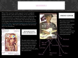
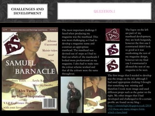
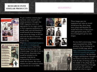
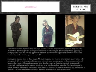
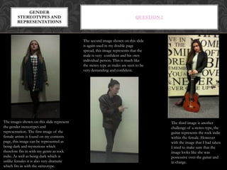
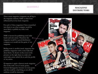
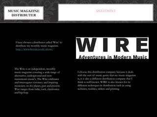
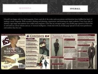
QUESTION 1 –
IN WHAT WAYS DOES YOUR MEDIA PRODUCT
USE, DEVELOP OR CHALLENGE FORMS AND
CONVENTIONS OF REAL MEDIA PRODUCTS?
QUESTION 1
FRONT COVER
When I first started my media magazine I wasn’t completed
familiar with the codes and conventions. It was only when I
familiarised myself with research that I began to understand the
different conventions a magazine must have in order for the
creation of my own to be successful. The task that allowed me
to be familiar with the different kinds of conventions is found
on my blog :http://christiehigh.blogspot.co.uk/2014/09/music-
magazine-edit.html. This task is also displayed on the left hand
side of my PowerPoint.
The pink circles indicate the
key conventions in which I
had learnt. These consist of
the masthead, main image,
cover lines, barcode, web
address, main cover line, price,
date and left third.
RESEARCH INTO
SIMILAR PRODUCTS
The arrows shown indicate
where I have used
conventions where needed.
I have incorporated my
previous learning into my
front cover page, this
enabled me to construct my
own music magazine that
looked professional
Masthead
Main image
Cover lines
Barcode
Web
address
Main Cover
Line
Price
Date
Left third
QUESTION 1
CHALLENGES AND
DEVELOPMENT
The most important challenge I
faced when producing my
magazine was the masthead. This
was most challenging as I had to
develop a magazine name and
construct an appropriate
masthead. The masthead was
devised out of steps as I had to
find out which of the mastheads I
looked more professional on my
magazine. I also had to make sure
the colour scheme worked and
that all the colours were the same
throughout.
The logos on the left
are part of my
masthead development,
they are both burgundy,
however the first one I
constructed didn’t look
so good as it was
overlooking the rest of
my magazine design,
however wit my final
one I constructed it
allowed the rest of my
magazine to be seen.
The first image that I needed to develop
was the image on the left, although I
had used appropriate clothing I thought
that something was missing and
therefore I took more image and used
different props such as the guitar on the
right. My other images that I had
developed and challenged to fit a certain
profile are found on my blog :
http://christiehigh.blogspot.co.uk/2014
/12/these-are-many-images-form-
which-i-have.html
QUESTION 1
To get a realistic contents page I
had done some research into
similar products, I thought that
NME magazines were most
appropriate for my target market
as their magazines publication are
mostly indie rock and therefore I
would benefit from browsing. I
came across the image on the left
and took this idea to form my
draft copy on placement which is
found on my
blog:http://christiehigh.blogspot.c
o.uk/2014/11/drafting-and-
planning_12.html. Once I had
figured out the position of my
contents page I was able to use my
front cover to determine what
would be included on the
magazine, I did this by
incorporating the cover lines
within the contents. My colour
scheme was also consistent within
my contents as it is on NME.
For my draft contents page I have
again researched into similar
products. For my writing on my
research double page spread
http://christiehigh.blogspot.co.uk
/2014/11/research-into-similar-
products-and.html the first letter
is bigger and therefore I thought it
was better to do this too. I also
took the idea of having a quote in
the middle of the p0age like my
researched magazine as I thought
it would give the audience an
insight into what to expect.
RESEARCH INTO
SIMILAR PRODUCTS
These images gave me
inspiration into what my model
should pose like, these image
shave props and therefore my
model tried some of these poses
with appropriate props, this is
how I managed to get my main
images.
QUESTION 2 –
HOW DOES YOUR MEDIA PRODUCT
REPRESENT PARTICULAR SOCIAL
GROUPS?
QUESTION 2 GENDER, AGE
& CLASS
These image resemble my music magazine target audience. The first image resembles my music magazine to be
stylish which therefore appeal to a younger audience such as early teenagers. The second picture is appealing to
younger people too as it is very age appropriate. The third picture appeals to people who like rock music/indie
music and would be aimed at ages between 14-19.
My magazine includes most of these images. My music magazine as a whole is aimed a older viewers such as older
teenagers (14-19) as the language and images used and music genre are appropriate to older teenagers and would
not appeal to children. The gender aim would most likely be females as the lead cover star is attractive male.
However it would also appeal to males as rock is seen to be based around the male take. The class aim would be
middle class as in the magazine the audience has a chance to win tickets to concerts which they may not be going to
normally. Also the types of clothes my model is wearing are middle class to show individuality.
QUESTION 2
GENDER
STEREOTYPES AND
REPRESENTATIONS
The third image is another
challenge of a stereo type, the
guitar represents the rock indie
within the female. However
with the image that I had taken
I tried to make sure that the
image looks like she was
possessive over the guitar and
in charge.
The images shown on this slide represent
the gender stereotypes and
representation. The first image of the
female artists is found on my contents
page, this image can be represented as
being dark and mysterious which
therefore fits in with my genre as rock
indie. As well as being dark which is
unlike females it is also very dramatic
which fits in with the stereotype.
The second image shown on this slide
is again used in my double page
spread, this image represents that the
male is very confident and his own
individual person. This is much like
the stereo type as males are seen to be
very demanding and confident.
QUESTION 3 –
WHAT KIND OF MEDIA INSTITUTION MIGHT
DISTRIBUTE YOUR MEDIA PRODUCT AND WHY?
QUESTION 3
MAGAZINE
DISTRIBUTORS
These music magazine companies are all big in
the magazine industry. NME is what I was
influenced by in my music magazine.
For each of these magazines I have researched
into them to see what company would be
most likely to publish my indie/rock
magazine.
NME is known for publishing rock/indie
bands and solo artists. Therefore this
magazine would be a good distribution
company as it would suit the genre of my
magazine.
Rolling stone is another music magazine that
publishes magazines with a rock/indie feel
about them. As shown on the cover in the
pictures on the right there is a male solo
rock/indie artists which fits in with the profile
of my artists.
Q magazine is again a famous music magazine
that works with a lot of music genres,
however Q magazine focusses on every genre
and this could be a bad thing as not all the
audience would be interested.
QUESTION 3MUSIC MAGAZINE
DISTRIBUTER
I have chosen a distributor called ‘Wire’ to
distribute my monthly music magazine.
http://www.thewire.co.uk/about/
The Wire is an independent, monthly
music magazine covering a wide range of
alternative, underground and non-
mainstream music's. The Wire celebrates
and interrogates visionary and inspiring
musicians on the planet, past and present.
Wire ranges from indie, rock, electronica
and hip-hop.
I choose this distribution company because it deals
with the sort of music genre that my music magazine
is, it is also a different distribution company that I
think is well known. WIRE is also known for its
different techniques in distribution such as using
websites, mobiles, tablets and printing.
QUESTION 4-
WHO WOULD BE THE AUDIENCE FOR YOUR
MEDIA PRODUCT?
QUESTION 4 TARGET
AUDIENCE
My music magazine has a lot of similarities with the
music magazine NME. Their target audience aims at
teenagers/adults ranging from 16-25. However my
music magazine would aim at just teenagers ranging
from the age of 14-20. Before I started to construct
my music magazine I done a questionnaire for
teenagers to fill in to see what they would want to see
and why.
http://christiehigh.blogspot.co.uk/2014/11/target-
audience.html
The circles that I have highlighted on the NME
magazine shows where my music magazine and
NME have similarities between them. Like the
NME have used a selling line in which
advertises something within my magazine. I
have also positioned my cover lines the same
way in which NME have placed theirs. The
colour scheme has also took place in my
magazine however the colours have been
burgundy and white
QUESTION 5-
HOW DID YOU ATTRACT/ADDRESS YOUR
AUDIENCE?
QUESTION 5CONTENTS
(IMAGES)
I have used a range of images throughout my
magazine. However my main musician has the
majority of images because my magazine
focusses closer towards a main musician. My
main Musician appears very confident with
music, this shows through some of these
images:
http://christiehigh.blogspot.co.uk/2014/12/the
se-are-many-images-form-which-i-have.html.
With the props I have used throughout my
magazine it also gives its own genre such as the
guitar steering towards rock/indie.
These are the final cover lines
that I have used on my
magazine front cover, these
are some of the subjects that
I think will catch the
audiences attention as they
are covers of stories. The use
of alliteration and
exclamation marks gives them
some excitement.
COVER STORIES
My cover stories are further
explained on my blog:
http://christiehigh.blogspot
.co.uk/2014/12/drafting-
and-planning_11.html
QUESTION 5
MASTHEAD
I have chosen to call my magazine
External Sound because this is in
reference to the ongoing music and
magazines that will be produced as the
magazine are all issues. ES is another
catchy way in which my audience will be
able to connect better with. The colours
of the masthead can change depending
on every magazine issue, this enables it
to become better with every magazine
issue. The two letters is also like slang
which fits in with my target audience
COLOURS
The colours on the right that I used in my
magazine can signify dark colours which are
associated with rock/indie artists . As well as dark
colours my audience would benefit from a light
colour such as white to make the text seen.
Further questions were asked on survey monkey :
http://christiehigh.blogspot.co.uk/2014/11/target-audience.html
QUESTION 6
WHAT HAVE YOU LEARNT ABOUT
TECHNOLOGIES FROM THE PROCESS OF
CONSTRUCTING THE PRODUCT?
QUESTION 6
TECHNOLOGIES
USED
When constructing my magazine I used various programmes to help with the final outcome.
However with these programmes they had strengths and weaknesses.
Publisher was easy to use. I
altered fonts and sizes to get the
appropriate text, it also gave me
clear results such as spell check
and accurate print previews
Page Plus enabled me to experiment
with different backgrounds and a
variety of fonts in which I could do
my masthead on. Also page Plus was
really easy to understand and had a
variety of different compartments to
which helped me a lot
Paint. Net - I was able
to change images with
different effects and
tools. I was also able to
separate my work so that
it was easy to produce.
STRENGTHS
QUESTION 6TECHNOLOGIES
USED
WEAKNESSES
Publisher was unable to edit
pictures. It was also tricky rearrange
text placements and text boxes.
Page Plus was tricky to save
documents as I had to save them as
different packs. It was also risky as
sometimes my work wouldn’t save
at a good standard.
Pain .NET had different
effects In which were a poor
quality. This was also a bit
tricky as I wasn’t familiar with
the programme. There were
also limited shapes and tools
in which I needed to use
QUESTION 6DRAFTING AND
PLANNING
Drafting and Planning : http://christiehigh.blogspot.co.uk/
Before I was able to come up with my final
music magazine I went through a lot of
drafting and planning so that I was able to
learn throughout my course. The image on
the left shows my contents ideas, the image
in the middle was from a website which
determined the name of my magazine and
the last image was some interview
questions and answers in which asked
someone. All of these drafting and
planning ideas links to all the research that
I have been discovering throughout.
QUESTION 6 PHOTOGRAPHIC
CHOICES
Once I had done my drafting and planning I was then aware in what genre area I wanted to do and therefore I took the a variety of
images that are shown on the left. I put these images into different programmes and edited them so that they were appropriate for
my magazine.
When I went on to designing my Contents page I realised that I would have to include other musical artists and therefore tried to
photograph some females so that it would appeal to both genders. With these images on the right you can see how I edited them and
how it benefitted my magazine.
http://christiehigh.blogspot.co.uk/
QUESTION 6
BLOGGER
Blogger is a way that I was able to post my magazine ideas and information. This was an easy
way as I was able to keep track of my work and edit and display key information. An
advantage of this is that I can access my blog at any time and with the right link other people
have the opportunity to view my work too. An disadvantage of not using blogger would be
that my work would be stored in a folder which would be thick with a lot of paper, blogger
can be accessed from computers or even phones and therefore is a more safer alternative.
Blogger is also good for
posting, deleting and editing
work compared to re-writing or
erasing work.
QUESTION 7-
LOOKING BACK TO YOUR PRELIMINARY TASK,
WHAT DO YOU FEEL THAT YOU HAVE LEARNT
IN THE PROGRESSION FROM IT TO THE FULL
PRODUCT?
QUESTION 7
PRELIMINARY TASK MAIN TASK FINAL
In the preliminary
task the layout is
not presented
very good as the
background
doesn’t suit the
magazine. Also I
have used any
colour scheme
and also the code
ad conventions
haven't been used
well or at all.
QUESTION 8-
HOW SUCCESSFUL DO YOU FEEL YOUR END
PRODUCT IS IN FULFILLING THE TASK? HOW
WELL DOES IT FIT THE BRIEF?
QUESTION 8 OVERALL
Overall I am happy with my final magazine, I have used all of the codes and conventions and therefore have fulfilled the brief of
making a music magazine. With research, drafting and planning, organisation and knowing my target audience I have been able to
identify a age range and audience for a indie/rock magazine. I feel that my strongest page is my double page spread as I feel it fits
in well with my colour scheme and use of musical intelligence. I think that with my double page spread it looks more profession
and realistic than the rest.

Evaluation

  • 2.
    QUESTION 1 – INWHAT WAYS DOES YOUR MEDIA PRODUCT USE, DEVELOP OR CHALLENGE FORMS AND CONVENTIONS OF REAL MEDIA PRODUCTS?
  • 3.
    QUESTION 1 FRONT COVER WhenI first started my media magazine I wasn’t completed familiar with the codes and conventions. It was only when I familiarised myself with research that I began to understand the different conventions a magazine must have in order for the creation of my own to be successful. The task that allowed me to be familiar with the different kinds of conventions is found on my blog :http://christiehigh.blogspot.co.uk/2014/09/music- magazine-edit.html. This task is also displayed on the left hand side of my PowerPoint. The pink circles indicate the key conventions in which I had learnt. These consist of the masthead, main image, cover lines, barcode, web address, main cover line, price, date and left third. RESEARCH INTO SIMILAR PRODUCTS The arrows shown indicate where I have used conventions where needed. I have incorporated my previous learning into my front cover page, this enabled me to construct my own music magazine that looked professional Masthead Main image Cover lines Barcode Web address Main Cover Line Price Date Left third
  • 4.
    QUESTION 1 CHALLENGES AND DEVELOPMENT Themost important challenge I faced when producing my magazine was the masthead. This was most challenging as I had to develop a magazine name and construct an appropriate masthead. The masthead was devised out of steps as I had to find out which of the mastheads I looked more professional on my magazine. I also had to make sure the colour scheme worked and that all the colours were the same throughout. The logos on the left are part of my masthead development, they are both burgundy, however the first one I constructed didn’t look so good as it was overlooking the rest of my magazine design, however wit my final one I constructed it allowed the rest of my magazine to be seen. The first image that I needed to develop was the image on the left, although I had used appropriate clothing I thought that something was missing and therefore I took more image and used different props such as the guitar on the right. My other images that I had developed and challenged to fit a certain profile are found on my blog : http://christiehigh.blogspot.co.uk/2014 /12/these-are-many-images-form- which-i-have.html
  • 5.
    QUESTION 1 To geta realistic contents page I had done some research into similar products, I thought that NME magazines were most appropriate for my target market as their magazines publication are mostly indie rock and therefore I would benefit from browsing. I came across the image on the left and took this idea to form my draft copy on placement which is found on my blog:http://christiehigh.blogspot.c o.uk/2014/11/drafting-and- planning_12.html. Once I had figured out the position of my contents page I was able to use my front cover to determine what would be included on the magazine, I did this by incorporating the cover lines within the contents. My colour scheme was also consistent within my contents as it is on NME. For my draft contents page I have again researched into similar products. For my writing on my research double page spread http://christiehigh.blogspot.co.uk /2014/11/research-into-similar- products-and.html the first letter is bigger and therefore I thought it was better to do this too. I also took the idea of having a quote in the middle of the p0age like my researched magazine as I thought it would give the audience an insight into what to expect. RESEARCH INTO SIMILAR PRODUCTS These images gave me inspiration into what my model should pose like, these image shave props and therefore my model tried some of these poses with appropriate props, this is how I managed to get my main images.
  • 6.
    QUESTION 2 – HOWDOES YOUR MEDIA PRODUCT REPRESENT PARTICULAR SOCIAL GROUPS?
  • 7.
    QUESTION 2 GENDER,AGE & CLASS These image resemble my music magazine target audience. The first image resembles my music magazine to be stylish which therefore appeal to a younger audience such as early teenagers. The second picture is appealing to younger people too as it is very age appropriate. The third picture appeals to people who like rock music/indie music and would be aimed at ages between 14-19. My magazine includes most of these images. My music magazine as a whole is aimed a older viewers such as older teenagers (14-19) as the language and images used and music genre are appropriate to older teenagers and would not appeal to children. The gender aim would most likely be females as the lead cover star is attractive male. However it would also appeal to males as rock is seen to be based around the male take. The class aim would be middle class as in the magazine the audience has a chance to win tickets to concerts which they may not be going to normally. Also the types of clothes my model is wearing are middle class to show individuality.
  • 8.
    QUESTION 2 GENDER STEREOTYPES AND REPRESENTATIONS Thethird image is another challenge of a stereo type, the guitar represents the rock indie within the female. However with the image that I had taken I tried to make sure that the image looks like she was possessive over the guitar and in charge. The images shown on this slide represent the gender stereotypes and representation. The first image of the female artists is found on my contents page, this image can be represented as being dark and mysterious which therefore fits in with my genre as rock indie. As well as being dark which is unlike females it is also very dramatic which fits in with the stereotype. The second image shown on this slide is again used in my double page spread, this image represents that the male is very confident and his own individual person. This is much like the stereo type as males are seen to be very demanding and confident.
  • 9.
    QUESTION 3 – WHATKIND OF MEDIA INSTITUTION MIGHT DISTRIBUTE YOUR MEDIA PRODUCT AND WHY?
  • 10.
    QUESTION 3 MAGAZINE DISTRIBUTORS These musicmagazine companies are all big in the magazine industry. NME is what I was influenced by in my music magazine. For each of these magazines I have researched into them to see what company would be most likely to publish my indie/rock magazine. NME is known for publishing rock/indie bands and solo artists. Therefore this magazine would be a good distribution company as it would suit the genre of my magazine. Rolling stone is another music magazine that publishes magazines with a rock/indie feel about them. As shown on the cover in the pictures on the right there is a male solo rock/indie artists which fits in with the profile of my artists. Q magazine is again a famous music magazine that works with a lot of music genres, however Q magazine focusses on every genre and this could be a bad thing as not all the audience would be interested.
  • 11.
    QUESTION 3MUSIC MAGAZINE DISTRIBUTER Ihave chosen a distributor called ‘Wire’ to distribute my monthly music magazine. http://www.thewire.co.uk/about/ The Wire is an independent, monthly music magazine covering a wide range of alternative, underground and non- mainstream music's. The Wire celebrates and interrogates visionary and inspiring musicians on the planet, past and present. Wire ranges from indie, rock, electronica and hip-hop. I choose this distribution company because it deals with the sort of music genre that my music magazine is, it is also a different distribution company that I think is well known. WIRE is also known for its different techniques in distribution such as using websites, mobiles, tablets and printing.
  • 12.
    QUESTION 4- WHO WOULDBE THE AUDIENCE FOR YOUR MEDIA PRODUCT?
  • 13.
    QUESTION 4 TARGET AUDIENCE Mymusic magazine has a lot of similarities with the music magazine NME. Their target audience aims at teenagers/adults ranging from 16-25. However my music magazine would aim at just teenagers ranging from the age of 14-20. Before I started to construct my music magazine I done a questionnaire for teenagers to fill in to see what they would want to see and why. http://christiehigh.blogspot.co.uk/2014/11/target- audience.html The circles that I have highlighted on the NME magazine shows where my music magazine and NME have similarities between them. Like the NME have used a selling line in which advertises something within my magazine. I have also positioned my cover lines the same way in which NME have placed theirs. The colour scheme has also took place in my magazine however the colours have been burgundy and white
  • 14.
    QUESTION 5- HOW DIDYOU ATTRACT/ADDRESS YOUR AUDIENCE?
  • 15.
    QUESTION 5CONTENTS (IMAGES) I haveused a range of images throughout my magazine. However my main musician has the majority of images because my magazine focusses closer towards a main musician. My main Musician appears very confident with music, this shows through some of these images: http://christiehigh.blogspot.co.uk/2014/12/the se-are-many-images-form-which-i-have.html. With the props I have used throughout my magazine it also gives its own genre such as the guitar steering towards rock/indie. These are the final cover lines that I have used on my magazine front cover, these are some of the subjects that I think will catch the audiences attention as they are covers of stories. The use of alliteration and exclamation marks gives them some excitement. COVER STORIES My cover stories are further explained on my blog: http://christiehigh.blogspot .co.uk/2014/12/drafting- and-planning_11.html
  • 16.
    QUESTION 5 MASTHEAD I havechosen to call my magazine External Sound because this is in reference to the ongoing music and magazines that will be produced as the magazine are all issues. ES is another catchy way in which my audience will be able to connect better with. The colours of the masthead can change depending on every magazine issue, this enables it to become better with every magazine issue. The two letters is also like slang which fits in with my target audience COLOURS The colours on the right that I used in my magazine can signify dark colours which are associated with rock/indie artists . As well as dark colours my audience would benefit from a light colour such as white to make the text seen. Further questions were asked on survey monkey : http://christiehigh.blogspot.co.uk/2014/11/target-audience.html
  • 17.
    QUESTION 6 WHAT HAVEYOU LEARNT ABOUT TECHNOLOGIES FROM THE PROCESS OF CONSTRUCTING THE PRODUCT?
  • 18.
    QUESTION 6 TECHNOLOGIES USED When constructingmy magazine I used various programmes to help with the final outcome. However with these programmes they had strengths and weaknesses. Publisher was easy to use. I altered fonts and sizes to get the appropriate text, it also gave me clear results such as spell check and accurate print previews Page Plus enabled me to experiment with different backgrounds and a variety of fonts in which I could do my masthead on. Also page Plus was really easy to understand and had a variety of different compartments to which helped me a lot Paint. Net - I was able to change images with different effects and tools. I was also able to separate my work so that it was easy to produce. STRENGTHS
  • 19.
    QUESTION 6TECHNOLOGIES USED WEAKNESSES Publisher wasunable to edit pictures. It was also tricky rearrange text placements and text boxes. Page Plus was tricky to save documents as I had to save them as different packs. It was also risky as sometimes my work wouldn’t save at a good standard. Pain .NET had different effects In which were a poor quality. This was also a bit tricky as I wasn’t familiar with the programme. There were also limited shapes and tools in which I needed to use
  • 20.
    QUESTION 6DRAFTING AND PLANNING Draftingand Planning : http://christiehigh.blogspot.co.uk/ Before I was able to come up with my final music magazine I went through a lot of drafting and planning so that I was able to learn throughout my course. The image on the left shows my contents ideas, the image in the middle was from a website which determined the name of my magazine and the last image was some interview questions and answers in which asked someone. All of these drafting and planning ideas links to all the research that I have been discovering throughout.
  • 21.
    QUESTION 6 PHOTOGRAPHIC CHOICES OnceI had done my drafting and planning I was then aware in what genre area I wanted to do and therefore I took the a variety of images that are shown on the left. I put these images into different programmes and edited them so that they were appropriate for my magazine. When I went on to designing my Contents page I realised that I would have to include other musical artists and therefore tried to photograph some females so that it would appeal to both genders. With these images on the right you can see how I edited them and how it benefitted my magazine. http://christiehigh.blogspot.co.uk/
  • 22.
    QUESTION 6 BLOGGER Blogger isa way that I was able to post my magazine ideas and information. This was an easy way as I was able to keep track of my work and edit and display key information. An advantage of this is that I can access my blog at any time and with the right link other people have the opportunity to view my work too. An disadvantage of not using blogger would be that my work would be stored in a folder which would be thick with a lot of paper, blogger can be accessed from computers or even phones and therefore is a more safer alternative. Blogger is also good for posting, deleting and editing work compared to re-writing or erasing work.
  • 23.
    QUESTION 7- LOOKING BACKTO YOUR PRELIMINARY TASK, WHAT DO YOU FEEL THAT YOU HAVE LEARNT IN THE PROGRESSION FROM IT TO THE FULL PRODUCT?
  • 24.
    QUESTION 7 PRELIMINARY TASKMAIN TASK FINAL In the preliminary task the layout is not presented very good as the background doesn’t suit the magazine. Also I have used any colour scheme and also the code ad conventions haven't been used well or at all.
  • 25.
    QUESTION 8- HOW SUCCESSFULDO YOU FEEL YOUR END PRODUCT IS IN FULFILLING THE TASK? HOW WELL DOES IT FIT THE BRIEF?
  • 26.
    QUESTION 8 OVERALL OverallI am happy with my final magazine, I have used all of the codes and conventions and therefore have fulfilled the brief of making a music magazine. With research, drafting and planning, organisation and knowing my target audience I have been able to identify a age range and audience for a indie/rock magazine. I feel that my strongest page is my double page spread as I feel it fits in well with my colour scheme and use of musical intelligence. I think that with my double page spread it looks more profession and realistic than the rest.