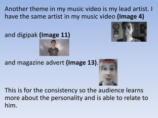
Question 2: How effective is the
combination of you main product
and ancillary tasks?
My brand identity is the theme of insanity. This is portrayed
through the use images, in my digipak I merged pictures
together in 3 of my sections. On the front cover I merged
different emotions being shown by the artist, which the target
audience can easily relate to. On the bottom right section I
showed the artist on a bed, gripping his head in different
positions to show his restlessness and insanity. On the top right
I used the artist sat against a fall to make it look like he is sat in
the corner thinking, letting his thoughts consume him. I used
different pictures to show him slowly turning insane from his
thoughts. These pictures are him being somewhat happy, then
thinking, then screaming as he has turned crazy and insane. My
magazine advert has the images of him being happy,
emotionless then screaming. My main product is my music
video of the song The Judge and my ancillary tasks are my
digipak and magazine advert.
The main theme in my music video is the effect of
black and white. I have used black and white
because it suggests a memory is taking place along
with the blur around the edge (Image 8).
This theme carries on into my digipak (Image 13)
and magazine advert (Image 15)
with my main image that represents insanity. It does
this as my main image is of my lead artist is showing
different emotions and the images of the artist are
merged together to show that he is insane.
This person is the same in my magazine advert
and my music video. However, in my music
video the black and white represents the
memory my digipak and magazine advert the
black and white in these represents the mind set
of what my artist used to be like and this album
is a reflection of his past.
Another theme in my music video is my lead artist. I
have the same artist in my music video (Image 4)
and digipak (Image 11)
and magazine advert (Image 13).
This is for the consistency so the audience learns
more about the personality and is able to relate to
him.
There is one actor in my music video that is not
in my digipak or magazine advert, but she isn’t
as important in the music video as the singer
and she just links back to the singer.
There is a text theme between my Digipak and
magazine advert. This theme is in the font
Gothic720 Lt BT the artists name on both the
digipak and magazine advert; I also used this font
on my track list, spine and copyright text for my
digipak. I also used this font for the newspaper that
left a review saying ‘THE TIMES’, the web address
for the artist and the section saying ‘Includes the
Hit Single THE JUDGE’
There was a connection between my magazine advert,
digipak and music video. This was the black and white
theme. I use black and white in my music video when
there is a memory and I use this with a blur around the
edge to show the audience that it’s a memory or a
flashback. The black and white is used in my digipak for
all the 6 sections, this is because I wanted to show the
audience inside the artists mind and how it is
depressing. I used the black and white in my magazine
advert for the same reason to show the depression in
the artist as well as to show continuity between the
magazine advert and digipak so the audience would
know that the magazine advert is advertising the
digipak.
I made a connection between the magazine advert
and digipak with the use of the red. I used little bits
of red in my magazine advert to represent the
danger that the artist it in, I used it mainly in the
album name in both my digipak (Image 15)
and advert (Image 13).
Another connection that I had between all three
products was that my actor was in them all.
A connection that I had between my music video
and digipak was the use of the pills. In my digipak
they are shown to be a lot of them pouring out of
the bottle onto a table (Image 16)
to represent the artist’s mental stability. In my
music video I show a lot of pills in a bottle being
poured into the hand of the artist (Image 17) which
also shows his mental stability.
It is important to have an effective combination
because it means that the audience can connect
the dots and realise that the magazine advert is
advertising the digipak and that the music video is
from that specific digipak. My overall theme is the
black and white as it represents the sadness in the
artist’s life that he is turmoil and is turning insane.
My digipak was influenced by Metallica’s album
called Hard Wired… To Self-Destruct (Image 18).
• This was my influence because it followed a
strong theme of Insanity and I thought it
would look great if I used inspiration from it. I
have a strong theme of insanity as I have
merged images together to make it look like
the artist is feeling lots of different things at
the same time and I have done this in multiple
sections of my digipak.
• I have a strong brand identity but I could make it
stronger by possibly editing my video in such a
way that shows the audience what he is
thinking, for example the artist in the corner of a
dark room screaming quickly moving his head
from side to side and adding a ghost of the
movements to represent the mind of the artist.
This means that whenever the artist sees the
image of the main character they will
automatically think of the song The Judge and
the album.
• My house style and layout of my digipak and
magazine advert is grey and red. This is because
the grey represents the sadness and the red
represents the danger and insanity within. In the
future I would mainly stick to these colours
because it means that the audience will
remember the artist by seeing certain colours
together. Gothic720 Lt BT is also my house style
because it is recognizable so when the audience
see it they will remember the artist.

Question 2 Evaluation

  • 1.
    Question 2: Howeffective is the combination of you main product and ancillary tasks?
  • 2.
    My brand identityis the theme of insanity. This is portrayed through the use images, in my digipak I merged pictures together in 3 of my sections. On the front cover I merged different emotions being shown by the artist, which the target audience can easily relate to. On the bottom right section I showed the artist on a bed, gripping his head in different positions to show his restlessness and insanity. On the top right I used the artist sat against a fall to make it look like he is sat in the corner thinking, letting his thoughts consume him. I used different pictures to show him slowly turning insane from his thoughts. These pictures are him being somewhat happy, then thinking, then screaming as he has turned crazy and insane. My magazine advert has the images of him being happy, emotionless then screaming. My main product is my music video of the song The Judge and my ancillary tasks are my digipak and magazine advert.
  • 3.
    The main themein my music video is the effect of black and white. I have used black and white because it suggests a memory is taking place along with the blur around the edge (Image 8).
  • 4.
    This theme carrieson into my digipak (Image 13) and magazine advert (Image 15) with my main image that represents insanity. It does this as my main image is of my lead artist is showing different emotions and the images of the artist are merged together to show that he is insane.
  • 5.
    This person isthe same in my magazine advert and my music video. However, in my music video the black and white represents the memory my digipak and magazine advert the black and white in these represents the mind set of what my artist used to be like and this album is a reflection of his past.
  • 6.
    Another theme inmy music video is my lead artist. I have the same artist in my music video (Image 4) and digipak (Image 11) and magazine advert (Image 13). This is for the consistency so the audience learns more about the personality and is able to relate to him.
  • 7.
    There is oneactor in my music video that is not in my digipak or magazine advert, but she isn’t as important in the music video as the singer and she just links back to the singer.
  • 8.
    There is atext theme between my Digipak and magazine advert. This theme is in the font Gothic720 Lt BT the artists name on both the digipak and magazine advert; I also used this font on my track list, spine and copyright text for my digipak. I also used this font for the newspaper that left a review saying ‘THE TIMES’, the web address for the artist and the section saying ‘Includes the Hit Single THE JUDGE’
  • 9.
    There was aconnection between my magazine advert, digipak and music video. This was the black and white theme. I use black and white in my music video when there is a memory and I use this with a blur around the edge to show the audience that it’s a memory or a flashback. The black and white is used in my digipak for all the 6 sections, this is because I wanted to show the audience inside the artists mind and how it is depressing. I used the black and white in my magazine advert for the same reason to show the depression in the artist as well as to show continuity between the magazine advert and digipak so the audience would know that the magazine advert is advertising the digipak.
  • 10.
    I made aconnection between the magazine advert and digipak with the use of the red. I used little bits of red in my magazine advert to represent the danger that the artist it in, I used it mainly in the album name in both my digipak (Image 15) and advert (Image 13). Another connection that I had between all three products was that my actor was in them all.
  • 11.
    A connection thatI had between my music video and digipak was the use of the pills. In my digipak they are shown to be a lot of them pouring out of the bottle onto a table (Image 16) to represent the artist’s mental stability. In my music video I show a lot of pills in a bottle being poured into the hand of the artist (Image 17) which also shows his mental stability.
  • 12.
    It is importantto have an effective combination because it means that the audience can connect the dots and realise that the magazine advert is advertising the digipak and that the music video is from that specific digipak. My overall theme is the black and white as it represents the sadness in the artist’s life that he is turmoil and is turning insane. My digipak was influenced by Metallica’s album called Hard Wired… To Self-Destruct (Image 18).
  • 13.
    • This wasmy influence because it followed a strong theme of Insanity and I thought it would look great if I used inspiration from it. I have a strong theme of insanity as I have merged images together to make it look like the artist is feeling lots of different things at the same time and I have done this in multiple sections of my digipak.
  • 14.
    • I havea strong brand identity but I could make it stronger by possibly editing my video in such a way that shows the audience what he is thinking, for example the artist in the corner of a dark room screaming quickly moving his head from side to side and adding a ghost of the movements to represent the mind of the artist. This means that whenever the artist sees the image of the main character they will automatically think of the song The Judge and the album.
  • 15.
    • My housestyle and layout of my digipak and magazine advert is grey and red. This is because the grey represents the sadness and the red represents the danger and insanity within. In the future I would mainly stick to these colours because it means that the audience will remember the artist by seeing certain colours together. Gothic720 Lt BT is also my house style because it is recognizable so when the audience see it they will remember the artist.