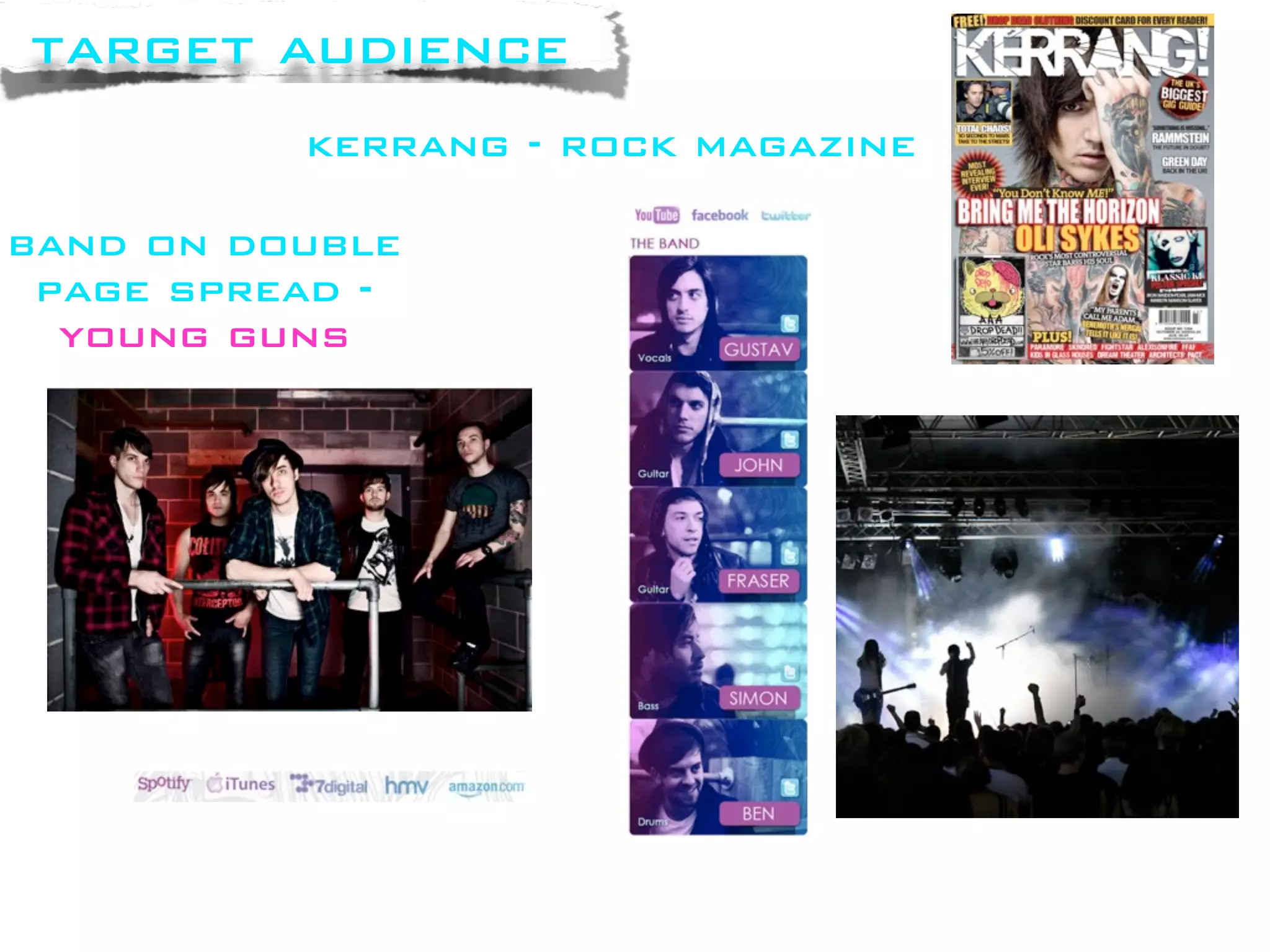
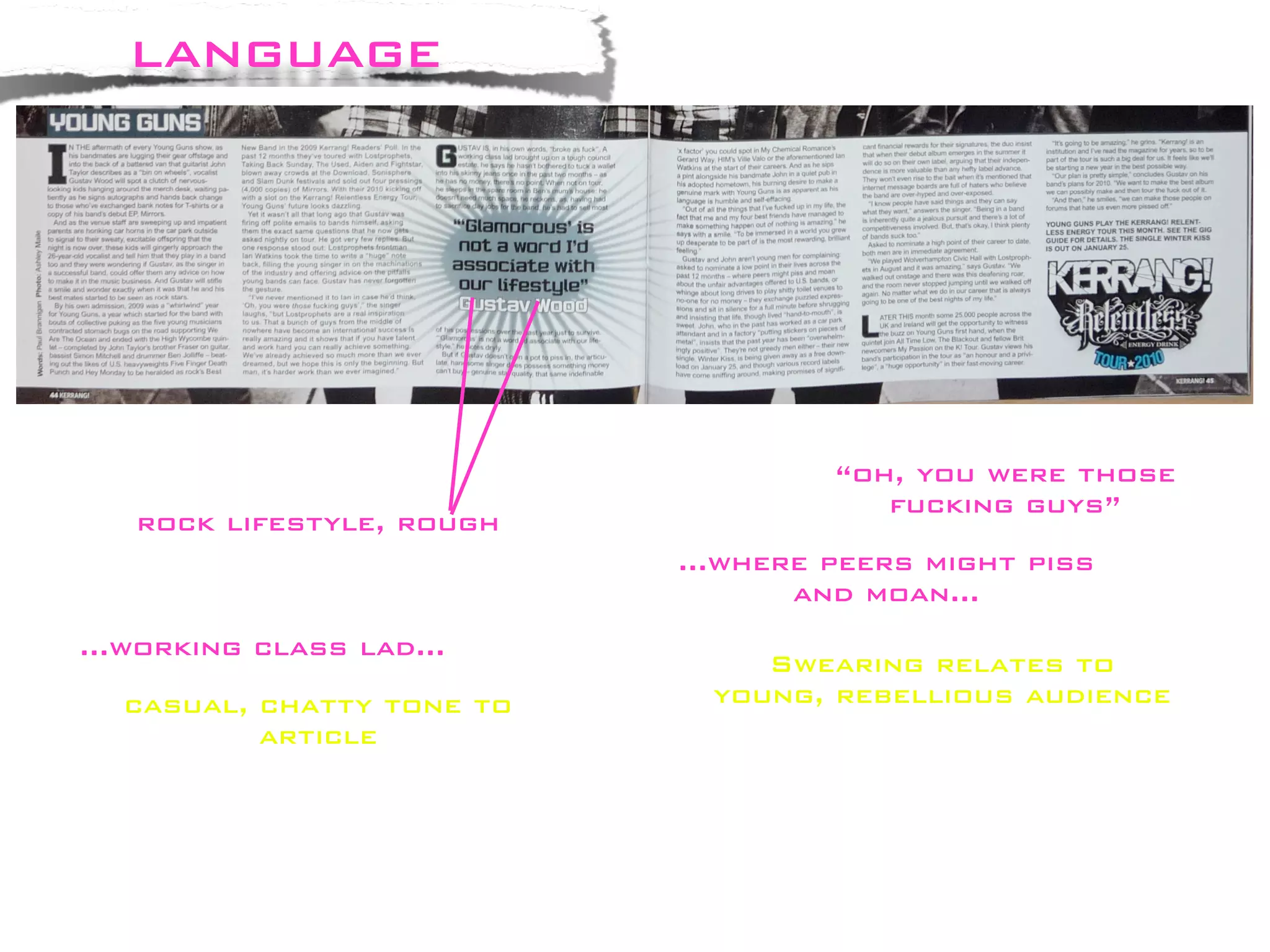
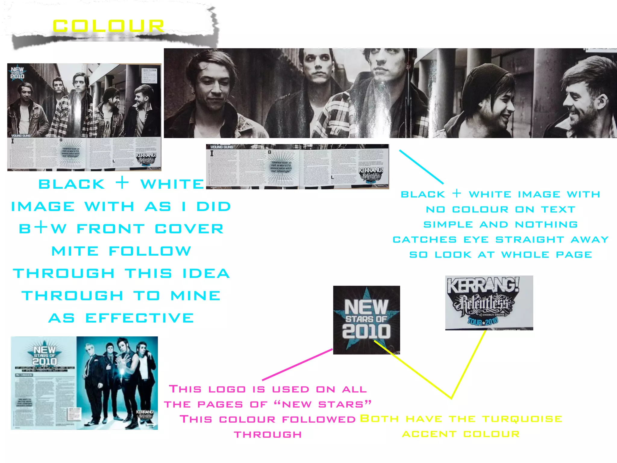
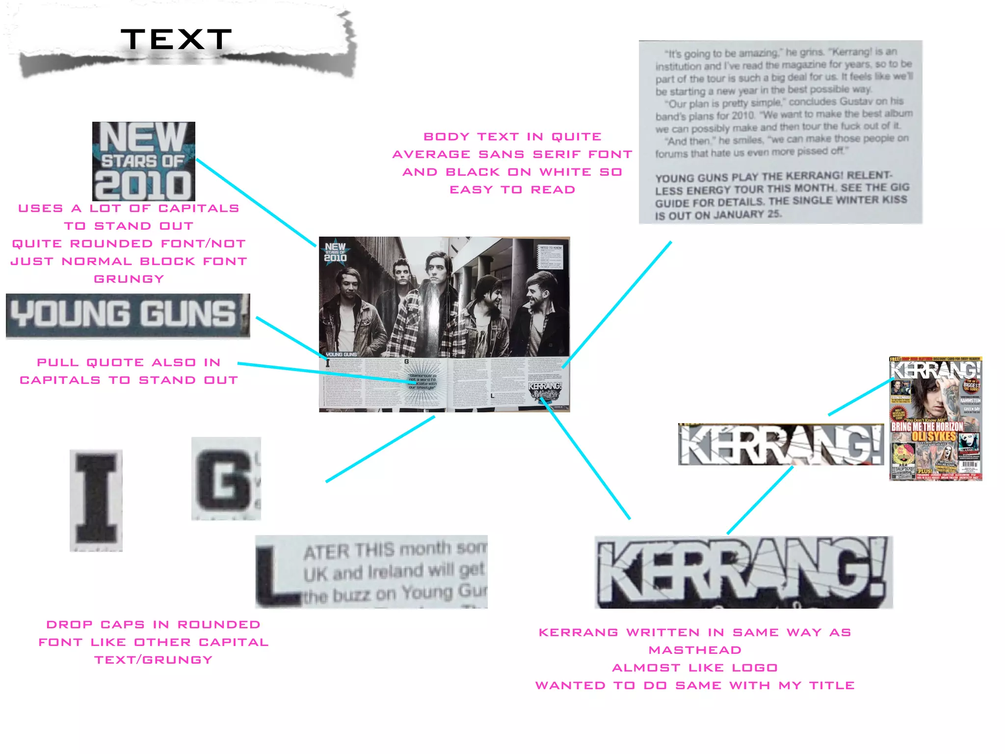
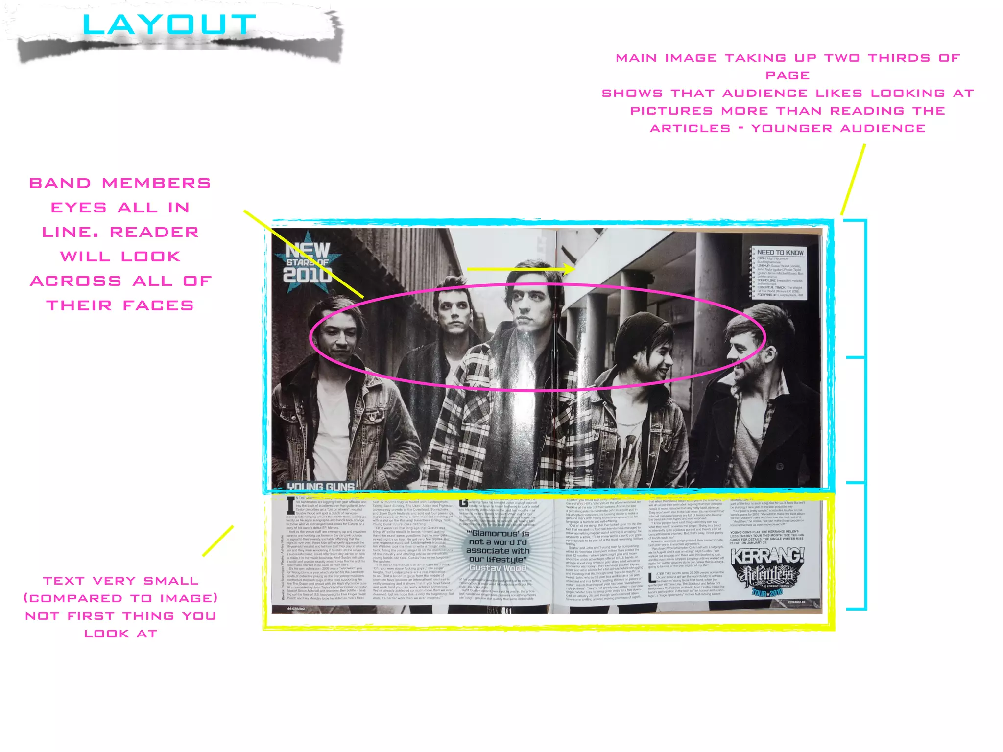
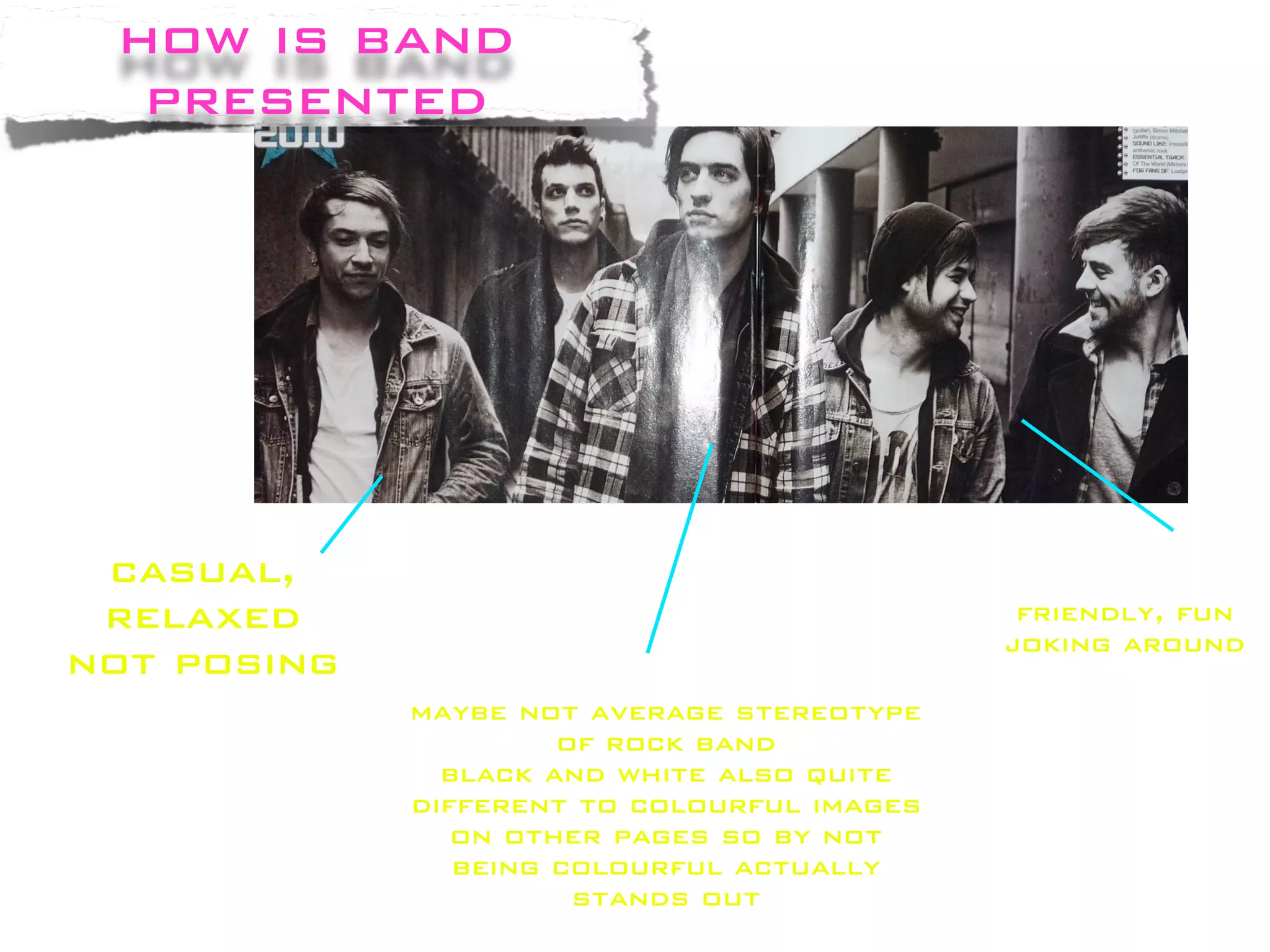
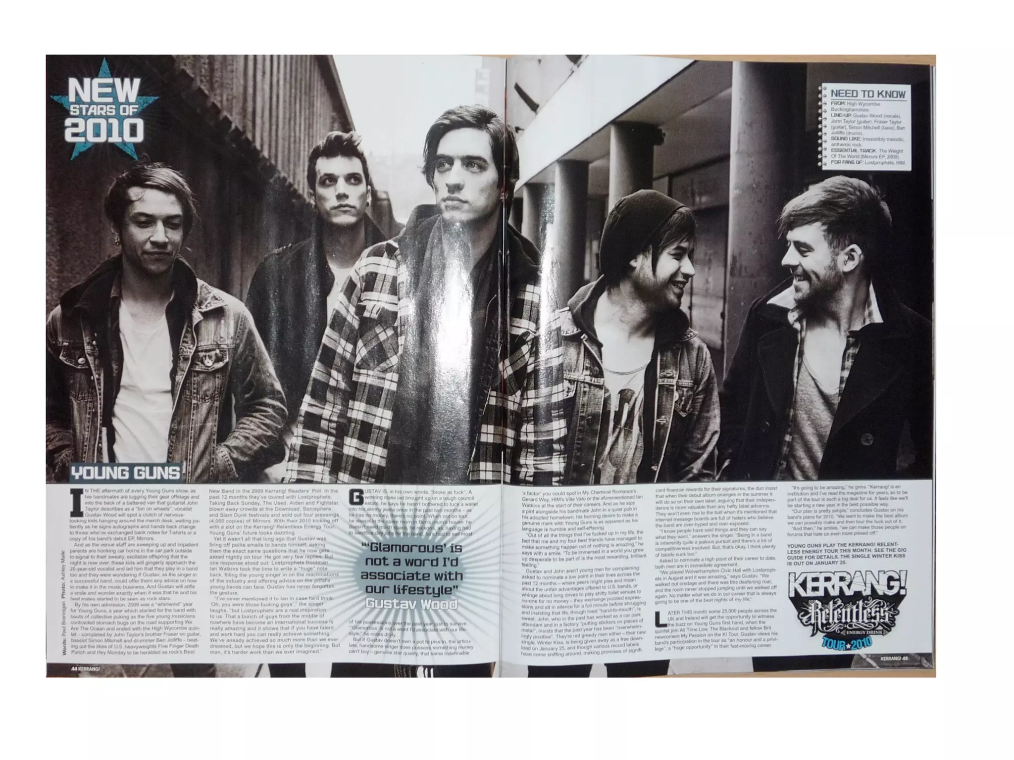
The double page spread in Kerrang magazine features the rock band Young Guns in a casual, relaxed pose. The black and white image takes up most of the page with smaller body text. Bold capitalized fonts are used throughout to stand out.
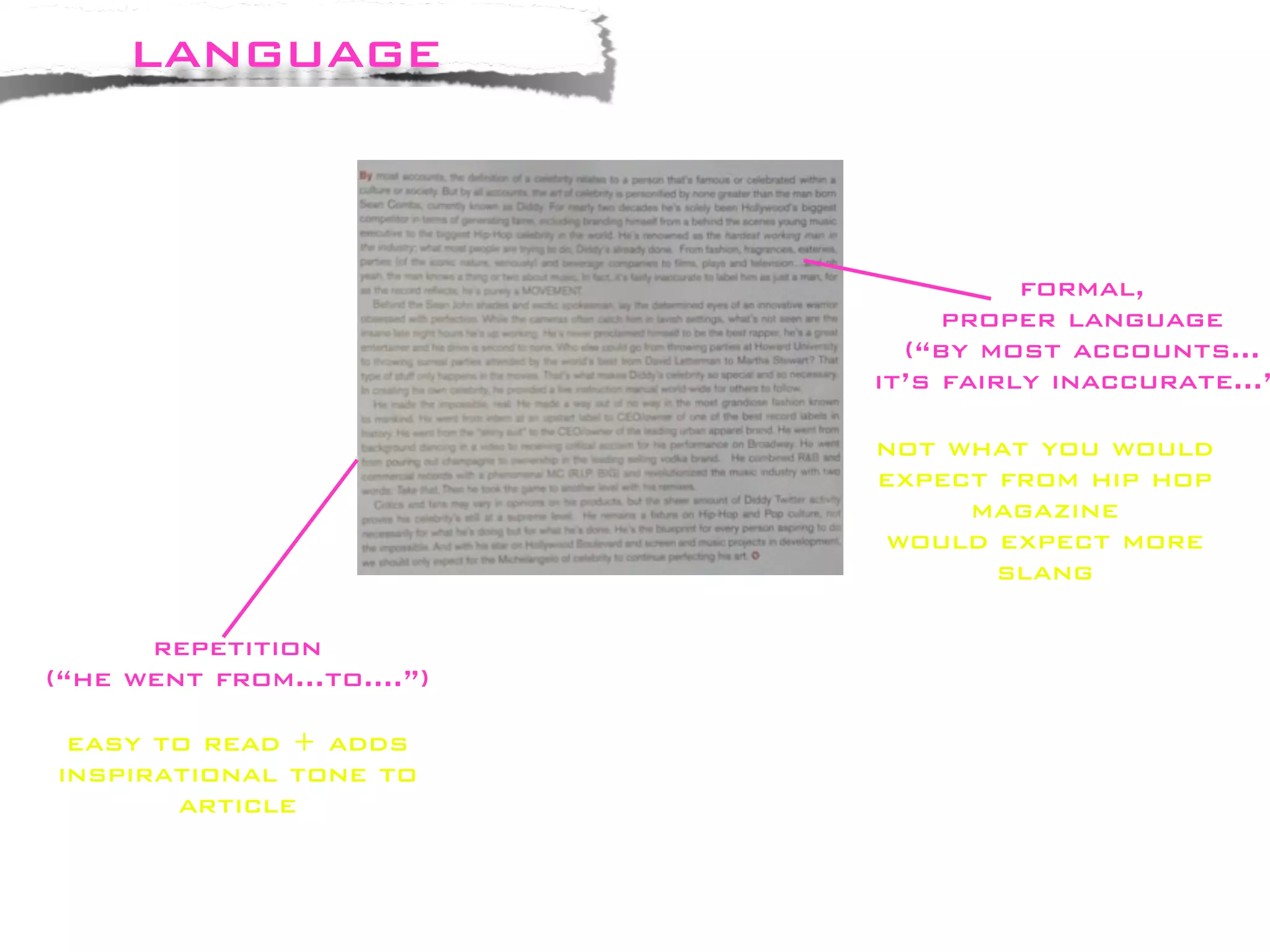
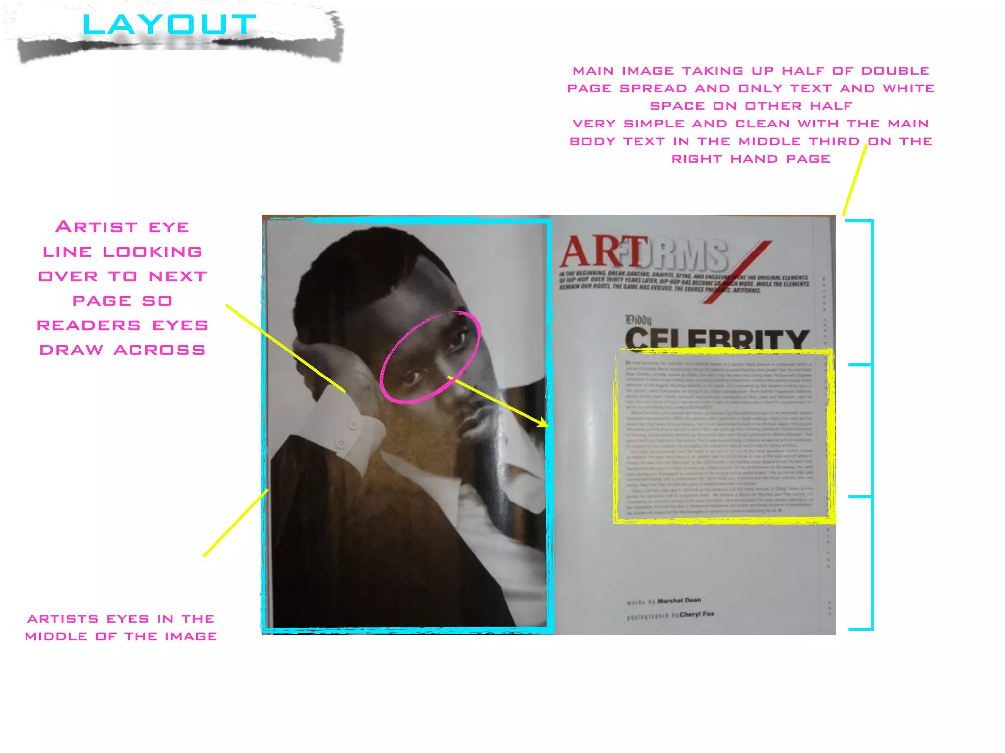
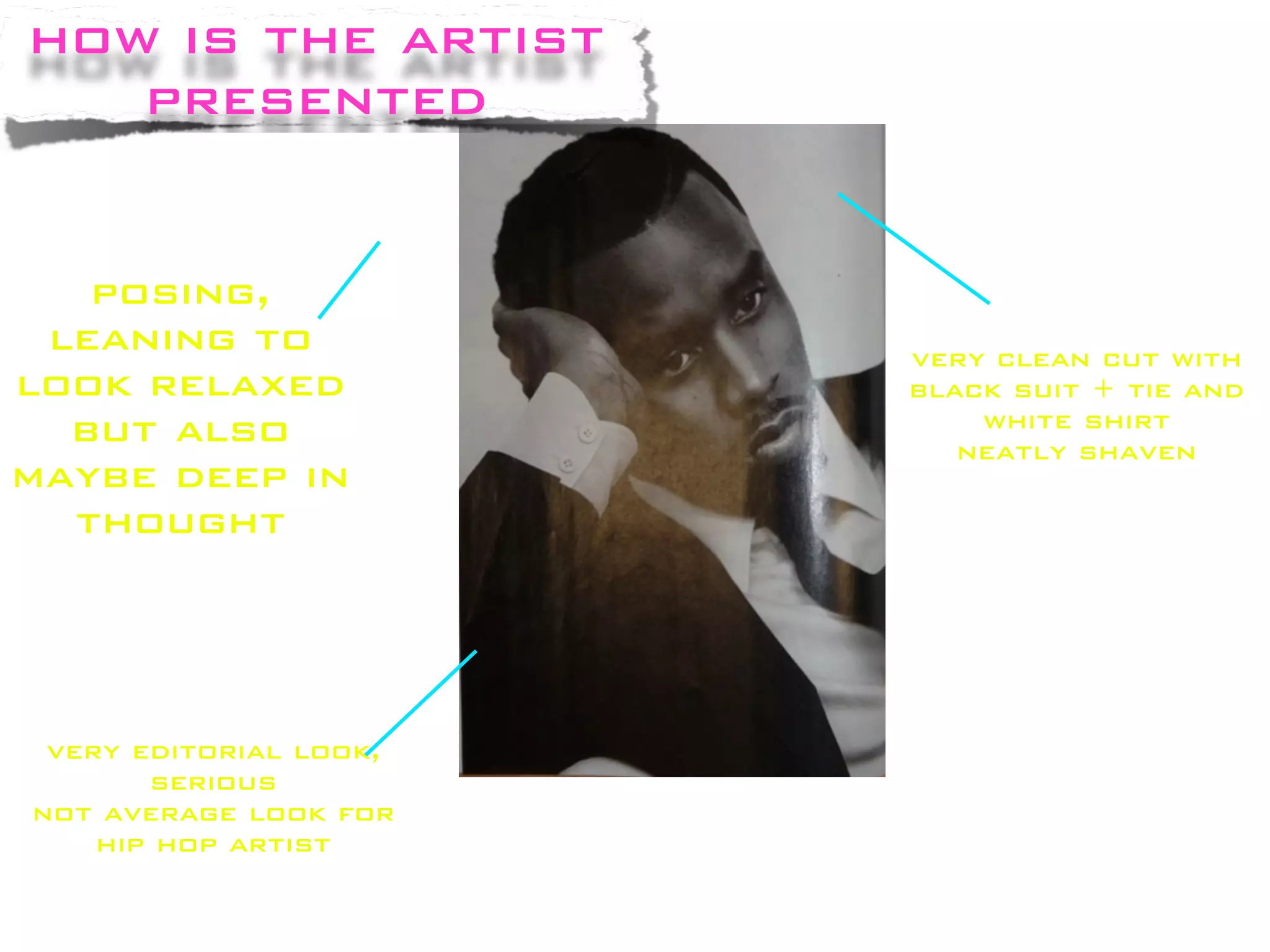
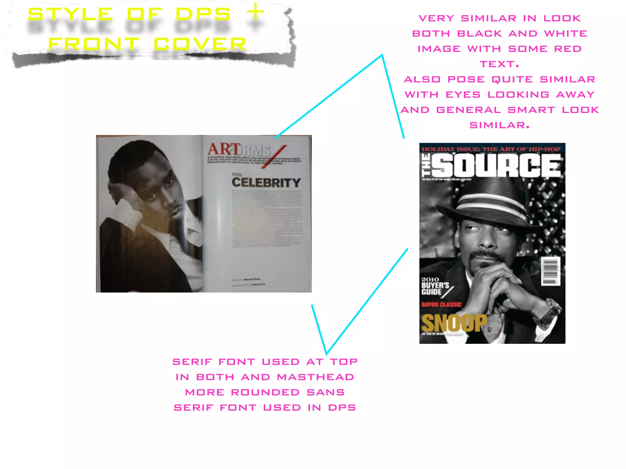
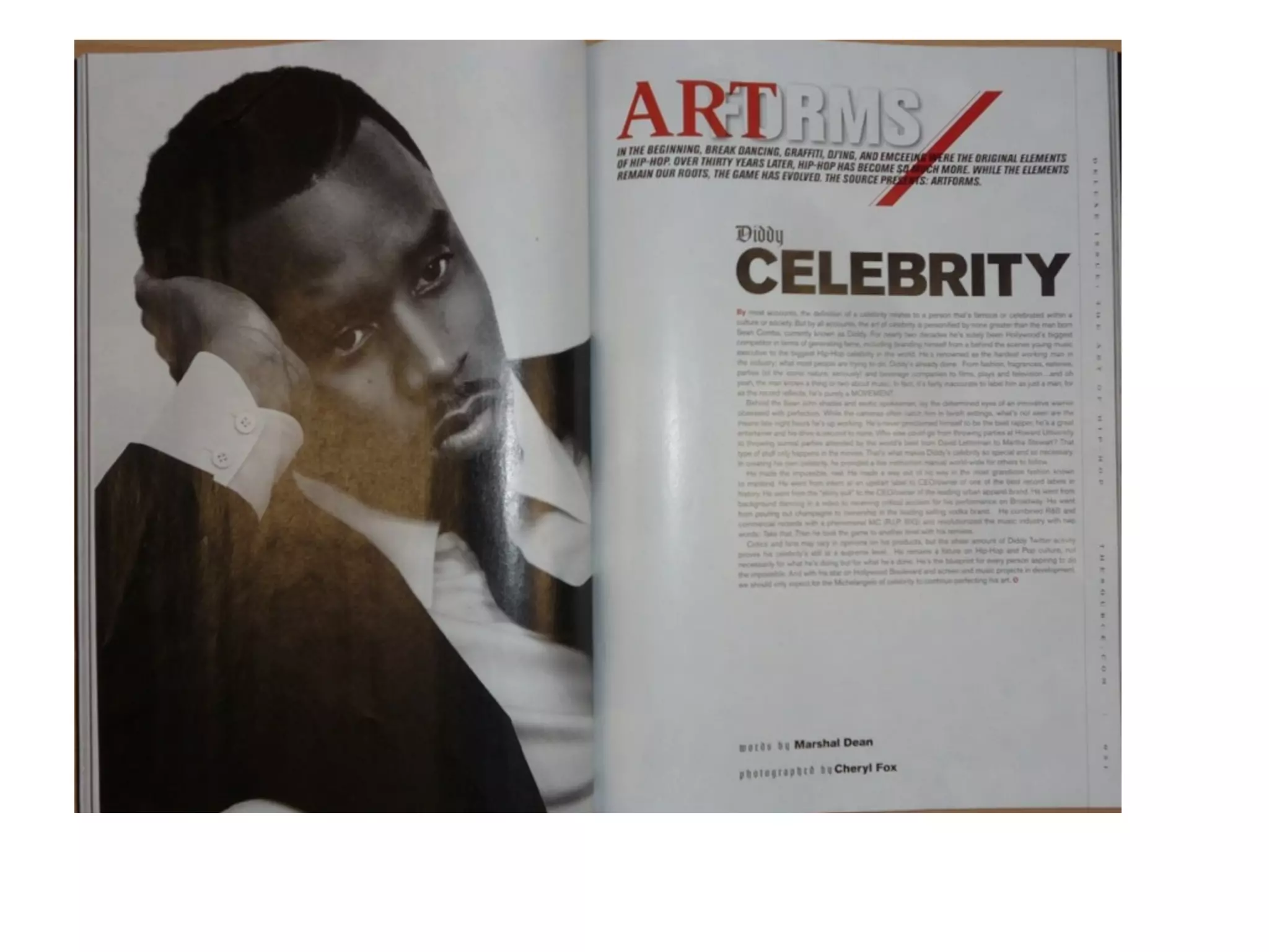
The double page spread in The Source magazine features rapper P. Diddy in a formal, clean cut pose wearing a black suit. The black and white image is on one half of the spread with body text on the other half. Red text is used to make certain words stand out from the formal style.


![Magazine analyasis[1]](https://cdn.slidesharecdn.com/ss_thumbnails/magazineanalyasis1-130118041551-phpapp01-thumbnail.jpg?width=640&height=640&fit=bounds)


