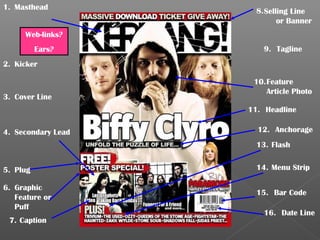
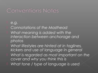
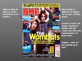
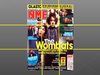
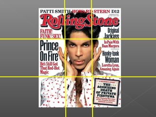
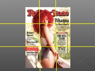
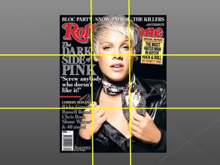
What you get on front
covers.
1. Masthead           8. Selling Line
                             or Banner
      Web-links?
          Ears?         9. Tagline
2. Kicker

                     10. Feature
                         Article Photo
3. Cover Line
                    11. Headline

4. Secondary Lead     12. Anchorage
                      13. Flash


5. Plug               14. Menu Strip

6. Graphic
                      15. Bar Code
   Feature or
   Puff
                        16. Date Line
 7. Caption
   e.g.
   Connotations of the Masthead
   What meaning is added with the
    interaction between anchorage and
    photos
   What lifestyles are hinted at in taglines,
    kickers and use of language in general
   What is regarded as most important on the
    cover and why you think this is
   What tone / type of language is used
How front covers are
conceived and laid out.
Indirect mode of      Direct mode of
address can be        address can appear
mysterious, lively,   ‘in yer face’, serious,
sombre…               warm…


                      Creates a wacky, fun
                      image, sharing an
                      identity with the
                      reader that offers the
                      ‘independence’ of
                      indie music.


                      Enigma – what are
                      they getting up to
                      now?
   Colour - The colour scheme of the Rolling Stone magazine seems to stick with being red, white
    and black. The colour scheme does not stay the same through issues and depends on the
    image being used. Such as in image one, Prince is wearing a white shirt with red dots, this then
    works well with the Rolling Stones red title. Where as on another magazine cover, the colour
    scheme is focused around the colour black. The colour red is always used as the titles colour,
    and this does not change. Where as the writing on the cover usually sticks to the same
    sequence of being either black, white, or red.
   Fonts - There are around about 4 different fonts used on the overall cover.
   Style - The front cover gives you an overall feel of intensity, as the feature photo on the article
    is looking directly at the reader. Also the look of the cover gives it a sophisticated feel, as the
    colours are not too bold, and the text is not in an unusual font. The overall look of the
    magazine holds an invitational feel, as the feature photo looks at the reader. This also gives the
    magazine a slight uncomfortable feel. The theme of the magazine could possibly be
    seduction, as the feature photo is invitational, but also has the shirt unbuttoned. Also from the
    features of the magazine you can tell it is very sexual as it uses quotes such as ‘FAITH! FUNK!
    SEX!’.
   Use of Space - The left third does not dominate as much as the right third does on this
    magazine cover. As the right third holds a lot more information than the left third. The
    masthead is also not in the top left corner, but instead covers a strip at the top of the
    magazine cover. The headline is also not at the bottom of the mid third, but is in the middle of
    the left third. The text and images on the magazine hold a square theme to them, as the font is
    straight up and down, with no curves to it, also the images that have been used to hold the
    text, are all square. It is also quite a chaotic front cover, as the whole of the magazine is
    covered by images and text, and there is no dead or white space.
   Conclusion - I think the magazine cover has been designed like it is, to go against the typical
    magazine conventions and show something different to appeal to audiences as this magazine
    being a particular different layout to many other magazines you may see. The magazine holds
    a slick but loud style. As the long fonts seem as if they may be in a bold, and this draws
    attention to them. Also, the regular use of the same colours does not make the magazine look
    tacky, or overdone, but a lot more classy and thought out. Also, because the magazine cover
    is full with no dead or white space. This makes it loud, as there is a lot more going on, on the
    front cover, compared to what you may find on other magazines.

Magazine Conventions

  • 2.
    What you geton front covers.
  • 3.
    1. Masthead 8. Selling Line or Banner Web-links? Ears? 9. Tagline 2. Kicker 10. Feature Article Photo 3. Cover Line 11. Headline 4. Secondary Lead 12. Anchorage 13. Flash 5. Plug 14. Menu Strip 6. Graphic 15. Bar Code Feature or Puff 16. Date Line 7. Caption
  • 4.
    e.g.  Connotations of the Masthead  What meaning is added with the interaction between anchorage and photos  What lifestyles are hinted at in taglines, kickers and use of language in general  What is regarded as most important on the cover and why you think this is  What tone / type of language is used
  • 5.
    How front coversare conceived and laid out.
  • 6.
    Indirect mode of Direct mode of address can be address can appear mysterious, lively, ‘in yer face’, serious, sombre… warm… Creates a wacky, fun image, sharing an identity with the reader that offers the ‘independence’ of indie music. Enigma – what are they getting up to now?
  • 11.
    Colour - The colour scheme of the Rolling Stone magazine seems to stick with being red, white and black. The colour scheme does not stay the same through issues and depends on the image being used. Such as in image one, Prince is wearing a white shirt with red dots, this then works well with the Rolling Stones red title. Where as on another magazine cover, the colour scheme is focused around the colour black. The colour red is always used as the titles colour, and this does not change. Where as the writing on the cover usually sticks to the same sequence of being either black, white, or red.  Fonts - There are around about 4 different fonts used on the overall cover.  Style - The front cover gives you an overall feel of intensity, as the feature photo on the article is looking directly at the reader. Also the look of the cover gives it a sophisticated feel, as the colours are not too bold, and the text is not in an unusual font. The overall look of the magazine holds an invitational feel, as the feature photo looks at the reader. This also gives the magazine a slight uncomfortable feel. The theme of the magazine could possibly be seduction, as the feature photo is invitational, but also has the shirt unbuttoned. Also from the features of the magazine you can tell it is very sexual as it uses quotes such as ‘FAITH! FUNK! SEX!’.  Use of Space - The left third does not dominate as much as the right third does on this magazine cover. As the right third holds a lot more information than the left third. The masthead is also not in the top left corner, but instead covers a strip at the top of the magazine cover. The headline is also not at the bottom of the mid third, but is in the middle of the left third. The text and images on the magazine hold a square theme to them, as the font is straight up and down, with no curves to it, also the images that have been used to hold the text, are all square. It is also quite a chaotic front cover, as the whole of the magazine is covered by images and text, and there is no dead or white space.  Conclusion - I think the magazine cover has been designed like it is, to go against the typical magazine conventions and show something different to appeal to audiences as this magazine being a particular different layout to many other magazines you may see. The magazine holds a slick but loud style. As the long fonts seem as if they may be in a bold, and this draws attention to them. Also, the regular use of the same colours does not make the magazine look tacky, or overdone, but a lot more classy and thought out. Also, because the magazine cover is full with no dead or white space. This makes it loud, as there is a lot more going on, on the front cover, compared to what you may find on other magazines.