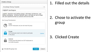
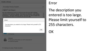
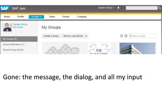
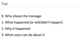
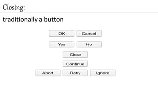
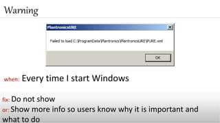
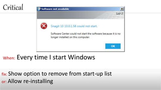
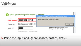
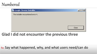
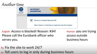
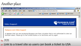
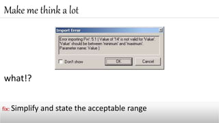
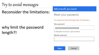
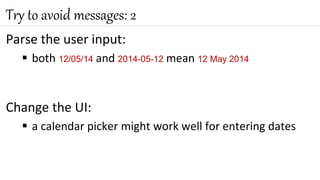
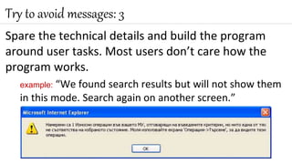
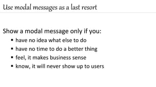
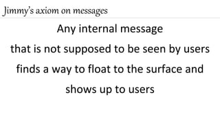
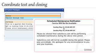
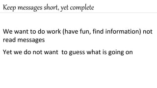
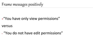
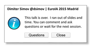
On Messages
Dimiter Simov – Jimmy
@dsimov | https://about.me/dsimov
Here is a story
3
4
At SAP, we have this nice “social” tool - Jam
5
I participate in a few groups
I wanted to start a new group on UX topics
6
Here is the new-group
form
7
1. Filled out the details
2. Chose to activate the
group
3. Clicked Create
8
Error
The description you
entered is too large.
Please limit yourself to
255 characters.
OK
9
Gone: the message, the dialog, and all my input
Talk about messages
Claim that we are responsible: designers/architects
No recipe – be practical
My goal today
I do not like to write
messages
What’s in a message?
Sign
source of icons: http://www.iconarchive.com/show/soft-scraps-icons-by-hopstarter.html
0. Who shows the message
1. What happened (or will/didn’t happen)
2. Why it happened
3. What users can do about it
Text
traditionally a button
Closing:
Interaction
User goal and expectations
User actions before and after the message
16
Messages by type
17
when: Every time I start Windows
Warning
fix: Do not show
or: Show more info so users know why it is important and
what to do
When: Every time I start Windows
Critical
fix: Show option to remove from start-up list
or: Allow re-installing
Validation
fix: Parse the input and ignore spaces, dashes, dots…
Translation:
Your electronic signature
is valid and you can make
money transfers online
Confirmation
fix: Hide the gibberish. Show a
normal message.
Informative
fix: State that the downtime will be at night and last only 1
hour. Please use my timezone.
As you type
fix: Accept Cyrillic
or: Add to the message that only Latin characters are OK
On Yes, the program starts
On No, the program does not start
Guess what
fix: Do not show, just use the default location
or: Ask users to select a library location
Glad I did not encounter the previous three
Numbered
fix: Say what happened, why, and what users need/can do
Another time
fix: Fix the site to work 24/7
or: Tell users to log in only during business hours
English: Access is blocked! Reason: #34!
Please call the Eurobank officer who
serves you.
Human: you are trying
access outside
business hours
Another place
fix: ?!?!
or: Link to a travel site so users can book a ticket to USA
what!?
Make me think a lot
fix: Simplify and state the acceptable range
Now I’m lost
Make me stop thinking
fix: No idea
Series of increasing severity
Unusual error… not enough storage
Unusual error… no scroll bars
Unusual error… catastrophic failure
fix: Fix the code
Not available… Not accessible… or Access denied?
Schizophrenic
fix: Explain in plain words; see the next slide for an example
Why not this instead of the previous message
You may have no permissions to
view the content of the folder, or it
may be located on a computer with
which you do not have a connection.
Check your connection and try again
or contact your administrator for
permissions.
Useless
fix: Show the list of external references or link to it
Unnecessary
fix: Do not show (no need to tell users in a browser that a page
will be reloaded; unless the reloading will take 3 minutes)
In progress
fix: No fix needed
In progress
fix: Use a normal progress indicator - see how the others do it
Predictive
fix: No fix needed
Preventive
fix: Maybe change the text of the buttons
or: Avoid the popup – see the next slide
2014: jetBlue “eliminated” the popup
…the message now obscures the input
fix: Make the message non-modal
or: Make the user input visible – get back the popup
2015, September
They no longer populate the date
fields automatically with today’s date
The OK and
Cancel buttons
reduced to OK
They still don’t
match text and
closing
CAPS LOCK IS ON
We sometimes need to type in all caps
Caps Lock is a mode, we often do not notice it is ON
The Caps Lock key is too easy to hit, next to Shift
When typing passwords, we don’t see what we type
CAPS LOCK
fix: I challenge you to design one or two fixes!
Do and don’t
Reconsider the limitations:
why limit the password
length?!
Try to avoid messages
Parse the user input:
 both 12/05/14 and 2014-05-12 mean 12 May 2014
Change the UI:
 a calendar picker might work well for entering dates
Try to avoid messages: 2
Spare the technical details and build the program
around user tasks. Most users don’t care how the
program works.
example: “We found search results but will not show them
in this mode. Search again on another screen.”
Try to avoid messages: 3
Show a modal message only if you:
 have no idea what else to do
 have no time to do a better thing
 feel, it makes business sense
 know, it will never show up to users
Use modal messages as a last resort
Any internal message
that is not supposed to be seen by users
finds a way to float to the surface and
shows up to users
Jimmy’s axiom on messages
Coordinate text and closing
We want to do work (have fun, find information) not
read messages
Yet we do not want to guess what is going on
Keep messages short, yet complete
+“You have only view permissions”
versus
- “You do not have edit permissions”
Frame messages positively
and before you write “oops“
Think twice before you try fun
Have a reviewer
I would rather have one colleague find my splling
mistakes than 6 000 000 users
Ask for help
Yes, you can user-test even messages and it pays off
Test with users
1. Avoid messages, especially modal ones
DON’T WRITE MESSAGES, DESIGN INTERACTIONS
2. If you have to give a message, make sure it is obvious
 who shows it
 what happened
 why
 what users can do about it
3. Be practical
Take home
Remember
It is your job to take care of interactions…
and messages!
Developers will write the code
57
Bonus
59
cAPS lOCK pROBLEM sOLVED
My message collection
https://onmessages.wordpress.com/
61
This talk is over. I ran out of slides and
time. You can comment and ask
questions or wait for the next session.
Dimiter Simov @dsimov | EuroIA 2015 Madrid

EuroIA 2015 On Messages

  • 2.
    On Messages Dimiter Simov– Jimmy @dsimov | https://about.me/dsimov
  • 3.
    Here is astory 3
  • 4.
    4 At SAP, wehave this nice “social” tool - Jam
  • 5.
    5 I participate ina few groups I wanted to start a new group on UX topics
  • 6.
    6 Here is thenew-group form
  • 7.
    7 1. Filled outthe details 2. Chose to activate the group 3. Clicked Create
  • 8.
    8 Error The description you enteredis too large. Please limit yourself to 255 characters. OK
  • 9.
    9 Gone: the message,the dialog, and all my input
  • 10.
    Talk about messages Claimthat we are responsible: designers/architects No recipe – be practical My goal today
  • 11.
    I do notlike to write messages
  • 12.
    What’s in amessage?
  • 13.
    Sign source of icons:http://www.iconarchive.com/show/soft-scraps-icons-by-hopstarter.html
  • 14.
    0. Who showsthe message 1. What happened (or will/didn’t happen) 2. Why it happened 3. What users can do about it Text
  • 15.
  • 16.
    Interaction User goal andexpectations User actions before and after the message 16
  • 17.
  • 18.
    when: Every timeI start Windows Warning fix: Do not show or: Show more info so users know why it is important and what to do
  • 19.
    When: Every timeI start Windows Critical fix: Show option to remove from start-up list or: Allow re-installing
  • 20.
    Validation fix: Parse theinput and ignore spaces, dashes, dots…
  • 21.
    Translation: Your electronic signature isvalid and you can make money transfers online Confirmation fix: Hide the gibberish. Show a normal message.
  • 22.
    Informative fix: State thatthe downtime will be at night and last only 1 hour. Please use my timezone.
  • 23.
    As you type fix:Accept Cyrillic or: Add to the message that only Latin characters are OK
  • 24.
    On Yes, theprogram starts On No, the program does not start Guess what fix: Do not show, just use the default location or: Ask users to select a library location
  • 25.
    Glad I didnot encounter the previous three Numbered fix: Say what happened, why, and what users need/can do
  • 26.
    Another time fix: Fixthe site to work 24/7 or: Tell users to log in only during business hours English: Access is blocked! Reason: #34! Please call the Eurobank officer who serves you. Human: you are trying access outside business hours
  • 27.
    Another place fix: ?!?! or:Link to a travel site so users can book a ticket to USA
  • 28.
    what!? Make me thinka lot fix: Simplify and state the acceptable range
  • 29.
    Now I’m lost Makeme stop thinking fix: No idea
  • 30.
    Series of increasingseverity Unusual error… not enough storage Unusual error… no scroll bars Unusual error… catastrophic failure fix: Fix the code
  • 31.
    Not available… Notaccessible… or Access denied? Schizophrenic fix: Explain in plain words; see the next slide for an example
  • 32.
    Why not thisinstead of the previous message You may have no permissions to view the content of the folder, or it may be located on a computer with which you do not have a connection. Check your connection and try again or contact your administrator for permissions.
  • 33.
    Useless fix: Show thelist of external references or link to it
  • 34.
    Unnecessary fix: Do notshow (no need to tell users in a browser that a page will be reloaded; unless the reloading will take 3 minutes)
  • 35.
  • 36.
    In progress fix: Usea normal progress indicator - see how the others do it
  • 37.
  • 38.
    Preventive fix: Maybe changethe text of the buttons or: Avoid the popup – see the next slide
  • 39.
  • 40.
    …the message nowobscures the input fix: Make the message non-modal or: Make the user input visible – get back the popup
  • 41.
    2015, September They nolonger populate the date fields automatically with today’s date The OK and Cancel buttons reduced to OK They still don’t match text and closing
  • 42.
  • 43.
    We sometimes needto type in all caps Caps Lock is a mode, we often do not notice it is ON The Caps Lock key is too easy to hit, next to Shift When typing passwords, we don’t see what we type CAPS LOCK fix: I challenge you to design one or two fixes!
  • 44.
  • 45.
    Reconsider the limitations: whylimit the password length?! Try to avoid messages
  • 46.
    Parse the userinput:  both 12/05/14 and 2014-05-12 mean 12 May 2014 Change the UI:  a calendar picker might work well for entering dates Try to avoid messages: 2
  • 47.
    Spare the technicaldetails and build the program around user tasks. Most users don’t care how the program works. example: “We found search results but will not show them in this mode. Search again on another screen.” Try to avoid messages: 3
  • 48.
    Show a modalmessage only if you:  have no idea what else to do  have no time to do a better thing  feel, it makes business sense  know, it will never show up to users Use modal messages as a last resort
  • 49.
    Any internal message thatis not supposed to be seen by users finds a way to float to the surface and shows up to users Jimmy’s axiom on messages
  • 50.
  • 51.
    We want todo work (have fun, find information) not read messages Yet we do not want to guess what is going on Keep messages short, yet complete
  • 52.
    +“You have onlyview permissions” versus - “You do not have edit permissions” Frame messages positively
  • 53.
    and before youwrite “oops“ Think twice before you try fun
  • 54.
    Have a reviewer Iwould rather have one colleague find my splling mistakes than 6 000 000 users Ask for help
  • 55.
    Yes, you canuser-test even messages and it pays off Test with users
  • 56.
    1. Avoid messages,especially modal ones DON’T WRITE MESSAGES, DESIGN INTERACTIONS 2. If you have to give a message, make sure it is obvious  who shows it  what happened  why  what users can do about it 3. Be practical Take home
  • 57.
    Remember It is yourjob to take care of interactions… and messages! Developers will write the code 57
  • 58.
  • 59.
  • 60.
  • 61.
    61 This talk isover. I ran out of slides and time. You can comment and ask questions or wait for the next session. Dimiter Simov @dsimov | EuroIA 2015 Madrid

Editor's Notes

  • #27 The user is trying to log into the internet banking part of the website of the bank but this is happening outside of business hours.