Vodafone app UX analysis
•
0 likes•886 views
The document provides a review of the Vodafone mobile app experience from a user experience (UX) perspective. It identifies several UX issues, including too many options on the home screen that could confuse users, unnecessary steps and redirects to the browser, and poor information architecture. The reviewer criticizes the app for prioritizing distractions over the core functionality of quick recharges. Overall, the reviewer concludes the app suffers from bad UX design despite its popularity, and that UX Meter will work to redesign the app with UX as the priority.
Report
Share
Report
Share
Download to read offline

Recommended
Ux analysis unacademy
This document discusses a user's experience testing the Unacademy mobile app and identifies numerous usability issues. Over the course of using the app, the user encounters problems like unclear password requirements, lack of feedback when expected, difficulty navigating, and important features like logout being hidden. While the app has a decent interface, the user experience is disappointing overall due to poor information architecture, missing features, and bad user experience design. The document promises a more detailed analysis of Unacademy app's UX issues in the next week.
easy5jobs - Jobseeker Getting Started
The document provides instructions for job seekers to get started applying for jobs on easy5jobs.com. It explains that no account is required and using the site is completely free. Uploading a resume is optional but advised as most employers will want to see experience and skills. The process involves searching jobs, browsing categories or locations, clicking apply now on a desired job, filling out a name, email, message, and optional resume upload under 3MB before submitting the application.
Soft-performance: Messages - ISTA 2014
We interact with websites, applications, and devices. Our productivity depends on the robustness, speed, load tolerance, connectivity… things that we all measure and monitor. Turn your back on these for half an hour, face the soft factor of messaging, and learn how to boost the performance of your product.
EuroIA 2015 On Messages
Dimiter Simov discusses improving error messages and notifications by following best practices. He recommends:
1) Avoiding messages whenever possible by designing better interactions.
2) If a message is needed, make sure it clearly states who is showing it, what happened, why it happened, and what the user can do.
3) Keeping messages short but complete, framed positively, and easy to understand for users who just want to complete their task.
4) Testing messages with real users to identify issues before widespread release.
The overall goal is to design systems that minimize disruptions and explain issues helpfully, so users can complete their work instead of struggling with unclear notifications.
Faq webhosting
A web hosting service allows individuals and organizations to have an online presence through their own websites and domain names. The service provides server space, email accounts, and a control panel for managing accounts. Customers are responsible for customizing their website and managing their account, while the service provider handles technical support and hosting infrastructure. Common features of web hosting include a domain name, server storage, email accounts, and an auto-responder. The control panel is a web-based tool for managing accounts and making changes. Users can specify email usernames, reset passwords if forgotten, and send unlimited files within storage limits. Content is generally secure if strong passwords are used properly. Additional domain information and assistance can be found on the provider's website or
Fun at Call Centre!!!
The document is a collection of anecdotes from tech support calls that highlight humorous instances of customer confusion or lack of understanding about basic computer functions and terminology. This includes customers being unsure of what actions to take like clicking or installing an update, providing nonsensical or incorrect information to the support staff, and not understanding simple computer concepts. The exchanges demonstrate the challenges and comedic situations tech support agents sometimes face when assisting less technically proficient users.
Wordpress getting started
WordPress is a free content management system that allows users to create their own website or blog. The document provides steps to get started with WordPress including selecting a grid layout and theme, choosing a domain name, selecting a free plan, and then creating pages and posts that will appear on the website. It also explains how to log into the WordPress admin interface and drag categories to the sidebar to organize content.
Easy testmaker
Easytestmaker is a free online test generator that allows users to create different types of tests, including multiple choice, true/false, matching, short answer, and fill-in-the-blank questions. To use it, users first register for an account and then can create tests by selecting a format, adding and saving questions, and organizing content. The tool automates formatting and stores tests for easy access and printing, though additional paid features are required to download files or add non-text elements like images.
RapidResponse Autoresponder Quick Start Guide Pictorial
This document provides a 7-step process for setting up an autoresponder. It instructs the user to add a new autoresponder, create a message, generate form code, paste the code onto a website, preview the page, and test it by signing up. The process uses default settings that can be customized later for subscriber confirmation and redirects.
Setting up a wordpress blog
The document provides step-by-step instructions for setting up a free blog on WordPress in less than 10 minutes. It outlines 13 steps for creating a WordPress account, including choosing a username and password, providing an email address, selecting a blog domain name and title, choosing a language and privacy settings, and finally signing up to complete the process and start blogging.
Getting Started With Quia Part1
This document provides instructions for getting started with the Quia educational website, including registering for an account, setting up classes and rosters, and creating class pages. It outlines the steps to register by entering an activation code, create a profile and classes, fill out class details, add students manually or via import, and set permissions. The goal is to prepare the user to start building quizzes and activities for their students on the Quia platform.
Getting Started With Quia Part1
This document provides instructions for getting started with the Quia educational website, including registering for an account, setting up classes and rosters, and creating class pages. It outlines the steps to register by entering an activation code, create a profile and classes, add students to rosters manually or via import, and select default class page settings. The goal is to prepare the user to begin making quizzes and activities for their students on the Quia site.
Exemplary Customer Service
The customer struggled to activate Microsoft Office on their MacBook due to a cancelled subscription still appearing in their account, causing frustration. A Microsoft chat agent named Oluwatoyosi called the customer and quickly resolved the issue. The customer suggests Microsoft should disable unrenewed subscriptions to prevent confusion and dissatisfaction, and that this call could have been avoided if the cancelled subscription was removed from their account. The customer praises Oluwatoyosi for the excellent customer service but critiques Microsoft's product innovation.
Can't login to sbcglobal.net email account ppt
This document provides solutions for issues logging into an SBCGlobal email account. Common causes of login problems include entering incorrect credentials, server failures, internet or browser errors, and firewall or third-party software interference. To troubleshoot, users should check the server status, update their browser, delete cache and cookies, and ensure they are using the correct credentials. If those don't work, the user may need to reset their password by selecting password recovery options on the AT&T site. As a last resort, users can contact email experts for additional help with SBCGlobal login problems.
We prompt trainingassignment_students_final
The document provides instructions for students to register and log in to a writing product website to access assignments. It outlines the 6-step registration/log-in process which includes going to the website, entering an access code, setting up an account, finding the course key, and being ready to use the writing product and view assignments. It also includes troubleshooting tips such as not using the browser back button and information on technical support.
Setup1
The document provides instructions for setting up a basic website in Dreamweaver. It describes naming a new site "My Practice Web Site", choosing to not use a server, selecting a local folder, and then creating and saving a new HTML page called "index.html" which will serve as the homepage. The homepage must be named "index.htm" or "index.html" to be properly recognized by browsers.
Post via e mail in word press
Post via e mail functionality in WordPress.Using this functionality, you can add post to blog without using admin panel.
Welcome presentation for august course
This document provides an overview of the Clevermaths program, which uses technology to enable math learning. The 3-day program involves surveys, multiple choice questions, tutorials, practice sessions with live tutors, and benefits like improving math skills and preparing for exams. It instructs on using the Adobe Connect video conferencing platform, including how to share content, adjust audio/video settings, use chat functions, and best practices for the online classes. Users are directed to log into the Clevermaths eLearning system using provided credentials to access the interactive math content.
Ciudad y plano
Este documento describe las características de las ciudades y sus planos. Explica que las ciudades están formadas por un centro histórico, barrios y distritos. También habla sobre áreas funcionales urbanas, conurbaciones y megalópolis. Los planos representan gráficamente las ciudades y sus componentes como manzanas, calles y zonas verdes. Finalmente, distingue entre diferentes tipos de planos según su distribución y forma de crecimiento.
CodeforKohoku 成果発表会 よそものエンジニアが見たOKPと港北区の父さん母さん達の奮闘記
2017/3/11 横浜市港北区で保育園・幼稚園を探せる子育てマップのリリース記念イベントにて、地域に根差す市民活動に若者・よそものエンジニアの立場から発表しました。
CodeforKohoku子育てマップ:https://codeforkohoku.github.io/papamama/
Vodafone Essar : Marketing Analysis
The company was founded in 1982 as a joint venture and was named Vodafone, deriving from its goal of establishing voice and data services over mobile networks. It has grown to be one of the largest mobile operators globally. In India, it began as a partnership between Hutchison Whampoa and Essar Group operating as Hutchison Essar. In 2007, Vodafone Group acquired a majority stake in the business, rebranding it as Vodafone Essar. The company now offers a range of prepaid and postpaid voice and data services across India, targeting various customer segments through differentiated products and pricing. It faces competition from other major mobile operators in India like Airtel but has
IMC plan for vodafone
This document outlines the integrated marketing communications plan of Vodafone over several years. It details various campaigns including the "Wherever you go our network follows" Hutch campaign personified by a pug, the rebranding to Vodafone with the tagline "Change is good", and the introduction of Zoozoo as a brand mascot. It discusses the use of TV, print, outdoor, internet and sponsorships across these campaigns. Key campaigns highlighted include the "3G Superman" launch and "Vodafone Delights" offering exclusive deals. Results showed strong awareness, video views and social media followers. Sponsorships included events like Big Boss and Formula 1 races. The conclusion emphasizes Vodafone
Vodafone Strategy
Vodafone Group is the world's leading mobile telecommunications company with operations in Europe, the Middle East, Africa, Asia Pacific and the United States. Vodafone has a market capitalization of approximately £71.2 billion and equity interests in 31 countries across five continents. Vodafone Essar is Vodafone's Indian subsidiary with over 85.82 million customers across India. The Indian telecom market is the fastest growing in the world and the second largest market globally in terms of wireless and wireline subscribers. Vodafone's business strategy in India focuses on leveraging its generic strategy and addressing the threats from new competitors through diversification and a focus on rural markets, infrastructure sharing, and
Vodafone presentation
This document analyzes Vodafone's strategy for developing total communications in the UK market. It provides an overview of Vodafone, including its mission, vision, and growth objectives. It then performs a PESTEL analysis, Porter's Five Forces analysis, and SWOT analysis to evaluate the market environment and Vodafone's position. Recommendations are made, such as partnering with BT, tapping into rural markets, and diversifying services. The value chain and bibliography are also included.
Vodafone (An Advertising Perspective)
The document discusses Vodafone's ZooZoos advertising campaign during the 2008 Indian Premier League season. ZooZoos were cartoon characters that promoted Vodafone's value-added services. The campaign was a viral marketing success, with videos receiving millions of views. It helped position Vodafone as a young, fun brand connected to common people in India compared to its previous 'Hutch' brand. The low-cost animated ads were more relatable than expensive celebrity endorsements.
Vodafone marketing ppt
This document summarizes a seminar presentation on Vodafone's marketing strategies. Vodafone's vision is to enrich customers' lives through mobile communication. Some of Vodafone's awards include being named the best mobile money service for the unbanked in 2011. The presentation discusses Vodafone's business strategies and the results of a survey showing that most users choose Vodafone for its call rates and learn about Vodafone through advertisements.
IBDesignable & IBInspectible
IBDesignable and IBInspectable allow developers to design and inspect custom views directly in Interface Builder. IBDesignable applies to classes and allows views to render themselves in Interface Builder. IBInspectable applies to properties and exposes them for editing in the Attributes Inspector. Only certain data types like integers, floats, colors and images can be IBInspectable. Together these features provide live previewing of custom components in Interface Builder.
Alyvix: Synthetic Monitoring @ Icinga Camp Berlin 2017
Alyvix is a synthetic monitoring system based on computer vision, that automates interactions with application GUIs, exactly as a human user would do and measures the perceived performance. At the Icinga Camp Berlin 2017, Francesco Melchiori presented the open source tool and it's integration to Icinga 2.
Ciencia, ¿técnica o servicio?
En este trabajo se intenta analizar el rol de las ciencias medicas y como es utilizada en la actualidad desde el punto de vista de la BIOETICA.
Lista de cotejo de 3 años instrumento con rutas version 2015
Este documento presenta un consolidado estadístico de una lista de cotejo aplicada a niños de 3 años en el nivel inicial de la Institución Educativa No 0022 "República de Guatemala" en Lima, Perú. La lista de cotejo evalúa diversas capacidades de los niños en áreas como el desarrollo personal y social, la comunicación, las matemáticas, la ciencia y el ambiente. Los resultados muestran el desempeño de cada niño en cada capacidad evaluada con una marca de sí o no.
More Related Content
What's hot
RapidResponse Autoresponder Quick Start Guide Pictorial
This document provides a 7-step process for setting up an autoresponder. It instructs the user to add a new autoresponder, create a message, generate form code, paste the code onto a website, preview the page, and test it by signing up. The process uses default settings that can be customized later for subscriber confirmation and redirects.
Setting up a wordpress blog
The document provides step-by-step instructions for setting up a free blog on WordPress in less than 10 minutes. It outlines 13 steps for creating a WordPress account, including choosing a username and password, providing an email address, selecting a blog domain name and title, choosing a language and privacy settings, and finally signing up to complete the process and start blogging.
Getting Started With Quia Part1
This document provides instructions for getting started with the Quia educational website, including registering for an account, setting up classes and rosters, and creating class pages. It outlines the steps to register by entering an activation code, create a profile and classes, fill out class details, add students manually or via import, and set permissions. The goal is to prepare the user to start building quizzes and activities for their students on the Quia platform.
Getting Started With Quia Part1
This document provides instructions for getting started with the Quia educational website, including registering for an account, setting up classes and rosters, and creating class pages. It outlines the steps to register by entering an activation code, create a profile and classes, add students to rosters manually or via import, and select default class page settings. The goal is to prepare the user to begin making quizzes and activities for their students on the Quia site.
Exemplary Customer Service
The customer struggled to activate Microsoft Office on their MacBook due to a cancelled subscription still appearing in their account, causing frustration. A Microsoft chat agent named Oluwatoyosi called the customer and quickly resolved the issue. The customer suggests Microsoft should disable unrenewed subscriptions to prevent confusion and dissatisfaction, and that this call could have been avoided if the cancelled subscription was removed from their account. The customer praises Oluwatoyosi for the excellent customer service but critiques Microsoft's product innovation.
Can't login to sbcglobal.net email account ppt
This document provides solutions for issues logging into an SBCGlobal email account. Common causes of login problems include entering incorrect credentials, server failures, internet or browser errors, and firewall or third-party software interference. To troubleshoot, users should check the server status, update their browser, delete cache and cookies, and ensure they are using the correct credentials. If those don't work, the user may need to reset their password by selecting password recovery options on the AT&T site. As a last resort, users can contact email experts for additional help with SBCGlobal login problems.
We prompt trainingassignment_students_final
The document provides instructions for students to register and log in to a writing product website to access assignments. It outlines the 6-step registration/log-in process which includes going to the website, entering an access code, setting up an account, finding the course key, and being ready to use the writing product and view assignments. It also includes troubleshooting tips such as not using the browser back button and information on technical support.
Setup1
The document provides instructions for setting up a basic website in Dreamweaver. It describes naming a new site "My Practice Web Site", choosing to not use a server, selecting a local folder, and then creating and saving a new HTML page called "index.html" which will serve as the homepage. The homepage must be named "index.htm" or "index.html" to be properly recognized by browsers.
Post via e mail in word press
Post via e mail functionality in WordPress.Using this functionality, you can add post to blog without using admin panel.
Welcome presentation for august course
This document provides an overview of the Clevermaths program, which uses technology to enable math learning. The 3-day program involves surveys, multiple choice questions, tutorials, practice sessions with live tutors, and benefits like improving math skills and preparing for exams. It instructs on using the Adobe Connect video conferencing platform, including how to share content, adjust audio/video settings, use chat functions, and best practices for the online classes. Users are directed to log into the Clevermaths eLearning system using provided credentials to access the interactive math content.
What's hot (10)
RapidResponse Autoresponder Quick Start Guide Pictorial
RapidResponse Autoresponder Quick Start Guide Pictorial
Viewers also liked
Ciudad y plano
Este documento describe las características de las ciudades y sus planos. Explica que las ciudades están formadas por un centro histórico, barrios y distritos. También habla sobre áreas funcionales urbanas, conurbaciones y megalópolis. Los planos representan gráficamente las ciudades y sus componentes como manzanas, calles y zonas verdes. Finalmente, distingue entre diferentes tipos de planos según su distribución y forma de crecimiento.
CodeforKohoku 成果発表会 よそものエンジニアが見たOKPと港北区の父さん母さん達の奮闘記
2017/3/11 横浜市港北区で保育園・幼稚園を探せる子育てマップのリリース記念イベントにて、地域に根差す市民活動に若者・よそものエンジニアの立場から発表しました。
CodeforKohoku子育てマップ:https://codeforkohoku.github.io/papamama/
Vodafone Essar : Marketing Analysis
The company was founded in 1982 as a joint venture and was named Vodafone, deriving from its goal of establishing voice and data services over mobile networks. It has grown to be one of the largest mobile operators globally. In India, it began as a partnership between Hutchison Whampoa and Essar Group operating as Hutchison Essar. In 2007, Vodafone Group acquired a majority stake in the business, rebranding it as Vodafone Essar. The company now offers a range of prepaid and postpaid voice and data services across India, targeting various customer segments through differentiated products and pricing. It faces competition from other major mobile operators in India like Airtel but has
IMC plan for vodafone
This document outlines the integrated marketing communications plan of Vodafone over several years. It details various campaigns including the "Wherever you go our network follows" Hutch campaign personified by a pug, the rebranding to Vodafone with the tagline "Change is good", and the introduction of Zoozoo as a brand mascot. It discusses the use of TV, print, outdoor, internet and sponsorships across these campaigns. Key campaigns highlighted include the "3G Superman" launch and "Vodafone Delights" offering exclusive deals. Results showed strong awareness, video views and social media followers. Sponsorships included events like Big Boss and Formula 1 races. The conclusion emphasizes Vodafone
Vodafone Strategy
Vodafone Group is the world's leading mobile telecommunications company with operations in Europe, the Middle East, Africa, Asia Pacific and the United States. Vodafone has a market capitalization of approximately £71.2 billion and equity interests in 31 countries across five continents. Vodafone Essar is Vodafone's Indian subsidiary with over 85.82 million customers across India. The Indian telecom market is the fastest growing in the world and the second largest market globally in terms of wireless and wireline subscribers. Vodafone's business strategy in India focuses on leveraging its generic strategy and addressing the threats from new competitors through diversification and a focus on rural markets, infrastructure sharing, and
Vodafone presentation
This document analyzes Vodafone's strategy for developing total communications in the UK market. It provides an overview of Vodafone, including its mission, vision, and growth objectives. It then performs a PESTEL analysis, Porter's Five Forces analysis, and SWOT analysis to evaluate the market environment and Vodafone's position. Recommendations are made, such as partnering with BT, tapping into rural markets, and diversifying services. The value chain and bibliography are also included.
Vodafone (An Advertising Perspective)
The document discusses Vodafone's ZooZoos advertising campaign during the 2008 Indian Premier League season. ZooZoos were cartoon characters that promoted Vodafone's value-added services. The campaign was a viral marketing success, with videos receiving millions of views. It helped position Vodafone as a young, fun brand connected to common people in India compared to its previous 'Hutch' brand. The low-cost animated ads were more relatable than expensive celebrity endorsements.
Vodafone marketing ppt
This document summarizes a seminar presentation on Vodafone's marketing strategies. Vodafone's vision is to enrich customers' lives through mobile communication. Some of Vodafone's awards include being named the best mobile money service for the unbanked in 2011. The presentation discusses Vodafone's business strategies and the results of a survey showing that most users choose Vodafone for its call rates and learn about Vodafone through advertisements.
IBDesignable & IBInspectible
IBDesignable and IBInspectable allow developers to design and inspect custom views directly in Interface Builder. IBDesignable applies to classes and allows views to render themselves in Interface Builder. IBInspectable applies to properties and exposes them for editing in the Attributes Inspector. Only certain data types like integers, floats, colors and images can be IBInspectable. Together these features provide live previewing of custom components in Interface Builder.
Alyvix: Synthetic Monitoring @ Icinga Camp Berlin 2017
Alyvix is a synthetic monitoring system based on computer vision, that automates interactions with application GUIs, exactly as a human user would do and measures the perceived performance. At the Icinga Camp Berlin 2017, Francesco Melchiori presented the open source tool and it's integration to Icinga 2.
Ciencia, ¿técnica o servicio?
En este trabajo se intenta analizar el rol de las ciencias medicas y como es utilizada en la actualidad desde el punto de vista de la BIOETICA.
Lista de cotejo de 3 años instrumento con rutas version 2015
Este documento presenta un consolidado estadístico de una lista de cotejo aplicada a niños de 3 años en el nivel inicial de la Institución Educativa No 0022 "República de Guatemala" en Lima, Perú. La lista de cotejo evalúa diversas capacidades de los niños en áreas como el desarrollo personal y social, la comunicación, las matemáticas, la ciencia y el ambiente. Los resultados muestran el desempeño de cada niño en cada capacidad evaluada con una marca de sí o no.
KQA - Shankar PoLi, Poli Shankara and Kampni. Karnataka Quiz - 2017
i) The township is Nittur in Bagalkote district of Karnataka.
ii) Families were displaced by the Tungabhadra Dam project (X).
iii) The ancient temple town that influenced the design of concentric rings is Pattadakal (Y).
Keyword Research & Website Analysis
Keywords are an important part of Search Engine Optimization (SEO) internet marketing. This is a presentation that I gave at a local community college in Michigan.
Vodafone Developer Day - Sheffield 3rd March 2010
Vodafone Developer Day - North.
Screen Yorkshire hosted developer day that took place in Electric Works Sheffield on 3rd March 2010. Opportunity for people to engage with Vodafone on the app and widget development with their platform.
Vodafone and etisalat egypt
Vodafone and Etisalat are the two largest mobile network operators in Egypt. Vodafone has a 41.6% market share and focuses on business-to-business customers through partnerships with large companies. It distributes through own stores, distributors, retailers, and online. Etisalat has a 23.3% share and also uses own stores, distributors, and retailers for distribution, but relies more on post offices and franchises. Both could improve their branch coverage to compete with new entrant Telecom Egypt which has an existing customer and branch platform.
UX, UI sur Mobile, moteur de l'engagement client!
This document discusses several topics related to user experience (UX) and user interface (UI) design for mobile applications:
1. It announces upcoming discussions on trends in UX by Remy Bourganel and other topics on UX and UI.
2. It then shares a summary of Remy Bourganel's presentation on trends in UX, including how services can learn from user behavior over time to provide more personalized experiences.
3. It discusses the importance of considering performance when designing mobile applications to improve user engagement, conversions, and brand trust. Faster applications can significantly improve business metrics.
Introduction to Design
Written presentation at: https://medium.com/@ashleycrutcher/intro-to-design-a821cd689f50#.x6n1rzopx Design is more than colors, fonts and shapes. But how do we define it? Is there a right answer? What does a design workflow look like?
worldwide-certificates
Enjoy travel with these vacation certificates from Travel Sales Direct. Great for company's incentive and loyalty programs for customers and employees.
I-Mode in mobile communication.
i-mode in mobile communication and Sync-ml topic.
a detailed description of i-mode and its features.
Viewers also liked (20)
CodeforKohoku 成果発表会 よそものエンジニアが見たOKPと港北区の父さん母さん達の奮闘記
CodeforKohoku 成果発表会 よそものエンジニアが見たOKPと港北区の父さん母さん達の奮闘記
Alyvix: Synthetic Monitoring @ Icinga Camp Berlin 2017
Alyvix: Synthetic Monitoring @ Icinga Camp Berlin 2017
Lista de cotejo de 3 años instrumento con rutas version 2015
Lista de cotejo de 3 años instrumento con rutas version 2015
KQA - Shankar PoLi, Poli Shankara and Kampni. Karnataka Quiz - 2017
KQA - Shankar PoLi, Poli Shankara and Kampni. Karnataka Quiz - 2017
Similar to Vodafone app UX analysis
InstaPay Audit.pdf
The document provides a detailed review of the onboarding and user experience of the InstaPay app. Some key issues identified include:
1) The onboarding experience does not adequately emphasize InstaPay's value proposition of instant money transfers.
2) Several screens require unnecessary actions or lack clarity around why certain steps are needed.
3) The information architecture and navigation structure is confusing with duplicated elements leading to the same screens.
4) Insufficient input validation was observed to cause user frustration and potential errors.
Overall, the review finds opportunities to streamline steps, better communicate value, and improve clarity, validation and organization to enhance the user experience of the InstaPay app.
InstaPay Audit.pdf
The document provides a detailed review and critique of the onboarding and user experience of the InstaPay app. Some key issues identified include:
- The onboarding process does not adequately emphasize InstaPay's value proposition of instant money transfers.
- Several screens require unnecessary steps, lack clarity in their language and instructions, and could cause confusion for users.
- The app's information architecture and navigation structure is disorganized, with duplicative elements leading to an unclear user flow.
- Input fields and transactions are not always validated properly, and error messages are lacking or unclear.
- The session expiration pop-up is overly frequent and could be designed to provide more user control and understanding of the
InstaPay Audit
The document provides a detailed review and critique of the onboarding and user experience of the InstaPay app. Some key issues identified include:
- The onboarding process does not adequately emphasize InstaPay's value proposition of instant money transfers.
- Several screens require unnecessary steps, lack clarity in their language and instructions, and could cause confusion for users.
- The app's information architecture and navigation structure is disorganized, with duplicative elements leading to an unclear user flow.
- Input fields are not consistently validated, such as for the Instant Payment Address which does not allow changes later.
- Confirmation screens contain too much extraneous information rather than focusing on the transaction to confirm.
Lauralynn signup audit
The document summarizes an audit of a signup flow for KISSmetrics. Key findings include:
1. The onboarding process works well for users ready to activate but could be improved for those wanting more information before activating.
2. Opportunities were identified to better connect hesitant users with sales, such as emphasizing options to learn more or get a demo.
3. Testing changes like redesigning pages where users feel "stuck" or clarifying next steps could help drive more activations.
ABSA Banking App Peer Review.pptx
As part of every new contract, I aim to first start off with and Expert Peer Review of the product I'm working on. Here is an objective review of the ABSA banking app.
Delight 2014 | Designing for Delight Workshop, Toby Sterrett
Toby Sterrett, of Simple, presented this Designing for Delight workshop at Delight 2014.
Originally presented at Delight 2014, Oct. 6-7, 2014. http://delight.us/conference
Creating an Uber Clone - Part I - Transcript.pdf
This is a part of an online Codename One course published around 2017 see it all for free at https://debugagent.com/series/cn1
Clever Messenger Review
Email Marketing Integrations
Integrate your email marketing automation solution with Clever Messenger to capture
leads, update contacts, delete contacts, based on chatbot behavior, and much more.
The ActiveCampaign Integration
Capacity - DO
Digital Ocean provides a fast and visually appealing signup process that leads new users smoothly through account creation and initial setup of a droplet instance. The interface utilizes consistent design principles and user experience best practices to simplify the onboarding process. While most of the user flow is seamless, there is one disruption where users must agree to terms and conditions. Overall, the signup and initial setup takes under five minutes to complete and immerses new users in Digital Ocean's products and platform.
Webtoons User Onboarding App Product Teardown
An analysis of the onboarding journey for a webtoon mobile app to provide an understanding of how its design is intentionally optimized for converting users into readers.
Overall presentation multiplatform_ux_patterns
This document discusses various user experience (UX) patterns and antipatterns for multiplatform mobile app design. It begins with definitions of UX and provides overviews of common mobile navigation patterns like side drawers and tab menus. The document then covers antipatterns to avoid such as splash screens, forcing registration, and excessive confirmation messages. It also discusses dark patterns designed to mislead users. Throughout, it provides examples and recommendations for implementing positive patterns and avoiding antipatterns to create a good user experience.
Testing Script
The document provides a usability test script for testing an app called Likely, which allows users to define and track personal goals. The script outlines test scenarios to evaluate key aspects of the app prototype including creating a profile, understanding the main navigation tabs, creating new goals, and updating existing goals. Testers are asked to complete tasks within the prototype and provide feedback on intuitiveness, clarity of functionality, and any issues encountered. The goal of the usability testing is to improve the app design based on user feedback.
Sarahah Growth Audit
Sarahah was designed as a way to “get honest feedback from your coworkers and friends.” It was #1 on the Appstore, ahead of YouTube and Facebook and Snapchat, on July 31st. The below powerpoint has a full walk through of the app annotated with in-depth feedback on how to grow faster.
How To Create 3D Animation With Smartphone
Hey, you are welcome to mitrobe.com do feel at home and visit often for more quality kinds of stuff. My today topic is How to create 3D animation with Smartphone. Link > https://mitrobe.com/how-to-create-3d-animation-with-smartphone/
How Microsoft Teams Onboards Users - ProductLoops.com.pptx
A teardown of user onboarding and activation of Microsoft Teams.
Find more startup best practises at: https://productloops.com
Make apps more awesome! - CocoaConf Atlanta '14
What are some things to consider when building my app? How can I increase the number of downloads and happy users? Why are ratings so important? This talk at CocoaConf Atlanta '14 will discuss some techniques and tools I have used over the years to improve downloads, ratings and rank in the app stores.
Gaining Insight for Website Improvement
You built it; is any one coming to your website? Are people successfully completing the tasks/goals? Is the website successful in meeting/exceeding the businesses/organizations goals?
Many times, once a website is launched, that's it. Many times, these websites fail at meeting their intended goals. Find out how to gain insight into what's happening with your website, through website analytics, A/B Split testing, memory/navigational tasks and usability tests. This session will include demonstrations of these methods, including an actual live usability test. You won't want to miss this session if your interested in learning how to continually improve your (or your client's) website.
Broken Mobile UX Design
This presentation offers a very brief analysis of some inconsistent Mobile UX Designs and reasons why they are inconsistent.
The presentation was delivered as part of Mobile UX Meetup in London in June 2016 on the theme of 'Consistency in Mobile UX Design'.
It also shows a couple of examples of consistent Mobile UX Design too and explains why they are so.
If you want to know how to design great mobile apps, UX Coach can coach you extensively on this theme, so feel free to reach out on hello@uxcoach.me
Best Cost Calculation to Make a Mobile App Development in 2020
How do companies calculate the cost of an app is the typical used by app that companies to calculate how much your app is going to cost and let's take a look at that right now.
Yikes...It Looks Like That?! - UI Worst Practices
The document provides examples of poor user interface design practices in applications. It discusses user interfaces that make data entry difficult by not properly handling formatting, provide unclear error messages that do not explain the problem or suggest solutions, use interface elements like radio buttons incorrectly, reuse components without ensuring they fit the context, use excessive and clashing colors, include too many tabs, show non-functional interface elements, are not designed for printing, integrate disparate programs in incoherent ways, and do not provide clear instructions for "magic" functions. The document emphasizes that applications must prioritize good user experience and learn from past mistakes.
Similar to Vodafone app UX analysis (20)
Delight 2014 | Designing for Delight Workshop, Toby Sterrett
Delight 2014 | Designing for Delight Workshop, Toby Sterrett
How Microsoft Teams Onboards Users - ProductLoops.com.pptx
How Microsoft Teams Onboards Users - ProductLoops.com.pptx
Best Cost Calculation to Make a Mobile App Development in 2020
Best Cost Calculation to Make a Mobile App Development in 2020
Recently uploaded
一比一原版布兰登大学毕业证(BU毕业证书)如何办理
学校原件一模一样【微信:6496090】【布兰登大学毕业证(BU毕业证书)成绩单学位证】【微信:6496090】(留信学历认证永久存档查询)采用学校原版纸张、特殊工艺完全按照原版一比一制作(包括:隐形水印,阴影底纹,钢印LOGO烫金烫银,LOGO烫金烫银复合重叠,文字图案浮雕,激光镭射,紫外荧光,温感,复印防伪)行业标杆!精益求精,诚心合作,真诚制作!多年品质 ,按需精细制作,24小时接单,全套进口原装设备,十五年致力于帮助留学生解决难题,业务范围有加拿大、英国、澳洲、韩国、美国、新加坡,新西兰等学历材料,包您满意。
【业务选择办理准则】
一、工作未确定,回国需先给父母、亲戚朋友看下文凭的情况,办理一份就读学校的毕业证【微信:6496090】文凭即可
二、回国进私企、外企、自己做生意的情况,这些单位是不查询毕业证真伪的,而且国内没有渠道去查询国外文凭的真假,也不需要提供真实教育部认证。鉴于此,办理一份毕业证【微信:6496090】即可
三、进国企,银行,事业单位,考公务员等等,这些单位是必需要提供真实教育部认证的,办理教育部认证所需资料众多且烦琐,所有材料您都必须提供原件,我们凭借丰富的经验,快捷的绿色通道帮您快速整合材料,让您少走弯路。
留信网认证的作用:
1:该专业认证可证明留学生真实身份【微信:6496090】
2:同时对留学生所学专业登记给予评定
3:国家专业人才认证中心颁发入库证书
4:这个认证书并且可以归档倒地方
5:凡事获得留信网入网的信息将会逐步更新到个人身份内,将在公安局网内查询个人身份证信息后,同步读取人才网入库信息
6:个人职称评审加20分
7:个人信誉贷款加10分
8:在国家人才网主办的国家网络招聘大会中纳入资料,供国家高端企业选择人才
→ 【关于价格问题(保证一手价格)
我们所定的价格是非常合理的,而且我们现在做得单子大多数都是代理和回头客户介绍的所以一般现在有新的单子 我给客户的都是第一手的代理价格,因为我想坦诚对待大家 不想跟大家在价格方面浪费时间
对于老客户或者被老客户介绍过来的朋友,我们都会适当给一些优惠。
选择实体注册公司办理,更放心,更安全!我们的承诺:可来公司面谈,可签订合同,会陪同客户一起到教育部认证窗口递交认证材料,客户在教育部官方认证查询网站查询到认证通过结果后付款,不成功不收费!
办理布兰登大学毕业证(BU毕业证书)【微信:6496090 】外观非常简单,由纸质材料制成,上面印有校徽、校名、毕业生姓名、专业等信息。
办理布兰登大学毕业证(BU毕业证书)【微信:6496090 】格式相对统一,各专业都有相应的模板。通常包括以下部分:
校徽:象征着学校的荣誉和传承。
校名:学校英文全称
授予学位:本部分将注明获得的具体学位名称。
毕业生姓名:这是最重要的信息之一,标志着该证书是由特定人员获得的。
颁发日期:这是毕业正式生效的时间,也代表着毕业生学业的结束。
其他信息:根据不同的专业和学位,可能会有一些特定的信息或章节。
办理布兰登大学毕业证(BU毕业证书)【微信:6496090 】价值很高,需要妥善保管。一般来说,应放置在安全、干燥、防潮的地方,避免长时间暴露在阳光下。如需使用,最好使用复印件而不是原件,以免丢失。
综上所述,办理布兰登大学毕业证(BU毕业证书)【微信:6496090 】是证明身份和学历的高价值文件。外观简单庄重,格式统一,包括重要的个人信息和发布日期。对持有人来说,妥善保管是非常重要的。
一比一原版美国加州大学欧文分校毕业证(UCI学位证)如何办理
原件一模一样【微信:WP101A】【美国加州大学欧文分校毕业证(UCI学位证)成绩单】【微信:WP101A】(留信学历认证永久存档查询)采用学校原版纸张、特殊工艺完全按照原版一比一制作(包括:隐形水印,阴影底纹,钢印LOGO烫金烫银,LOGO烫金烫银复合重叠,文字图案浮雕,激光镭射,紫外荧光,温感,复印防伪)行业标杆!精益求精,诚心合作,真诚制作!多年品质 ,按需精细制作,24小时接单,全套进口原装设备,十五年致力于帮助留学生解决难题,业务范围有加拿大、英国、澳洲、韩国、美国、新加坡,新西兰等学历材料,包您满意。
【业务选择办理准则】
一、工作未确定,回国需先给父母、亲戚朋友看下文凭的情况,办理一份就读学校的毕业证【微信:WP101A】文凭即可
二、回国进私企、外企、自己做生意的情况,这些单位是不查询毕业证真伪的,而且国内没有渠道去查询国外文凭的真假,也不需要提供真实教育部认证。鉴于此,办理一份毕业证【微信:WP101A】即可
三、进国企,银行,事业单位,考公务员等等,这些单位是必需要提供真实教育部认证的,办理教育部认证所需资料众多且烦琐,所有材料您都必须提供原件,我们凭借丰富的经验,快捷的绿色通道帮您快速整合材料,让您少走弯路。
留信网认证的作用:
1:该专业认证可证明留学生真实身份【微信:WP101A】
2:同时对留学生所学专业登记给予评定
3:国家专业人才认证中心颁发入库证书
4:这个认证书并且可以归档倒地方
5:凡事获得留信网入网的信息将会逐步更新到个人身份内,将在公安局网内查询个人身份证信息后,同步读取人才网入库信息
6:个人职称评审加20分
7:个人信誉贷款加10分
8:在国家人才网主办的国家网络招聘大会中纳入资料,供国家高端企业选择人才
→ 【关于价格问题(保证一手价格)
我们所定的价格是非常合理的,而且我们现在做得单子大多数都是代理和回头客户介绍的所以一般现在有新的单子 我给客户的都是第一手的代理价格,因为我想坦诚对待大家 不想跟大家在价格方面浪费时间
对于老客户或者被老客户介绍过来的朋友,我们都会适当给一些优惠。
选择实体注册公司办理,更放心,更安全!我们的承诺:可来公司面谈,可签订合同,会陪同客户一起到教育部认证窗口递交认证材料,客户在教育部官方认证查询网站查询到认证通过结果后付款,不成功不收费!
办理美国加州大学欧文分校毕业证(UCI学位证)学位证【微信:WP101A 】外观非常精致,由特殊纸质材料制成,上面印有校徽、校名、毕业生姓名、专业等信息。
办理美国加州大学欧文分校毕业证(UCI学位证)学位证【微信:WP101A 】格式相对统一,各专业都有相应的模板。通常包括以下部分:
校徽:象征着学校的荣誉和传承。
校名:学校英文全称
授予学位:本部分将注明获得的具体学位名称。
毕业生姓名:这是最重要的信息之一,标志着该证书是由特定人员获得的。
颁发日期:这是毕业正式生效的时间,也代表着毕业生学业的结束。
其他信息:根据不同的专业和学位,可能会有一些特定的信息或章节。
办理美国加州大学欧文分校毕业证(UCI学位证)学位证【微信:WP101A 】价值很高,需要妥善保管。一般来说,应放置在安全、干燥、防潮的地方,避免长时间暴露在阳光下。如需使用,最好使用复印件而不是原件,以免丢失。
综上所述,办理美国加州大学欧文分校毕业证(UCI学位证)学位证【微信:WP101A 】是证明身份和学历的高价值文件。外观简单庄重,格式统一,包括重要的个人信息和发布日期。对持有人来说,妥善保管是非常重要的。
一比一原版(UoB毕业证)英国伯明翰大学毕业证如何办理
原件一模一样【微信:WP101A】【(UoB毕业证)英国伯明翰大学毕业证学位证成绩单】【微信:WP101A】(留信学历认证永久存档查询)采用学校原版纸张、特殊工艺完全按照原版一比一制作(包括:隐形水印,阴影底纹,钢印LOGO烫金烫银,LOGO烫金烫银复合重叠,文字图案浮雕,激光镭射,紫外荧光,温感,复印防伪)行业标杆!精益求精,诚心合作,真诚制作!多年品质 ,按需精细制作,24小时接单,全套进口原装设备,十五年致力于帮助留学生解决难题,业务范围有加拿大、英国、澳洲、韩国、美国、新加坡,新西兰等学历材料,包您满意。
【业务选择办理准则】
一、工作未确定,回国需先给父母、亲戚朋友看下文凭的情况,办理一份就读学校的毕业证【微信:WP101A】文凭即可
二、回国进私企、外企、自己做生意的情况,这些单位是不查询毕业证真伪的,而且国内没有渠道去查询国外文凭的真假,也不需要提供真实教育部认证。鉴于此,办理一份毕业证【微信:WP101A】即可
三、进国企,银行,事业单位,考公务员等等,这些单位是必需要提供真实教育部认证的,办理教育部认证所需资料众多且烦琐,所有材料您都必须提供原件,我们凭借丰富的经验,快捷的绿色通道帮您快速整合材料,让您少走弯路。
留信网认证的作用:
1:该专业认证可证明留学生真实身份【微信:WP101A】
2:同时对留学生所学专业登记给予评定
3:国家专业人才认证中心颁发入库证书
4:这个认证书并且可以归档倒地方
5:凡事获得留信网入网的信息将会逐步更新到个人身份内,将在公安局网内查询个人身份证信息后,同步读取人才网入库信息
6:个人职称评审加20分
7:个人信誉贷款加10分
8:在国家人才网主办的国家网络招聘大会中纳入资料,供国家高端企业选择人才
→ 【关于价格问题(保证一手价格)
我们所定的价格是非常合理的,而且我们现在做得单子大多数都是代理和回头客户介绍的所以一般现在有新的单子 我给客户的都是第一手的代理价格,因为我想坦诚对待大家 不想跟大家在价格方面浪费时间
对于老客户或者被老客户介绍过来的朋友,我们都会适当给一些优惠。
选择实体注册公司办理,更放心,更安全!我们的承诺:可来公司面谈,可签订合同,会陪同客户一起到教育部认证窗口递交认证材料,客户在教育部官方认证查询网站查询到认证通过结果后付款,不成功不收费!
办理(UoB毕业证)英国伯明翰大学毕业证学位证【微信:WP101A 】外观非常精致,由特殊纸质材料制成,上面印有校徽、校名、毕业生姓名、专业等信息。
办理(UoB毕业证)英国伯明翰大学毕业证学位证【微信:WP101A 】格式相对统一,各专业都有相应的模板。通常包括以下部分:
校徽:象征着学校的荣誉和传承。
校名:学校英文全称
授予学位:本部分将注明获得的具体学位名称。
毕业生姓名:这是最重要的信息之一,标志着该证书是由特定人员获得的。
颁发日期:这是毕业正式生效的时间,也代表着毕业生学业的结束。
其他信息:根据不同的专业和学位,可能会有一些特定的信息或章节。
办理(UoB毕业证)英国伯明翰大学毕业证学位证【微信:WP101A 】价值很高,需要妥善保管。一般来说,应放置在安全、干燥、防潮的地方,避免长时间暴露在阳光下。如需使用,最好使用复印件而不是原件,以免丢失。
综上所述,办理(UoB毕业证)英国伯明翰大学毕业证学位证【微信:WP101A 】是证明身份和学历的高价值文件。外观简单庄重,格式统一,包括重要的个人信息和发布日期。对持有人来说,妥善保管是非常重要的。
一比一原版澳洲科廷科技大学毕业证(Curtin毕业证)如何办理
原件一模一样【微信:WP101A】【澳洲科廷科技大学毕业证(Curtin毕业证)学位证成绩单】【微信:WP101A】(留信学历认证永久存档查询)采用学校原版纸张、特殊工艺完全按照原版一比一制作(包括:隐形水印,阴影底纹,钢印LOGO烫金烫银,LOGO烫金烫银复合重叠,文字图案浮雕,激光镭射,紫外荧光,温感,复印防伪)行业标杆!精益求精,诚心合作,真诚制作!多年品质 ,按需精细制作,24小时接单,全套进口原装设备,十五年致力于帮助留学生解决难题,业务范围有加拿大、英国、澳洲、韩国、美国、新加坡,新西兰等学历材料,包您满意。
【业务选择办理准则】
一、工作未确定,回国需先给父母、亲戚朋友看下文凭的情况,办理一份就读学校的毕业证【微信:WP101A】文凭即可
二、回国进私企、外企、自己做生意的情况,这些单位是不查询毕业证真伪的,而且国内没有渠道去查询国外文凭的真假,也不需要提供真实教育部认证。鉴于此,办理一份毕业证【微信:WP101A】即可
三、进国企,银行,事业单位,考公务员等等,这些单位是必需要提供真实教育部认证的,办理教育部认证所需资料众多且烦琐,所有材料您都必须提供原件,我们凭借丰富的经验,快捷的绿色通道帮您快速整合材料,让您少走弯路。
留信网认证的作用:
1:该专业认证可证明留学生真实身份【微信:WP101A】
2:同时对留学生所学专业登记给予评定
3:国家专业人才认证中心颁发入库证书
4:这个认证书并且可以归档倒地方
5:凡事获得留信网入网的信息将会逐步更新到个人身份内,将在公安局网内查询个人身份证信息后,同步读取人才网入库信息
6:个人职称评审加20分
7:个人信誉贷款加10分
8:在国家人才网主办的国家网络招聘大会中纳入资料,供国家高端企业选择人才
→ 【关于价格问题(保证一手价格)
我们所定的价格是非常合理的,而且我们现在做得单子大多数都是代理和回头客户介绍的所以一般现在有新的单子 我给客户的都是第一手的代理价格,因为我想坦诚对待大家 不想跟大家在价格方面浪费时间
对于老客户或者被老客户介绍过来的朋友,我们都会适当给一些优惠。
选择实体注册公司办理,更放心,更安全!我们的承诺:可来公司面谈,可签订合同,会陪同客户一起到教育部认证窗口递交认证材料,客户在教育部官方认证查询网站查询到认证通过结果后付款,不成功不收费!
办理澳洲科廷科技大学毕业证(Curtin毕业证)学位证【微信:WP101A 】外观非常精致,由特殊纸质材料制成,上面印有校徽、校名、毕业生姓名、专业等信息。
办理澳洲科廷科技大学毕业证(Curtin毕业证)学位证【微信:WP101A 】格式相对统一,各专业都有相应的模板。通常包括以下部分:
校徽:象征着学校的荣誉和传承。
校名:学校英文全称
授予学位:本部分将注明获得的具体学位名称。
毕业生姓名:这是最重要的信息之一,标志着该证书是由特定人员获得的。
颁发日期:这是毕业正式生效的时间,也代表着毕业生学业的结束。
其他信息:根据不同的专业和学位,可能会有一些特定的信息或章节。
办理澳洲科廷科技大学毕业证(Curtin毕业证)学位证【微信:WP101A 】价值很高,需要妥善保管。一般来说,应放置在安全、干燥、防潮的地方,避免长时间暴露在阳光下。如需使用,最好使用复印件而不是原件,以免丢失。
综上所述,办理澳洲科廷科技大学毕业证(Curtin毕业证)学位证【微信:WP101A 】是证明身份和学历的高价值文件。外观简单庄重,格式统一,包括重要的个人信息和发布日期。对持有人来说,妥善保管是非常重要的。
一比一原版(KPU毕业证)加拿大昆特兰理工大学毕业证如何办理
原件一模一样【微信:WP101A】【(KPU毕业证)加拿大昆特兰理工大学毕业证学位证成绩单】【微信:WP101A】(留信学历认证永久存档查询)采用学校原版纸张、特殊工艺完全按照原版一比一制作(包括:隐形水印,阴影底纹,钢印LOGO烫金烫银,LOGO烫金烫银复合重叠,文字图案浮雕,激光镭射,紫外荧光,温感,复印防伪)行业标杆!精益求精,诚心合作,真诚制作!多年品质 ,按需精细制作,24小时接单,全套进口原装设备,十五年致力于帮助留学生解决难题,业务范围有加拿大、英国、澳洲、韩国、美国、新加坡,新西兰等学历材料,包您满意。
【业务选择办理准则】
一、工作未确定,回国需先给父母、亲戚朋友看下文凭的情况,办理一份就读学校的毕业证【微信:WP101A】文凭即可
二、回国进私企、外企、自己做生意的情况,这些单位是不查询毕业证真伪的,而且国内没有渠道去查询国外文凭的真假,也不需要提供真实教育部认证。鉴于此,办理一份毕业证【微信:WP101A】即可
三、进国企,银行,事业单位,考公务员等等,这些单位是必需要提供真实教育部认证的,办理教育部认证所需资料众多且烦琐,所有材料您都必须提供原件,我们凭借丰富的经验,快捷的绿色通道帮您快速整合材料,让您少走弯路。
留信网认证的作用:
1:该专业认证可证明留学生真实身份【微信:WP101A】
2:同时对留学生所学专业登记给予评定
3:国家专业人才认证中心颁发入库证书
4:这个认证书并且可以归档倒地方
5:凡事获得留信网入网的信息将会逐步更新到个人身份内,将在公安局网内查询个人身份证信息后,同步读取人才网入库信息
6:个人职称评审加20分
7:个人信誉贷款加10分
8:在国家人才网主办的国家网络招聘大会中纳入资料,供国家高端企业选择人才
→ 【关于价格问题(保证一手价格)
我们所定的价格是非常合理的,而且我们现在做得单子大多数都是代理和回头客户介绍的所以一般现在有新的单子 我给客户的都是第一手的代理价格,因为我想坦诚对待大家 不想跟大家在价格方面浪费时间
对于老客户或者被老客户介绍过来的朋友,我们都会适当给一些优惠。
选择实体注册公司办理,更放心,更安全!我们的承诺:可来公司面谈,可签订合同,会陪同客户一起到教育部认证窗口递交认证材料,客户在教育部官方认证查询网站查询到认证通过结果后付款,不成功不收费!
办理(KPU毕业证)加拿大昆特兰理工大学毕业证学位证【微信:WP101A 】外观非常精致,由特殊纸质材料制成,上面印有校徽、校名、毕业生姓名、专业等信息。
办理(KPU毕业证)加拿大昆特兰理工大学毕业证学位证【微信:WP101A 】格式相对统一,各专业都有相应的模板。通常包括以下部分:
校徽:象征着学校的荣誉和传承。
校名:学校英文全称
授予学位:本部分将注明获得的具体学位名称。
毕业生姓名:这是最重要的信息之一,标志着该证书是由特定人员获得的。
颁发日期:这是毕业正式生效的时间,也代表着毕业生学业的结束。
其他信息:根据不同的专业和学位,可能会有一些特定的信息或章节。
办理(KPU毕业证)加拿大昆特兰理工大学毕业证学位证【微信:WP101A 】价值很高,需要妥善保管。一般来说,应放置在安全、干燥、防潮的地方,避免长时间暴露在阳光下。如需使用,最好使用复印件而不是原件,以免丢失。
综上所述,办理(KPU毕业证)加拿大昆特兰理工大学毕业证学位证【微信:WP101A 】是证明身份和学历的高价值文件。外观简单庄重,格式统一,包括重要的个人信息和发布日期。对持有人来说,妥善保管是非常重要的。
Getting Data Ready for Culture Hack by Neontribe
Sometime in the 2010s, this is how explained how to make data "hackday ready"
Plastic Molding Infographic - RPWORLD.pdf
RPWORLD offers custom injection molding service to help customers develop products ramping up from prototypeing to end-use production. We can deliver your on-demand parts in as fast as 7 days.
一比一原版(lu毕业证书)英国拉夫堡大学毕业证如何办理
原版一模一样【微信:741003700 】【(lu毕业证书)英国拉夫堡大学毕业证成绩单】【微信:741003700 】学位证,留信认证(真实可查,永久存档)原件一模一样纸张工艺/offer、雅思、外壳等材料/诚信可靠,可直接看成品样本,帮您解决无法毕业带来的各种难题!外壳,原版制作,诚信可靠,可直接看成品样本。行业标杆!精益求精,诚心合作,真诚制作!多年品质 ,按需精细制作,24小时接单,全套进口原装设备。十五年致力于帮助留学生解决难题,包您满意。
本公司拥有海外各大学样板无数,能完美还原。
1:1完美还原海外各大学毕业材料上的工艺:水印,阴影底纹,钢印LOGO烫金烫银,LOGO烫金烫银复合重叠。文字图案浮雕、激光镭射、紫外荧光、温感、复印防伪等防伪工艺。材料咨询办理、认证咨询办理请加学历顾问Q/微741003700
【主营项目】
一.毕业证【q微741003700】成绩单、使馆认证、教育部认证、雅思托福成绩单、学生卡等!
二.真实使馆公证(即留学回国人员证明,不成功不收费)
三.真实教育部学历学位认证(教育部存档!教育部留服网站永久可查)
四.办理各国各大学文凭(一对一专业服务,可全程监控跟踪进度)
如果您处于以下几种情况:
◇在校期间,因各种原因未能顺利毕业……拿不到官方毕业证【q/微741003700】
◇面对父母的压力,希望尽快拿到;
◇不清楚认证流程以及材料该如何准备;
◇回国时间很长,忘记办理;
◇回国马上就要找工作,办给用人单位看;
◇企事业单位必须要求办理的
◇需要报考公务员、购买免税车、落转户口
◇申请留学生创业基金
留信网认证的作用:
1:该专业认证可证明留学生真实身份
2:同时对留学生所学专业登记给予评定
3:国家专业人才认证中心颁发入库证书
4:这个认证书并且可以归档倒地方
5:凡事获得留信网入网的信息将会逐步更新到个人身份内,将在公安局网内查询个人身份证信息后,同步读取人才网入库信息
6:个人职称评审加20分
7:个人信誉贷款加10分
8:在国家人才网主办的国家网络招聘大会中纳入资料,供国家高端企业选择人才
办理(lu毕业证书)英国拉夫堡大学毕业证【微信:741003700 】外观非常简单,由纸质材料制成,上面印有校徽、校名、毕业生姓名、专业等信息。
办理(lu毕业证书)英国拉夫堡大学毕业证【微信:741003700 】格式相对统一,各专业都有相应的模板。通常包括以下部分:
校徽:象征着学校的荣誉和传承。
校名:学校英文全称
授予学位:本部分将注明获得的具体学位名称。
毕业生姓名:这是最重要的信息之一,标志着该证书是由特定人员获得的。
颁发日期:这是毕业正式生效的时间,也代表着毕业生学业的结束。
其他信息:根据不同的专业和学位,可能会有一些特定的信息或章节。
办理(lu毕业证书)英国拉夫堡大学毕业证【微信:741003700 】价值很高,需要妥善保管。一般来说,应放置在安全、干燥、防潮的地方,避免长时间暴露在阳光下。如需使用,最好使用复印件而不是原件,以免丢失。
综上所述,办理(lu毕业证书)英国拉夫堡大学毕业证【微信:741003700 】是证明身份和学历的高价值文件。外观简单庄重,格式统一,包括重要的个人信息和发布日期。对持有人来说,妥善保管是非常重要的。
一比一原版(ututaustin毕业证书)美国德克萨斯大学奥斯汀分校毕业证如何办理
原版一模一样【微信:741003700 】【(ututaustin毕业证书)美国德克萨斯大学奥斯汀分校毕业证成绩单】【微信:741003700 】学位证,留信认证(真实可查,永久存档)原件一模一样纸张工艺/offer、雅思、外壳等材料/诚信可靠,可直接看成品样本,帮您解决无法毕业带来的各种难题!外壳,原版制作,诚信可靠,可直接看成品样本。行业标杆!精益求精,诚心合作,真诚制作!多年品质 ,按需精细制作,24小时接单,全套进口原装设备。十五年致力于帮助留学生解决难题,包您满意。
本公司拥有海外各大学样板无数,能完美还原。
1:1完美还原海外各大学毕业材料上的工艺:水印,阴影底纹,钢印LOGO烫金烫银,LOGO烫金烫银复合重叠。文字图案浮雕、激光镭射、紫外荧光、温感、复印防伪等防伪工艺。材料咨询办理、认证咨询办理请加学历顾问Q/微741003700
【主营项目】
一.毕业证【q微741003700】成绩单、使馆认证、教育部认证、雅思托福成绩单、学生卡等!
二.真实使馆公证(即留学回国人员证明,不成功不收费)
三.真实教育部学历学位认证(教育部存档!教育部留服网站永久可查)
四.办理各国各大学文凭(一对一专业服务,可全程监控跟踪进度)
如果您处于以下几种情况:
◇在校期间,因各种原因未能顺利毕业……拿不到官方毕业证【q/微741003700】
◇面对父母的压力,希望尽快拿到;
◇不清楚认证流程以及材料该如何准备;
◇回国时间很长,忘记办理;
◇回国马上就要找工作,办给用人单位看;
◇企事业单位必须要求办理的
◇需要报考公务员、购买免税车、落转户口
◇申请留学生创业基金
留信网认证的作用:
1:该专业认证可证明留学生真实身份
2:同时对留学生所学专业登记给予评定
3:国家专业人才认证中心颁发入库证书
4:这个认证书并且可以归档倒地方
5:凡事获得留信网入网的信息将会逐步更新到个人身份内,将在公安局网内查询个人身份证信息后,同步读取人才网入库信息
6:个人职称评审加20分
7:个人信誉贷款加10分
8:在国家人才网主办的国家网络招聘大会中纳入资料,供国家高端企业选择人才
办理(ututaustin毕业证书)美国德克萨斯大学奥斯汀分校毕业证【微信:741003700 】外观非常简单,由纸质材料制成,上面印有校徽、校名、毕业生姓名、专业等信息。
办理(ututaustin毕业证书)美国德克萨斯大学奥斯汀分校毕业证【微信:741003700 】格式相对统一,各专业都有相应的模板。通常包括以下部分:
校徽:象征着学校的荣誉和传承。
校名:学校英文全称
授予学位:本部分将注明获得的具体学位名称。
毕业生姓名:这是最重要的信息之一,标志着该证书是由特定人员获得的。
颁发日期:这是毕业正式生效的时间,也代表着毕业生学业的结束。
其他信息:根据不同的专业和学位,可能会有一些特定的信息或章节。
办理(ututaustin毕业证书)美国德克萨斯大学奥斯汀分校毕业证【微信:741003700 】价值很高,需要妥善保管。一般来说,应放置在安全、干燥、防潮的地方,避免长时间暴露在阳光下。如需使用,最好使用复印件而不是原件,以免丢失。
综上所述,办理(ututaustin毕业证书)美国德克萨斯大学奥斯汀分校毕业证【微信:741003700 】是证明身份和学历的高价值文件。外观简单庄重,格式统一,包括重要的个人信息和发布日期。对持有人来说,妥善保管是非常重要的。
一比一原版(UVM毕业证)佛蒙特大学毕业证如何办理
原件一模一样【微信:176555708】【佛蒙特大学毕业证(UVM学位证)成绩单】【微信:176555708】(留信学历认证永久存档查询)采用学校原版纸张、特殊工艺完全按照原版一比一制作(包括:隐形水印,阴影底纹,钢印LOGO烫金烫银,LOGO烫金烫银复合重叠,文字图案浮雕,激光镭射,紫外荧光,温感,复印防伪)行业标杆!精益求精,诚心合作,真诚制作!多年品质 ,按需精细制作,24小时接单,全套进口原装设备,十五年致力于帮助留学生解决难题,业务范围有加拿大、英国、澳洲、韩国、美国、新加坡,新西兰等学历材料,包您满意。
【业务选择办理准则】
一、工作未确定,回国需先给父母、亲戚朋友看下文凭的情况,办理一份就读学校的毕业证【微信:176555708】文凭即可
二、回国进私企、外企、自己做生意的情况,这些单位是不查询毕业证真伪的,而且国内没有渠道去查询国外文凭的真假,也不需要提供真实教育部认证。鉴于此,办理一份毕业证【微信:176555708】即可
三、进国企,银行,事业单位,考公务员等等,这些单位是必需要提供真实教育部认证的,办理教育部认证所需资料众多且烦琐,所有材料您都必须提供原件,我们凭借丰富的经验,快捷的绿色通道帮您快速整合材料,让您少走弯路。
留信网认证的作用:
1:该专业认证可证明留学生真实身份【微信:176555708】
2:同时对留学生所学专业登记给予评定
3:国家专业人才认证中心颁发入库证书
4:这个认证书并且可以归档倒地方
5:凡事获得留信网入网的信息将会逐步更新到个人身份内,将在公安局网内查询个人身份证信息后,同步读取人才网入库信息
6:个人职称评审加20分
7:个人信誉贷款加10分
8:在国家人才网主办的国家网络招聘大会中纳入资料,供国家高端企业选择人才
→ 【关于价格问题(保证一手价格)
我们所定的价格是非常合理的,而且我们现在做得单子大多数都是代理和回头客户介绍的所以一般现在有新的单子 我给客户的都是第一手的代理价格,因为我想坦诚对待大家 不想跟大家在价格方面浪费时间
对于老客户或者被老客户介绍过来的朋友,我们都会适当给一些优惠。
选择实体注册公司办理,更放心,更安全!我们的承诺:可来公司面谈,可签订合同,会陪同客户一起到教育部认证窗口递交认证材料,客户在教育部官方认证查询网站查询到认证通过结果后付款,不成功不收费!
办理佛蒙特大学毕业证(UVM学位证)学位证【微信:176555708 】外观非常精致,由特殊纸质材料制成,上面印有校徽、校名、毕业生姓名、专业等信息。
办理佛蒙特大学毕业证(UVM学位证)学位证【微信:176555708 】格式相对统一,各专业都有相应的模板。通常包括以下部分:
校徽:象征着学校的荣誉和传承。
校名:学校英文全称
授予学位:本部分将注明获得的具体学位名称。
毕业生姓名:这是最重要的信息之一,标志着该证书是由特定人员获得的。
颁发日期:这是毕业正式生效的时间,也代表着毕业生学业的结束。
其他信息:根据不同的专业和学位,可能会有一些特定的信息或章节。
办理佛蒙特大学毕业证(UVM学位证)学位证【微信:176555708 】价值很高,需要妥善保管。一般来说,应放置在安全、干燥、防潮的地方,避免长时间暴露在阳光下。如需使用,最好使用复印件而不是原件,以免丢失。
综上所述,办理佛蒙特大学毕业证(UVM学位证)学位证【微信:176555708 】是证明身份和学历的高价值文件。外观简单庄重,格式统一,包括重要的个人信息和发布日期。对持有人来说,妥善保管是非常重要的。
Rethinking Kållered │ From Big Box to a Reuse Hub: A Transformation Journey ...
"Rethinking Kållered │ From Big Box to a Reuse Hub: A Transformation Journey Toward Sustainability"
The booklet of my master’s thesis at the Department of Architecture and Civil Engineering at Chalmers University of Technology. (Gothenburg, Sweden)
This thesis explores the transformation of the vacated (2023) IKEA store in Kållered, Sweden, into a "Reuse Hub" addressing various user types. The project aims to create a model for circular and sustainable economic practices that promote resource efficiency, waste reduction, and a shift in societal overconsumption patterns.
Reuse, though crucial in the circular economy, is one of the least studied areas. Most materials with reuse potential, especially in the construction sector, are recycled (downcycled), causing a greater loss of resources and energy. My project addresses barriers to reuse, such as difficult access to materials, storage, and logistics issues.
Aims:
• Enhancing Access to Reclaimed Materials: Creating a hub for reclaimed construction materials for both institutional and individual needs.
• Promoting Circular Economy: Showcasing the potential and variety of reusable materials and how they can drive a circular economy.
• Fostering Community Engagement: Developing spaces for social interaction around reuse-focused stores and workshops.
• Raising Awareness: Transforming a former consumerist symbol into a center for circular practices.
Highlights:
• The project emphasizes cross-sector collaboration with producers and wholesalers to repurpose surplus materials before they enter the recycling phase.
• This project can serve as a prototype for reusing many idle commercial buildings in different scales and sizes.
• The findings indicate that transforming large vacant properties can support sustainable practices and present an economically attractive business model with high social returns at the same time.
• It highlights the potential of how sustainable practices in the construction sector can drive societal change.
一比一原版肯特大学毕业证UKC成绩单一模一样
原件一模一样【微信:6496090】【肯特大学毕业证UKC学位证成绩单】【微信:6496090】(留信学历认证永久存档查询)采用学校原版纸张、特殊工艺完全按照原版一比一制作(包括:隐形水印,阴影底纹,钢印LOGO烫金烫银,LOGO烫金烫银复合重叠,文字图案浮雕,激光镭射,紫外荧光,温感,复印防伪)行业标杆!精益求精,诚心合作,真诚制作!多年品质 ,按需精细制作,24小时接单,全套进口原装设备,十五年致力于帮助留学生解决难题,业务范围有加拿大、英国、澳洲、韩国、美国、新加坡,新西兰等学历材料,包您满意。
【业务选择办理准则】
一、工作未确定,回国需先给父母、亲戚朋友看下文凭的情况,办理一份就读学校的毕业证【微信:6496090】文凭即可
二、回国进私企、外企、自己做生意的情况,这些单位是不查询毕业证真伪的,而且国内没有渠道去查询国外文凭的真假,也不需要提供真实教育部认证。鉴于此,办理一份毕业证【微信:6496090】即可
三、进国企,银行,事业单位,考公务员等等,这些单位是必需要提供真实教育部认证的,办理教育部认证所需资料众多且烦琐,所有材料您都必须提供原件,我们凭借丰富的经验,快捷的绿色通道帮您快速整合材料,让您少走弯路。
留信网认证的作用:
1:该专业认证可证明留学生真实身份【微信:6496090】
2:同时对留学生所学专业登记给予评定
3:国家专业人才认证中心颁发入库证书
4:这个认证书并且可以归档倒地方
5:凡事获得留信网入网的信息将会逐步更新到个人身份内,将在公安局网内查询个人身份证信息后,同步读取人才网入库信息
6:个人职称评审加20分
7:个人信誉贷款加10分
8:在国家人才网主办的国家网络招聘大会中纳入资料,供国家高端企业选择人才
→ 【关于价格问题(保证一手价格)
我们所定的价格是非常合理的,而且我们现在做得单子大多数都是代理和回头客户介绍的所以一般现在有新的单子 我给客户的都是第一手的代理价格,因为我想坦诚对待大家 不想跟大家在价格方面浪费时间
对于老客户或者被老客户介绍过来的朋友,我们都会适当给一些优惠。
选择实体注册公司办理,更放心,更安全!我们的承诺:可来公司面谈,可签订合同,会陪同客户一起到教育部认证窗口递交认证材料,客户在教育部官方认证查询网站查询到认证通过结果后付款,不成功不收费!
办理肯特大学毕业证UKC学位证【微信:6496090 】外观非常精致,由特殊纸质材料制成,上面印有校徽、校名、毕业生姓名、专业等信息。
办理肯特大学毕业证UKC学位证【微信:6496090 】格式相对统一,各专业都有相应的模板。通常包括以下部分:
校徽:象征着学校的荣誉和传承。
校名:学校英文全称
授予学位:本部分将注明获得的具体学位名称。
毕业生姓名:这是最重要的信息之一,标志着该证书是由特定人员获得的。
颁发日期:这是毕业正式生效的时间,也代表着毕业生学业的结束。
其他信息:根据不同的专业和学位,可能会有一些特定的信息或章节。
办理肯特大学毕业证UKC学位证【微信:6496090 】价值很高,需要妥善保管。一般来说,应放置在安全、干燥、防潮的地方,避免长时间暴露在阳光下。如需使用,最好使用复印件而不是原件,以免丢失。
综上所述,办理肯特大学毕业证UKC学位证【微信:6496090 】是证明身份和学历的高价值文件。外观简单庄重,格式统一,包括重要的个人信息和发布日期。对持有人来说,妥善保管是非常重要的。
一比一原版美国俄勒冈大学毕业证(UO,UofO学位证)如何办理
原件一模一样【微信:WP101A】【美国俄勒冈大学毕业证(UO,UofO学位证)成绩单】【微信:WP101A】(留信学历认证永久存档查询)采用学校原版纸张、特殊工艺完全按照原版一比一制作(包括:隐形水印,阴影底纹,钢印LOGO烫金烫银,LOGO烫金烫银复合重叠,文字图案浮雕,激光镭射,紫外荧光,温感,复印防伪)行业标杆!精益求精,诚心合作,真诚制作!多年品质 ,按需精细制作,24小时接单,全套进口原装设备,十五年致力于帮助留学生解决难题,业务范围有加拿大、英国、澳洲、韩国、美国、新加坡,新西兰等学历材料,包您满意。
【业务选择办理准则】
一、工作未确定,回国需先给父母、亲戚朋友看下文凭的情况,办理一份就读学校的毕业证【微信:WP101A】文凭即可
二、回国进私企、外企、自己做生意的情况,这些单位是不查询毕业证真伪的,而且国内没有渠道去查询国外文凭的真假,也不需要提供真实教育部认证。鉴于此,办理一份毕业证【微信:WP101A】即可
三、进国企,银行,事业单位,考公务员等等,这些单位是必需要提供真实教育部认证的,办理教育部认证所需资料众多且烦琐,所有材料您都必须提供原件,我们凭借丰富的经验,快捷的绿色通道帮您快速整合材料,让您少走弯路。
留信网认证的作用:
1:该专业认证可证明留学生真实身份【微信:WP101A】
2:同时对留学生所学专业登记给予评定
3:国家专业人才认证中心颁发入库证书
4:这个认证书并且可以归档倒地方
5:凡事获得留信网入网的信息将会逐步更新到个人身份内,将在公安局网内查询个人身份证信息后,同步读取人才网入库信息
6:个人职称评审加20分
7:个人信誉贷款加10分
8:在国家人才网主办的国家网络招聘大会中纳入资料,供国家高端企业选择人才
→ 【关于价格问题(保证一手价格)
我们所定的价格是非常合理的,而且我们现在做得单子大多数都是代理和回头客户介绍的所以一般现在有新的单子 我给客户的都是第一手的代理价格,因为我想坦诚对待大家 不想跟大家在价格方面浪费时间
对于老客户或者被老客户介绍过来的朋友,我们都会适当给一些优惠。
选择实体注册公司办理,更放心,更安全!我们的承诺:可来公司面谈,可签订合同,会陪同客户一起到教育部认证窗口递交认证材料,客户在教育部官方认证查询网站查询到认证通过结果后付款,不成功不收费!
办理美国俄勒冈大学毕业证(UO,UofO学位证)学位证【微信:WP101A 】外观非常精致,由特殊纸质材料制成,上面印有校徽、校名、毕业生姓名、专业等信息。
办理美国俄勒冈大学毕业证(UO,UofO学位证)学位证【微信:WP101A 】格式相对统一,各专业都有相应的模板。通常包括以下部分:
校徽:象征着学校的荣誉和传承。
校名:学校英文全称
授予学位:本部分将注明获得的具体学位名称。
毕业生姓名:这是最重要的信息之一,标志着该证书是由特定人员获得的。
颁发日期:这是毕业正式生效的时间,也代表着毕业生学业的结束。
其他信息:根据不同的专业和学位,可能会有一些特定的信息或章节。
办理美国俄勒冈大学毕业证(UO,UofO学位证)学位证【微信:WP101A 】价值很高,需要妥善保管。一般来说,应放置在安全、干燥、防潮的地方,避免长时间暴露在阳光下。如需使用,最好使用复印件而不是原件,以免丢失。
综上所述,办理美国俄勒冈大学毕业证(UO,UofO学位证)学位证【微信:WP101A 】是证明身份和学历的高价值文件。外观简单庄重,格式统一,包括重要的个人信息和发布日期。对持有人来说,妥善保管是非常重要的。
一比一原版(Brunel毕业证)英国布鲁内尔大学毕业证如何办理
原件一模一样【微信:WP101A】【(Brunel毕业证)英国布鲁内尔大学毕业证学位证成绩单】【微信:WP101A】(留信学历认证永久存档查询)采用学校原版纸张、特殊工艺完全按照原版一比一制作(包括:隐形水印,阴影底纹,钢印LOGO烫金烫银,LOGO烫金烫银复合重叠,文字图案浮雕,激光镭射,紫外荧光,温感,复印防伪)行业标杆!精益求精,诚心合作,真诚制作!多年品质 ,按需精细制作,24小时接单,全套进口原装设备,十五年致力于帮助留学生解决难题,业务范围有加拿大、英国、澳洲、韩国、美国、新加坡,新西兰等学历材料,包您满意。
【业务选择办理准则】
一、工作未确定,回国需先给父母、亲戚朋友看下文凭的情况,办理一份就读学校的毕业证【微信:WP101A】文凭即可
二、回国进私企、外企、自己做生意的情况,这些单位是不查询毕业证真伪的,而且国内没有渠道去查询国外文凭的真假,也不需要提供真实教育部认证。鉴于此,办理一份毕业证【微信:WP101A】即可
三、进国企,银行,事业单位,考公务员等等,这些单位是必需要提供真实教育部认证的,办理教育部认证所需资料众多且烦琐,所有材料您都必须提供原件,我们凭借丰富的经验,快捷的绿色通道帮您快速整合材料,让您少走弯路。
留信网认证的作用:
1:该专业认证可证明留学生真实身份【微信:WP101A】
2:同时对留学生所学专业登记给予评定
3:国家专业人才认证中心颁发入库证书
4:这个认证书并且可以归档倒地方
5:凡事获得留信网入网的信息将会逐步更新到个人身份内,将在公安局网内查询个人身份证信息后,同步读取人才网入库信息
6:个人职称评审加20分
7:个人信誉贷款加10分
8:在国家人才网主办的国家网络招聘大会中纳入资料,供国家高端企业选择人才
→ 【关于价格问题(保证一手价格)
我们所定的价格是非常合理的,而且我们现在做得单子大多数都是代理和回头客户介绍的所以一般现在有新的单子 我给客户的都是第一手的代理价格,因为我想坦诚对待大家 不想跟大家在价格方面浪费时间
对于老客户或者被老客户介绍过来的朋友,我们都会适当给一些优惠。
选择实体注册公司办理,更放心,更安全!我们的承诺:可来公司面谈,可签订合同,会陪同客户一起到教育部认证窗口递交认证材料,客户在教育部官方认证查询网站查询到认证通过结果后付款,不成功不收费!
办理(Brunel毕业证)英国布鲁内尔大学毕业证学位证【微信:WP101A 】外观非常精致,由特殊纸质材料制成,上面印有校徽、校名、毕业生姓名、专业等信息。
办理(Brunel毕业证)英国布鲁内尔大学毕业证学位证【微信:WP101A 】格式相对统一,各专业都有相应的模板。通常包括以下部分:
校徽:象征着学校的荣誉和传承。
校名:学校英文全称
授予学位:本部分将注明获得的具体学位名称。
毕业生姓名:这是最重要的信息之一,标志着该证书是由特定人员获得的。
颁发日期:这是毕业正式生效的时间,也代表着毕业生学业的结束。
其他信息:根据不同的专业和学位,可能会有一些特定的信息或章节。
办理(Brunel毕业证)英国布鲁内尔大学毕业证学位证【微信:WP101A 】价值很高,需要妥善保管。一般来说,应放置在安全、干燥、防潮的地方,避免长时间暴露在阳光下。如需使用,最好使用复印件而不是原件,以免丢失。
综上所述,办理(Brunel毕业证)英国布鲁内尔大学毕业证学位证【微信:WP101A 】是证明身份和学历的高价值文件。外观简单庄重,格式统一,包括重要的个人信息和发布日期。对持有人来说,妥善保管是非常重要的。
一比一原版(CSUEB毕业证)美国加州州立大学东湾分校毕业证如何办理
原件一模一样【微信:WP101A】【(CSUEB毕业证)美国加州州立大学东湾分校毕业证学位证成绩单】【微信:WP101A】(留信学历认证永久存档查询)采用学校原版纸张、特殊工艺完全按照原版一比一制作(包括:隐形水印,阴影底纹,钢印LOGO烫金烫银,LOGO烫金烫银复合重叠,文字图案浮雕,激光镭射,紫外荧光,温感,复印防伪)行业标杆!精益求精,诚心合作,真诚制作!多年品质 ,按需精细制作,24小时接单,全套进口原装设备,十五年致力于帮助留学生解决难题,业务范围有加拿大、英国、澳洲、韩国、美国、新加坡,新西兰等学历材料,包您满意。
【业务选择办理准则】
一、工作未确定,回国需先给父母、亲戚朋友看下文凭的情况,办理一份就读学校的毕业证【微信:WP101A】文凭即可
二、回国进私企、外企、自己做生意的情况,这些单位是不查询毕业证真伪的,而且国内没有渠道去查询国外文凭的真假,也不需要提供真实教育部认证。鉴于此,办理一份毕业证【微信:WP101A】即可
三、进国企,银行,事业单位,考公务员等等,这些单位是必需要提供真实教育部认证的,办理教育部认证所需资料众多且烦琐,所有材料您都必须提供原件,我们凭借丰富的经验,快捷的绿色通道帮您快速整合材料,让您少走弯路。
留信网认证的作用:
1:该专业认证可证明留学生真实身份【微信:WP101A】
2:同时对留学生所学专业登记给予评定
3:国家专业人才认证中心颁发入库证书
4:这个认证书并且可以归档倒地方
5:凡事获得留信网入网的信息将会逐步更新到个人身份内,将在公安局网内查询个人身份证信息后,同步读取人才网入库信息
6:个人职称评审加20分
7:个人信誉贷款加10分
8:在国家人才网主办的国家网络招聘大会中纳入资料,供国家高端企业选择人才
→ 【关于价格问题(保证一手价格)
我们所定的价格是非常合理的,而且我们现在做得单子大多数都是代理和回头客户介绍的所以一般现在有新的单子 我给客户的都是第一手的代理价格,因为我想坦诚对待大家 不想跟大家在价格方面浪费时间
对于老客户或者被老客户介绍过来的朋友,我们都会适当给一些优惠。
选择实体注册公司办理,更放心,更安全!我们的承诺:可来公司面谈,可签订合同,会陪同客户一起到教育部认证窗口递交认证材料,客户在教育部官方认证查询网站查询到认证通过结果后付款,不成功不收费!
办理(CSUEB毕业证)美国加州州立大学东湾分校毕业证学位证【微信:WP101A 】外观非常精致,由特殊纸质材料制成,上面印有校徽、校名、毕业生姓名、专业等信息。
办理(CSUEB毕业证)美国加州州立大学东湾分校毕业证学位证【微信:WP101A 】格式相对统一,各专业都有相应的模板。通常包括以下部分:
校徽:象征着学校的荣誉和传承。
校名:学校英文全称
授予学位:本部分将注明获得的具体学位名称。
毕业生姓名:这是最重要的信息之一,标志着该证书是由特定人员获得的。
颁发日期:这是毕业正式生效的时间,也代表着毕业生学业的结束。
其他信息:根据不同的专业和学位,可能会有一些特定的信息或章节。
办理(CSUEB毕业证)美国加州州立大学东湾分校毕业证学位证【微信:WP101A 】价值很高,需要妥善保管。一般来说,应放置在安全、干燥、防潮的地方,避免长时间暴露在阳光下。如需使用,最好使用复印件而不是原件,以免丢失。
综上所述,办理(CSUEB毕业证)美国加州州立大学东湾分校毕业证学位证【微信:WP101A 】是证明身份和学历的高价值文件。外观简单庄重,格式统一,包括重要的个人信息和发布日期。对持有人来说,妥善保管是非常重要的。
一比一原版(OU毕业证)美国俄克拉荷马大学毕业证如何办理
原件一模一样【微信:WP101A】【(OU毕业证)美国俄克拉荷马大学毕业证学位证成绩单】【微信:WP101A】(留信学历认证永久存档查询)采用学校原版纸张、特殊工艺完全按照原版一比一制作(包括:隐形水印,阴影底纹,钢印LOGO烫金烫银,LOGO烫金烫银复合重叠,文字图案浮雕,激光镭射,紫外荧光,温感,复印防伪)行业标杆!精益求精,诚心合作,真诚制作!多年品质 ,按需精细制作,24小时接单,全套进口原装设备,十五年致力于帮助留学生解决难题,业务范围有加拿大、英国、澳洲、韩国、美国、新加坡,新西兰等学历材料,包您满意。
【业务选择办理准则】
一、工作未确定,回国需先给父母、亲戚朋友看下文凭的情况,办理一份就读学校的毕业证【微信:WP101A】文凭即可
二、回国进私企、外企、自己做生意的情况,这些单位是不查询毕业证真伪的,而且国内没有渠道去查询国外文凭的真假,也不需要提供真实教育部认证。鉴于此,办理一份毕业证【微信:WP101A】即可
三、进国企,银行,事业单位,考公务员等等,这些单位是必需要提供真实教育部认证的,办理教育部认证所需资料众多且烦琐,所有材料您都必须提供原件,我们凭借丰富的经验,快捷的绿色通道帮您快速整合材料,让您少走弯路。
留信网认证的作用:
1:该专业认证可证明留学生真实身份【微信:WP101A】
2:同时对留学生所学专业登记给予评定
3:国家专业人才认证中心颁发入库证书
4:这个认证书并且可以归档倒地方
5:凡事获得留信网入网的信息将会逐步更新到个人身份内,将在公安局网内查询个人身份证信息后,同步读取人才网入库信息
6:个人职称评审加20分
7:个人信誉贷款加10分
8:在国家人才网主办的国家网络招聘大会中纳入资料,供国家高端企业选择人才
→ 【关于价格问题(保证一手价格)
我们所定的价格是非常合理的,而且我们现在做得单子大多数都是代理和回头客户介绍的所以一般现在有新的单子 我给客户的都是第一手的代理价格,因为我想坦诚对待大家 不想跟大家在价格方面浪费时间
对于老客户或者被老客户介绍过来的朋友,我们都会适当给一些优惠。
选择实体注册公司办理,更放心,更安全!我们的承诺:可来公司面谈,可签订合同,会陪同客户一起到教育部认证窗口递交认证材料,客户在教育部官方认证查询网站查询到认证通过结果后付款,不成功不收费!
办理(OU毕业证)美国俄克拉荷马大学毕业证学位证【微信:WP101A 】外观非常精致,由特殊纸质材料制成,上面印有校徽、校名、毕业生姓名、专业等信息。
办理(OU毕业证)美国俄克拉荷马大学毕业证学位证【微信:WP101A 】格式相对统一,各专业都有相应的模板。通常包括以下部分:
校徽:象征着学校的荣誉和传承。
校名:学校英文全称
授予学位:本部分将注明获得的具体学位名称。
毕业生姓名:这是最重要的信息之一,标志着该证书是由特定人员获得的。
颁发日期:这是毕业正式生效的时间,也代表着毕业生学业的结束。
其他信息:根据不同的专业和学位,可能会有一些特定的信息或章节。
办理(OU毕业证)美国俄克拉荷马大学毕业证学位证【微信:WP101A 】价值很高,需要妥善保管。一般来说,应放置在安全、干燥、防潮的地方,避免长时间暴露在阳光下。如需使用,最好使用复印件而不是原件,以免丢失。
综上所述,办理(OU毕业证)美国俄克拉荷马大学毕业证学位证【微信:WP101A 】是证明身份和学历的高价值文件。外观简单庄重,格式统一,包括重要的个人信息和发布日期。对持有人来说,妥善保管是非常重要的。
一比一原版(UCB毕业证)英国伯明翰大学学院毕业证如何办理
原件一模一样【微信:WP101A】【(UCB毕业证)英国伯明翰大学学院毕业证学位证成绩单】【微信:WP101A】(留信学历认证永久存档查询)采用学校原版纸张、特殊工艺完全按照原版一比一制作(包括:隐形水印,阴影底纹,钢印LOGO烫金烫银,LOGO烫金烫银复合重叠,文字图案浮雕,激光镭射,紫外荧光,温感,复印防伪)行业标杆!精益求精,诚心合作,真诚制作!多年品质 ,按需精细制作,24小时接单,全套进口原装设备,十五年致力于帮助留学生解决难题,业务范围有加拿大、英国、澳洲、韩国、美国、新加坡,新西兰等学历材料,包您满意。
【业务选择办理准则】
一、工作未确定,回国需先给父母、亲戚朋友看下文凭的情况,办理一份就读学校的毕业证【微信:WP101A】文凭即可
二、回国进私企、外企、自己做生意的情况,这些单位是不查询毕业证真伪的,而且国内没有渠道去查询国外文凭的真假,也不需要提供真实教育部认证。鉴于此,办理一份毕业证【微信:WP101A】即可
三、进国企,银行,事业单位,考公务员等等,这些单位是必需要提供真实教育部认证的,办理教育部认证所需资料众多且烦琐,所有材料您都必须提供原件,我们凭借丰富的经验,快捷的绿色通道帮您快速整合材料,让您少走弯路。
留信网认证的作用:
1:该专业认证可证明留学生真实身份【微信:WP101A】
2:同时对留学生所学专业登记给予评定
3:国家专业人才认证中心颁发入库证书
4:这个认证书并且可以归档倒地方
5:凡事获得留信网入网的信息将会逐步更新到个人身份内,将在公安局网内查询个人身份证信息后,同步读取人才网入库信息
6:个人职称评审加20分
7:个人信誉贷款加10分
8:在国家人才网主办的国家网络招聘大会中纳入资料,供国家高端企业选择人才
→ 【关于价格问题(保证一手价格)
我们所定的价格是非常合理的,而且我们现在做得单子大多数都是代理和回头客户介绍的所以一般现在有新的单子 我给客户的都是第一手的代理价格,因为我想坦诚对待大家 不想跟大家在价格方面浪费时间
对于老客户或者被老客户介绍过来的朋友,我们都会适当给一些优惠。
选择实体注册公司办理,更放心,更安全!我们的承诺:可来公司面谈,可签订合同,会陪同客户一起到教育部认证窗口递交认证材料,客户在教育部官方认证查询网站查询到认证通过结果后付款,不成功不收费!
办理(UCB毕业证)英国伯明翰大学学院毕业证学位证【微信:WP101A 】外观非常精致,由特殊纸质材料制成,上面印有校徽、校名、毕业生姓名、专业等信息。
办理(UCB毕业证)英国伯明翰大学学院毕业证学位证【微信:WP101A 】格式相对统一,各专业都有相应的模板。通常包括以下部分:
校徽:象征着学校的荣誉和传承。
校名:学校英文全称
授予学位:本部分将注明获得的具体学位名称。
毕业生姓名:这是最重要的信息之一,标志着该证书是由特定人员获得的。
颁发日期:这是毕业正式生效的时间,也代表着毕业生学业的结束。
其他信息:根据不同的专业和学位,可能会有一些特定的信息或章节。
办理(UCB毕业证)英国伯明翰大学学院毕业证学位证【微信:WP101A 】价值很高,需要妥善保管。一般来说,应放置在安全、干燥、防潮的地方,避免长时间暴露在阳光下。如需使用,最好使用复印件而不是原件,以免丢失。
综上所述,办理(UCB毕业证)英国伯明翰大学学院毕业证学位证【微信:WP101A 】是证明身份和学历的高价值文件。外观简单庄重,格式统一,包括重要的个人信息和发布日期。对持有人来说,妥善保管是非常重要的。
欧洲杯足彩-欧洲杯足彩买球软件-欧洲杯足彩买球软件下载|【网址🎉ac123.net🎉】
【网址🎉ac123.net🎉】欧洲杯足彩 Sports 与其他博彩公司相比,其独特之处在于欧洲杯足彩 Sports 基于低利润和高营业额的独一无二的体育博彩模式,该模式可以为玩家开出最高的赔率。欧洲杯足彩的优势在于中文界面友好,接受人民币投注。他们的开户奖金和实时体育投注界面是大陆玩家的首选。
International Upcycling Research Network advisory board meeting 4
Slides used for the International Upcycling Research Network advisory board 4 (last one). The project is based at De Montfort University in Leicester, UK, and funded by the Arts and Humanities Research Council.
Recently uploaded (20)
Rethinking Kållered │ From Big Box to a Reuse Hub: A Transformation Journey ...
Rethinking Kållered │ From Big Box to a Reuse Hub: A Transformation Journey ...
International Upcycling Research Network advisory board meeting 4
International Upcycling Research Network advisory board meeting 4
Vodafone app UX analysis
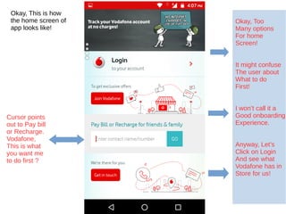
- 1. Okay, This is how the home screen of app looks like! Cursor points out to Pay bill or Recharge. Vodafone, This is what you want me to do first ? Okay, Too Many options For home Screen! It might confuse The user about What to do First! I won’t call it a Good onboarding Experience. Anyway, Let’s Click on Login And see what Vodafone has in Store for us!
- 2. Ohh, Vodafone ZooZoo is saying Hello to me, Hello! Cursor Directly points to the field! Great! Nice copy! Nice CTA, Moreover verb in copy above reinforces CTA
- 3. I don’t seem to understand reason of creating cognitive noises here! Won’t Just sms Suffice ? What is the use of asking users to choose! Dear Vodafone, Don’t tell me that you want your users to leave your app & go check their email for OTP and come back! Seriously :O
- 4. If SMS did not work you could have given other options later like verify by call etc But email ? I don’t seem to comprehend reasoning behind using it here. Anyway, Let’s click on SMS and see what happens :)
- 5. Nice! Cursor directly points to field and wait you are automatically detecting OTP for me. So nice of you! Good use of permission to read my SMS. Seems like that you are not that bad afterall, Vodafone! Let’s go!
- 6. OMG, How do you know my name ? I know, I know you fetched it from your Database. Great! And you are welcoming me. It’s always nice to be welcomed. Thank you for that. Let’s quickly setup my profile. I am excited now!
- 7. Ohh, I can select my favourite zoozoo! And all of them look so cute :-* My Name is autofilled for me with an option to edit that. Great! So is the phone Number Cursor should have directly pointed here! But no trouble you seem to be doing good lately, Vodafone! Let’s go
- 8. Nice use of Animation! Keeps the tone light and engages the user while the app sends data to the server! Overall, Nice!
- 9. What do you have in store for me, Dear menu ? Wait I will explore you later! Neat, Clean! Okay, The very first thing you me to do is probably quick recharge! Fair enough will try that! Seems Like a menu, Self explantory.You also have amazing offers curated for me! Great, Will also check that out. Let’s try to do quick recharge!
- 10. Why not number keypad ? Ohh wait, Seems like I can also enter some sort of name. Nope, It does not work! Ohh you Vodafone why are you making things complex for users ? What are you doing here ? You are utter distraction from UX point of view! Vodafone, you want me to concentrate on quick recharge or this rupee symbol menu. Moreover, from UI point of view it does not even let me click on Go button properly.
- 11. Vodafone, we expect better from your UX team, App Suffers from poorly designed Information Architecture. There are unnecessary steps involved. And app keeps asking you to redirect you to some website and open browser. Really ? You made an app so that you could redirect your users to browser for their needs , Vodafone :O App has been downloaded 10+ million times on Google Play store but it still is an epitome of bad UX. UX Meter will soon publish a redesigned version of Vodafone app keeping UX at its core. UX Meter will publish wireframes and Lo-fi prototypes for all UX challenges of Vodafone app.