Download to read offline


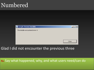
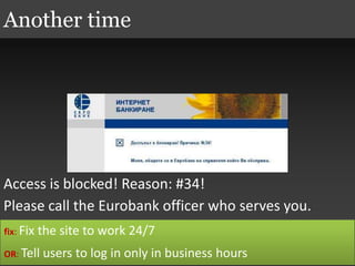
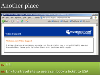
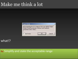


The document discusses effective messaging in user interfaces, emphasizing the importance of clarity and user understanding. It suggests that messages should communicate what happened, why it happened, and what users can do about it, while advocating for the minimization of unnecessary messages. It highlights various examples of ineffective messages and practical fixes to improve user experience.


![20260201 [FOSDEM] gomodjail - library sandboxing for Go modules.pdf](https://cdn.slidesharecdn.com/ss_thumbnails/20260201fosdemgomodjail-librarysandboxingforgomodules-260201225659-76609ec4-thumbnail.jpg?width=640&height=640&fit=bounds)


