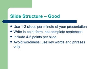
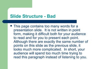
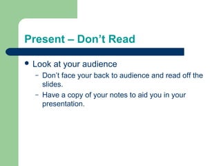
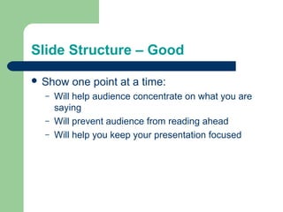
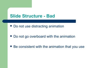
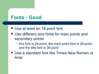
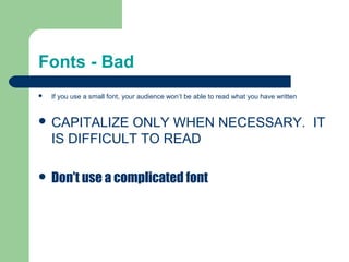
Creating an Effective Presentation
By: Mr. B
Slide Structure – Good
 Use 1-2 slides per minute of your presentation
 Write in point form, not complete sentences
 Include 4-5 points per slide
 Avoid wordiness: use key words and phrases
only
Slide Structure - Bad
 This page contains too many words for a
presentation slide. It is not written in point
form, making it difficult both for your audience
to read and for you to present each point.
Although there are exactly the same number of
points on this slide as the previous slide, it
looks much more complicated. In short, your
audience will spend too much time trying to
read this paragraph instead of listening to you.
Present – Don’t Read
 Look at your audience
– Don’t face your back to audience and read off the
slides.
– Have a copy of your notes to aid you in your
presentation.
Slide Structure – Good
 Show one point at a time:
– Will help audience concentrate on what you are
saying
– Will prevent audience from reading ahead
– Will help you keep your presentation focused
Slide Structure - Bad
 Do not use distracting animation
 Do not go overboard with the animation
 Be consistent with the animation that you use
Fonts - Good
 Use at least an 18-point font
 Use different size fonts for main points and
secondary points
– this font is 24-point, the main point font is 28-point,
and the title font is 36-point
 Use a standard font like Times New Roman or
Arial
Fonts - Bad
 If you use a small font, your audience won’t be able to read what you have written
 CAPITALIZE ONLY WHEN NECESSARY. IT
IS DIFFICULT TO READ
 Don’t use a complicated font
Colour - Good
 Use a colour of font that can been seen with
the background
– Ex: blue font on white background
 Use colour to emphasize a point
– But only use this occasionally
Colour - Bad
 Using a font colour that does not contrast with
the background colour is hard to read
 Using colour for decoration is distracting and
annoying.
 Using a different colour for each point is
unnecessary
– Using a different colour for secondary points is also
unnecessary
 Trying to be creative can also be bad
Background - Good
 Use backgrounds such as this one that are
attractive but simple
 Use backgrounds which are light
 Use the same background consistently
throughout your presentation
Background – Bad
 Avoid backgrounds that are distracting or
difficult to read from
 Always be consistent with the background that
you use
Spelling and Grammar
 Proof your slides for:
– speling mistakes
– the use of of repeated words
– grammatical errors you might have make
Questions??
 End your presentation with a simple question
slide to:
– Invite your audience to ask questions
– Provide a visual aid during question period
– Avoid ending a presentation abruptly

Making powerpoints

  • 1.
    Creating an EffectivePresentation By: Mr. B
  • 2.
    Slide Structure –Good  Use 1-2 slides per minute of your presentation  Write in point form, not complete sentences  Include 4-5 points per slide  Avoid wordiness: use key words and phrases only
  • 3.
    Slide Structure -Bad  This page contains too many words for a presentation slide. It is not written in point form, making it difficult both for your audience to read and for you to present each point. Although there are exactly the same number of points on this slide as the previous slide, it looks much more complicated. In short, your audience will spend too much time trying to read this paragraph instead of listening to you.
  • 4.
    Present – Don’tRead  Look at your audience – Don’t face your back to audience and read off the slides. – Have a copy of your notes to aid you in your presentation.
  • 5.
    Slide Structure –Good  Show one point at a time: – Will help audience concentrate on what you are saying – Will prevent audience from reading ahead – Will help you keep your presentation focused
  • 6.
    Slide Structure -Bad  Do not use distracting animation  Do not go overboard with the animation  Be consistent with the animation that you use
  • 7.
    Fonts - Good Use at least an 18-point font  Use different size fonts for main points and secondary points – this font is 24-point, the main point font is 28-point, and the title font is 36-point  Use a standard font like Times New Roman or Arial
  • 8.
    Fonts - Bad If you use a small font, your audience won’t be able to read what you have written  CAPITALIZE ONLY WHEN NECESSARY. IT IS DIFFICULT TO READ  Don’t use a complicated font
  • 9.
    Colour - Good Use a colour of font that can been seen with the background – Ex: blue font on white background  Use colour to emphasize a point – But only use this occasionally
  • 10.
    Colour - Bad Using a font colour that does not contrast with the background colour is hard to read  Using colour for decoration is distracting and annoying.  Using a different colour for each point is unnecessary – Using a different colour for secondary points is also unnecessary  Trying to be creative can also be bad
  • 11.
    Background - Good Use backgrounds such as this one that are attractive but simple  Use backgrounds which are light  Use the same background consistently throughout your presentation
  • 12.
    Background – Bad Avoid backgrounds that are distracting or difficult to read from  Always be consistent with the background that you use
  • 13.
    Spelling and Grammar Proof your slides for: – speling mistakes – the use of of repeated words – grammatical errors you might have make
  • 14.
    Questions??  End yourpresentation with a simple question slide to: – Invite your audience to ask questions – Provide a visual aid during question period – Avoid ending a presentation abruptly