Download to read offline

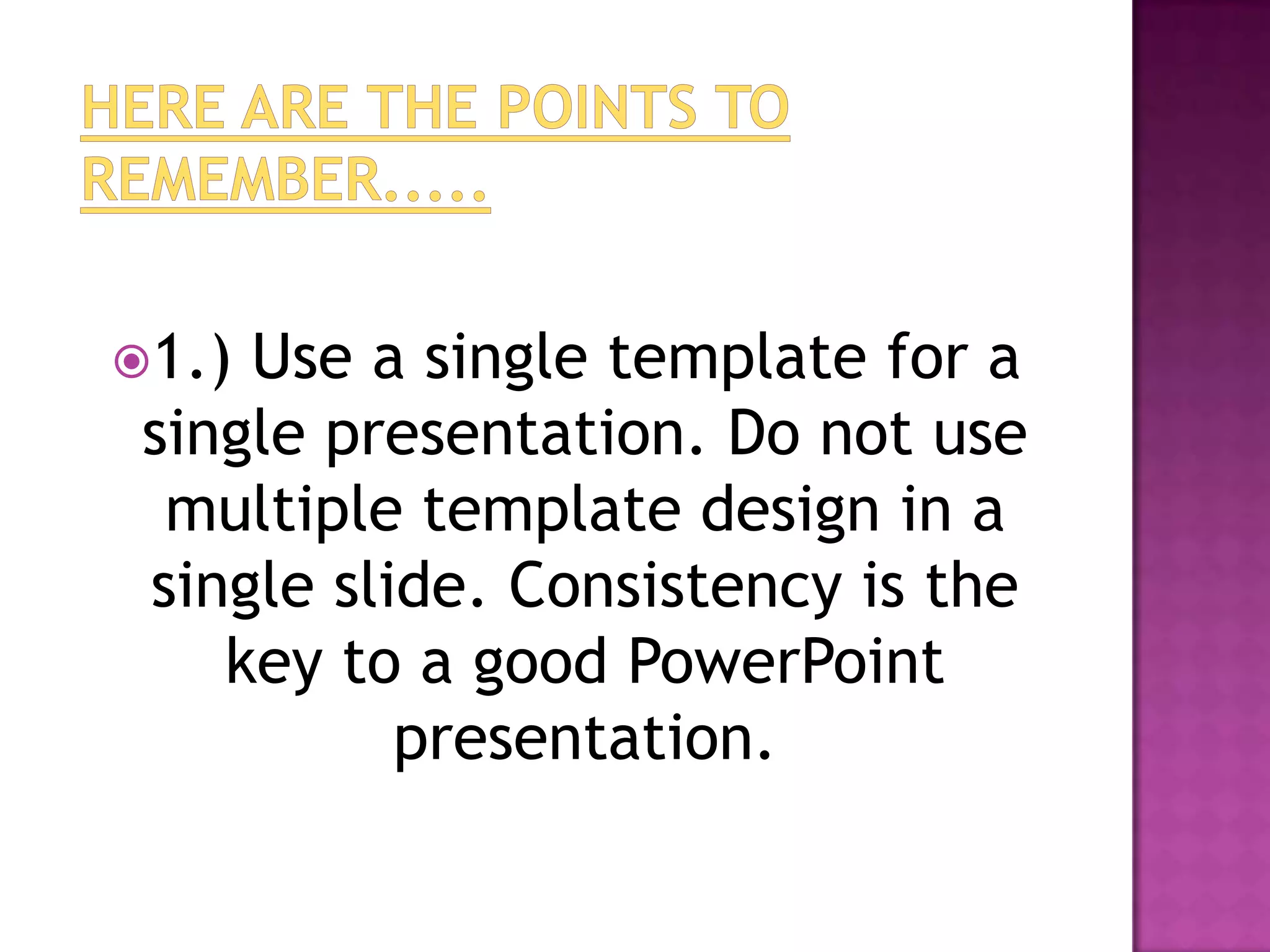
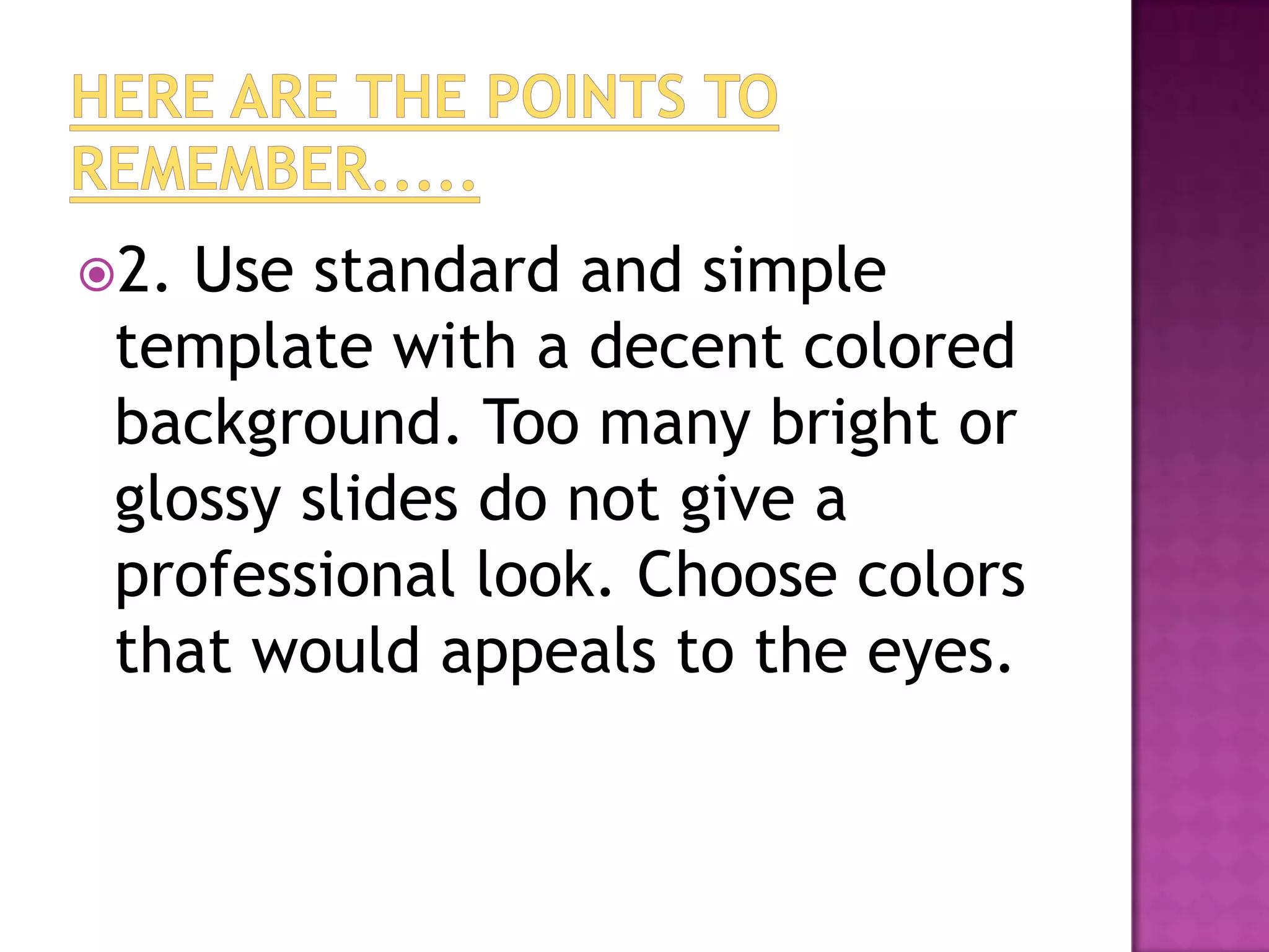
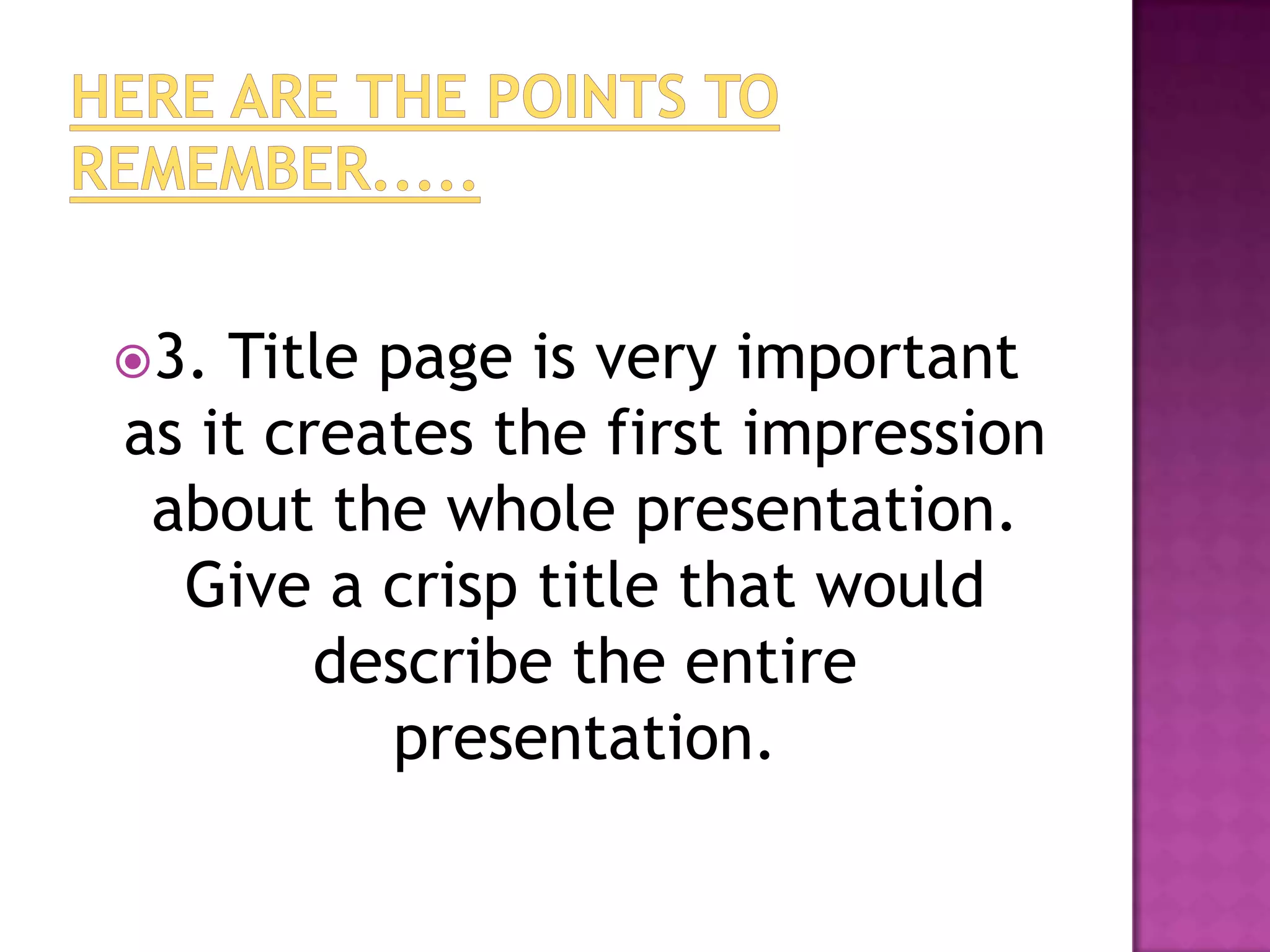

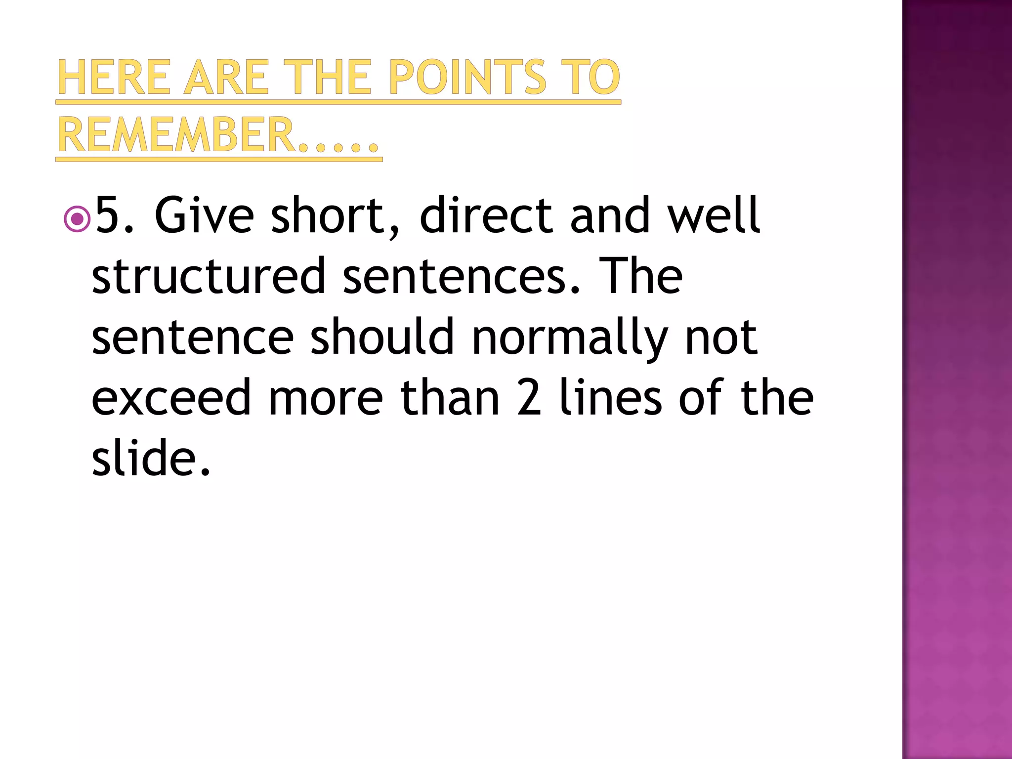


The document provides 20 tips for creating effective PowerPoint presentations with consistency, simplicity, and clarity. Key recommendations include using a single template, standard colors, descriptive titles, tables of contents, short bullet points, varied media like images and videos to engage audiences, and leaving room for discussion on the last slide. The overall goals are to maintain professionalism, structure information flow, and keep audiences focused on the main ideas.


