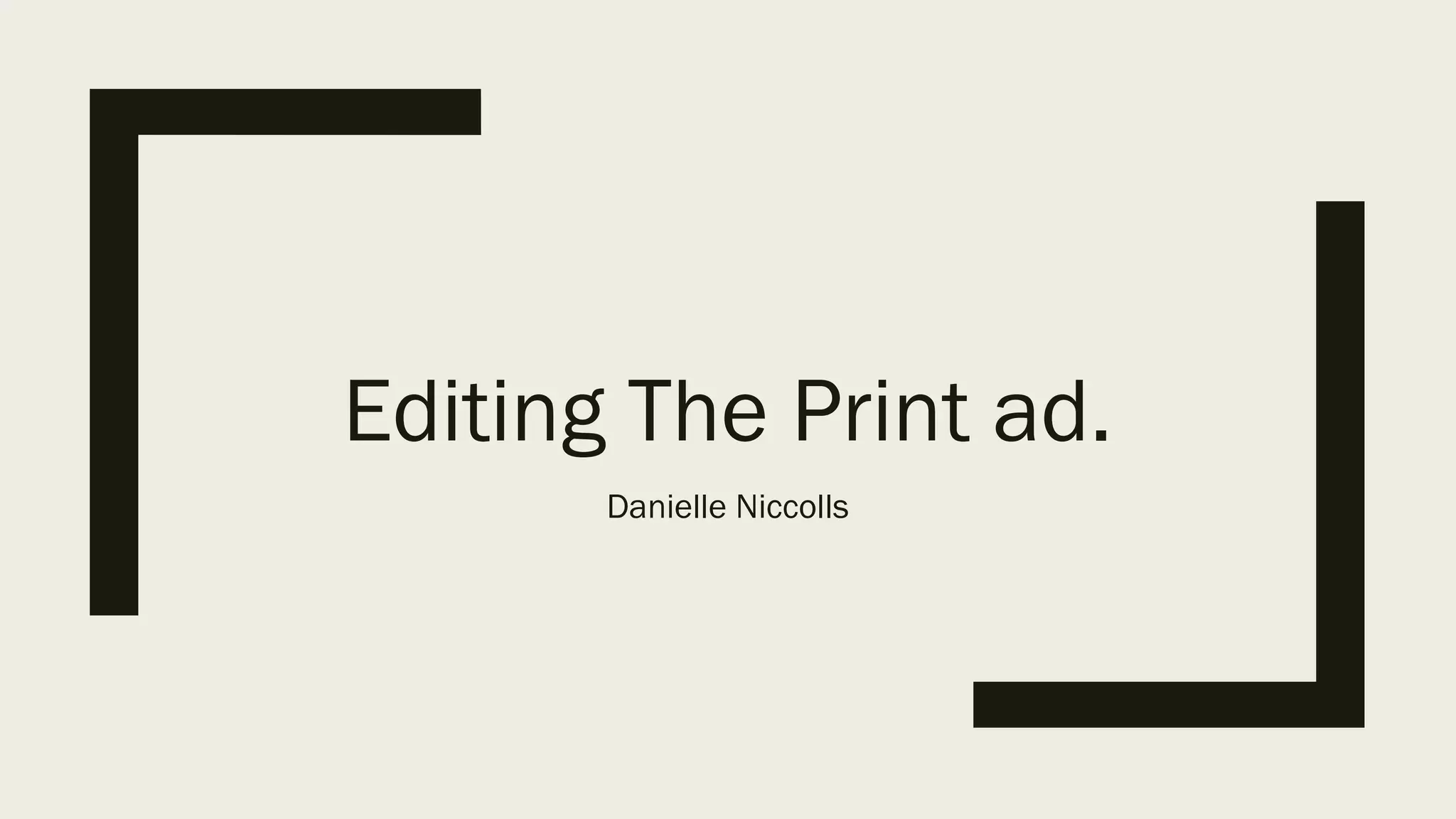
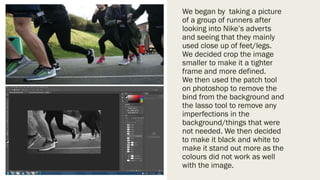
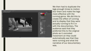
Editing The Print ad.
Danielle Niccolls
We began by taking a picture
of a group of runners after
looking into Nike’s adverts
and seeing that they mainly
used close up of feet/legs.
We decided crop the image
smaller to make it a tighter
frame and more defined.
We then used the patch tool
on photoshop to remove the
bind from the background and
the lasso tool to remove any
imperfections in the
background/things that were
not needed. We then decided
to make it black and white to
make it stand out more as the
colours did not work as well
with the image.
We then had to duplicate the
legs enough times to motion
blur them and make the legs
more effective with the
running genre. We did this to
create the effect of running
and to display that they were
actually running to fit it in
with the documentary. The
audience said that they
preferred this to the original
photo as it connoted
movement an they could
automatically see that they
were running and what the
narrative of our documentary
was.
The final thing that we
needed to do was to add
the BBC One logo, we added
this into the centre of the
poster and added the Title,
Tagline , date and time
underneath in smaller
writing. We stuck to white
writing with a black outline
to make it stand out.

Editing the print ad

  • 1.
    Editing The Printad. Danielle Niccolls
  • 2.
    We began bytaking a picture of a group of runners after looking into Nike’s adverts and seeing that they mainly used close up of feet/legs. We decided crop the image smaller to make it a tighter frame and more defined. We then used the patch tool on photoshop to remove the bind from the background and the lasso tool to remove any imperfections in the background/things that were not needed. We then decided to make it black and white to make it stand out more as the colours did not work as well with the image.
  • 3.
    We then hadto duplicate the legs enough times to motion blur them and make the legs more effective with the running genre. We did this to create the effect of running and to display that they were actually running to fit it in with the documentary. The audience said that they preferred this to the original photo as it connoted movement an they could automatically see that they were running and what the narrative of our documentary was.
  • 4.
    The final thingthat we needed to do was to add the BBC One logo, we added this into the centre of the poster and added the Title, Tagline , date and time underneath in smaller writing. We stuck to white writing with a black outline to make it stand out.