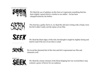
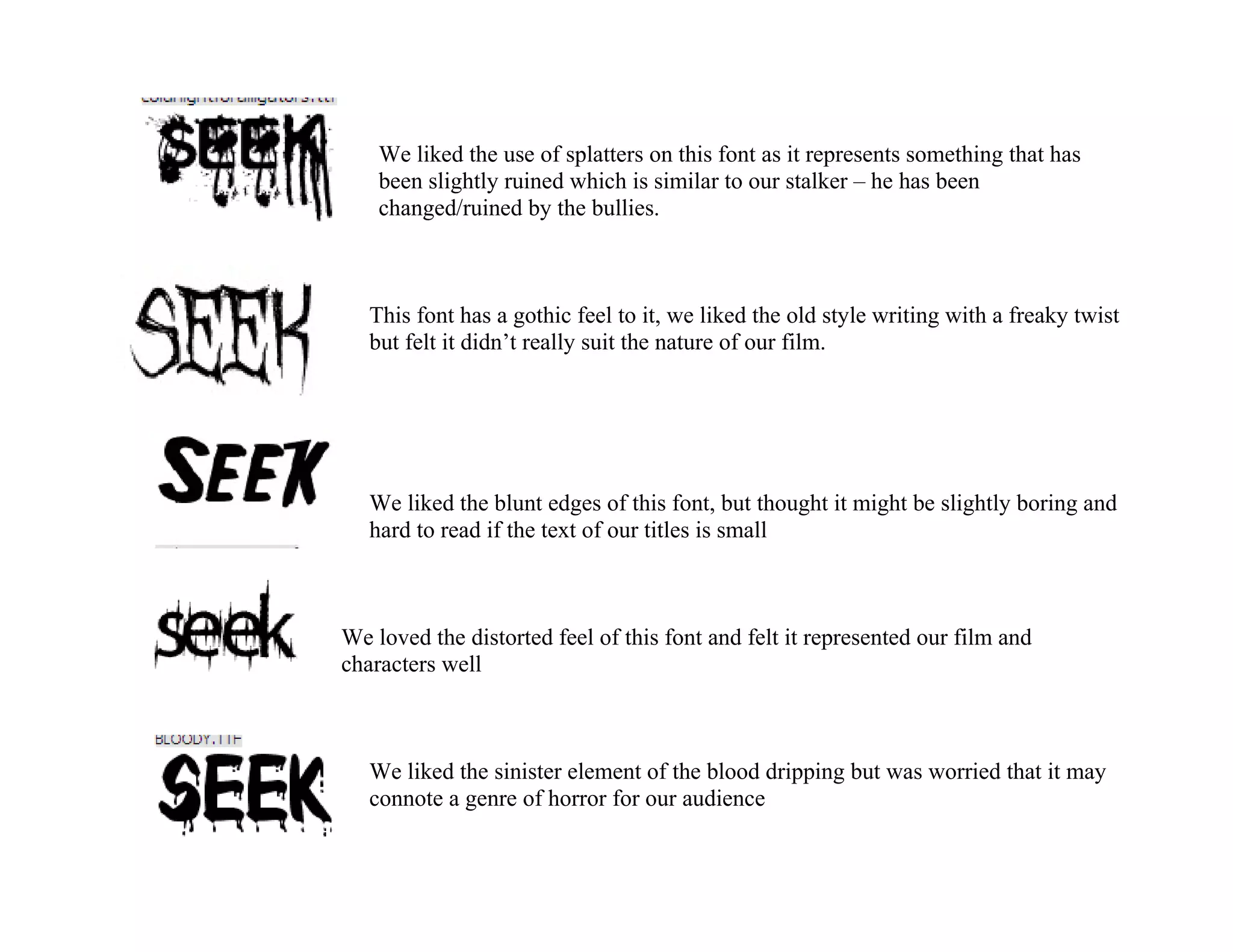
We liked the use of splatters on this font as it represents something that has
    been slightly ruined which is similar to our stalker – he has been
    changed/ruined by the bullies.


   This font has a gothic feel to it, we liked the old style writing with a freaky twist
   but felt it didn’t really suit the nature of our film.


   We liked the blunt edges of this font, but thought it might be slightly boring and
   hard to read if the text of our titles is small


We loved the distorted feel of this font and felt it represented our film and
characters well


   We liked the sinister element of the blood dripping but was worried that it may
   connote a genre of horror for our audience

Fonts

  • 1.
    We liked theuse of splatters on this font as it represents something that has been slightly ruined which is similar to our stalker – he has been changed/ruined by the bullies. This font has a gothic feel to it, we liked the old style writing with a freaky twist but felt it didn’t really suit the nature of our film. We liked the blunt edges of this font, but thought it might be slightly boring and hard to read if the text of our titles is small We loved the distorted feel of this font and felt it represented our film and characters well We liked the sinister element of the blood dripping but was worried that it may connote a genre of horror for our audience