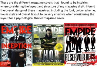
The document describes the process taken to design a magazine cover for a psychological thriller. Key steps included:
- Choosing an image of the main character and cropping it to size. Manipulating it to be black and white and adjusting brightness and contrast to make it more dramatic.
- Adding the text "Empire" in red font across the top to match the genre. Choosing a font similar to the original magazine.
- Overlaying a second image of broken glass on the character's face to add texture and imply cracks in personality.
- Adding cover lines of different sizes and styles to draw attention and intrigue audiences about the content.