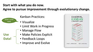
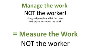
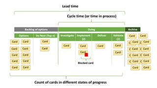
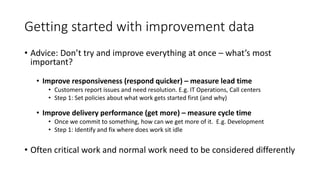
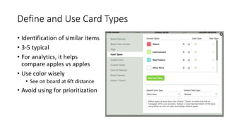
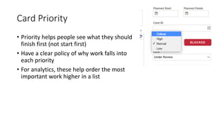
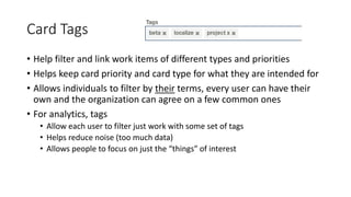
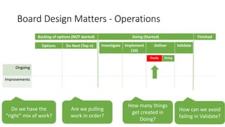
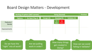
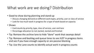
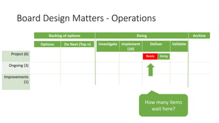
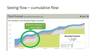
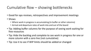
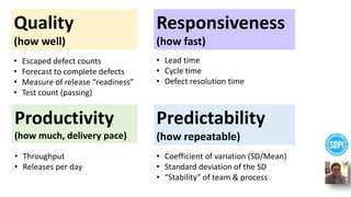
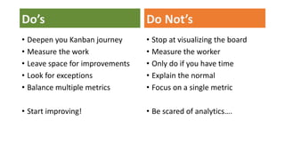
MAHA Global and IPR: Do Actions Speak Louder Than Words?
Driving Change with Data: Getting Started with Continuous Improvement
1. Driving Change with Data
Getting Started with Continuous Improvement
Troy Magennis, President of Focused Objective
2. GoToWebinar House Keeping
• We are recording the presentation
• Use the Grab Tab to:
- Hide the control panel
- View webinar in full screen
• Manage audio settings: Choose between
Telephone and Mic & Speakers
• Use the Questions pane to ask questions
3. Poll Question
1. Where are you in your continuous improvement
efforts?
• We have not started measuring to improve our process
• We would like to start improving, but don’t know how to
• We have started tracking key metrics to improve
• We are actively using metrics to drive improvement initiative
4. Introducing Troy Magennis
– President, Focused Objective LLC
– Brickell Key Award Winner
– Consultant for LeanKit Analytics Team
troy.magennis@FocusedObjective.com
@t_magennis
5.
6. Kanban Practices:
• Visualize
• Limit Work in Progress
• Manage Flow
• Make Policies Explicit
• Feedback Loops
• Improve and Evolve
Start with what you do now.
Agree to pursue improvement through evolutionary change.
DON’T STOP
HERE
Use
Data!
7. Manage the work
NOT the worker!
hire good people and let the team
self organize around the work
= Measure the Work
NOT the worker
8. Backlog of options Doing Archive
Options Do Next (Top n) Investigate Implement
(2)
Deliver Validate
(2)
Cycle time (or time in process)
Lead time
Card
Card
Card
Card
Card
Card
Card
Card
Card
Card
Card
Card
Card
Card
Card Card
Card
Card
Card
Card
Card
Card
Card
Card
Card
Card
Card
Card
Card
Card
Card
Card
Card
Card
Card
Card
Card
Card
Blocked card
Count of cards in different states of progress
9. Getting started with improvement data
• Advice: Don’t try and improve everything at once – what’s most
important?
• Improve responsiveness (respond quicker) – measure lead time
• Customers report issues and need resolution. E.g. IT Operations, Call centers
• Step 1: Set policies about what work gets started first (and why)
• Improve delivery performance (get more) – measure cycle time
• Once we commit to something, how can we get more of it. E.g. Development
• Step 1: Identify and fix where does work sit idle
• Often critical work and normal work need to be considered differently
10. Setting up a board for insights
Board design ideas and patterns to maximize analytics and insights
11. Define and Use Card Types
• Identification of similar items
• 3-5 typical
• For analytics, it helps
compare apples vs apples
• Use color wisely
• See on board at 6ft distance
• Avoid using for prioritization
12. Card Priority
• Priority helps people see what they should
finish first (not start first)
• Have a clear policy of why work falls into
each priority
• For analytics, these help order the most
important work higher in a list
13. Card Tags
• Help filter and link work items of different types and priorities
• Helps keep card priority and card type for what they are intended for
• Allows individuals to filter by their terms, every user can have their
own and the organization can agree on a few common ones
• For analytics, tags
• Allow each user to filter just work with some set of tags
• Helps reduce noise (too much data)
• Allows people to focus on just the “things” of interest
14. Board Design Matters - Operations
Backlog of options (NOT started) Doing (Started) Finished
Options Do Next (Top n) Investigate Implement
(10)
Deliver Validate
Ongoing
Improvements
How many things
get created in
Doing?
Are we pulling
work in order?
Do we have the
“right” mix of work?
How can we avoid
failing in Validate?
Ready Doing
15. Board Design Matters - Development
Backlog of options (NOT started) Doing (Started) Finished
Options Do Next (Top n) Design (2) Develop (5) Validate (3)
Features /
Stories
Improvements
How many things
get created in
Doing?
Are we pulling
work in order?
Do we have the
“right” mix of work?
How can we avoid
failing in Validate?
In
Dev
Dev
Done
17. Analytics – Helping see “un-usual”
• See something that isn’t normal
• Snow in December in Alaska isn’t unusual, snow in Los Angeles is unusual…
• Is it a NEW normal?
• Compare apple to apples
• Don’t expect or want some types of work to take less time than others
• Normal for some types of work is unusual for others
• Goal is to create a visual tracking system that helps see the unusual
• Analytical analysis can help
19. Where do we discuss un-usual & Improve
• Stand-ups
• Daily meetings where the team recounts lessons and looks to refine plan
• Planning meetings / Input Replenishment Meetings
• Team looks at work that is going to be attempted for the next “period”
• Status review meetings / Demos
• Team and stakeholders look at what was done and determine what’s next
• Team or project Retrospectives
• Team or teams(s) look at what happened previously and how to improve
• Operations Review
• Everyone gets to understand how an organization is performing and learn how to
work better in the future with an eye on entire organization operational health
22. Demand on this team decreasing?
Cycle-time stable
Bulk close? Stable
“Long term”
distribution
23. Decreasing cycle time – Speed & Stability
• Good for ops-reviews, retrospectives and improvement meetings
• Shows
• System stability
• Throughput
• Cycle time distribution for the entire date range window
• How cycle time average changes over shorter periods (day, week, month)
• Tip: Set the date range for double the period of interest to see trend
• Tip: Filter by each card type to see contribution to change
• Tip: Start by looking how cycle time trend changes by week or month
• Tip: Hover and filter by selecting different items to look for common root
causes that impact above-average items
25. Exception report
• Good to use during stand-up or status review meetings
• Shows
• Stale = not moved in x days
• Set the stale delay days to help trigger discussion at stand-up
• Blocked = the blocked flag is set in the item
• Missed start date = didn’t start by the planned start date
• Missed finish date = didn’t complete by the planned finish date
• Tip: Start from the top bar and work down, items are in priority order
• Tip: Click on the bars to filter to just those items in the detail section
• Tip: Use card types and tags to minimize noise; some types age differently
• Tip: Set teams the target of keeping empty and celebrating
27. What work are we doing? Distribution
• Good to show during planning and stand-up
• Discuss changing demand on different work types, priority, user or class of service
• Look for too much work in progress for a type of work based on capacity
• Shows
• Card counts by priority, type, class of service, user and lane
• Percentage allocation to not started, started and finished
• Tip: Remove the archive lane to hide “done” work that swamps detail
• Tip: Remove and backlog and queue lanes to see JUST in progress items
and see if you have enough capacity or are passive blocking
• Tip: Use the Lane counts to identify actual work in progress counts
28. Board Design Matters - Operations
Backlog of options Doing Archive
Options Do Next (Top n) Investigate Implement
(10)
Deliver Validate
Project (6)
Ongoing (3)
Improvements
(1)
How many items
wait here?
Ready Doing
30. Cumulative flow – showing bottlenecks
• Good for ops-reviews, retrospectives and improvement meetings
• Shows
• Where work in progress is accumulating (in buffer or other columns)
• Arrival and departure rates of work into and out of the board
• Tip: Adding buffer columns for the purpose of seeing work waiting for
free resources
• Tip: Hide the backlog and complete to see work in progress for one or
more column with a zero line (not cumulative)
• Tip: Use it to see if WIP limits should be added or changed
32. Predictability
(how repeatable)
Responsiveness
(how fast)
Quality
(how well)
Productivity
(how much, delivery pace)
• Escaped defect counts
• Forecast to complete defects
• Measure of release “readiness”
• Test count (passing)
• Throughput
• Releases per day
• Lead time
• Cycle time
• Defect resolution time
• Coefficient of variation (SD/Mean)
• Standard deviation of the SD
• “Stability” of team & process
33. Do’s
• Deepen you Kanban journey
• Measure the work
• Leave space for improvements
• Look for exceptions
• Balance multiple metrics
• Start improving!
Do Not’s
• Stop at visualizing the board
• Measure the worker
• Only do if you have time
• Explain the normal
• Focus on a single metric
• Be scared of analytics….
34.
35. Q & A
• How to effectively link continuous improvement efforts back to
desired outcomes – I.e., traceability?
• We would like to know the differences in how to practice
continuous improvement at the strategic level as well as in daily
management?
• How to address this issue with people: “I have no time to
document my improvements?”
36. Next Steps
Checkout the following resources:
1. 7 Lean Metrics to Improve Flow
- https://leankit.com/learn/kanban/lean-
flow-metrics/
2. Improved Insights into the
Distribution of Work -
https://leankit.com/blog/2016/08/improved-
insights-distribution-of-work/
Try LeanKit FREE for 30 days:
http://info.leankit.com/get-leankit
Hello everyone and welcome to this months webinar on Driving Change with Data. My name is Carl Nightingale and I am on the Product Marketing team here at LeanKit. Our guest speaker today is Troy Magennis, President of Focused Objective.
Today we will be discussion how you can use Lean Metrics to get started with continuous improvement within your organization.
Troy will explain how to setup a Kanban board so that you can measure the effectiveness of your process and identify constraints.
From there he’ll give you some tips on how to use LeanKit’s reports to guide your continuous improvement efforts.
Our goal is that this session will give you a way to get started with continuous improvement that you can continue to build on over time as you get more comfortable using data to inform your team’s decisions. Welcome Troy, we are very excited to have you here today.
Before we get started, lets just go over a couple of house keeping notes.
Firstly, we are recording today’s session. Please look out for an email from us in a few days time with a link to the playback; we’ll also be publishing it on our blog site.
If you haven’t used GoToWebinar before let’s take a quick moment to get familiar with the control panel. The first thing I’d like to point out is the Grab Tab. This enables you to hide the control panel and view the webinar in full screen.
You can also manage your audio settings within the control panel.
All participants are muted throughout the presentation, and so if you have questions please submit them using the question feature on your control panel we’ll answer as many of them as we can as we go.
Where are you in your continuous improvement efforts?
We have not started measuring to improve our process
We would like to start improving, but don’t know how to
We have started tracking key metrics to improve
We are actively using metrics to drive improvement initiatives
So to introduce Troy…. Troy is a strong technology professional having held executive level positions in IT management for global brands. His company, Focused Objective, offers consulting services to enterprise clients on software development modeling and forecasting for IT projects. Troy frequently speaks at Lean and Agile conferences around the world, most recently Agile 2016, and is currently working as a consultant for our own LeanKit Analytics team to expand and improve the reports we offer in our product.
And that’s why I’m so excited that Troy is going to be talking to us today about Driving Change with Data – he will provide you with some actionable tips on how to get started with continuous improvement that you can take back to your organizations. Without further ado, I will hand it over to Troy.
There are a lot of books written on Lean and Kanban, dating back to the Toyota Production System in the 1970-80’s, but here is a definition I like taken from the book Essential Kanban Condensed.
Start with what you do now and agree to improve over time.
This book breaks Kanban down to 6 practices, but unfortunately people often stop at the first – visualize your work. This is important, but it sells Kanban a bit short and limits the ability to improve to gut instinct alone.
To fully improve using Leankit and the kanban practices it helps apply, you need to use data. Especially to evolve and improve.
Luckily, just by using Leankit you get much of the data you need to improve.
We are OK with fire fighters sitting “idle” as long as they can respond quickly to emergency calls. They fill this time with training, visiting schools, eating donuts and we are perfectly OK with that so that they are available when needed. We don’t put them in fast cars, we put them in relatively unweildy trucks – they need to do their job once they arrive.
Critical work -> Lead time reduction (work is prioritized over other work)
Normal work -> Cycle time delivery performance reduction
Interpreting data we capture for process improvement and coaching teams is hard. Sometimes you think you understand what you see, only to have that taken away from you. Sometimes, If it walks like a duck and quacks like a duck, it could still be a rabbit. Perspective and context matters.
Although this looks more aesthetically pleasing by not yelling in ALL CAPS using harsh colors. This visualizations packs a lot of information. Lets look at the layout.
Across the top are the time period buckets. Users can choose day week or month, we default it to week. And they can choose to show all types of work or just selected ones, we default it to all types [click]
Under that is a bar chart showing how many items were completed in that period. This is throughput. We can see by glancing at the bar height how completion rate is changing over time. [click]
Then our scatter plot. To avoid all of the dots being overlapped and not accessible by cursor, these dots are randomly jittered in horizontal location. Hovering over them gives popul information about that specific piece of work.. This is technically a jitter plot. [click] The key story though is how the average reference lines in each period trend over time. We try and help the user follow the path from left to right giving them the average value of cycle times for items completed in that time period.[click]
On the right hand side if the marginal histogram showing cycle-time distribution. This is an area of my research, how the cycle time histogram relates to Agile process factors, but most people will totally ignore it! [click]
And here is how I interpret the story of this team for this period. Demand is decreasing, and this lower demand is helping stabilize the cycle time of the items to a little less than 2 days on average. There are a few outliers to understand, in case we can solve the root cause of them. The cycle time distribution is following an expected shape. Of course, I’m the only one that knows that a dev-ops kanban team should expect an Exponential distribution, which this would have been if not for that clump of late january items all closing around 20 days.
One goal of mine when coaching teams using metrics is helping them make smart trades between competing forces. Maximizing performance in all facets of a process is stupid and likely impossible without gaming. I’m far more impressed by teams who trade something they are super good at for an incremental improvement in another area they are struggling. As a coach, we can help teams assess and make these trades.
Larry Maccherone spearheaded some research whilst working at Rally with collaboration with CMU/SEI. The Software Development Performance Index. The SDPI framework includes a balanced set of outcome measures. These fall along the dimensions of Responsiveness, Quality, Productivity, Predictability.
Each of these are opposing forces. Its unlikely any team will excel at all of them. Increasing productivity beyond team capability will likely cause a decrease in quality. Responding faster likewise, could mean corners are cut on quality with fewer tests or less testing. By making sure you track data trends in each area will help the team creeping net positive.