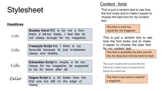
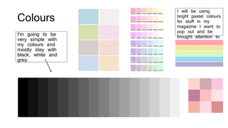
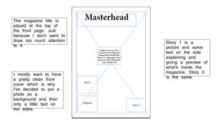
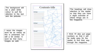
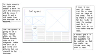
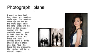
Drafting
Stylesheet
Headlines
Cello
Cello
Cello
Cello
Bradley Hand ITC is for me a font
that's a bit too freely, I feel like its
not classy enough for my magazine.
Freestyle Script this I think is my
favourite because its just in-between
classy and shabby.
Edwardian Script is maybe a bit too
classy for my magazine, its supposed
to be for teens after all.
Segoe Script is a bit better than the
first one but still on the edge of
classy.
Content fonts
This is just a random text to see how
the font looks and to make it easier to
choose the best font for my content
text.
This is just a random text to see
how the font looks and to make
it easier to choose the best font
for my content text.
This is just a random text to see how the font
looks and to make it easier to choose the best
font for my content text.
This font is a bit too
casual for my magazine
This font is probably the best one for
me, its classy but not too hard to read.
This font is too hard to read for
a magazine
Colours
I'm going to be
very simple with
my colours and
mostly stay with
black, white and
grey.
I will be using
bright pastel colours
for stuff in my
magazine I want to
pop out and be
brought attention to.
I mostly want to have
a pretty clean front
cover which is why
I've decided to put a
photo as a
background and then
only a little text on
the sides.
The magazine title is
placed at the top of
the front page. Just
because I don’t want to
draw too much attention
to it.
Story 1 is a
picture and some
text on the side
explaining and
giving a preview of
what's inside the
magazine. Story 2
is the same.
The background will
be a plain white
colour to pull the
attention to the text
and the pictures.
I recon the images
wont be as messy as
this is presented, but
still a bit similar. It
wont be that many
images as well.
The headings will draw
attention to the reader
so that they can have
a slight overview of
where things are in
the magazine.
I think I’ll also put page
numbers so that it will
be really easy for the
reader to find their way
through the magazine.
To draw attention
and give the
reader a taste on
what the interview
will be about I
want to put a
pull quote from
the interview as a
headline.
I want to use
one big image
that fills up over
half the page of
the artist. This is
to make it easier
for the reader to
read the context
and for it to
seem that its not
that much text to
read.
I haven’t put it in
this example but
the questions will
be outlined so that
the reader can
choose what they
want to read.
The background is
going to be a
calm, natural
white, as this
follows through
most of the
magazine. There
will also be a
pull quote and
pictures that are
relevant to the
interview.
Photograph plans
I want to take both
long shots and medium
close ups. The medium
close up will be for
the front page while
the long shots will be
used in the double
spread and the
contents page. I want
to take most of the
pictures outside and
that's the plan. I
already have a model
chosen and I chose
one that have the
looks for my magazine.
Her clothes will be in
natural colours.

Drafting

  • 1.
  • 2.
    Stylesheet Headlines Cello Cello Cello Cello Bradley Hand ITCis for me a font that's a bit too freely, I feel like its not classy enough for my magazine. Freestyle Script this I think is my favourite because its just in-between classy and shabby. Edwardian Script is maybe a bit too classy for my magazine, its supposed to be for teens after all. Segoe Script is a bit better than the first one but still on the edge of classy. Content fonts This is just a random text to see how the font looks and to make it easier to choose the best font for my content text. This is just a random text to see how the font looks and to make it easier to choose the best font for my content text. This is just a random text to see how the font looks and to make it easier to choose the best font for my content text. This font is a bit too casual for my magazine This font is probably the best one for me, its classy but not too hard to read. This font is too hard to read for a magazine
  • 3.
    Colours I'm going tobe very simple with my colours and mostly stay with black, white and grey. I will be using bright pastel colours for stuff in my magazine I want to pop out and be brought attention to.
  • 4.
    I mostly wantto have a pretty clean front cover which is why I've decided to put a photo as a background and then only a little text on the sides. The magazine title is placed at the top of the front page. Just because I don’t want to draw too much attention to it. Story 1 is a picture and some text on the side explaining and giving a preview of what's inside the magazine. Story 2 is the same.
  • 5.
    The background will bea plain white colour to pull the attention to the text and the pictures. I recon the images wont be as messy as this is presented, but still a bit similar. It wont be that many images as well. The headings will draw attention to the reader so that they can have a slight overview of where things are in the magazine. I think I’ll also put page numbers so that it will be really easy for the reader to find their way through the magazine.
  • 6.
    To draw attention andgive the reader a taste on what the interview will be about I want to put a pull quote from the interview as a headline. I want to use one big image that fills up over half the page of the artist. This is to make it easier for the reader to read the context and for it to seem that its not that much text to read. I haven’t put it in this example but the questions will be outlined so that the reader can choose what they want to read. The background is going to be a calm, natural white, as this follows through most of the magazine. There will also be a pull quote and pictures that are relevant to the interview.
  • 7.
    Photograph plans I wantto take both long shots and medium close ups. The medium close up will be for the front page while the long shots will be used in the double spread and the contents page. I want to take most of the pictures outside and that's the plan. I already have a model chosen and I chose one that have the looks for my magazine. Her clothes will be in natural colours.