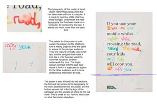
1. The typography of this poster is hand
drawn rather than using a font that
has been selected from a computer. It
is made to look like a little child has
wrote the type, underneath the neat
typography that has been made on a
computer. By contrasting the type, it
stands out much more than one plain
font.
The palette for this poster is quite
varied, the colours on the childrenʼs
font is mainly bright as they are used
to appeal to the younger audience.
They are colours normally used in felt
tips, and the designer has made it
look like a child has also used the
same felt tip/pen to scribble
underneath the type. The bright
colours contrast with the dark type
above it, which is supposed to appeal
for the older audience, as it is more
professional and easier to read.
The poster is also divided into two sections,
the first and top section is the typography for
the main advertisement of the poster, and the
bottom second half is for the logo of the
campaign and the website of where to find out
more. This is small so you have to look closer
on what the poster advertises.