The document discusses the layout and design choices for a magazine double page spread interview. Key points include:
- The title of the spread is the name of the person interviewed to clearly identify the subject.
- A simple logo was created to brand the magazine and was placed through the title on each page.
- A brief description of the interview setting was included to immerse readers.
- The interview questions are in red columns for emphasis, with responses in white for easy reading across or down.
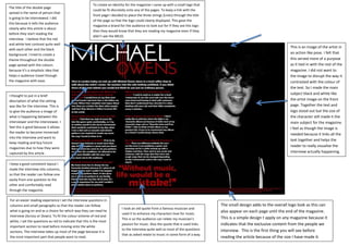
- A black and white image of the artist ties in the text and helps visualize the interview.
- Consistent layout and formatting aids the reading experience.