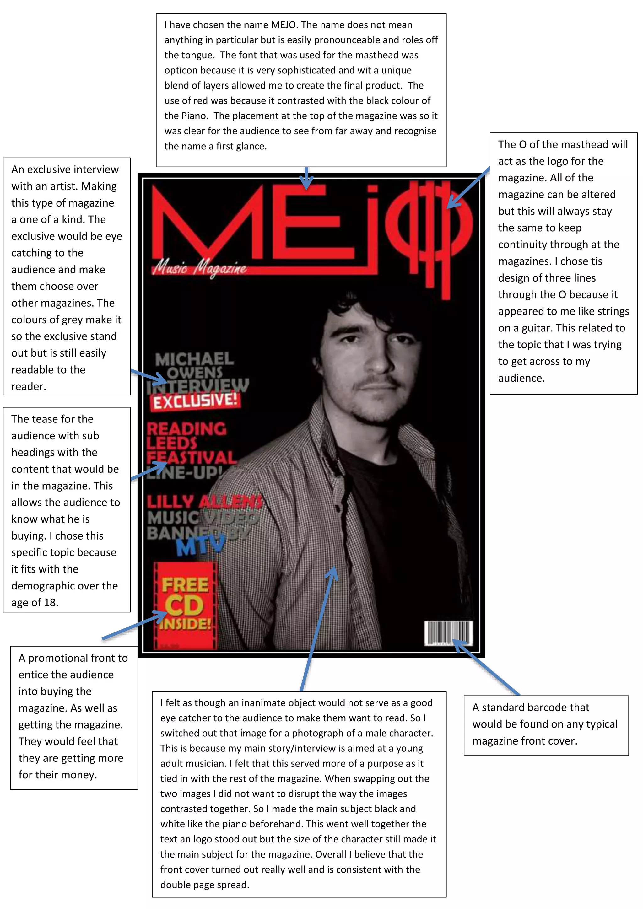
I felt as though an inanimate object would not serve as a good
eye catcher to the audience to make them want to read. So I
switched out that image for a photograph of a male character.
This is because my main story/interview is aimed at a young
adult musician. I felt that this served more of a purpose as it
tied in with the rest of the magazine. When swapping out the
two images I did not want to disrupt the way the images
contrasted together. So I made the main subject black and
white like the piano beforehand. This went well together the
text an logo stood out but the size of the character still made it
the main subject for the magazine. Overall I believe that the
front cover turned out really well and is consistent with the
double page spread.
A standard barcode that
would be found on any typical
magazine front cover.
A promotional front to
entice the audience
into buying the
magazine. As well as
getting the magazine.
They would feel that
they are getting more
for their money.
The tease for the
audience with sub
headings with the
content that would be
in the magazine. This
allows the audience to
know what he is
buying. I chose this
specific topic because
it fits with the
demographic over the
age of 18.
An exclusive interview
with an artist. Making
this type of magazine
a one of a kind. The
exclusive would be eye
catching to the
audience and make
them choose over
other magazines. The
colours of grey make it
so the exclusive stand
out but is still easily
readable to the
reader.
I have chosen the name MEJO. The name does not mean
anything in particular but is easily pronounceable and roles off
the tongue. The font that was used for the masthead was
opticon because it is very sophisticated and wit a unique
blend of layers allowed me to create the final product. The
use of red was because it contrasted with the black colour of
the Piano. The placement at the top of the magazine was so it
was clear for the audience to see from far away and recognise
the name a first glance. The O of the masthead will
act as the logo for the
magazine. All of the
magazine can be altered
but this will always stay
the same to keep
continuity through at the
magazines. I chose tis
design of three lines
through the O because it
appeared to me like strings
on a guitar. This related to
the topic that I was trying
to get across to my
audience.

Magazine review

  • 1.
    I felt asthough an inanimate object would not serve as a good eye catcher to the audience to make them want to read. So I switched out that image for a photograph of a male character. This is because my main story/interview is aimed at a young adult musician. I felt that this served more of a purpose as it tied in with the rest of the magazine. When swapping out the two images I did not want to disrupt the way the images contrasted together. So I made the main subject black and white like the piano beforehand. This went well together the text an logo stood out but the size of the character still made it the main subject for the magazine. Overall I believe that the front cover turned out really well and is consistent with the double page spread. A standard barcode that would be found on any typical magazine front cover. A promotional front to entice the audience into buying the magazine. As well as getting the magazine. They would feel that they are getting more for their money. The tease for the audience with sub headings with the content that would be in the magazine. This allows the audience to know what he is buying. I chose this specific topic because it fits with the demographic over the age of 18. An exclusive interview with an artist. Making this type of magazine a one of a kind. The exclusive would be eye catching to the audience and make them choose over other magazines. The colours of grey make it so the exclusive stand out but is still easily readable to the reader. I have chosen the name MEJO. The name does not mean anything in particular but is easily pronounceable and roles off the tongue. The font that was used for the masthead was opticon because it is very sophisticated and wit a unique blend of layers allowed me to create the final product. The use of red was because it contrasted with the black colour of the Piano. The placement at the top of the magazine was so it was clear for the audience to see from far away and recognise the name a first glance. The O of the masthead will act as the logo for the magazine. All of the magazine can be altered but this will always stay the same to keep continuity through at the magazines. I chose tis design of three lines through the O because it appeared to me like strings on a guitar. This related to the topic that I was trying to get across to my audience.