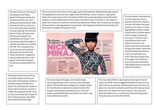
There isonlyone maincolouron thispage,and it dominatesthe wholedoublepage spread.
The backgroundto the textandimage ispink,Nicki Minaj’sname iswritteninbigcapital
lettersthisisalsoinpink,andin the photoof Nicki she iswearingbrightpinklipstickwhich
matchesa similarshade of pinktothe colourinwhichhername iswrittenin.the reasonin
whichthisisdone isto match the identityandreputationof Nicki.She isknownasa verygirly
artistand oftenisphotographedinasexual way.The brightpinkmatchesthisperfectlyasof
course pinkisrecognisedasa girlscolour.
The title of the text‘The Gospel
accordingto Nicki Minaj’
doesn’tfitthe personalitythat
she oftenportrays.AsI have
previouslymentionedshe often
portraysherself asa verysexy
and iscommonlyseenwearing
minimal clothing.Thiscertainly
doesn’tfitthe title due tothe
fact the work ‘gospel’has
connotationsof religion.This
may drawa potential readerto
readthe textafteronlyreading
the title.Thisisbecause they
may have seenthe wayNicki
Minaj presentherself tothe
mediaandwill be intriguedto
findoutwhat she feelsis‘the
gospel’asthe title indicated
thiswill be revealedwithinthe
text.
Thispull quote isseparatedup
intotwo separate colours,
blackand white thiscreatesa
contrast andmakesthe quote
standout a lot more.It isalso
highlightedinadarkershade
of pinkwhichisanotherwayin
whichitmakesit standout
evenmore.The fontusedis
alsodifferenttothe main
bodyof textandis a lot
bolder,boththese techniques
will gainthe reader’sattention
and effectivelyforce themto
readit as it will standout,
evenif theyare justglancing
at the page.Thispull quote
may interestthemtherefore
makingthemwantto read the
bodyof textbelow.
The ring inwhichNicki iswearinghasletteringonitwhich
spellsout‘ICON’ thiswill suggestthatNicki herself isanicon
withinthe musicindustry.Someone whomaynotknowa lot
abouther may feel inclinedtoreadthe textto discovermore
aboutthisicon withinthe musicindustry.The ringisalso
blackand white andisa similarfonttothe letteringusedin
the pull quote justto the leftof Nicki.
The colouringonthispage isextremelysimple,
consistingof prettymuch3 colours,pink,blackand
white.The pinkbeingthe background,adarkershade
for the title whichmatchesthe shade of pinkof her
lipstick.Andthe blackandwhite theme inthe pull
quotesresemblethe blackandwhite inherdress,ring,
eyesandfalse eye lashes.
The bodiesof textare all splitup
intosmall sectionsandtheyall
have titlesinformingthe readeron
whatthe bodyof textbelowis
about.Thiswill allowthe readerto
knowrealise if theyare interestin
readerthe paragraph below.They
can pick and choose whichparts of
the texttheywantto read rather
than readerthe whole page.
Otherthan the picture the firstthingmy
eye wasdrawn toon the double page
spreadwasthe pull quote “Itkeeps
draggingme back”. The artistfeatured
isDavid Bowie one of the most
recognised,iconicandsuccessful artists
ever.Andthe pull quote isclearlya
quote fromhim.He hasa huge amount
of fansthat wouldbe interestedinwhat
he had to say,so m usinga quote like
that, will intriguethe reader,theywill
wantto knowexactlywhatit isthat is
dragginghimback, andfrom whathe is
beingdraggedbackfrom.It’s a clever
pull quote andwill certainlymake the
readerwantto read the textto see
whathe has to say.
The title of the textwhichalsodoublesupas a pull quote “Itkeepsdraggingme
back..”is well linkedwiththe image onBowie onthe leftyhandside.If something
was draggingyouback, thiswouldbe frustratingasyouare not able toreach what
youshouldbe able to.The picture onthe leftshowsastressedoutfrustrated
lookingBowie withhisheadinhishandsandglumlylookingintothe camera.The
readerwill automaticallybe able tolinkthe factthat Bowie looksdestressedwith
the quote on the rightand will wanttofindout exactlywhyhe feelsthisway,and
of course,thiswill featureinthe text,drawingthe readertoreadthe ext.
Bowie wasbornin the 40s, his
musiccouldbe classedas relatively
old.Blackand white isan effect
usedinmoderndayphotography
to give a vintage of edgylooktoan
image.There isnocolour onthis
page at all,itisall in blackand
white,thiscould link/portraythe
fact mostof hismusicwas
produceda while ago,it symbolises
hisoldstyle of music.
There isalso a separate subheader,just
3 or 4 linesof textbelowthe maintitle.
Thisis an introductiontothe textandis
justa small previewtowhatmaybe
featuredwithinthe text.Thiswill allow
the readerto decide if theywantto
readthe article withouthavingtostart
readingthe maintextitself.
The majorityof the musicinwhichBowie
producedfallsunderthe ‘rock’genre.Inthe
image of him,whichisa mediumclose up,
the onlyitemof clothingvisibleof David’s
bodyis a blackleatherjacket.The black
leatherisa popularclothingitemwithinthe
rock industryandcouldbe seenas reflecting
hisgenre of music.
WhenDavidwas producingmusiche wascommonlyfeaturedinthe
media,howeverusuallywithbrightcoloursaroundhimorwearing
brightclothes.The colourredwas a commontheme witha lotof the
photographstakenof him.Thisiswhy seeinghiminblackandwhite
may intrigue the reader,theymaywonder whyhe isinblackand white
and whythere isno colourwithinthe image,itdoesn’tsuitthe
standardimage portrayedof Bowie mythe media,thismymake the
readerwantto read the textto findout.
At the start of eacharticle bigbold
capital lettersare used,the fontsize isa
lotbiggerthan the restof the textand
the lettersare a lot bolderthiswill draw
attentiontothe start of each article and
will encourage the readertoreadthe
text.
Thisdouble page spreadisfroman issue of an NME magazine.The
colouringof the photousedgoesagainstregularconventionsof an
NME magazine due tothe fact itis inblack andwhite.Thiscreates
a huge colourcontrast on the page due to the fact the texthas
brightblue andorange coloursaround it.
The photo of Lana Del Ray is inblackand white,
there isa reasonbehindthisotherthanto look
aestheticallypleasing.The majorityof LanaDel Rays
musicisslow,sad music,whichiswhythe dull,black
and white photoof herfitsappropriately.The dull
image reflectshermusicaswhatshe producesisn’t
‘vibrant’or‘popgenre’hermusicis a lotmore
traditional.Hermusicismore jazzand blues
reflectiveratherthancontemporary
The use of blue andorange also
reflectsherasan artist. Due to the
fact he brightcoloursand reflect
herage as she is a youngerartist.
Orange is seenasa rich colour,so
the orange on the page couldbe
usedto suggestthe facther music
issophisticated.Thesecoloursalso
helpada bitof colourto the page,
usuallyona double page spread the
mostcolourful partof the page is
the picture,howeverasthispicture
isblack andwhite youlose this
colour.So inorderfor the page to
looksomewhatinterestingand
vibrantthe textmusthave some
kindof colourto it.
The title of the article and the fact that
Lana Del Ray is winkinginthe
photographyiscleverlythought
through.The title is‘Mission
Accomplished’thisautomatically
makesthe readerwonderwhat
missionhasbeenaccomplishedand
may wantto make themread the
article to findout,itdraw inthe reader
effectively.The readermaylooktothe
picture forcluesof what she has
accomplishedandasshe is winkingit
may intrigue the readerevenmore.
Sometimeswinkingisassociatedwith
somethingnaughtyordoing
somethingyoushouldn’thave,soby
titlingthe text‘missionaccomplished’
and pairingthisupwitha picture of
herwinking,itmaysuggestthatthe
‘mission’wasone thatshe wasn’t
supposedtotake part in, it maybe
suggeststhatshe wasn’t allowedtodo
whatevershe hasaccomplished,and
thiswill definitely intriguethe reader
to readthe text.
In the middle of the texttheyhave includedabox
featuringstatisticsonLanas Success.The box is a
brightblue box whichstandsouton the surrounding
coloursof white background andblack text.The box
will catchthe reader’sattentionandthe stats
featuringinthe box will informthe readerabout
Lana del ray. Thismay drawpeople whodon’t
usuallylistentohermusictoread the article.They
may see howsuccessful she hasbeenbyquickly
readingthe statsand thenwant to readthe article
on herafterthis.

Double page spread analysis

  • 1.
    There isonlyone maincolouronthispage,and it dominatesthe wholedoublepage spread. The backgroundto the textandimage ispink,Nicki Minaj’sname iswritteninbigcapital lettersthisisalsoinpink,andin the photoof Nicki she iswearingbrightpinklipstickwhich matchesa similarshade of pinktothe colourinwhichhername iswrittenin.the reasonin whichthisisdone isto match the identityandreputationof Nicki.She isknownasa verygirly artistand oftenisphotographedinasexual way.The brightpinkmatchesthisperfectlyasof course pinkisrecognisedasa girlscolour. The title of the text‘The Gospel accordingto Nicki Minaj’ doesn’tfitthe personalitythat she oftenportrays.AsI have previouslymentionedshe often portraysherself asa verysexy and iscommonlyseenwearing minimal clothing.Thiscertainly doesn’tfitthe title due tothe fact the work ‘gospel’has connotationsof religion.This may drawa potential readerto readthe textafteronlyreading the title.Thisisbecause they may have seenthe wayNicki Minaj presentherself tothe mediaandwill be intriguedto findoutwhat she feelsis‘the gospel’asthe title indicated thiswill be revealedwithinthe text. Thispull quote isseparatedup intotwo separate colours, blackand white thiscreatesa contrast andmakesthe quote standout a lot more.It isalso highlightedinadarkershade of pinkwhichisanotherwayin whichitmakesit standout evenmore.The fontusedis alsodifferenttothe main bodyof textandis a lot bolder,boththese techniques will gainthe reader’sattention and effectivelyforce themto readit as it will standout, evenif theyare justglancing at the page.Thispull quote may interestthemtherefore makingthemwantto read the bodyof textbelow. The ring inwhichNicki iswearinghasletteringonitwhich spellsout‘ICON’ thiswill suggestthatNicki herself isanicon withinthe musicindustry.Someone whomaynotknowa lot abouther may feel inclinedtoreadthe textto discovermore aboutthisicon withinthe musicindustry.The ringisalso blackand white andisa similarfonttothe letteringusedin the pull quote justto the leftof Nicki. The colouringonthispage isextremelysimple, consistingof prettymuch3 colours,pink,blackand white.The pinkbeingthe background,adarkershade for the title whichmatchesthe shade of pinkof her lipstick.Andthe blackandwhite theme inthe pull quotesresemblethe blackandwhite inherdress,ring, eyesandfalse eye lashes. The bodiesof textare all splitup intosmall sectionsandtheyall have titlesinformingthe readeron whatthe bodyof textbelowis about.Thiswill allowthe readerto knowrealise if theyare interestin readerthe paragraph below.They can pick and choose whichparts of the texttheywantto read rather than readerthe whole page.
  • 2.
    Otherthan the picturethe firstthingmy eye wasdrawn toon the double page spreadwasthe pull quote “Itkeeps draggingme back”. The artistfeatured isDavid Bowie one of the most recognised,iconicandsuccessful artists ever.Andthe pull quote isclearlya quote fromhim.He hasa huge amount of fansthat wouldbe interestedinwhat he had to say,so m usinga quote like that, will intriguethe reader,theywill wantto knowexactlywhatit isthat is dragginghimback, andfrom whathe is beingdraggedbackfrom.It’s a clever pull quote andwill certainlymake the readerwantto read the textto see whathe has to say. The title of the textwhichalsodoublesupas a pull quote “Itkeepsdraggingme back..”is well linkedwiththe image onBowie onthe leftyhandside.If something was draggingyouback, thiswouldbe frustratingasyouare not able toreach what youshouldbe able to.The picture onthe leftshowsastressedoutfrustrated lookingBowie withhisheadinhishandsandglumlylookingintothe camera.The readerwill automaticallybe able tolinkthe factthat Bowie looksdestressedwith the quote on the rightand will wanttofindout exactlywhyhe feelsthisway,and of course,thiswill featureinthe text,drawingthe readertoreadthe ext. Bowie wasbornin the 40s, his musiccouldbe classedas relatively old.Blackand white isan effect usedinmoderndayphotography to give a vintage of edgylooktoan image.There isnocolour onthis page at all,itisall in blackand white,thiscould link/portraythe fact mostof hismusicwas produceda while ago,it symbolises hisoldstyle of music. There isalso a separate subheader,just 3 or 4 linesof textbelowthe maintitle. Thisis an introductiontothe textandis justa small previewtowhatmaybe featuredwithinthe text.Thiswill allow the readerto decide if theywantto readthe article withouthavingtostart readingthe maintextitself. The majorityof the musicinwhichBowie producedfallsunderthe ‘rock’genre.Inthe image of him,whichisa mediumclose up, the onlyitemof clothingvisibleof David’s bodyis a blackleatherjacket.The black leatherisa popularclothingitemwithinthe rock industryandcouldbe seenas reflecting hisgenre of music. WhenDavidwas producingmusiche wascommonlyfeaturedinthe media,howeverusuallywithbrightcoloursaroundhimorwearing brightclothes.The colourredwas a commontheme witha lotof the photographstakenof him.Thisiswhy seeinghiminblackandwhite may intrigue the reader,theymaywonder whyhe isinblackand white and whythere isno colourwithinthe image,itdoesn’tsuitthe standardimage portrayedof Bowie mythe media,thismymake the readerwantto read the textto findout. At the start of eacharticle bigbold capital lettersare used,the fontsize isa lotbiggerthan the restof the textand the lettersare a lot bolderthiswill draw attentiontothe start of each article and will encourage the readertoreadthe text.
  • 3.
    Thisdouble page spreadisfromanissue of an NME magazine.The colouringof the photousedgoesagainstregularconventionsof an NME magazine due tothe fact itis inblack andwhite.Thiscreates a huge colourcontrast on the page due to the fact the texthas brightblue andorange coloursaround it. The photo of Lana Del Ray is inblackand white, there isa reasonbehindthisotherthanto look aestheticallypleasing.The majorityof LanaDel Rays musicisslow,sad music,whichiswhythe dull,black and white photoof herfitsappropriately.The dull image reflectshermusicaswhatshe producesisn’t ‘vibrant’or‘popgenre’hermusicis a lotmore traditional.Hermusicismore jazzand blues reflectiveratherthancontemporary The use of blue andorange also reflectsherasan artist. Due to the fact he brightcoloursand reflect herage as she is a youngerartist. Orange is seenasa rich colour,so the orange on the page couldbe usedto suggestthe facther music issophisticated.Thesecoloursalso helpada bitof colourto the page, usuallyona double page spread the mostcolourful partof the page is the picture,howeverasthispicture isblack andwhite youlose this colour.So inorderfor the page to looksomewhatinterestingand vibrantthe textmusthave some kindof colourto it. The title of the article and the fact that Lana Del Ray is winkinginthe photographyiscleverlythought through.The title is‘Mission Accomplished’thisautomatically makesthe readerwonderwhat missionhasbeenaccomplishedand may wantto make themread the article to findout,itdraw inthe reader effectively.The readermaylooktothe picture forcluesof what she has accomplishedandasshe is winkingit may intrigue the readerevenmore. Sometimeswinkingisassociatedwith somethingnaughtyordoing somethingyoushouldn’thave,soby titlingthe text‘missionaccomplished’ and pairingthisupwitha picture of herwinking,itmaysuggestthatthe ‘mission’wasone thatshe wasn’t supposedtotake part in, it maybe suggeststhatshe wasn’t allowedtodo whatevershe hasaccomplished,and thiswill definitely intriguethe reader to readthe text. In the middle of the texttheyhave includedabox featuringstatisticsonLanas Success.The box is a brightblue box whichstandsouton the surrounding coloursof white background andblack text.The box will catchthe reader’sattentionandthe stats featuringinthe box will informthe readerabout Lana del ray. Thismay drawpeople whodon’t usuallylistentohermusictoread the article.They may see howsuccessful she hasbeenbyquickly readingthe statsand thenwant to readthe article on herafterthis.