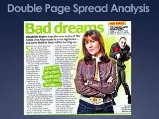
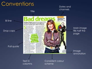
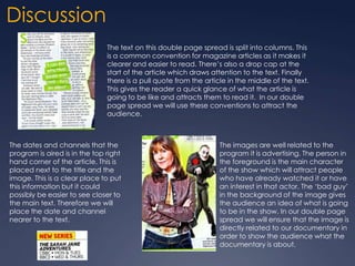
Double Page Spread Analysis
Conventions
Title

Dates and
channels

Bi line
Main image
fills half the
page

Drop caps

Pull quote
Image
annotation
Text in
columns

Consistent colour
scheme
Discussion
The text on this double page spread is split into columns. This
is a common convention for magazine articles as it makes it
clearer and easier to read. There’s also a drop cap at the
start of the article which draws attention to the text. Finally
there is a pull quote from the article in the middle of the text.
This gives the reader a quick glance of what the article is
going to be like and attracts them to read it. In our double
page spread we will use these conventions to attract the
audience.

The dates and channels that the
program is aired is in the top right
hand corner of the article. This is
placed next to the title and the
image. This is a clear place to put
this information but it could
possibly be easier to see closer to
the main text. Therefore we will
place the date and channel
nearer to the text.

The images are well related to the
program it is advertising. The person in
the foreground is the main character
of the show which will attract people
who have already watched it or have
an interest in that actor. The ‘bad guy’
in the background of the image gives
the audience an idea of what is going
to be in the show. In our double page
spread we will ensure that the image is
directly related to our documentary in
order to show the audience what the
documentary is about.

Double page spread analysis

  • 1.
  • 2.
    Conventions Title Dates and channels Bi line Mainimage fills half the page Drop caps Pull quote Image annotation Text in columns Consistent colour scheme
  • 3.
    Discussion The text onthis double page spread is split into columns. This is a common convention for magazine articles as it makes it clearer and easier to read. There’s also a drop cap at the start of the article which draws attention to the text. Finally there is a pull quote from the article in the middle of the text. This gives the reader a quick glance of what the article is going to be like and attracts them to read it. In our double page spread we will use these conventions to attract the audience. The dates and channels that the program is aired is in the top right hand corner of the article. This is placed next to the title and the image. This is a clear place to put this information but it could possibly be easier to see closer to the main text. Therefore we will place the date and channel nearer to the text. The images are well related to the program it is advertising. The person in the foreground is the main character of the show which will attract people who have already watched it or have an interest in that actor. The ‘bad guy’ in the background of the image gives the audience an idea of what is going to be in the show. In our double page spread we will ensure that the image is directly related to our documentary in order to show the audience what the documentary is about.