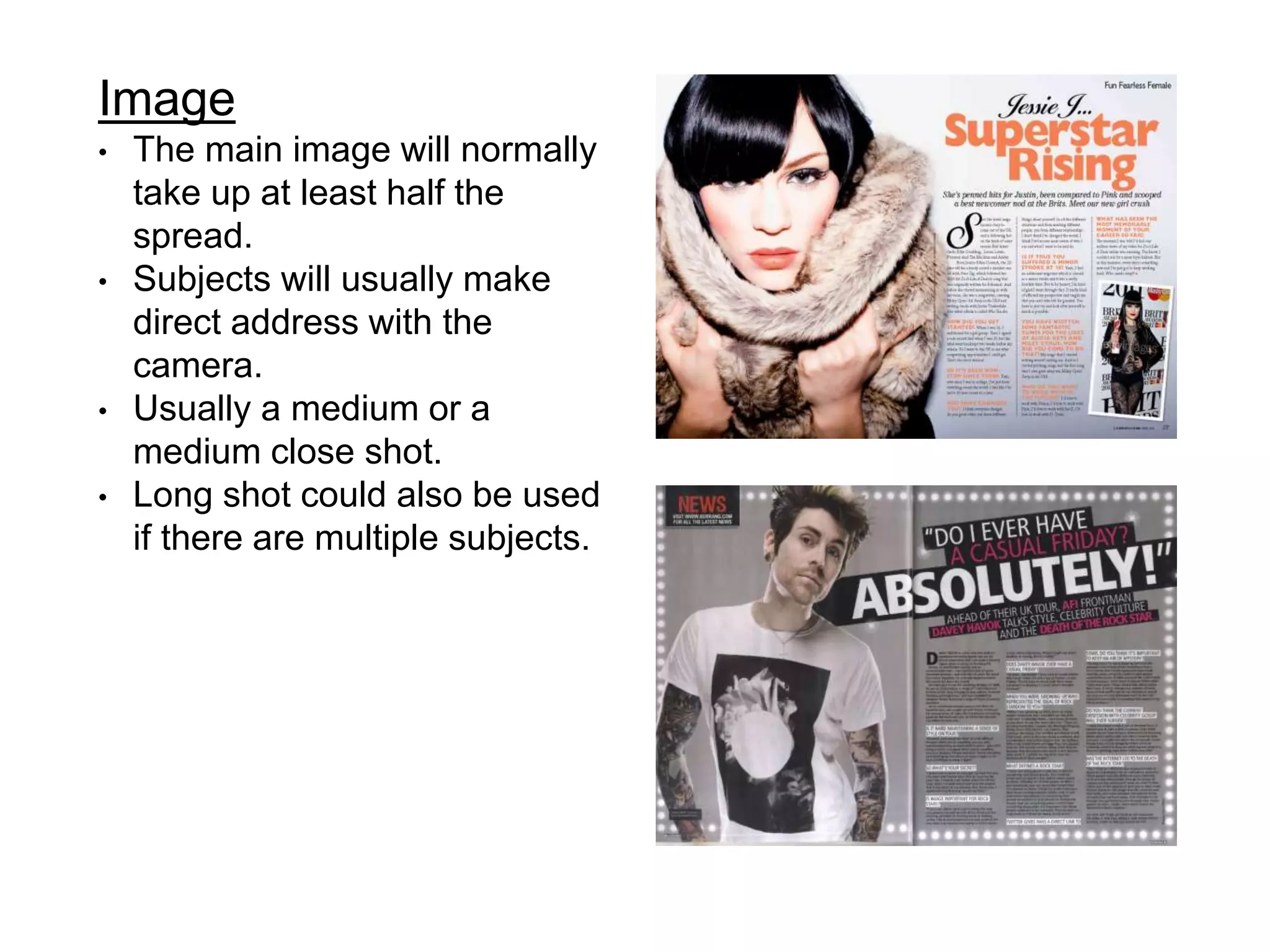
The document outlines codes and conventions for designing a double page spread in a magazine. It notes that the main image will take up half the spread and subjects will make direct eye contact. The headline is the largest font to draw attention. A standfirst introduces the subject. Drop caps, inserts, and bleeding are used to break up the text. Columns, captions, and line breaks are implemented to structure the body text readably across the two pages. Color schemes and page numbers follow magazine-wide styles.


![Writing Newsletter And Magazine Articles[1]](https://cdn.slidesharecdn.com/ss_thumbnails/writing-newsletter-and-magazine-articles1-1224321481217449-8-thumbnail.jpg?width=640&height=640&fit=bounds)


