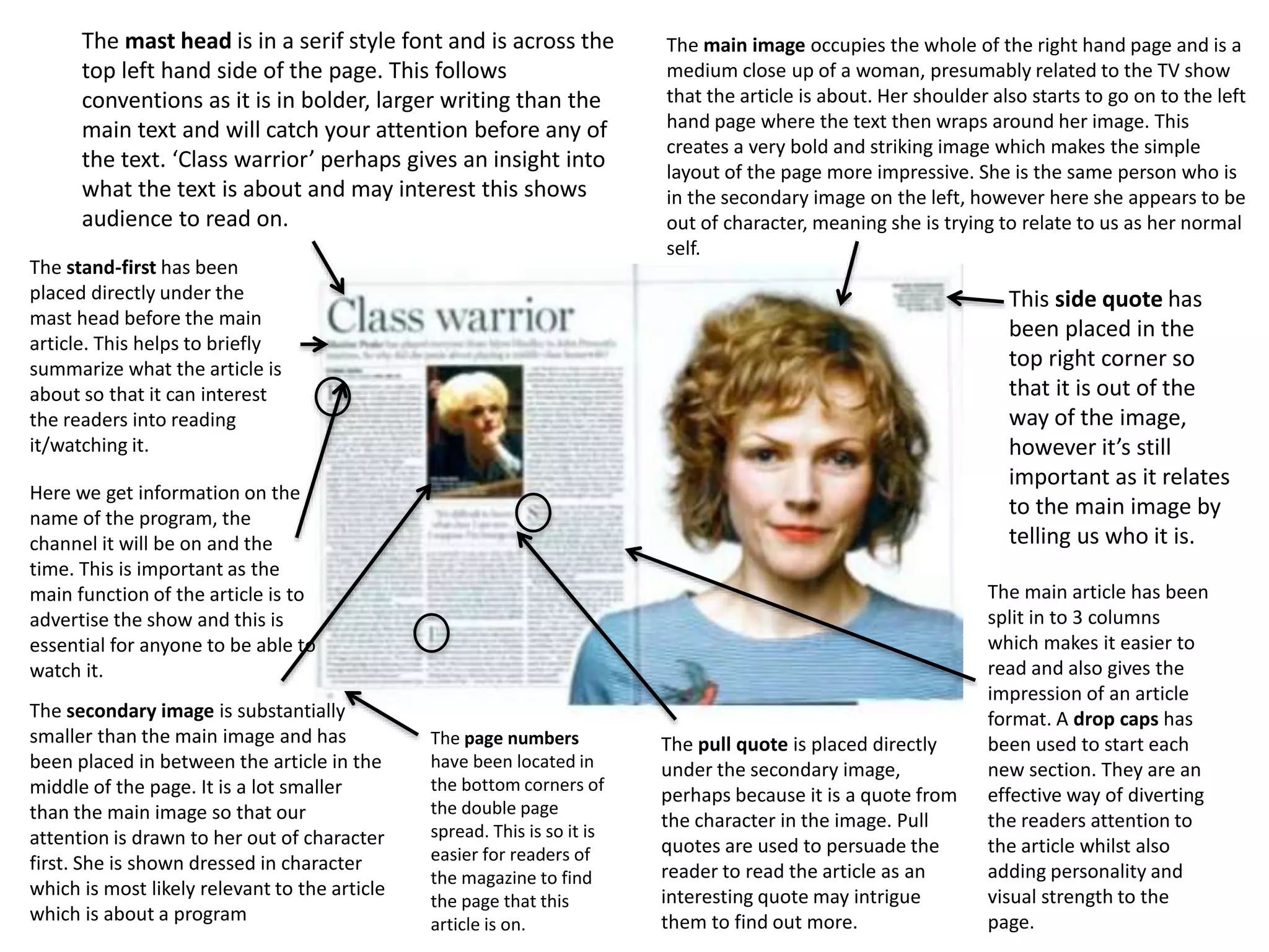
The main image occupies the whole of the right hand page and is a
medium close up of a woman, presumably related to the TV show
that the article is about. Her shoulder also starts to go on to the left
hand page where the text then wraps around her image. This
creates a very bold and striking image which makes the simple
layout of the page more impressive. She is the same person who is
in the secondary image on the left, however here she appears to be
out of character, meaning she is trying to relate to us as her normal
self.
The mast head is in a serif style font and is across the
top left hand side of the page. This follows
conventions as it is in bolder, larger writing than the
main text and will catch your attention before any of
the text. ‘Class warrior’ perhaps gives an insight into
what the text is about and may interest this shows
audience to read on.
The stand-first has been
placed directly under the
mast head before the main
article. This helps to briefly
summarize what the article is
about so that it can interest
the readers into reading
it/watching it.
The secondary image is substantially
smaller than the main image and has
been placed in between the article in the
middle of the page. It is a lot smaller
than the main image so that our
attention is drawn to her out of character
first. She is shown dressed in character
which is most likely relevant to the article
which is about a program
The pull quote is placed directly
under the secondary image,
perhaps because it is a quote from
the character in the image. Pull
quotes are used to persuade the
reader to read the article as an
interesting quote may intrigue
them to find out more.
Here we get information on the
name of the program, the
channel it will be on and the
time. This is important as the
main function of the article is to
advertise the show and this is
essential for anyone to be able to
watch it.
The page numbers
have been located in
the bottom corners of
the double page
spread. This is so it is
easier for readers of
the magazine to find
the page that this
article is on.
This side quote has
been placed in the
top right corner so
that it is out of the
way of the image,
however it’s still
important as it relates
to the main image by
telling us who it is.
The main article has been
split in to 3 columns
which makes it easier to
read and also gives the
impression of an article
format. A drop caps has
been used to start each
new section. They are an
effective way of diverting
the readers attention to
the article whilst also
adding personality and
visual strength to the
page.
Purpose
• The purpose of researching in to similar
products is to gain inspiration into how other
articles advertising TV programs lay out their
page, and what kinds of conventions they use
to help promote the program.
• It will also help us to remember which key
conventions need to be included to express a
professional quality.

Presentation1

  • 1.
    The main imageoccupies the whole of the right hand page and is a medium close up of a woman, presumably related to the TV show that the article is about. Her shoulder also starts to go on to the left hand page where the text then wraps around her image. This creates a very bold and striking image which makes the simple layout of the page more impressive. She is the same person who is in the secondary image on the left, however here she appears to be out of character, meaning she is trying to relate to us as her normal self. The mast head is in a serif style font and is across the top left hand side of the page. This follows conventions as it is in bolder, larger writing than the main text and will catch your attention before any of the text. ‘Class warrior’ perhaps gives an insight into what the text is about and may interest this shows audience to read on. The stand-first has been placed directly under the mast head before the main article. This helps to briefly summarize what the article is about so that it can interest the readers into reading it/watching it. The secondary image is substantially smaller than the main image and has been placed in between the article in the middle of the page. It is a lot smaller than the main image so that our attention is drawn to her out of character first. She is shown dressed in character which is most likely relevant to the article which is about a program The pull quote is placed directly under the secondary image, perhaps because it is a quote from the character in the image. Pull quotes are used to persuade the reader to read the article as an interesting quote may intrigue them to find out more. Here we get information on the name of the program, the channel it will be on and the time. This is important as the main function of the article is to advertise the show and this is essential for anyone to be able to watch it. The page numbers have been located in the bottom corners of the double page spread. This is so it is easier for readers of the magazine to find the page that this article is on. This side quote has been placed in the top right corner so that it is out of the way of the image, however it’s still important as it relates to the main image by telling us who it is. The main article has been split in to 3 columns which makes it easier to read and also gives the impression of an article format. A drop caps has been used to start each new section. They are an effective way of diverting the readers attention to the article whilst also adding personality and visual strength to the page.
  • 2.
    Purpose • The purposeof researching in to similar products is to gain inspiration into how other articles advertising TV programs lay out their page, and what kinds of conventions they use to help promote the program. • It will also help us to remember which key conventions need to be included to express a professional quality.