This DPS features rapper 50 Cent in a full body shot wearing jewelry and chains reflecting the hip hop genre. He has a serious facial expression and is sitting on a gym bench in an unusual way, symbolizing that he does what he wants. The background shows what is going on in the gym to provide context. A headline and quote are included to catch the audience's eye and let them know what they will read about. Tattoos, watches and clothing indicate themes of time, hip hop culture and mood that relate to the artist and message of the content.
The double page spread features two images of the artist being discussed. The main image shows the artist looking happy and engaged in his work, while not making eye contact with the audience. This could intrigue readers to learn more about what is distracting him. The text provides an in-depth article about the artist in paragraph form. Visual and written elements maintain consistency with the magazine's style to reinforce its brand identity.
This double page spread from Vibe magazine features two images and text about an artist. The first image takes up the entire left page and shows the artist's face covered by the phrase "swag" in a stylized font. The text is in long paragraphs with keywords in bold and discusses the artist's rise to fame and struggles with authenticity. Formatting conventions like a 'V' in the top corner and similar color schemes across pages maintain the magazine's branding and guide readers through the spread.
The document provides an analysis of a magazine cover featuring rapper Lil Wayne. A color photo shows Lil Wayne in a suit with a bored facial expression, conveying different sides to his public persona. Text articles are differentiated through varying fonts and sizes. The contents page features photos related to articles to give readers a preview. A double page spread profiles singer Jamelia, using warm, casual photos of her smiling without makeup to portray an intimate interview over her career highs and lows.
The document provides an analysis of different shots in a music video to understand how they convey meaning and sell the artist's image. It summarizes that close up shots of the artist's face establish her identity to help sell her music. Mid shots show her dancing to follow pop conventions while keeping her outfit feminine. Long shots emphasize pink backgrounds and flowers to portray a romantic theme, while placing the artist off-center draws attention to other elements that fit the theme. Extreme close ups again focus on the artist's face and smirk to illustrate the sexual lyrics.
The main image takes up more than two thirds of the double page spread, showing its importance to the text. The artist is wearing clothing that symbolizes wealth. Having the image so prominently displayed suggests the target audience will be more interested in visuals than reading. Some words are highlighted in white or colored to emphasize importance.
This document contains a survey with questions about music magazine preferences. It asks about music genres listened to, preferred price range and content for a magazine, color scheme appeals, preferred artists on covers, and frequency of issues. Respondents are also asked about free gifts influencing purchases and preferences between established vs upcoming artists on covers. The survey collects demographic information and preferences to help design a new music magazine.
The document provides an analysis of the front covers and double page spreads of three dance music magazines: DJ Mag, Mixmag, and Knowledge Magazine. It examines the design elements, color schemes, photography styles, and writing approaches used and how they appeal to different target audiences. For DJ Mag and Mixmag, the covers use bright, energetic colors and casual photography and writing to attract a younger audience. Knowledge Magazine features a more serious black and white aesthetic and minimal text, aiming to appeal to an older, more technically-minded readership.
The document summarizes the design elements and stylistic choices made for a contents page inspired by DRUMMER Magazine and a double page spread inspired by NME Magazine. Key details summarized include:
- The contents page uses eroded fonts, scrapbook-style layout, and bold varsity fonts to convey the messy yet organized nature and college rap style of the promoted genre.
- Colors of red and grey are used to represent contrasts in style and mood within the genre.
- The double page spread copies the slanted, eroded masthead style from NME and uses a red and white color scheme to distinguish interviewer and interviewee contributions.
- Red text signifies a level of authority for
The document analyzes the contents page of the magazine Kerrang!. It summarizes that the main image dominates the page to highlight its importance. It shows the band "Hit the Deck" looking directly at the camera to establish a relationship with the reader. Text and imagery are used to portray themes of rebellion and rock music stereotypes associated with the genre. The layout is organized into sections for easy navigation of the magazine's content.
This document analyzes magazine double page spreads featuring articles. It summarizes the layout, design elements, and content of two spreads. The first spread features British rapper Dizzee Rascal and analyzes the use of columns, images, captions, and fonts to clearly convey information in an appealing visual style. The second spread profiles Beyoncé and discusses design elements like backgrounds, headings, and photos that draw attention and represent her powerful persona. Both analyses describe how the articles inform readers about the subjects in an engaging manner through their writing style and structured formatting.
The main image depicts two men facing away from each other with clenched fists, suggesting conflict between the characters. A woman stands between them with a confused expression, implying she is the source of tension. One man has an unusually pale complexion, relating to the film's supernatural genre. The masthead has a ghostly effect, reflecting the film is about ghosts or vampires. Overall, the image and design suggest a mysterious film with danger and conflict between the main characters driven by the woman at the center.
The document summarizes a magazine article about rapper Drake. It describes the layout, style, and design elements used throughout the article and magazine pages. Key points include the use of sans-serif font to appeal to a young audience, divided columns and pull quotes to draw the reader in, consistent branding elements like the magazine barcode, and photos of Drake representing his music but also breaking stereotypes. The document analyzes how the magazine's stylistic choices help tell the story and engage the target readership.
The contents page of Kerrang! magazine uses a large image of the rock band 'Hit the Deck' looking directly at the camera to establish a connection with readers, with all band members dressed in black to portray rebellion. The layout divides the page into sections for the main image, side text strips, and bottom advertisements. Throughout the magazine, predominantly male artists and masculine colors, fonts, and language are used to appeal to its target rock music audience.
The document analyzes the design elements of an NME magazine cover featuring Jay-Z. It summarizes that the cover is designed to draw attention to Jay-Z through the placement of elements. The masthead uses a large, blocky font in red to stand out. Kickers on the cover relate to Jay-Z and use his logo font in red. The language and terms used on the cover appeal to indie music fans and associate the magazine with rebellion through music. Black, red, and white are prominently used to connote rebellion and the music genre. Jay-Z is prominently featured as the main model, looking directly at the reader while wearing black glasses in line with his musical heritage.
The article provides information about the music artist Dizzee Rascal and his rise to fame in the hip hop genre. It uses visual elements like photos of Dizzee Rascal and a graffiti background to engage the audience. The article is split into four columns of short paragraphs to make the information clear and appealing to read. It aims to inform readers about Dizzee Rascal's career while also persuading them to learn more about this entertaining and interesting artist.
The document discusses the key elements expected on the front cover of a music magazine. It begins with the masthead at the top center stating the company name to identify the publisher. The main image features a well-known music artist relevant to the genre to attract the target audience. Cover lines below provide clear information about the magazine's content and anchor the image. Other standard elements include a barcode and date at the bottom for pricing and a footer that mirrors the header.
The document provides an analysis of magazine covers and contents pages. Key points:
1) Magazine covers use images, fonts, colors and taglines to attract target audiences and convey what's inside. Covers of Rolling Stone, Q and NME use revealing models and prominent artist names to appeal mainly to male readers interested in music.
2) Contents pages organize articles into columns and sections labeled with clear headers. They include photos, editor's letters, and page numbers to help readers find stories of interest.
3) Design elements like mastheads, dates, and color schemes frame the content and guide readers through the magazines in a tidy, easy-to-navigate format. Photos and graphics make the pages visually
This document provides a summary of a hip-hop magazine cover featuring an artist. Some key points:
1) The cover uses bold colors, fonts, and imagery to catch readers' attention and portray the artist as intimidating and masculine, fitting with hip-hop aesthetics.
2) Photos show the artist using fashion, jewelry, and tattoos to display wealth, strength, and authenticity as an artist focused on music above all else.
3) Pull quotes and details about the artist's background and interview aim to give readers insight into the artist and make them feel a personal connection.
4) Stylistic elements like sans-serif fonts, violent language, and references to crime
The document provides details on the design conventions used across magazine covers to attract their target audiences. Key elements summarized include:
1. Mastheads are prominently placed and use distinctive colors to create a recognizable brand identity. Slogans and taglines further reinforce what readers can expect.
2. Featured artist images are intentionally selected and styled to connect with readers through informal poses and natural looks. Close-up photos emphasize eye contact.
3. Puffs and teasers use bright colors and promises of exclusivity to intrigue readers and draw their attention to specific articles or items within. Informal language builds rapport.
Deconstruction of 3 music magazine covers rachelblack10
This magazine cover features Adele taking up most of the space. It suggests she is well-known enough to sell magazines on her name alone. The bold red masthead and text stand out against the pale background. Only including one large image of Adele indicates the magazine is targeting an older audience that doesn't need many pictures to stay engaged.
The Florence + The Machine magazine cover also suggests an older audience through its minimal text and single artistic image of Florence. Her sophisticated pose and the magazine's simple color scheme present it as trendy without being overcomplicated.
Drake is featured in grayscale on the third magazine, making him the main selling point over the additional text. Its blend of muted and
The document provides analysis of magazine covers to determine their target audiences. Analyzing one cover, the response summarizes that the magazine is aimed at teenagers aged 14 and up who enjoy alternative pop music. The social groupings would include those interested in fashion and photography industries. A second cover is analyzed, with the summary stating that magazine targets teens born in the 1990s from 13 up who enjoy mainstream pop and hip hop genres. Both magazines seem aimed at younger, mainstream audiences interested in music and celebrity gossip.
The document summarizes a magazine article layout. It uses red, white, and black colors throughout, with red highlighting key information. While the main body text is dense, it is broken up by varying fonts, drop caps, and images to make it less daunting. The dominant front page image sets the theme but does not stand out strikingly. Overall the design draws readers in through the use of color, images, and varying text while maintaining a cohesive style.
The magazine cover uses bold colors and text to attract attention. It features a large image of Robert Downey Jr that takes up most of the space. Additional text uses puns, exaggeration, and lists of celebrities to suggest exclusivity and value for readers. Smaller text at the bottom includes publication details.
The document provides details about a project to visually represent Emily Fields' poetry through typographic designs. Research was conducted using Emily's poetry and interviews to accurately capture the subject matter and intent. The target audience was poets, writers and artists ages 22-30. Typographic images were created to integrate Emily's words and provide an unconventional promotional effort for her online work. Originally, the designs were to be printed on newsprint but a clearer medium was later used to properly represent her words.
The document summarizes the contents page of a music magazine. It is organized into sections with large images of bands and articles. Key information about each article is included to provide readers with previews. The consistent color scheme, font, and layout create a professional, easy to navigate design that clearly presents the magazine's content.
The document summarizes the key symbolic, technical, written and color codes used in a film magazine cover. The masthead uses bold white letters to draw attention. The color scheme uses black, white and yellow. Technical codes like long shots portray the characters as active and masculine. Written codes promote the science fiction genre. Symbolic codes like guns convey threat and action. The characters' masculine clothing and poses address them as serious and superior. Overall the visual elements characterize the magazine as promoting an action film.
This document is the sheet music for the song "The Shadow of Your Smile" by Johnny Mandel. It contains the lyrics and musical notation for the song arranged for soprano, alto, tenor and bass voices. The song expresses the idea that the memory of a lover's smile will continue to bring joy even after they are gone. It describes how their smile will "color all my dreams" and "light the dawn".
This article provides a behind-the-scenes look at rapper Dizzie Rascal's photo shoot with NME magazine. It describes his arrival with entourage and discusses his successful past year, having won several awards including from GQ and NME. The article aims to give readers insight into his personality through informal descriptions of the shoot atmosphere and his interactions, appealing to its audience through an intimate tone that balances humor with celebrating his music career achievements.
This document provides an analysis of the front cover of NME magazine from September 2009, which features urban artist Dizzie Rascal. Some key points:
1) The classic masthead establishes familiarity while the inclusion of Dizzie Rascal introduces readers to a new genre of music.
2) Visual elements like the graffiti background, Dizzie's costume, and pull quote help convey his urban/rap style within NME's usual indie/rock focus.
3) Cover lines use different fonts and "more" to entice readers and convey the magazine's extensive coverage of music news and reviews.
4) Composition follows the rule of thirds for a stylish, engaging
Vibe is a magazine focused on R&B and hip-hop music, launched in 1993 by Quincy Jones. While it shut down print production in 2009, it was purchased by a private equity firm and continues online. The magazine features artists and entertainers predominantly from the hip-hop world. Its target audience is between ages 18-34, especially those interested in hip-hop culture.
The album advertisement features Madonna's name and the album title "Celebration" in a large sans serif font at the top. Below is a collage image of Madonna featuring different colors to emphasize it is a compilation album. This will appeal to multiple generations by including Madonna's music over her career. The release date is printed in the bottom right corner, following people's natural eye movement. A brief album summary is at the bottom in the weak fallow area against a grey background.
The magazine cover features a large image of the band Paramore, drawing attention to the main article about the band. Large text displays the band's name and the magazine's name prominently. Additional text and images advertise other content like interviews and articles about other bands. The use of bold colors, fonts, and images throughout aims to attract readers, particularly fans of the featured band and artists, and ultimately encourage people to buy the magazine.
The magazine cover features a large image of the band Paramore, drawing attention to the main article about the band. In bold text above the image, the band's name is prominently displayed to further emphasize the focus of this issue. Additional text and images around the cover promote other aspects of the magazine, such as a competition to win posters, details of articles on other bands, and an attractive female singer to appeal to various audiences. The cover design utilizes prominent images and text in different fonts, sizes, and colors to attract readers and fans of the featured band as well as other musical content within the issue.
This article profiles British rapper Dizzie Rascal and his recent success. It describes the scene before his photo shoot for NME magazine, where he arrives with an entourage. The article then discusses Dizzie's winning numerous awards in the past year, including awards from GQ, NME and MOBOs. By providing details about both Dizzie's personality and his professional accomplishments, the article gives readers insight into his rise in the music industry.
The CD cover uses bright yellow and simple fonts and designs to attract younger audiences. It features a bubbly font for the artist name and a small silhouette of the artist instead of a portrait to intrigue audiences into learning who the artist is. While some elements like the tracklist font and barcode are conventional, the overall design stands out from other pop albums through its unusual colors and lack of the artist's face, aiding future identification of the album.
Analysing contents pages prep for blog pptasmediag12
The contents page uses a large image of Kanye West, who reflects the interests of the target audience. Information such as artist profiles, music news and reviews are highlighted in bold text and positioning to easily catch the reader's attention. The overall simple yet stylish layout suggests the magazine carefully selects only the most relevant content for its target audience.
The document summarizes the design elements of a music magazine content page. Large images and quotes are used under each musician to draw the reader in. Different fonts and layouts create an individual feel reflecting the intended indie audience. Bright colors highlight important information like the subscription box to increase readership. Overall, the design emphasizes musicians' images and grabs attention to feature important artists and articles.
The document provides analysis of magazine cover and content page design elements. It discusses how various visual elements are used to attract readers' attention and convey information about the musicians featured. Large images and a bold color scheme are used to draw the eye. Musician names and most important text are in red to make them stand out. Photograph placement and sizing are designed to associate images with corresponding articles. Font styles, eye contact and clothing choices in images aim to reflect musicians' personas and appeal to the intended audience. Overall the document examines how visual design strategically communicates information and brands to engage readers.
The document summarizes a double-page magazine spread about Lady Gaga. A large black and white photo of Lady Gaga takes up one whole page to emphasize that she is the focus of the article. On the opposite page, text about Lady Gaga is placed next to her photo so it is clear the story is about her. Additional photos and design elements like colored text, quotes, and section headers are used to attract readers and provide more information about Lady Gaga and her music.
The digipack artwork is vibrant with neon colors, spray-painted textures, and abstract patterns in reference to graphite and rebellious teenagers. There is no identification of the band Coldplay anywhere on the packaging, making it mysterious and enticing audiences to purchase it to discover the artist. The packaging aims to attract both female and male audiences across genres with its unique and eye-catching design that challenges expectations of an indie rock album.
The magazine cover targets a female audience aged 20-30. The main image features a woman posing in simple clothing to portray an attainable lifestyle. Pink fonts and colors are used throughout to appeal to stereotypical female interests. Celebrity images and alliterative text are intended to draw readers in with promises of inside stories. The price is displayed discreetly as magazines are an expensive product.
The document provides an analysis of magazine front covers and contents pages from NME magazine issues. It examines various design elements like the masthead, cover lines, images, and page layout. Specific covers and contents pages are broken down in detail, analyzing how elements like colors, fonts, images and positioning are used to target the magazine's intended audience and convey the right tone or message. The purpose is to understand how magazine covers and contents pages are planned and designed to effectively engage and inform readers.
The magazine cover features a serious image of two male artists from a boy band facing away from each other. In three sentences or less:
The magazine cover features a serious image of two male artists from a boy band facing away from each other, their clothing and facial expressions intended to convey a serious dedication to their music industry. Brief text and a website address provide just enough information to intrigue readers without giving away too many details of the stories inside. Red coloring and fonts are used prominently to match the rock genre of the magazine.
The document provides an analysis of magazine front covers and articles layouts. It examines elements like the masthead, cover lines, images, and target audiences. Specific magazines analyzed include NME and their covers and articles focusing on artists like Dizzee Rascal and Florence and the Machine. Key elements summarized include color schemes, fonts, image placement and sizing, and how elements are designed to attract intended audiences.
Task 1, 2, 3 Analysing Music Magazine Pages [G321]GRACEASMEDIA
The document provides an analysis of magazine layout elements including covers, contents pages, and articles. Key points analyzed include mastheads, images, fonts, colors, page numbers, and section headings. Strategic placement of elements is discussed to attract audiences and guide readers through the magazine in a logical flow. Specific examples from NME magazine issues are referenced to demonstrate conventions used across music and culture-focused publications.
The magazine cover uses a simple layout with a medium shot of two artists facing away from each other to imply rivalry in the music industry. Red is prominently used to connote the rock genre. Questions are asked under subheadings to encourage reading the articles. The masthead is bright yellow to catch the eye, and the main image overlaps it for regular readers.
The document provides a history of the supernatural/horror genre across different time periods. It discusses how supernatural horror originated from 18th century Gothic literature and folklore traditions involving death and the afterlife. Major influential 19th century works that helped define the genre included Frankenstein, works by Edgar Allan Poe, Robert Louis Stevenson, Oscar Wilde, and Bram Stoker. In the 20th century, the proliferation of publications provided an outlet for horror writers like H.P. Lovecraft and M.R. James to pioneer new subgenres. Contemporary popular horror authors now include Stephen King, Clive Barker, and Dean Koontz.
This document analyzes magazine front covers from different genres. It discusses several elements of magazine design including the masthead, images, colors, fonts, layout and how they are used to target audiences. Specific magazines examined include ones for horror/supernatural films, Harry Potter and Batman. Elements like the prominent placement of stars and quotes are aimed at attracting fans of the featured works. Colors like red are chosen to represent themes like danger relevant to the genre. The layouts are designed to guide the viewer's eyes across different elements of the cover.
This document discusses various elements of a magazine contents page including page numbers, issue dates, mastheads, and featured articles to provide important information to readers. Colors, fonts, and graphics are used strategically to draw attention to key details. Featured celebrities are also discussed in the context of their clothing and how it relates to their public image.
The magazine targets 16-24 year olds, as represented by the models wearing tracksuits typically worn by young people. The magazine features male artists, indicating its focus on music appealing to younger demographics. While mostly aimed at 16-24 year olds due to the language used, the magazine hopes to attract readers through its attractive colors and designs as well as appealing to those who listen to music channels like MTV and radio stations such as Kiss FM.
The magazine would be distributed monthly at stores like WH Smiths, local book and magazine stores, corner shops, and music recording studios. These locations were chosen because young people frequently visit them and would be interested in a music and books-focused magazine that is affordable. Most people cannot afford to buy magazines weekly, and monthly publication allows time to include more music gossip and news. Existing hip hop magazines like Vibe, XL, and NME are selling well due to artist endorsements and fans purchasing them, with potential for wider audiences as music listening increases globally in English.
The document describes a media product designed to look like a music magazine focusing on the hip hop genre. The student analyzed existing magazines like Vibe and XXL to inform the design of their magazine. They used photography, editing, and mise-en-scene to make the pictures look professional and clearly represent the hip hop genre through the clothing of the models. The layout design features a two-page spread in columns, images cropped and placed on the contents page to look like real magazines, and strategic placement of text and images on the cover.
The document discusses the student's media product, which is a music magazine. The student believes their magazine looks like a real music magazine due to the colors and text used, as well as details related to music. They looked at existing magazines like Vibe and XXL for inspiration. The clothing and poses of the models help indicate the magazine's hip hop genre. Photography, editing, clothing choices, and layout were used to make the magazine look professional and clearly fit into the music genre.
Hip hop originated in the 1970s in the Bronx, New York among African American and Latino communities. It is characterized by four key elements - rapping, DJing, breaking, and graffiti. DJ Kool Herc is considered the "father" of hip hop, pioneering DJ techniques like looping breaks on two turntables. Hip hop music first emerged from DJs creating rhythmic beats and was accompanied by rapping in rhythmic chants. It has since spread globally and incorporates influences from genres like blues, jazz, rock, soul, funk, and rhythm and blues. While hip hop faces some criticism, it provides an artistic outlet and global platform for marginalized communities.
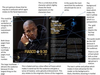
1. This is a mid shot of the In the quote the main The
character which slightly word that the audience background
The arm gesture shows that he shows the facial should look for are in colour is
may be in confusion which again expressions on the white. black which
relates to the facial expressions characters face. makes the
text in yellow
stand out
This could be which is a
a sign to juxtaposition.
symbolise or
recognize the The gold
artist’s watch
mainstream depicts the
audience. hip hop
bracket.
The quote could
Both these be the USP
pages have because it
page connects with
numbers, a the audience.
ssumingly
all the There is a lot
pages must of font which
have tells us that
number. the audience’s
age group is
mature.
The large masthead
attracts the audience This is faded and has a blue effect of Fiasco which The text is white and yellow which
because it’s the makes it stand out for the audience and gives a makes it more attractive for the
largest thing on the sense of mystery and a ghostly embracement. This reader as the background is
page also relates to the enigmatic theme of the magazine. black, therefore, boosting in market
2. His facial expressions The tattoos on his arm indicate
His vest that Nas is
show that he is not the genre hip hop because
wearing could indicate the The letter
One side of very happy so he is in a most music artist have tattoos.
weather of how hot he is “D” at the
his face is bad mood.
or how angry he is feeling. start
darker than
the others shows the
which could audience
show that that the
he is half readers
evil know
what word
they are
The going to
background start with.
shows that
he is This DPS
indoors also has the
with his page
vest on. number,
magazine
It’s a close name and
mid shot to issue date.
show the
audience There is
the facial quote grab
expressions from to
of the Nas magazine to
make catch
the
The watch could represent that The letter at the back “Y” is shown The punch bag in the audiences
he is In the gym but he does not clearly whereas the other are not. Y background shows that he eye
want to waste any other time. could represent why? is in the gym
3. This DPS also has a He is also wearing a
headline so the He is wearing chains which This is a full
snap back which
audience know what reflects to the genre “Hip shot of 50 Cent
also reflect to “Hip
they are reading. Hop”. which could
Hop”
show his body
expressions
what the
message they
want to send
across.
50 cent is
wearing a The
lot of background
jewellery is not blurred
which out which
could could show
symbolise that they
that he want to show
wants what going
attention ton in the
because it background.
all catches
the His facial
audiences expressions
eye. show that he is
serious and his
not looking
On this DPS there is also a grab quote to He is on a bench but sitting on
towards the
catch the audiences eye. the table part which could show
camera.
that no one can tell him what to
do and he is his own boss.