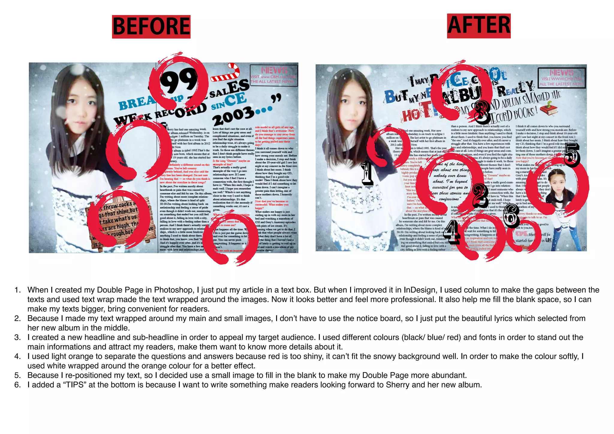
1. The document discusses improvements made to a double page layout in InDesign compared to an earlier Photoshop version. Using columns and text wrap allowed the text to flow better around images, filling blank space and making the page feel more professional.
2. Images were used with text wrapped around them, eliminating the need for a notice board. Lyrics from an album were placed in the center.
3. Headlines and sub-headlines in different colors and fonts were used to highlight key information and attract readers.