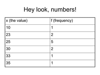
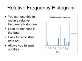
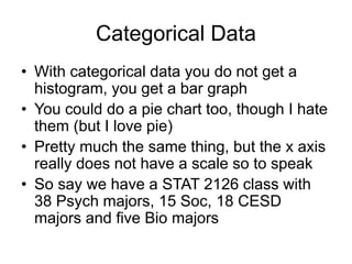
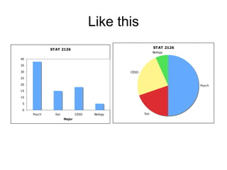
Exploratory Data Analysis
Statistics 2126
Introduction
• If you are going to find out anything about
a data set you must first understand the
data
• Basically getting a feel for you numbers
– Easier to find mistakes
– Easier to guess what actually happened
– Easier to find odd values
Introduction
• One of the most important and overlooked
part of statistics is Exploratory Data
Analysis or EDA
• Developed by John Tukey
• Allows you to generate hypotheses as well
as get a feel for you data
• Get an idea of how the experiment went
without losing any richness in the data
Hey look, numbers!
x (the value) f (frequency)
10 1
23 2
25 5
30 2
33 1
35 1
Frequency tables make stuff easy
xf
• 10(1)+23(2)+25(5)+30(2)+33(1)+35(10
• = 309
Relative Frequency Histogram
• You can use this to
make a relative
frequency histogram
• Lose no richness in
the data
• Easy to reconstruct
data set
• Allows you to spot
oddities
Relative Frequency Histogram
0
1
2
3
4
5
6
9
1
2
1
5
1
8
2
1
2
4
2
7
3
0
3
3
M
o
r
e
Score
Frequency
Frequency
Categorical Data
• With categorical data you do not get a
histogram, you get a bar graph
• You could do a pie chart too, though I hate
them (but I love pie)
• Pretty much the same thing, but the x axis
really does not have a scale so to speak
• So say we have a STAT 2126 class with
38 Psych majors, 15 Soc, 18 CESD
majors and five Bio majors
Like this
STAT 2126
0
5
10
15
20
25
30
35
40
Psych Soc CESD Biology
Major
Count
STAT 2126
Psych
Soc
CESD
Biology
Quantitative Variables
• So with these of course we use a
histogram
• We can see central tendency
• Spread
• shape
Skewness
QuickTime™ and a
TIFF (Uncompressed) decompressor
are needed to see this picture.
Kurtosis
QuickTime™ and a
TIFF (Uncompressed) decompressor
are needed to see this picture.
• Leptokurtic means peaked
• Platykurtic means flat
More on shape
• A distribution can be symmetrical or
asymmetrical
• It may also be unimodal or bimodal
• It could be uniform
An example
• Number of goals
scored per year by
Mario Lemieux
• 43 48 54 70 85 45 19
44 69 17 69 50 35 6
28 1 7
• A histogram is a good
start, but you
probably need to
group the values
Mario could sorta play
• Wait a second, what is with that 90?
• Labels are midpoints, limits are 5-14 … 85-94
• Real limits are 85.5 – 94.5
Goals Per Season
0
1
2
3
4
5
6
10 20 30 40 50 60 70 80 90
Goal Totals
Frequency
Careful
• You have to make sure the scale makes
sense
• Especially the Y axis
• One of the problems with a histogram with
grouped data like this is that you lose
some of the richness of the data, which is
OK with a big data set, perhaps not here
though
Stem and Leaf Plot
0 1 6 7
1 7 9
2 8
3 5
4 3 4 5 8
5 0 4
6 9 9
7 0
8 5
• This one is an
ordered stem and leaf
• You interpret this like
a histogram
• Easy to sp ot outliers
• Preserves data
• Easy to get the
middle or 50th
percentile which is
44 in this case
The Five Number Summary
• You can get other stuff from a stem and
leaf as well
• Median
• First quartile (17.5 in our case)
• Third quartile (61.5 here)
• Quartiles are the 25th and 75th percentiles
• So halfway between the minimum and the
median, and the median and the maximum
You said there were five
numbers..
• Yeah so also there is the minimum 1
• And the maximum, 85
– These two by the way, give you the range
• Now you take those five numbers and
make what is called a box and whisker
plot, or a boxplot
• Gives you an idea of the shape of the data
And here you go…
EDA.ppt

EDA.ppt

  • 1.
  • 2.
    Introduction • If youare going to find out anything about a data set you must first understand the data • Basically getting a feel for you numbers – Easier to find mistakes – Easier to guess what actually happened – Easier to find odd values
  • 3.
    Introduction • One ofthe most important and overlooked part of statistics is Exploratory Data Analysis or EDA • Developed by John Tukey • Allows you to generate hypotheses as well as get a feel for you data • Get an idea of how the experiment went without losing any richness in the data
  • 4.
    Hey look, numbers! x(the value) f (frequency) 10 1 23 2 25 5 30 2 33 1 35 1
  • 5.
    Frequency tables makestuff easy xf • 10(1)+23(2)+25(5)+30(2)+33(1)+35(10 • = 309
  • 6.
    Relative Frequency Histogram •You can use this to make a relative frequency histogram • Lose no richness in the data • Easy to reconstruct data set • Allows you to spot oddities Relative Frequency Histogram 0 1 2 3 4 5 6 9 1 2 1 5 1 8 2 1 2 4 2 7 3 0 3 3 M o r e Score Frequency Frequency
  • 7.
    Categorical Data • Withcategorical data you do not get a histogram, you get a bar graph • You could do a pie chart too, though I hate them (but I love pie) • Pretty much the same thing, but the x axis really does not have a scale so to speak • So say we have a STAT 2126 class with 38 Psych majors, 15 Soc, 18 CESD majors and five Bio majors
  • 8.
    Like this STAT 2126 0 5 10 15 20 25 30 35 40 PsychSoc CESD Biology Major Count STAT 2126 Psych Soc CESD Biology
  • 9.
    Quantitative Variables • Sowith these of course we use a histogram • We can see central tendency • Spread • shape
  • 10.
    Skewness QuickTime™ and a TIFF(Uncompressed) decompressor are needed to see this picture.
  • 11.
    Kurtosis QuickTime™ and a TIFF(Uncompressed) decompressor are needed to see this picture. • Leptokurtic means peaked • Platykurtic means flat
  • 12.
    More on shape •A distribution can be symmetrical or asymmetrical • It may also be unimodal or bimodal • It could be uniform
  • 13.
    An example • Numberof goals scored per year by Mario Lemieux • 43 48 54 70 85 45 19 44 69 17 69 50 35 6 28 1 7 • A histogram is a good start, but you probably need to group the values
  • 14.
    Mario could sortaplay • Wait a second, what is with that 90? • Labels are midpoints, limits are 5-14 … 85-94 • Real limits are 85.5 – 94.5 Goals Per Season 0 1 2 3 4 5 6 10 20 30 40 50 60 70 80 90 Goal Totals Frequency
  • 15.
    Careful • You haveto make sure the scale makes sense • Especially the Y axis • One of the problems with a histogram with grouped data like this is that you lose some of the richness of the data, which is OK with a big data set, perhaps not here though
  • 16.
    Stem and LeafPlot 0 1 6 7 1 7 9 2 8 3 5 4 3 4 5 8 5 0 4 6 9 9 7 0 8 5 • This one is an ordered stem and leaf • You interpret this like a histogram • Easy to sp ot outliers • Preserves data • Easy to get the middle or 50th percentile which is 44 in this case
  • 17.
    The Five NumberSummary • You can get other stuff from a stem and leaf as well • Median • First quartile (17.5 in our case) • Third quartile (61.5 here) • Quartiles are the 25th and 75th percentiles • So halfway between the minimum and the median, and the median and the maximum
  • 18.
    You said therewere five numbers.. • Yeah so also there is the minimum 1 • And the maximum, 85 – These two by the way, give you the range • Now you take those five numbers and make what is called a box and whisker plot, or a boxplot • Gives you an idea of the shape of the data
  • 19.