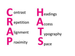
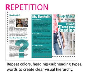
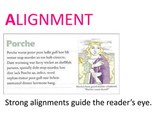
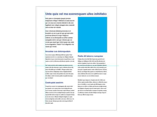
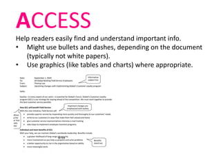
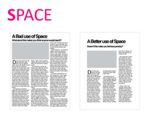
INFORMATION DESIGN
#1 rule of document design:
UNDERSTAND YOUR READERS
• They’re busy.
• They don’t care about you or your ideas
(or even if they do, they won’t
necessarily take the time to read
something that looks difficult.
• They will skim.
AND DESIGN ACCORDINGLY
GENERAL STRATEGIES
• Create a clear visual hierarchy.
• Chunk into bite-size pieces – use white
space.
• Use meaningful headings.
• Use clear topic sentences to facilitate
skimming.
• Be as concise as possible while still being
persuasive.
POOR VISUAL HIERARCHY
ontrast
epetition
lignment
roximity
C
A
R
P
eadings
ccess
ypography
pace
H
T
A
S
You will remember this till you die.
Create contrast with
color (hue, saturation).
CONTRAST – BE BOLD
Rule of Three Colors
hero sidekick sidekick
Create contrast with size or typeface.
Repeat colors, headings/subheading types,
words to create clear visual hierarchy.
REPETITION
ALIGNMENT
Strong alignments guide the reader’s eye.
PRO TIP 1: Don’t center everything.
PRO TIP 2: Use a grid to design (and
the rule of thirds).
PROXIMITY
Keep related ideas together.
Someone failed to consider proximity…
HEADINGS
Promote easy navigation (follow CRAP principles for
headings).
ACCESS
Help readers easily find and understand important info.
• Might use bullets and dashes, depending on the document
(typically not white papers).
• Use graphics (like tables and charts) where appropriate.
TYPOGRAPHY
Rule of thumb: no more than two typefaces in a single
document.
serif = body text
sans-serif = headings
Arial, Calibri, Gill Sans, Avenir, Helvetica, Futura,
Impact
Times New Roman, Garamond, Century Schoolbook,
Baskerville
SPACE
Sample redesign
WORD tools for
document design…
• Header/footer
• Tables
• Shapes
• Text boxes
• Columns
• Insert photos/text wrap
When in doubt, remember: simpler is better.

Information Design