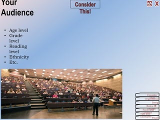
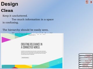
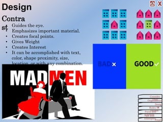
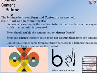
2. This!
Before you start a project
you should consider
these points:
• Your Audience
• Your Skill Level
• Your Equipment,
Time and Cost
Organization
Consider
This!
Desig
nRules Of
ThumbForm and
ContentTips and
Examples
Finall
3. Your
Audience
• Age level
• Grade
level
• Reading
level
• Ethnicity
• Etc.
Organization
Consider
This!
Desig
nRules Of
ThumbForm and
ContentTips and
Examples
Finall
4. Skill Level
Are you a Super-
Techie?
Or, are you a
Beginner?
Organization
Consider
This!
Desig
nRules Of
ThumbForm and
ContentTips and
Examples
Finall
5. Equipment,
Time, and Cost
What equipment do you
need for:
• Creating
• Displaying
• Transporting
What will the cost
be?
How much time do
you have?
Organization
Consider
This!
Desig
nRules Of
ThumbForm and
ContentTips and
Examples
Finall
6. Organizat
ion
In order to be successful in any project, you need organization
skills.
That starts with taking steps to actually Get Organized and
follow some practical advice.
Another aspect in organization is creating a Story Board.
Organization
Consider
This!
Desig
nRules Of
ThumbForm and
ContentTips and
Examples
Finall
7. Get Organized!
Make a detailed outline before you turn the
computer on!
Order the information:
• Chronologically
• By development
• According to topics
• From general to specific
• From problem to solutionRefine each section and subsection according to a
consistent pattern.
Create a “Story Board” where you are
cryptic, but complete in your thoughts.
Organization
Consider
This!
Desig
nRules Of
ThumbForm and
ContentTips and
Examples
Finall
8. Story Board
The purpose of the story board is to allow you to collect your ideas,
order the material, and make revision before investing a great deal
of time and effort in the mechanics of creating the project.
An essential step in the process.
But how?
Organization
Consider
This!
Desig
nRules Of
ThumbForm and
ContentTips and
Examples
Finall
9. How to Create
a Story Board
1. Begin with an outline.
2. “Lay-out” the macro order of the
information. (Sections, headings,
etc.)
3. Put the pages in sequence. (Index
cards are very useful here.)
4. “Sketch each page/slide/screen
indicating text, graphics, colors,
and/or sounds.
5. Note any transitions and
animations.
6. Make off-page notes where they are
helpful.
7. Review and Revise
It is much easier to make changes in sketches than
after several pages have been created in the
application.
Organization
Consider
This!
Desig
nRules Of
ThumbForm and
ContentTips and
Examples
Finall
10. Desi
gn
The appearance of the information (text or
graphics) effects the way we perceive it.
It impacts the content.
Remember CCC:
• Clean
• Consistent
• ContrastWe will also consider some of the basic principles of
design that you should be aware of as you’re working.
Organization
Consider
This!
Desig
nRules Of
ThumbForm and
ContentTips and
Examples
Finall
11. Design
Keep it uncluttered.
Too much information in a space
is confusing.
The hierarchy should be easily seen.
More important material should
be at the top and/or left.
Clean
Organization
Consider
This!
Desig
nRules Of
ThumbForm and
ContentTips and
Examples
Finall
12. The mind orders information based, in part, on the
perceptual environment.
Constantly changing environments require constant
mental adjustment.
This can interfere with content.
Consist
ent
TIP: To see the consistency of the entire
presentation, view it in the Slide Sorter
View.
Organization
Consider
This!
Desig
nRules Of
ThumbForm and
ContentTips and
Examples
Finall
Design
13. Contra
st
Organization
Consider
This!
Desig
nRules Of
ThumbForm and
ContentTips and
Examples
Finall
Design
• Guides the eye.
• Emphasizes important material.
• Creates focal points.
• Gives Weight
• Creates Interest
• It can be accomplished with text,
color, shape proximity, size,
location, or with any combination.
14. Back To
Basics
Consider the basic
principles of design:
Organization
Consider
This!
Desig
nRules Of
ThumbForm and
ContentTips and
Examples
Finall
Design
15. • Don’t mix
alignments
• Center=Balanced
• Left &
Right=Movement
Basics – Text Alignment
Alignment -
Horizontal We read from the top
down, therefore, the
top is the most
important position.
Alignment - Vertical
Alignment – Horizontal
Base line – the line that text and
graphics sit on.
Organization
Consider
This!
Desig
nRules Of
ThumbForm and
ContentTips and
Examples
Finall
Design
Lef
t
Cent
er
Righ
t
Justifi
ed
Top
Middle
Bottom
16. Too close = cluttered and
confusing.
Too far = weak and
confusing.
Basics -
Proximity
Proximity ties the various components together using
your graphics and white space.
Organization
Consider
This!
Desig
nRules Of
ThumbForm and
ContentTips and
Examples
Finall
Design
17. “White space” is the unused areas of a page or screen.
Graphic designers realized long ago that it is important for
clarity and appeal.
Don’t crowed your materials.
Leave plenty of open space.
Basics – White
Space
Organization
Consider
This!
Desig
nRules Of
ThumbForm and
ContentTips and
Examples
Finall
Design
18. Rules Of Thumb
General rules of thumb to remember
as you’re working are:
Organization
Consider
This!
Desig
nRules Of
ThumbForm and
ContentTips and
Examples
Finall
19. Keep It Simple
Stupid/Sweetie
Most multimedia presentations can be improved
by eliminating some elements or moving them to
another screen.
KIS
S
Organization
Consider
This!
Desig
nRules Of
ThumbForm and
ContentTips and
Examples
Finall
Rules Of Thumb
20. Typography
• Use only 2 (3 at the very most) fonts in any document.
• Let size and style (bold, italic, underline) create contrast.
• Avoid the use of all caps. (We read as much by the shape of the
words as by the collection of letters.)
• All capitalized texts have no variety in shape, so they are
more difficult to read.
• Avoid the use of all Bold
• Constant emphasis is no emphasis.
• Connect the style to the meaning of the text.
Con
t.
Organization
Consider
This!
Desig
nRules Of
ThumbForm and
ContentTips and
Examples
Finall
Rules Of Thumb
21. Sans - Serif
Fonts without terminating
marks.
Studies in perception indicate that when blocks of text are used,
serif fonts work best for the printed page and sans-serif are best
Typography -
Fonts
Serif Fonts
A serif is a terminating mark at the
end of a letter stroke.
Organization
Consider
This!
Desig
nRules Of
ThumbForm and
ContentTips and
Examples
Finall
Rules Of Thumb
22. Color
Color helps make the foreground/background distinction.
Light color indicates background and bold colors indicate
foreground.
Avoid strong backgrounds. They put the background “in your face”
and de-emphasize texts and graphics which need to be in the
foreground.
Organization
Consider
This!
Desig
nRules Of
ThumbForm and
ContentTips and
Examples
Finall
Con
t.
Rules Of Thumb
23. Color
Some colors work better
together than others.
More Importantly, some
background colors
should not be used with
certain font colors!
Organization
Consider
This!
Desig
nRules Of
ThumbForm and
ContentTips and
Examples
Finall
Con
t.
Rules Of Thumb
24. Color
Limit your pallet to 3 or 4 colors.
Like fonts, too many colors will be distracting.
Some colors have inherent meaning.
• Blue = comfort, “clear, blue sky”
• Green = growth, “lush, green forest”
• Red = danger, fire & red light
• Blue is for baby boys.
• Pink is for baby girls.
Organization
Consider
This!
Desig
nRules Of
ThumbForm and
ContentTips and
Examples
Finall
Rules Of Thumb
25. Objects
• Too many graphics can be confusing.
• They are inherently more attractive than text.
• Movement is even stronger.
• Balance all objects on the page.
• Objects require much more computer memory than
text.
Rules Of Thumb
Organization
Consider
This!
Desig
nRules Of
ThumbForm and
ContentTips and
Examples
Finall
26. Balanc
e
For teachers, content is the material to be learned and form is the way in
which that material is presented.
Form should enable the content but not detract from it!
Form can engage learners but it must not distract them from the content.
Content must have some form, but there needs to be a balance that allow
the form to focus attention on the content.
Form and
Content
The balance between Form and Content is an age - old
issue in art and in communication.
Organization
Consider
This!
Desig
nRules Of
ThumbForm and
ContentTips and
Examples
Finall
27. Tips and
Examples
This video is a little long, but it’s a great reference and has
some great points on creating presentations.
Also Reference:
Articles by Cliff Atkinson:
•
Organization
Consider
This!
Desig
nRules Of
ThumbForm and
ContentTips and
Examples
Finall
Co
nt.
29. Finally!
It’s not about you!
Your students do not need to know what your favorite color is,
color is, or your favorite sport, animal, or flower. Nor is it
important what you think is pretty, cute, or “cool”.
It is about the content!
What your students need is a learning experience that is
clean, clear and consistent.
Design for your audience not for yourself!
Organization
Consider
This!
Desig
nRules Of
ThumbForm and
ContentTips and
Examples
Finall